❌

Normale Ansicht

Apple's All-New Home Hub Will Be Revealed October 13: What to Expect

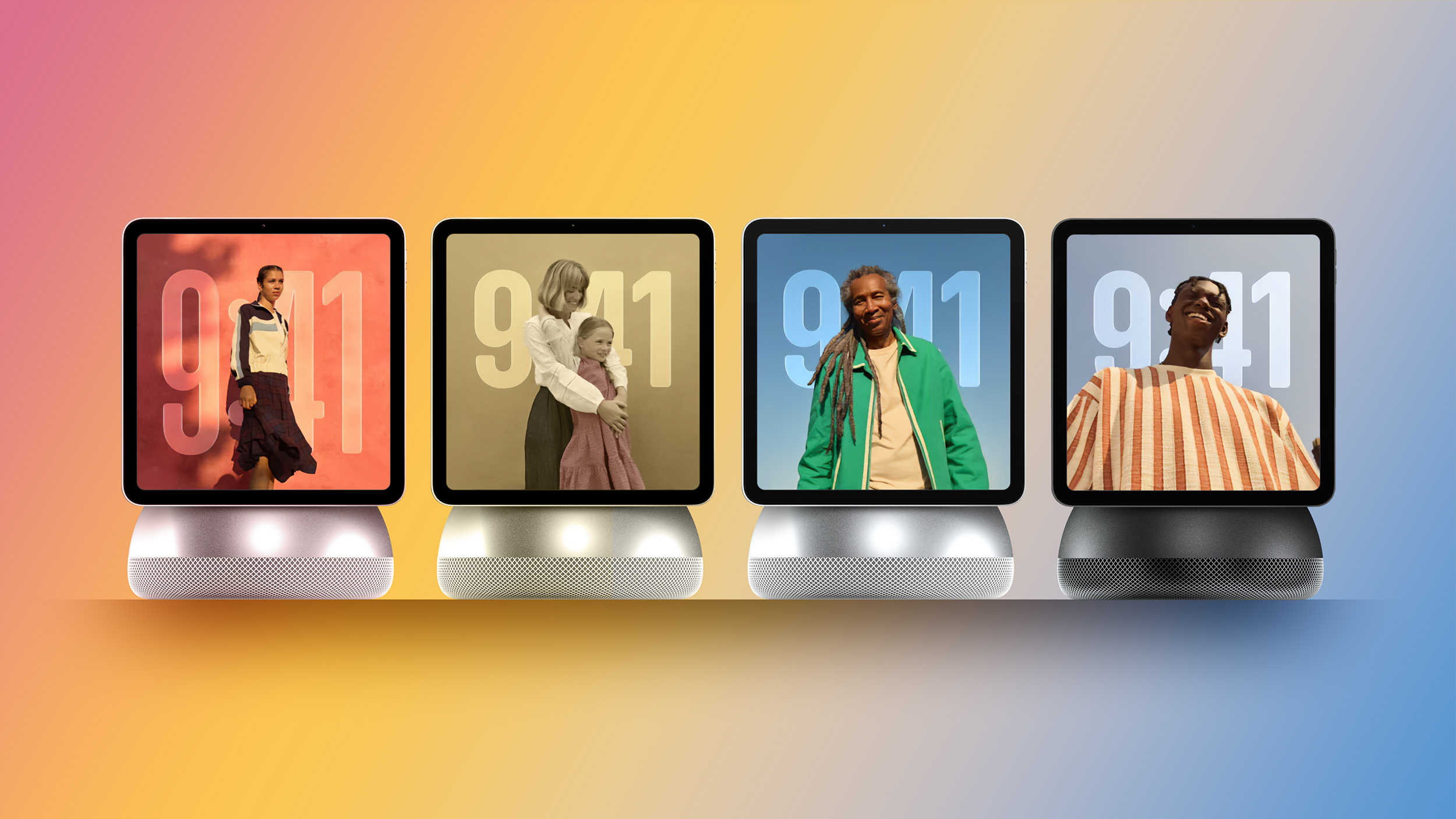
Apple reportedly plans to unveil an all-new smart home hub as part of the "Welcome home" product launch it announced for Tuesday, October 13.


Our image above is just a rough concept based on rumored design details, so be prepared for the device's actual appearance to be different.

The device will likely be unveiled in a press release shared on the Apple Newsroom website at around 9 a.m. Eastern Time on Tuesday, as that is when Apple's private "Welcome home" experience in New York begins. At the experience, invited reporters and content creators will likely receive hands-on time with the home hub.

The hub is said to be designed for managing smart home accessories in the Apple Home app, home security monitoring, digital photo galleries, calendar appointments, music playback, FaceTime video calls, and more. As a user approaches the hub, or moves away from it, the size of the interface elements will reportedly adjust.

The device will be ideal for the kitchen, bedroom, and living room, and it will reportedly have multi-user support for families.

The hub reportedly has a 6-inch square display, and an A18 chip or newer for Apple Intelligence, with Siri AI expected to be a tentpole feature. A new operating system — potentially named "homeOS" — will feature clock faces, widgets, and more. There will be a tabletop version of the hub with a speaker base, plus a wall-mounted version.

Some of the preinstalled Apple apps that will apparently be available on the new platform include Calendar, Camera, Apple Music, Apple Podcasts, Apple News, Reminders, Notes, and the new Siri app with Siri AI conversation history. Do not expect third-party apps at launch, though, as the device reportedly lacks an App Store.

The device is often referred to as a "HomePad" in rumors because of expectations that it will be sort of a HomePod-iPad hybrid, but perhaps Apple will opt for a straightforward "Apple Home" name, or perhaps it will go with "HomeView" based on trademark filings that are potentially linked to the company. We will soon find out.
This article, "Apple's All-New Home Hub Will Be Revealed October 13: What to Expect" first appeared on MacRumors.com

Discuss this article in our forums

  •  

Apple Signs Hiring and Licensing Deal With AI Podcast Startup Huxe

Apple has reached an agreement to recruit employees from Huxe and license the AI audio startup's technology, according to a new European Commission filing.


The filing says Apple will have the right to make employment offers to certain Huxe employees and receive a non-exclusive license to the company's intellectual property, so this isn't an outright acquisition of the company.

Huxe was founded by former Google NotebookLM team members Raiza Martin, Jason Spielman, and Stephen Hughes. NotebookLM – since renamed Gemini Notebook – is Google's AI research tool, which is best known for its ability to turn documents and other source material into podcast-style audio discussions.

Huxe brought a similar approach to personalized listening, given that its app generated audio briefings based on users' emails, calendars, and interests, as well as podcasts about topics they wanted to explore. Listeners could interrupt the AI hosts to ask questions or request a different explanation.

The startup announced in May that it was winding down, and said its team was moving on and that development would stop. Its audio service ended on May 28. Apple notified the Commission of the arrangement on June 9.

The filing does not say which employees Apple could recruit, nor does it confirm whether anyone has actually been hired.
This article, "Apple Signs Hiring and Licensing Deal With AI Podcast Startup Huxe" first appeared on MacRumors.com

Discuss this article in our forums

  •  

PoseKit – 3D-Modelle für Screenshots aus neuen Perspektiven

08. Oktober 2026 um 15:15

Wie viele Mockup–Apps für gerahmte Screenshots kann man besitzen? Die Antwort lautet wie immer: „Ja.“

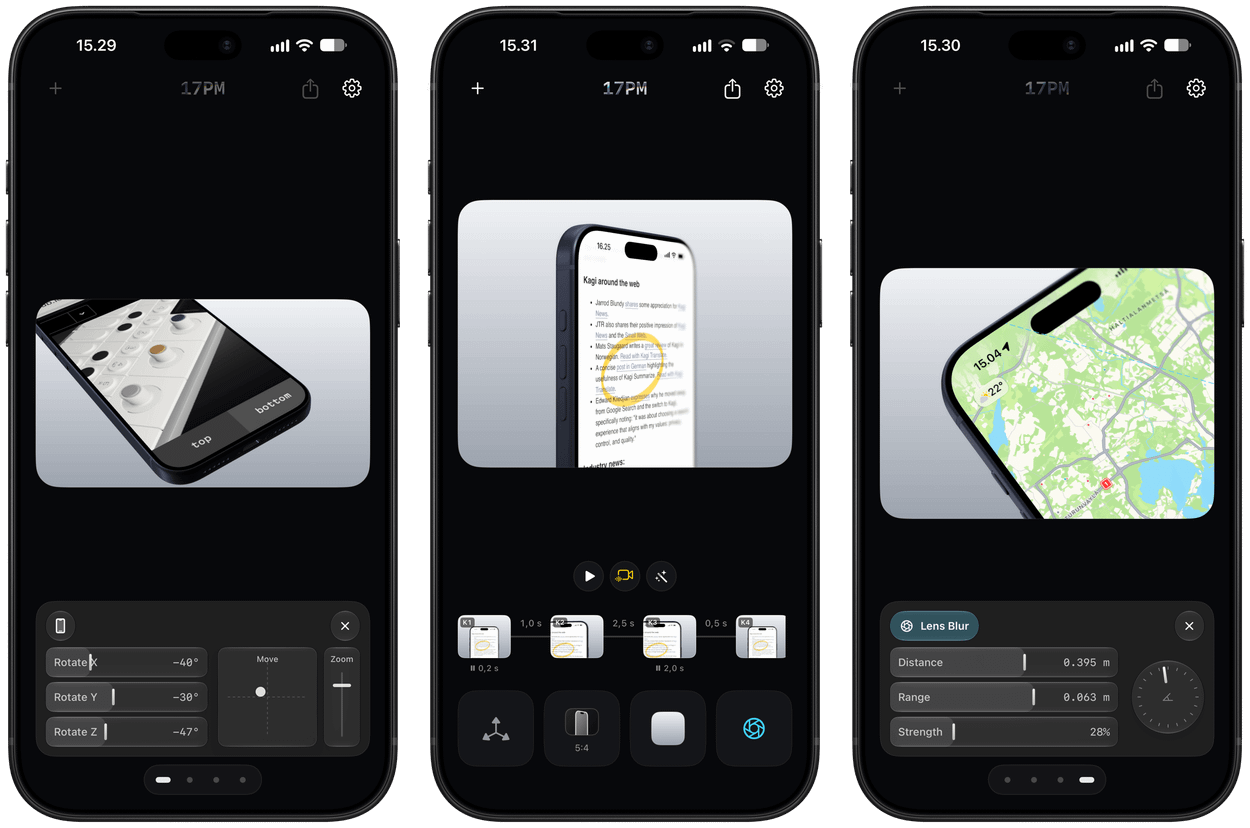
Three iPhone screens displaying video editing software with different preview windows: the left shows a rotated perspective of coffee cups on a tray, the center shows a phone screen with highlighted text, and the right shows a map application on a phone.

PoseKit ist eine Geschwister-App von ByePhotos und befreit eure Bildschirmfotos aus ihrer immer gleichen Frontalperspektive. Sogar kurze Kamerafahrten sind im 15-Euro-Einmalpreis inbegriffen.

Eine optionale Objektivunschärfe rückt Details in den Fokus, die man explizit, aber unaufdringlich hervorheben will.

Ich bin ein großer Fan der Positionssteuerung. Anstatt das 3D-Modell lediglich ungenau mit den Patschehändchen innerhalb des Frames zu verschieben, nutzt man präzise Schieberegler. Andere Apps schauen sich diese Idee bitte ab!

Die Grafiken, die mit nur wenigen Gesten entstehen, sind nicht komplett neu. Diese Posen jedoch mit lediglich zwei Handgriffen direkt am Telefon zu erstellen, ist für alle, die Software zeigen oder präsentieren, ein echtes Geschenk.

  •  

Apple Has Announced 12 New Products in the Past Month

Apple kicked off its recent wave of product announcements on August 25, when it introduced a new Mac mini with M6 and M5 Pro chips, a new Mac Studio with M5 Max and M5 Ultra chips, and an updated version of the Apple Polishing Cloth.


As usual, September then arrived with many new Apple products. Already this month, the company has unveiled the iPhone 18 Pro, iPhone 18 Pro Max, iPhone Duo, Apple Watch Series 12, Apple Watch Ultra 4, AirPods 5, and Beats 360. Apple also debuted a new Wrist Strap accessory, along with an updated Apple Watch magnetic charging cable.

In case you missed anything, here is our previous coverage of 12 new products and accessories announced by Apple over the past month:

Apple has also released new iPhone cases, Apple Watch bands, and revised U.S. English versions of its Magic Keyboards for Macs with glyphs on select keys.
This article, "Apple Has Announced 12 New Products in the Past Month" first appeared on MacRumors.com

Discuss this article in our forums

  •  

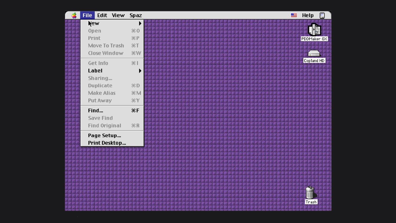
You Can Now Try Apple's Unreleased Copland OS in Your Browser

In the mid–1990s, Apple worked on an operating system called Copland, which was announced but never commercially released because of project management issues and feature creep. Parts of Copland were eventually included in Mac OS 7.6 and Mac OS 8, but it was so problematic as a whole that Apple nixed it before it was finished.


Michael Steil, who works to reverse engineer vintage hardware and software, was recently able to get Copland running in emulation. He modified the open-source Power Mac emulator DingusPPC, and he said it took 11 patches to get Copland up and running. He has a browser version of Copland you can try on his website, and shared the patches needed to boot Copland.

During Copland's development, Apple released three beta versions. The last beta was D11E4, which is what Steil got to work. He said Copland is "notoriously hard to run on real hardware," and wasn't previously available in emulation.

After Apple canceled Copland in August 1996, it looked outside the company for a new operating system. That led to the purchase of NeXT in 1997 and the return of Steve Jobs. NeXTSTEP, NeXT's operating system, was the precursor to Mac OS X.
This article, "You Can Now Try Apple's Unreleased Copland OS in Your Browser" first appeared on MacRumors.com

Discuss this article in our forums

  •  

Apples Handgelenk Band

21. September 2026 um 14:51

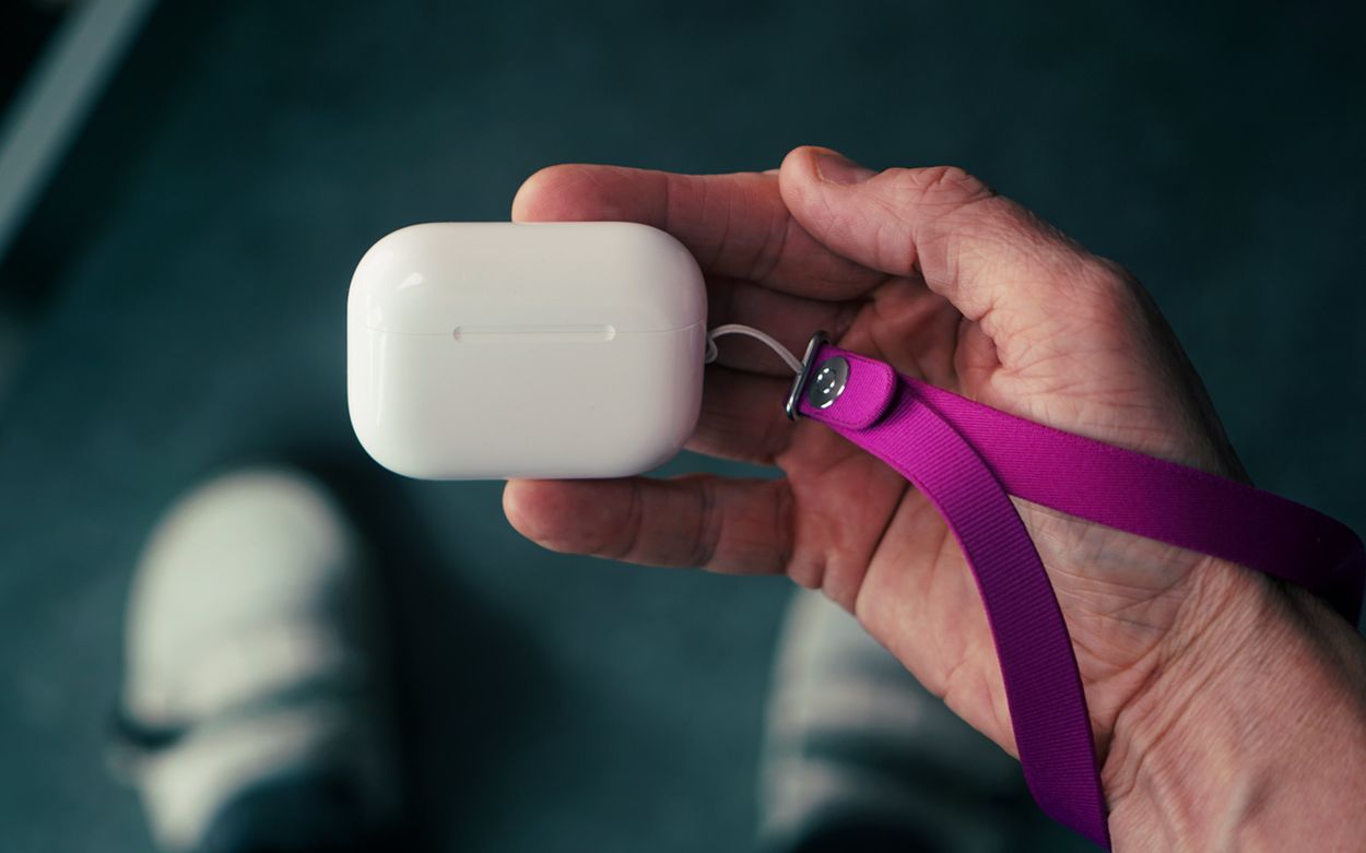
Ignorieren wir den „Hand strap“ für die QuickTake 200, dann sind der iPod touch Loop sowie die Remote Loop die einzigen Bänder fürs Handgelenk aus Apples 50-jähriger Geschichte – zumindest bis letzte Woche.

A person's hand holding a white earbud charging case attached to a purple lanyard.

Apples neues Handgelenk Band befestigt man an einer separaten iPhone-Hülle oder etwa direkt am AirPods-Case1. Es orientiert sich am Design des Crossbody Straps aus dem letzten Jahr.

Ich wette, Apples Marge für das 30-Euro-Bändchen stimmt. Trotzdem bleibt der flache Knopf am eng gewebten Garn mit integrierten Magneten erstaunlich nett.

Meine einzige Kritik: Es ist eine relativ dauerhafte Befestigung. Die Handschlaufe lässt sich einfach lösen, die Befestigungsschlaufen fummelt man aber nur mit etwas Aufwand wieder raus.

  1. Als Apple im Jahr 2022 die Öse am Kopfhörer-Case einführte, überließ der Konzern den Zubehörverkauf anderen Herstellern so wie Incase. ↩
  •  

#523 – mehr Kleinigkeiten aus iOS 27

16. September 2026 um 14:17

Vier Monate später trugen sich mehr Kleinigkeiten zusammen; iOS 27 ist ein Trog mit vielen kleinen „Quality of Life“-Verbesserungen.

Die Zusammenstellung dieser unscheinbaren Änderungen in jedem Sommer führt regelmäßig zu meinen absoluten Lieblingsvideos.

Hier das Intro der Episode:

Weiterlesen

  •  

„Swipe Down for Search or Ask“

15. September 2026 um 09:51

Ohne Spracheingabe bestand am iPhone nie die Möglichkeit, Spotlight außerhalb des Home- und Sperrbildschirms aufzurufen. Mit Siri AI geht das jetzt – nur nicht bei uns.

Wenn wir über fehlende Funktionen für iOS 27 in der EU sprechen, fehlt mir insbesondere diese Interaktion.

Spotlight, as you know it, is gone in iOS 27. Swiping down from the middle of the Home Screen now opens Search or Ask, where you can type or speak to Siri. Apple rebuilt the underlying search index at the same time, so returned results are more current.

via MacRumors

Für iPadOS existiert ein solcher Hack; fürs iPhone nicht. Apples Telefon benutzt sich signifikant besser, wenn man Spotlight auch aus geöffneten Apps heraus aufrufen kann.

  •  

Es zählt, weil es ein iPhone ist, nicht weil es neu ist.

10. September 2026 um 10:29

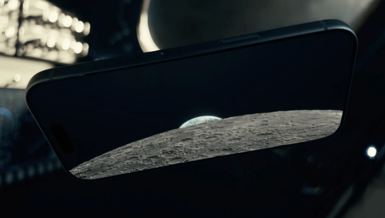
Tim Cook legte charmant für Ternus auf, der dann aber auch direkt verwandelte. Er platzierte das iPhone direkt zum Anpfiff im absoluten Mittelpunkt – von Apple selbst, aber auch als „intelligente und persönliche Zentrale“. Die Aussage war klar: Du brauchst keine anderen KI-Computer!

A close-up photograph of a smartphone screen displaying an image of the moon's surface rising against a dark sky.

„When you have been to the moon. Where do you go next?“

Das Duo zeigt der Industrie den korrekten Fold-Formfaktor – nicht nur mit seiner Reisepassgröße, sondern auch durch die Gleichberechtigung beider Displays. Apples Foldable stellt erstmals die wirklich schwierige Frage: „Warum zwei Bildschirme?“

Das iPhone Air diente mit seiner Hardware im letzten Jahr als vorgeschaltetes Experiment; die Software ist jedoch das Alleinstellungsmerkmal für die neue Form.

Ohne Vorlauf, mit nur wenigen frühzeitig eingeweihten Entwicklerpartnern sowie einer Preismarke, die jeder rechtfertigen muss, wird es zweifellos ein holpriger Anlauf. Wir wissen nicht einmal, ob Apple alle seine eigenen Apps zum Start im Oktober vorbereitet hat.

Und der Preis ist der Preis. Dieses Telefon wird mit seiner zweiten Generation und einem möglicherweise überstandenen RAMageddon nicht günstiger. Der Preis bleibt der Preis.

Deshalb ist die Software so wichtig; sie entscheidet darüber, ob man damit mehr macht als mit Apples wohl bestem iPhone ever™ – dem 18 Pro (Max).

Diese Animation … „I can’t.“

Die Kompromisse fallen überraschend überschaubar aus. Wer die Pro-Video- und Fotofunktionen vermisst, ist hier nicht die Zielgruppe. Kein Action Button, kein Face ID und das insgesamt reduzierte Kamerasystem werfen trotzdem die Frage auf: Warum mehr bezahlen für weniger?

Plus, Mini und Air hatten nie eine Chance, sich besser zu verkaufen als Apples Standard- und Pro-Modelle. Zugegeben: Das war auch nie ihre Aufgabe.

Aber welche Aufgabe hat das Duo? Es ist zu anders, um nur ein weiteres Modell in der Aufstellung zu sein. Es ist nicht nur eine andere Verpackung der gleichen Idee.

„Like other iPhones, it packs the power of a computer. But it can take the shape of a computer…“

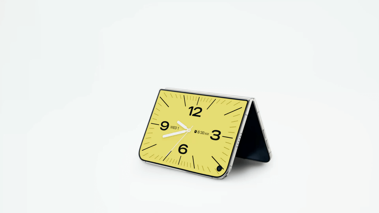
Das ist derzeit nur Marketing; aber ist das auch ein ausgerufenes Ziel? Bleibt es mehr als zwei Generationen im Line-up, um dafür auch nur annähernd eine Chance zu bekommen? Mit dem Duo lebt etwa das Standby-Feature wieder auf, das nach seiner ersten Vorstellung vor drei Jahren quasi vergessen wurde.

A foldable smartphone resting in a stand position displaying an analog clock face.

Das Duo ist Apples Chance, eigene Produkte zu kannibalisieren – von kleinen iPads bis zu großen Telefonen. Es bietet die Möglichkeit, sich breiter aufzustellen und die Abhängigkeit vom klassischen iPhone-Geschäft auf mehr Schultern zu verteilen.

Deshalb die Frage: Neues iPhone oder tatsächlich neuer Computer?

  •  

„Why the iPhone is about to get more expensive“

07. September 2026 um 22:43
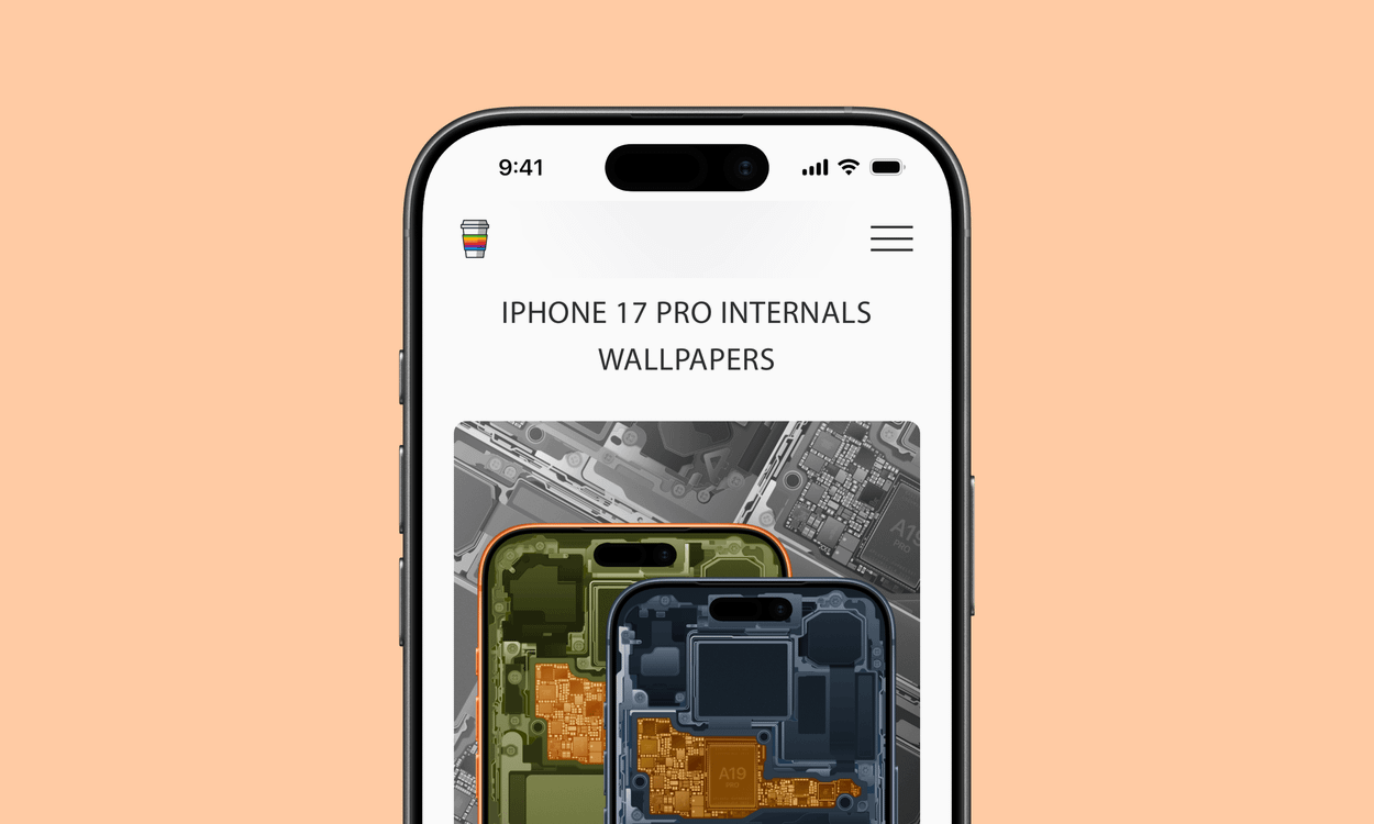
A smartphone screen displays "iPhone 17 Pro Internals Wallpapers" above an image showing the detailed internal components of two smartphones, one with an orange frame and the other with a dark gray frame.

via BasicAppleGuy

In other words, AI isn’t just making electronics cost more. The memory shortage is changing which electronics companies bother making in the first place.

Rani Molla | The Verge

Der Aufhänger des Artikels ist das iPhone – was auch sonst.

Der Artikel selbst reicht allerdings darüber hinaus, hätte aber noch stärker auf die sichtbaren Folgen eingehen sollen – „AI is killing the cheap smartphone“.

But that model breaks when memory prices spike as much as they’re now spiking. The sub-$100 smartphone risks becoming “permanently uneconomical” as a product. And that means that the budget smartphone makers have been forced to pass memory costs onto consumers: smartphones that sold for $50 are now selling for $120 or more. And price-sensitive consumers have responded by simply not buying phones. […]

In India, the sub-$100 smartphone market collapsed 59 percent year-on-year in the first quarter of 2026: surging memory prices resulted in a “forced premiumization” of the Indian smartphone market. But in the poorest markets, such premiumization isn’t a possibility. In 2025, 81 percent of smartphone shipments in Africa were in the sub-$200 category: as smartphone prices surge, many African consumers will simply be priced out of phone ownership entirely.

Apple verzichtete auf Preiserhöhungen seiner Telefone – nicht nur in den letzten Monaten, sondern auch in den letzten Jahren, und griff damit indirekt dem Servicegeschäft unter die Arme.

Es wird interessant, wie viele Kund:innen von neuen Pro-Modellen und noch teureren Falt-Telefonen das wirklich interessiert – insbesondere mit neuen Leasing-Optionen sowie monatlichen Ratenzahlungen über Mobilfunkanbieter.

Relevanter ist sicherlich eine (neue?) Preisgestaltung für das hervorragende Standard-iPhone 17 sowie das nachfolgende Modell, das voraussichtlich aber erst im Frühling 2027 erscheint.

  •  

Foldable iPhone Ultra: The Latest Rumors Before Apple's Event

We're less than a week away from the debut of Apple's first foldable iPhone, and rumors have been picking up as the event date approaches. Here's the latest.


  • MagSafe - Even though foldable iPhone dummies we saw earlier this year didn't have a MagSafe ring, Bloomberg's Mark Gurman claims all signs indicate MagSafe charging will be supported.

  • Crease - Some of the early language about the foldable iPhone's crease suggested Apple might have found a way to make it invisible, but later rumors are more realistic. The crease is minimal, but Apple hasn't found a magic way to get rid of it.

  • Touch ID - Touch ID is still expected for the foldable iPhone. Apple didn't have room for the Face ID hardware because the device is rumored to be just 4.5mm thick. There will be volume buttons at the top of the iPhone Ultra, with a ‌Touch ID‌ side button for unlocking.

  • Software - iOS 27 makes it clear Apple is making sure apps will work with the foldable iPhone. There's a big push for app resizability and layout flexibility. The iPhone is expected to support multitasking, sidebars, and side-by-side app usage.

  • Cameras - Camera rumors haven't changed. We're expecting a two-lens camera setup with Wide and Ultra Wide lenses.

  • Chips - Early rumors said Apple would transition to the C2 and move away from Qualcomm, but it looks like Apple might still use Qualcomm modems in the United States. It hinges on whether the C2 supports mmWave 5G. The ‌iPhone Ultra‌ will also adopt Apple's A20 Pro chip, the same as the iPhone 18 Pro models.

  • Colors - The foldable iPhone is expected in white/silver and dark blue.

  • Apple Pencil - Apple tested an Apple Pencil with the foldable iPhone, but it's probably not going to launch.

  • Launch Timing - Rumors on ‌iPhone Ultra‌ launch timing and production have been mixed, with some sources reporting delays. Gurman says he will be "very surprised" if the device doesn't launch at the same time as the ‌iPhone 18 Pro‌ models or "very close to it." It's still possible supplies could be constrained, leading to long waits for those who don't pre-order early.

  • Price - The ‌iPhone Ultra‌ is expected to cost over $2,000, possibly up to $2,500 depending on storage capacity.


Apple will introduce the ‌iPhone Ultra‌ and the ‌iPhone 18 Pro‌ models at its "Surprise and Shine" event that will be held on Wednesday, September 9.
Related Roundup: iPhone Fold

This article, "Foldable iPhone Ultra: The Latest Rumors Before Apple's Event" first appeared on MacRumors.com

Discuss this article in our forums

  •  

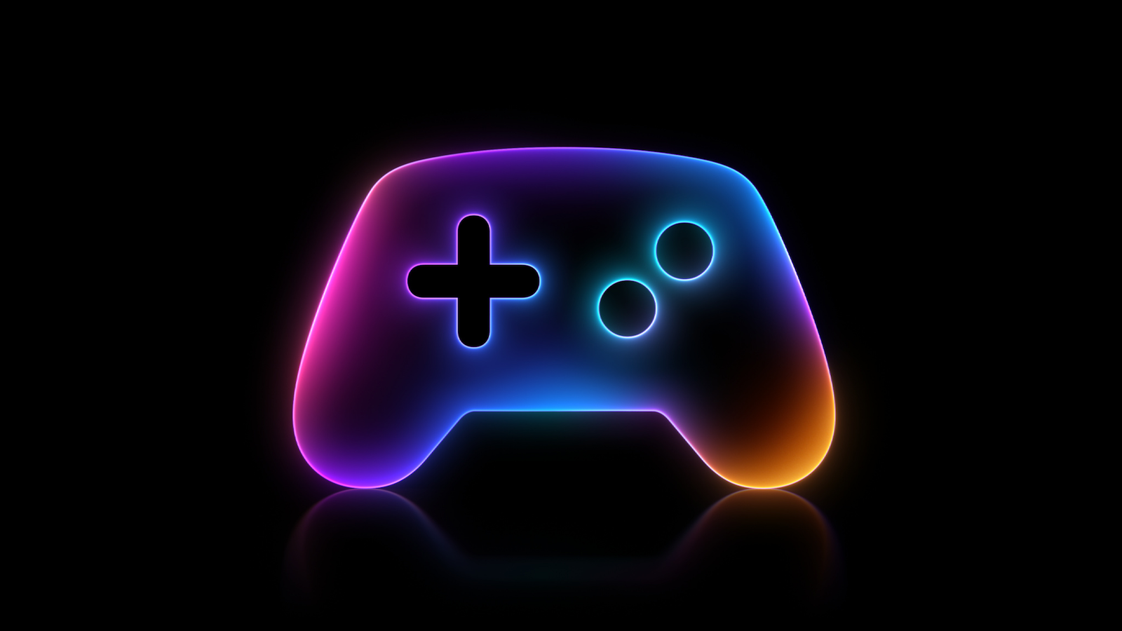
macOS 26.7 Code Hints at Two Unreleased Apple Game Controllers

References to two unreleased controllers that identify as Apple hardware in code were spotted in the macOS 26.7 release candidate by MacRumors reader Pdfu. Apple's first macOS 26.7 release candidate came out in mid-August, and it was full of references to unreleased Apple devices, from iPhones and Macs to new home accessories. Pdfu has continued to dig into the RC, finding new details that were previously overlooked.


There are GameController profiles for two hardware devices identified as T6502 and T1057, which Pdfu suggests could be Apple gaming controllers in development. The two controllers have different haptic designs and standard controller components, like a D-pad, dual thumbsticks, shoulder buttons, Home and Menu buttons, and analog triggers. T1057 also has accelerometer and gyroscope support, while T6502 doesn't.

The code includes dedicated hardware plug-ins for each device as well, which suggests these are actual devices instead of placeholder code.

There have been rumors about a possible Apple game controller over the years, but nothing has ever materialized.

The code found in the first macOS Tahoe 26.7 RC could point to an Apple controller in the works, but it could also be referencing internal test hardware Apple uses for testing game controller code and support. Apple removed the code in the second ‌macOS Tahoe‌ 26.7 RC.

Apple has had multiple opportunities to release a game controller. The company could have launched one alongside any version of the Apple TV, when Apple Arcade came out, or when the Vision Pro launched, but it didn't. Instead, Apple focused on building extensive support for third-party controllers.

In 2015, Apple required ‌Apple TV‌ games to support the Siri Remote as a gaming controller, but gave that up in a matter of months. With the Vision Pro, it partnered with Sony to add Vision Pro support to the PlayStation VR2 Sense controllers instead of designing its own controller.

Console makers have mastered the controller, and many people already have Xbox, PlayStation, or Nintendo controllers. There's little improvement to be made on controller ergonomics, but if Apple is working on a controller, features like Find My and instant cross-device pairing could set it apart from competitors.

All of the references can be found in blacktop/ipsw-diffs on GitHub, with Pdfu's highlights available in the forum post.
This article, "macOS 26.7 Code Hints at Two Unreleased Apple Game Controllers" first appeared on MacRumors.com

Discuss this article in our forums

  •  

Review: Acer's 6K Touchscreen Display Turns Your Mac Into a Giant iPad, Sort Of

Acer recently came out with a new 6K 31.5-inch display, the ProDesigner PE320QXT. It's a touchscreen display that's able to work with a Mac using touch drivers, and it's aimed at professional creators. It's fun to use, but there are some compromises, and this is not the display to get unless you really want touch integration.
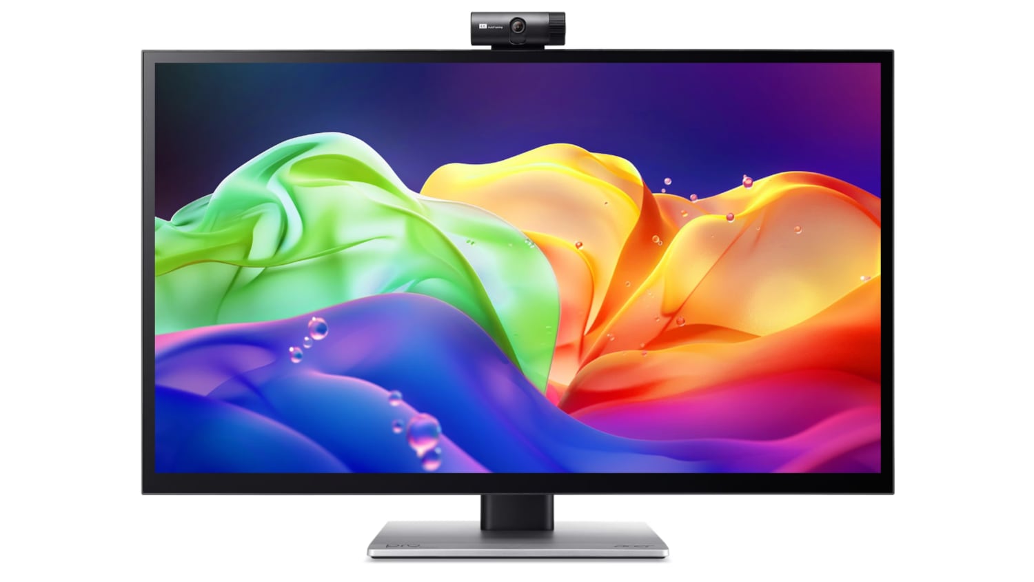

This is a big, heavy display. It's thicker than my Apple Studio Display, and it's thicker than any other display I've tested, likely because of the touch layer. It does have a tapered design so the sides aren't quite as thick as the middle, but this isn't a modern-looking monitor. It doesn't resemble something designed in 2026, especially with the button-based controls and the thick bezels. If someone told me this was a display from 2006, I'd believe it. With its stand, the ProDesigner weighs about 22 pounds, and it takes up a lot of room on my desk.

The display uses an IPS panel and has a resolution of 6016 x 3384, and it can connect to a Mac using HDMI or USB-C. I tested it on a 16-inch M1 Max MacBook Pro running macOS Golden Gate and an M4 MacBook Air. By default, macOS uses a 3008 x 1692 scaled resolution, which is a good compromise between display quality and sizing. It can be set at higher resolutions, including the full 6016 x 3384, but window sizing and text get smaller as resolution goes up.
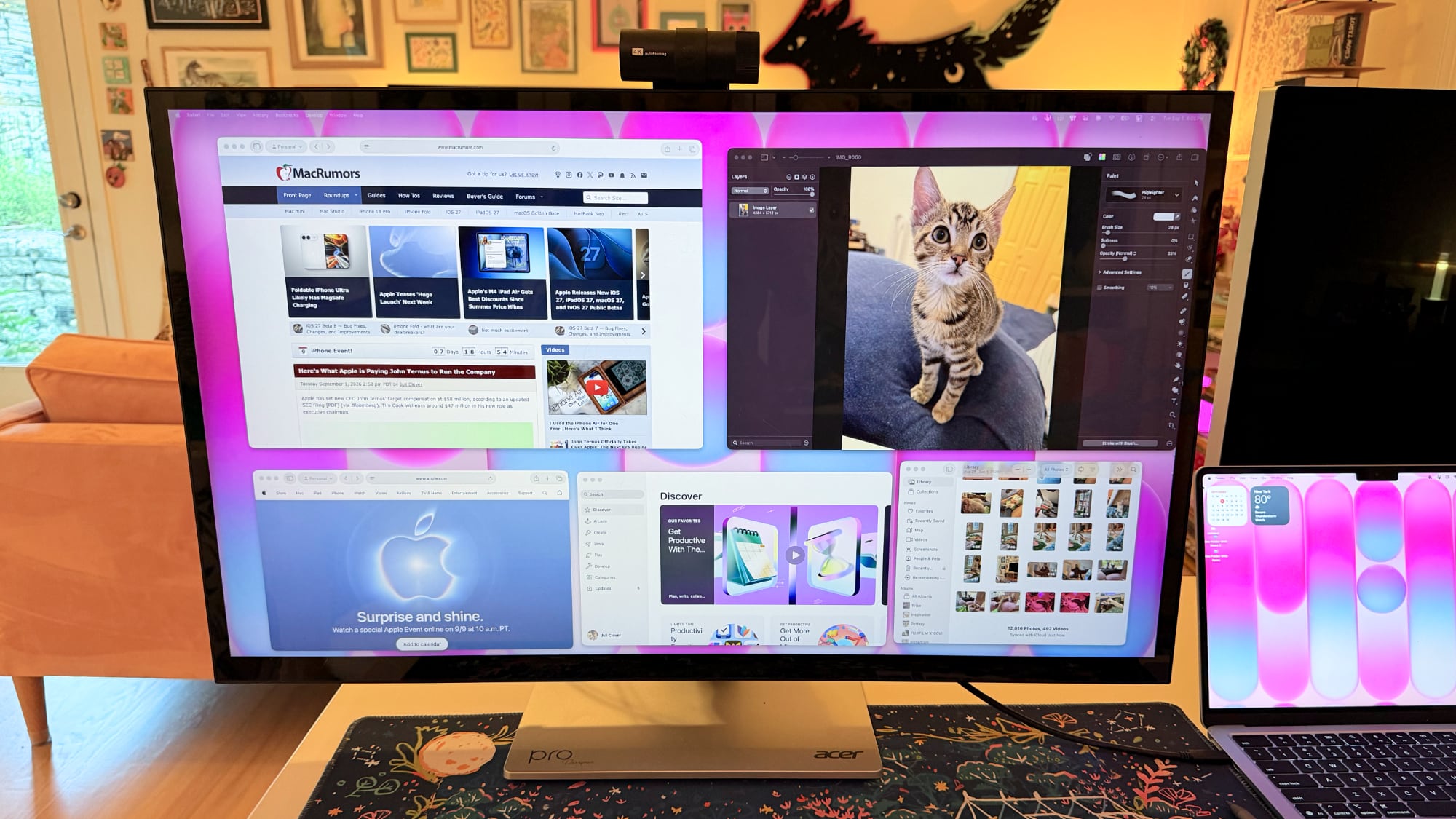

Text is crisp and everything looks sharp at the default resolution, but brightness is limited to 400 nits and contrast is just fair, not outstanding. My office is bright, and in the daytime, 400 nits is a little too dim, especially if I'm simultaneously using the ‌MacBook Pro‌'s much better mini-LED screen or a ‌Studio Display‌ with the Acer ProDesigner. Brightness does go up to 600 nits for HDR content, but I wouldn't recommend it for HDR movies because it doesn't have the local dimming you get from mini-LED or OLED.

Though brightness wasn't where I wanted it to be, quality and color were excellent. With some displays, it's unpleasant to use them with a ‌MacBook Pro‌ because of the pixel density mismatch, but 6K resolution makes a difference when using the display next to a ‌MacBook Pro‌. Text and interface elements don't look soft or low-resolution. Acer says the display is Calman-verified for color accuracy with support for 99 percent of the Adobe RGB and P3 color gamuts. I don't have a colorimeter or a reference display for testing, but colors were saturated and seemed similar to those on my ‌MacBook Pro‌. I did notice a little light bleed at the edges of the display when viewing a dark image in a dark room, but it's not something I noticed in regular use and the display otherwise looked uniform.
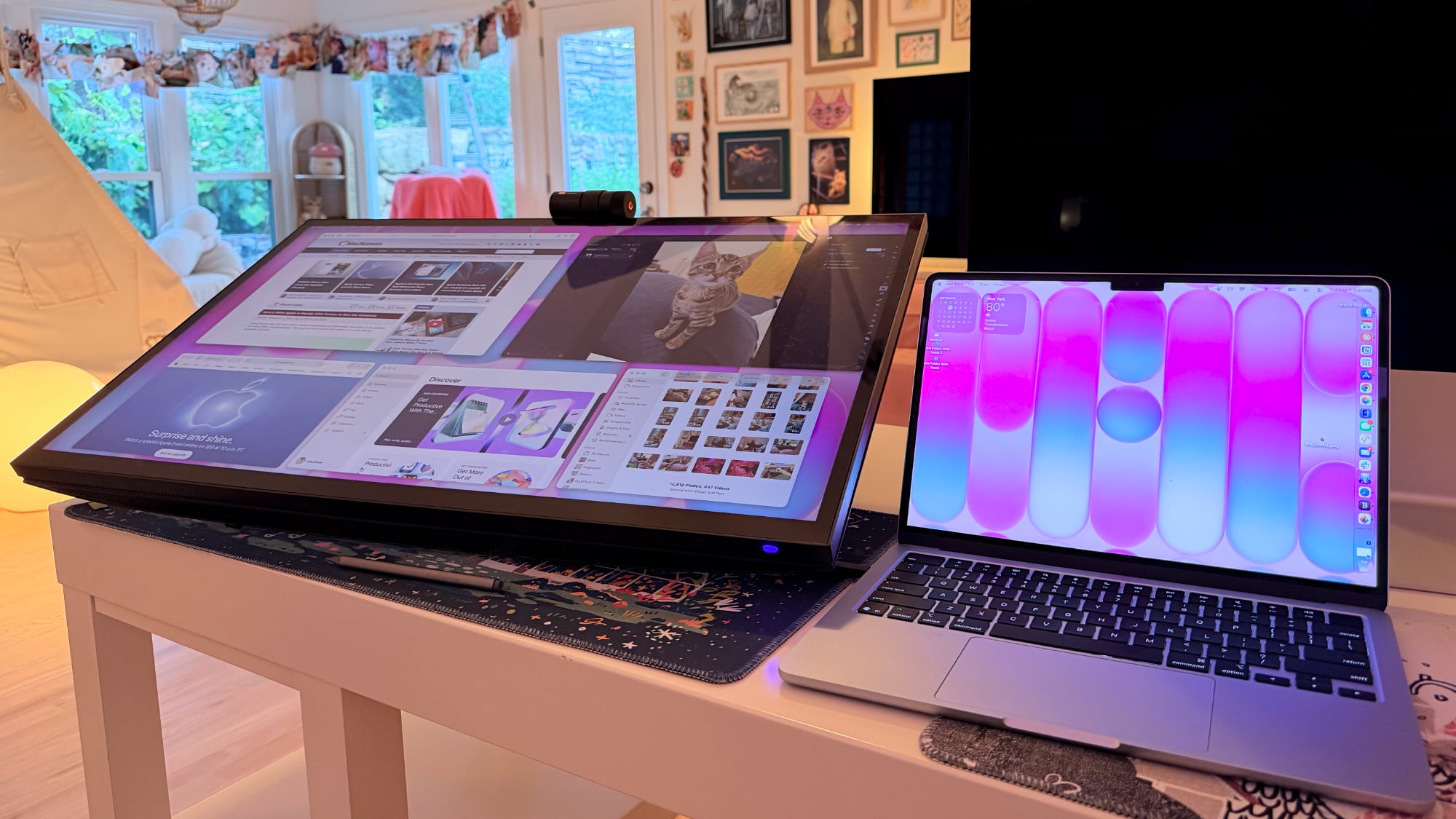

One of the main concerns with any kind of color work is the glossiness of the display. This is one of the most reflective displays I've used, and it is problematic when viewing dark content in a room with bright light. If you have lights behind you, they're going to reflect and make it harder to see what you're working on. Acer says it's an anti-glare display, but I disagree.
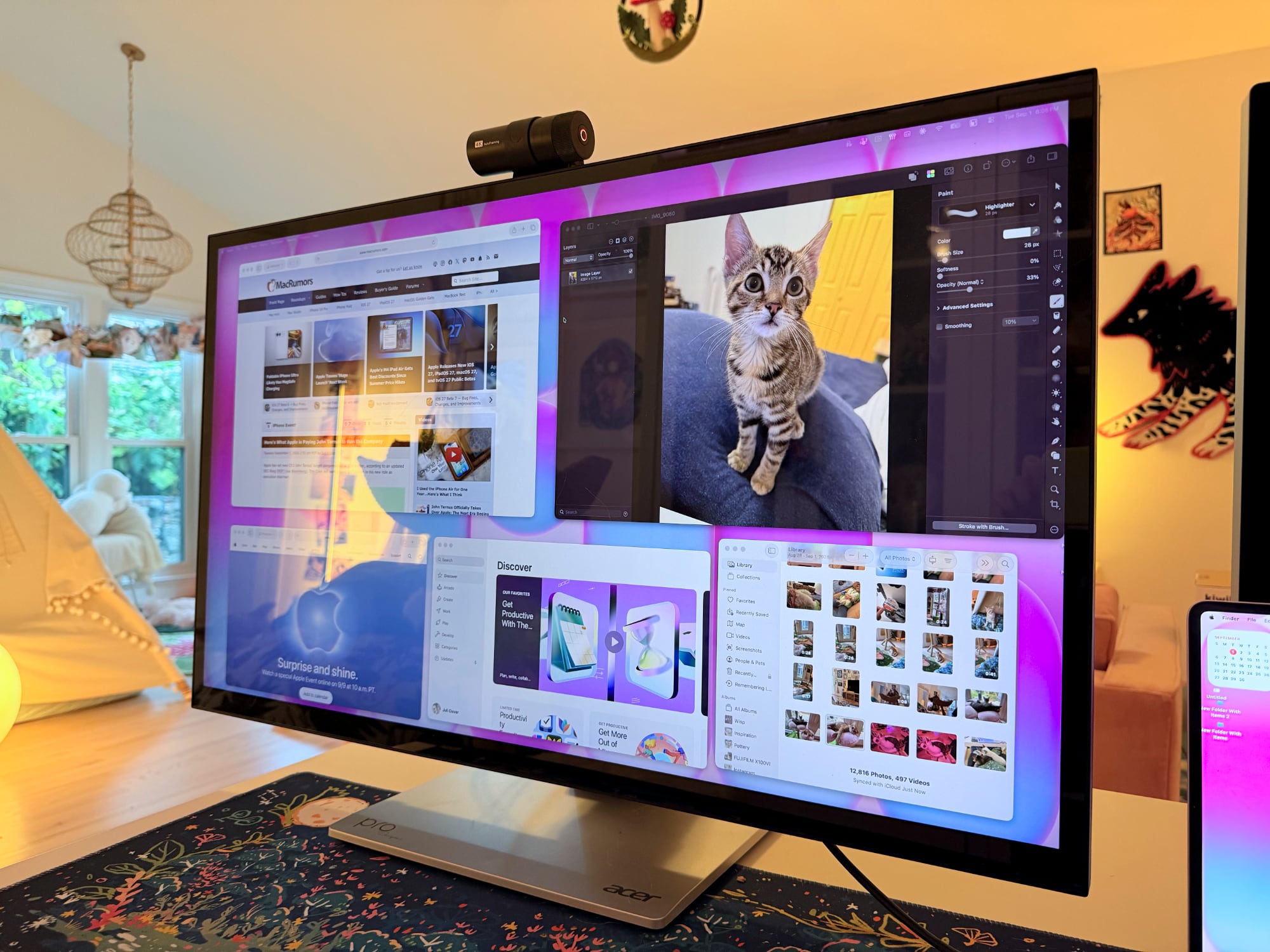

This is a display with a 60Hz refresh rate, and I do notice the lower refresh rate when scrolling through webpages because I'm used to my Mac's 120Hz option. This isn't a display I'd choose for games because of it, but games do look good thanks to the resolution.

Controls


Acer doesn't have a native macOS app for controlling the display, so there's no way to control brightness from the Mac unless you download third-party display software. I use BetterDisplay, and it works well.

Without third-party display software, you're limited to the brightness controls on the monitor itself. There are five buttons on the bottom right of the display. On-device controls are not as convenient as software-based controls, and it takes too many button presses to adjust brightness. I need to press one button to toggle the brightness setting, then use a different button and press several times to adjust up or down.

The brightness control is right next to the power button, so I've accidentally turned the display off several times. It's hard to imagine a control scheme that would be less ergonomic than the one Acer chose. You can tediously control all of the display settings with the physical buttons, or use third-party software to solve the problem.

Stand


The ProDesigner uses a folding stand made for switching between an upright and a tilted, low-angle orientation, with the latter meant to be used for drawing, sketching, and other tablet-style work. Since the stand is meant to tilt into a tablet position, it doesn't have much height adjustment, with about six inches of range. If you need the display to be taller, you'll need a monitor riser.
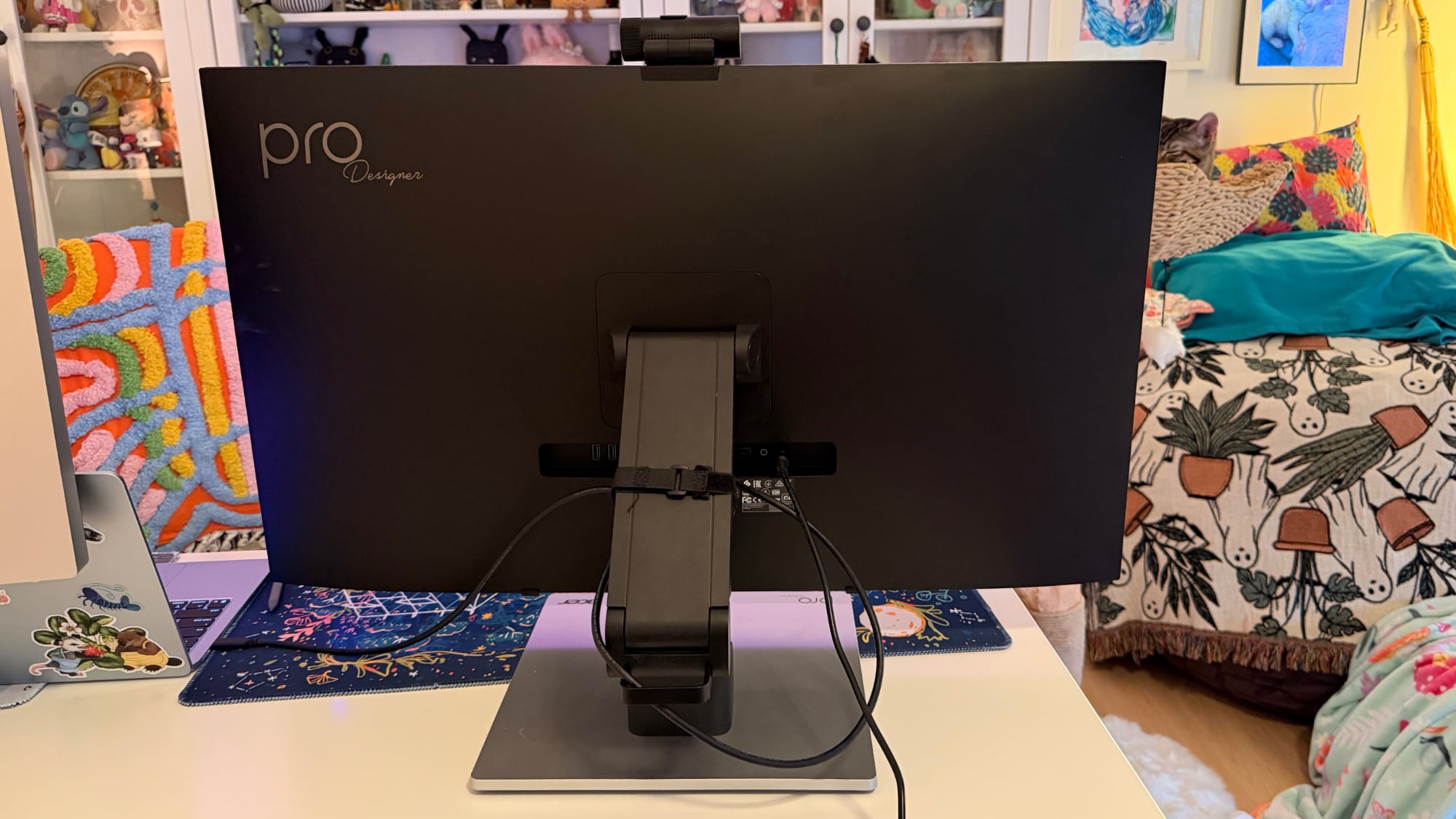

It is easy to pull it down into more of a tablet mode, and when it's oriented like that, it's like using a giant iPad or drawing tablet. It can be adjusted to several different angles, and it swivels 360 degrees so you can find the best position for whatever you're doing. The stand mechanism feels well-designed and there's little friction when making changes.
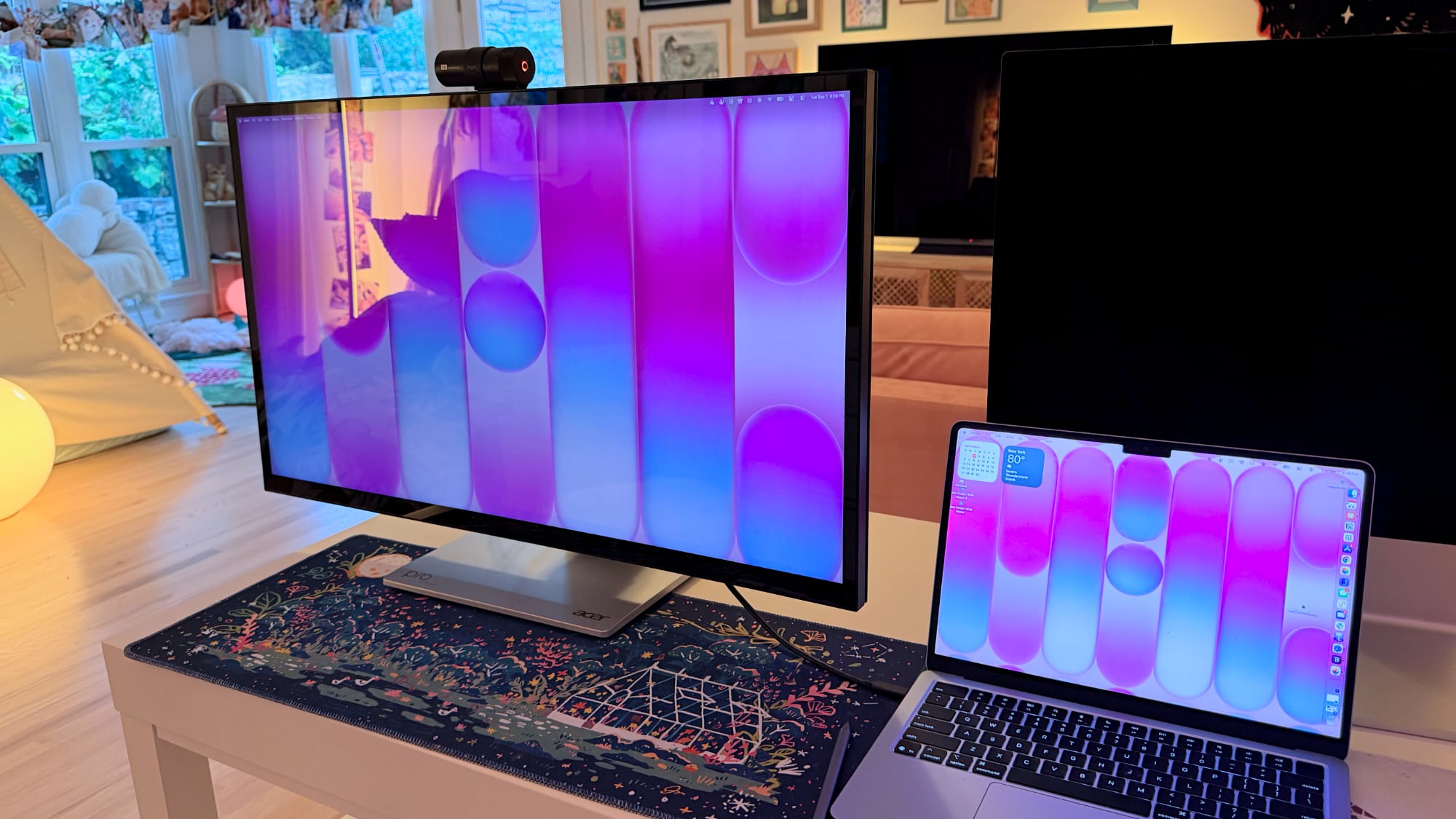

I didn't think attempting to draw or write on a display this size was going to be comfortable, but being able to angle the display helped. I had no issue when using it at my desk, though it does take up a lot of space. This isn't a situation where you can pick up your drawing surface and pop over to the couch to draw. You need the right setup for this display and its large stand.

The stand design makes the most sense if you're often using the display in touch mode, and less sense if you just want a display. It doesn't have the range of height adjustment of a standard desktop display because of the mechanism to shift it into a tablet position.

Ports and Charging


The display connects to a Mac over USB-C and offers 90W passthrough charging. That's not enough power to reach the 140W maximum charging speed of a 16-inch ‌MacBook Pro‌, but it was enough to keep my Mac topped up over the course of the day, even while gaming.

It has two HDMI 2.1 ports, one DisplayPort 1.4 port, a USB-C port with power delivery, two USB-A 3.2 Gen 1 ports, a USB-B upstream port, and a 3.5mm jack. There is no Thunderbolt support, so you can't daisy-chain displays.

Touchscreen and Software


macOS doesn't have native touchscreen support, so third-party software is required to make the Acer display's touchscreen function. Acer suggests the UPDD Touch Software driver from Touch-Base, and it allows for 10-finger touch input.
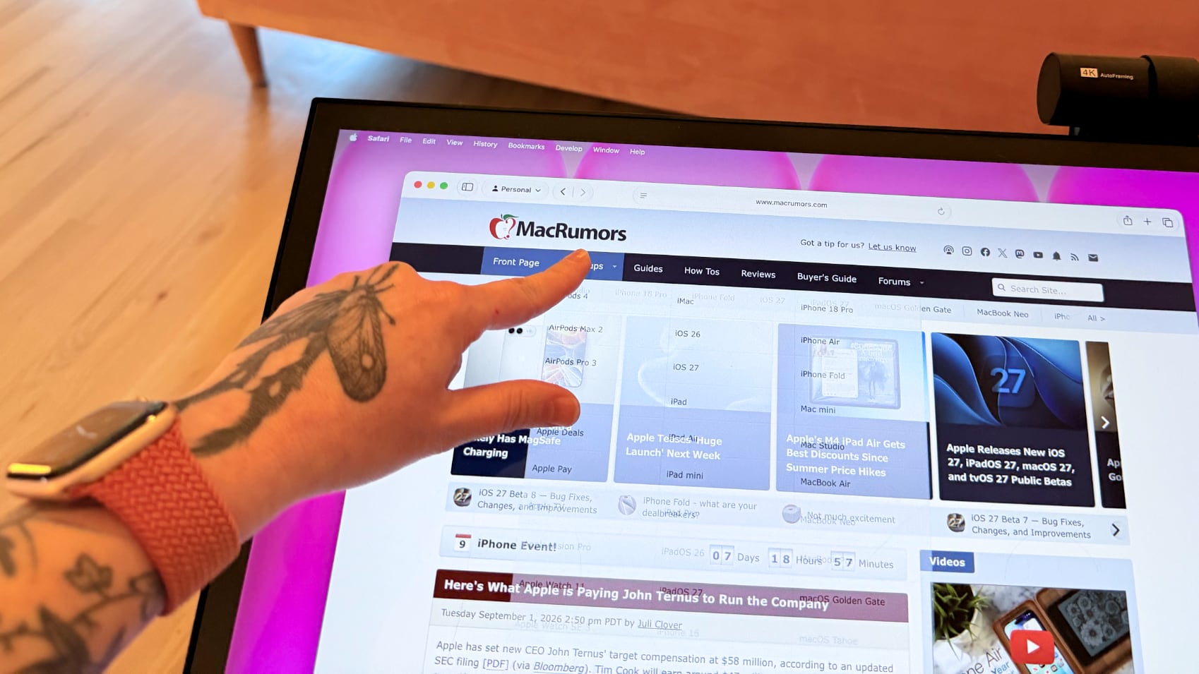

You can use all of the Mac gestures you're familiar with on the ProDesigner, but it's clear this is a display that wasn't built with the Mac in mind. The UPDD software requires per-app customization of touch gestures for some workflows. It's nice that the customization is available, but the software can be confusing. I don't know who is going to want to put in the work to get this running in a way that doesn't involve at least some frustration. In an app like Pixelmator Pro, I'd have to manually tweak the gestures to be able to use it efficiently, and the same goes for most apps. Apps on the Mac just weren't built for touch input.

With the UPDD software, touch input works, and works well. Finger taps are accurate, and Acer has a stylus that goes along with the display (that is a separate purchase). With the stylus, fine-line writing and drawing are supported, and features I'd expect with a stylus, like palm rejection and tilt, are available. Using the stylus is similar to using an ‌iPad‌ with an Apple Pencil that has hover. I can see the mouse cursor when the stylus is close to the screen so I can tell what I'm doing. Using touch or the stylus didn't seem laggy, and writing on the display was responsive.


Touch works on macOS, and I can tap with a finger to launch apps, change settings, adjust windows, and control on-screen elements, but it's not a feature I need or want. It would take me months, if not years, to get as fast with touch gestures as I am with a trackpad, and I'd never be able to replace the keyboard.

The display's touch feature is useful for drawing and sketching, and likely convenient for workflows like video editing, but I'm not sure it has appeal beyond that. There aren't many Mac tasks that are easier to do or more accessible with touch controls. Also, a display this big and this glossy really shows fingerprints.

Webcam and Speakers


There is a built-in 8-megapixel webcam, and it is higher quality than the camera in my ‌MacBook Pro‌ (not hard to achieve). Since I don't do a ton of video calls, it's not a super important feature for me, but someone who is often in video meetings might appreciate it more.
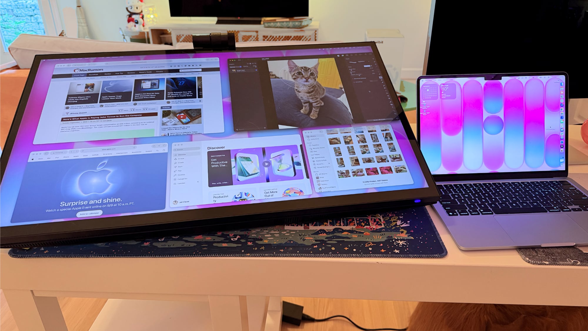

The camera can tilt for adjusting the angle depending on where you're positioned, but it is a wider angle than I'm used to with a webcam and the framing is awkward. When the camera is not in use, there's a physical cover for privacy purposes.

The speakers are fine, but nothing special. I wouldn't use them over standalone speakers or a Mac's speakers. Voice calls and short video content sound fine, but music sounds one-dimensional.

Bottom Line


Acer's ProDesigner PE320QXT wasn't built for the Mac, and it's obvious. It requires a lot of software to work, and it's software that Acer didn't even design. You can use it with the Mac, but the Mac was an afterthought.

The touch hardware works well, and if you want a 31.5-inch drawing surface, this display does that. You can make this work with a favorite creative app, and it's a lot of fun to have such a big digital canvas. There are rumors that Apple is working on a touchscreen ‌OLED‌ MacBook, so macOS could get more touch-friendly in the near future and that might change how useful the display is.

macOS wasn't built to be used with a touchscreen, and I would bet money that no Mac user is going to speed up an established and comfortable Mac workflow with Acer's display.

The only reason to choose this display over another 6K display is the touch feature. If you want a big touch surface, the ProDesigner is a good option and it's priced well for what it is. If you need a Mac display for any other purpose, you're probably better off getting something else.

How to Buy


The Acer ProDesigner PE320QXT can be purchased from B&H for $1,299.99.
This article, "Review: Acer's 6K Touchscreen Display Turns Your Mac Into a Giant iPad, Sort Of" first appeared on MacRumors.com

Discuss this article in our forums

  •  

iPhone 20 Rumored to Have Biggest Revamp Since iPhone X

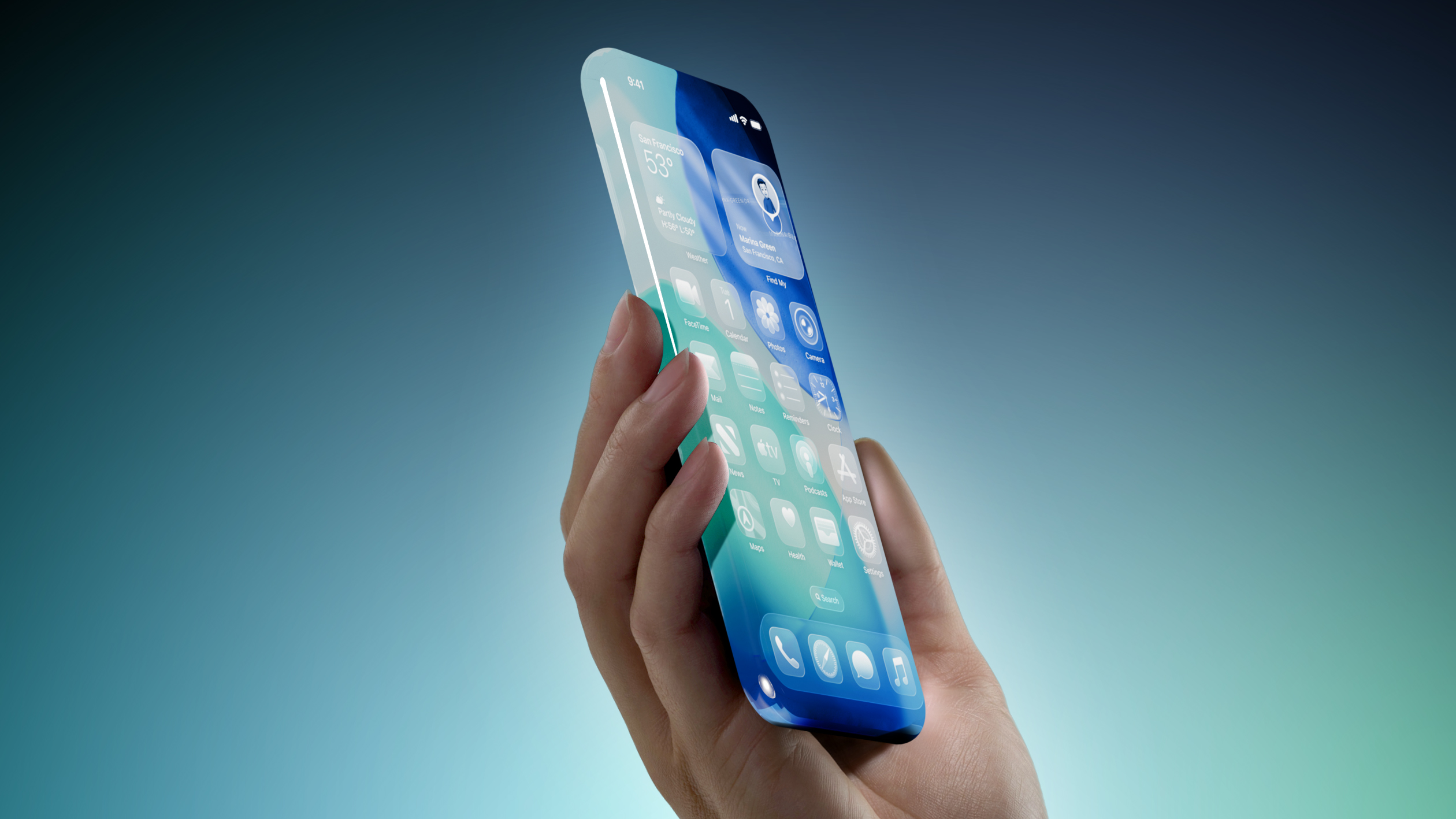
Apple plans to release a special 20th-anniversary iPhone next year with the biggest design changes since the iPhone X, according to Bloomberg's Mark Gurman.


Unveiled by Steve Jobs in 2007, the iPhone turns 20 next year. To mark the occasion, the report said Apple plans to release a 20th-anniversary iPhone with "curved glass around all corners and edges" and thinner bezels around the screen.

"It will be the biggest overhaul to what is now the iPhone Pro line since the iPhone X," the report said, but no further details were provided.

Released in 2017, the iPhone X was the first iPhone with Face ID. The removal of the Touch ID button allowed for the iPhone X's screen to extend more towards the edges of the device compared to previous models. It seems like the 20th-anniversary iPhone would go a step further than this by truly having the screen wrap around the corners and edges of the device, for a seemingly all-glass appearance.

Rumors about the 20th-anniversary iPhone have gone back and forth, but based on Gurman's latest reporting today, the device seems to be in the works still. However, it remains to be seen if Apple can fully achieve the ambitious design changes that are apparently in development, or if plans for the device will ultimately be scaled back.
This article, "iPhone 20 Rumored to Have Biggest Revamp Since iPhone X" first appeared on MacRumors.com

Discuss this article in our forums

  •  

PageFeed – RSS-Feeds durchgeblättert

03. September 2026 um 21:47
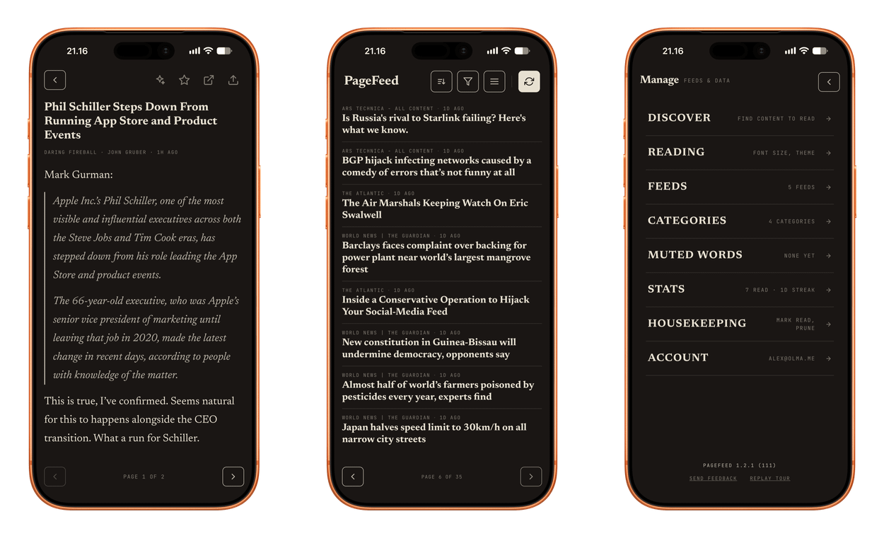
Three screens from the PageFeed mobile application showing an article view, a news feed, and the manage settings menu.

No endless scroll. No algorithm deciding what you see. Just the writers you choose — turned page by page, the way a newspaper used to feel.

PageFeed

Nichts für berufliche RSS-Leser:innen, aber ein erfrischender Take für die Kategorie der Feed-Reader.

Ihr wollt hier explizit nur wenige Quellen eintragen, von denen ihr dann aber keinen Eintrag übersehen möchtet – „Calm Feeds“, etwa für einen entspannten Sonntagvormittag.

Statt TikTok-Scrolling tippt ihr fürs Umblättern hier wie am Kindle. In die meinungsstarke Aufmachung lässt sich kaum reinquatschen: Lediglich zwischen unterschiedlichen Schriftgrößen sowie einem E-Ink-Mode wählt ihr aus. Das nenne ich Mut zur Entscheidung!

Der Sync verläuft nicht nur zwischen euren iPhones und iPads, sondern reicht bis ins Web – bereits die kostenlose Version ist viel zu großzügig. Mit nur wenigen Euro schaltet ihr alle anderen Nettigkeiten frei.

PageFeed fühlt sich wie eine typische Später-Lesen-Anwendung an, bleibt aber ein Feed-Reader – eine liebevolle Verpackung von RSS-Abos.

  •  

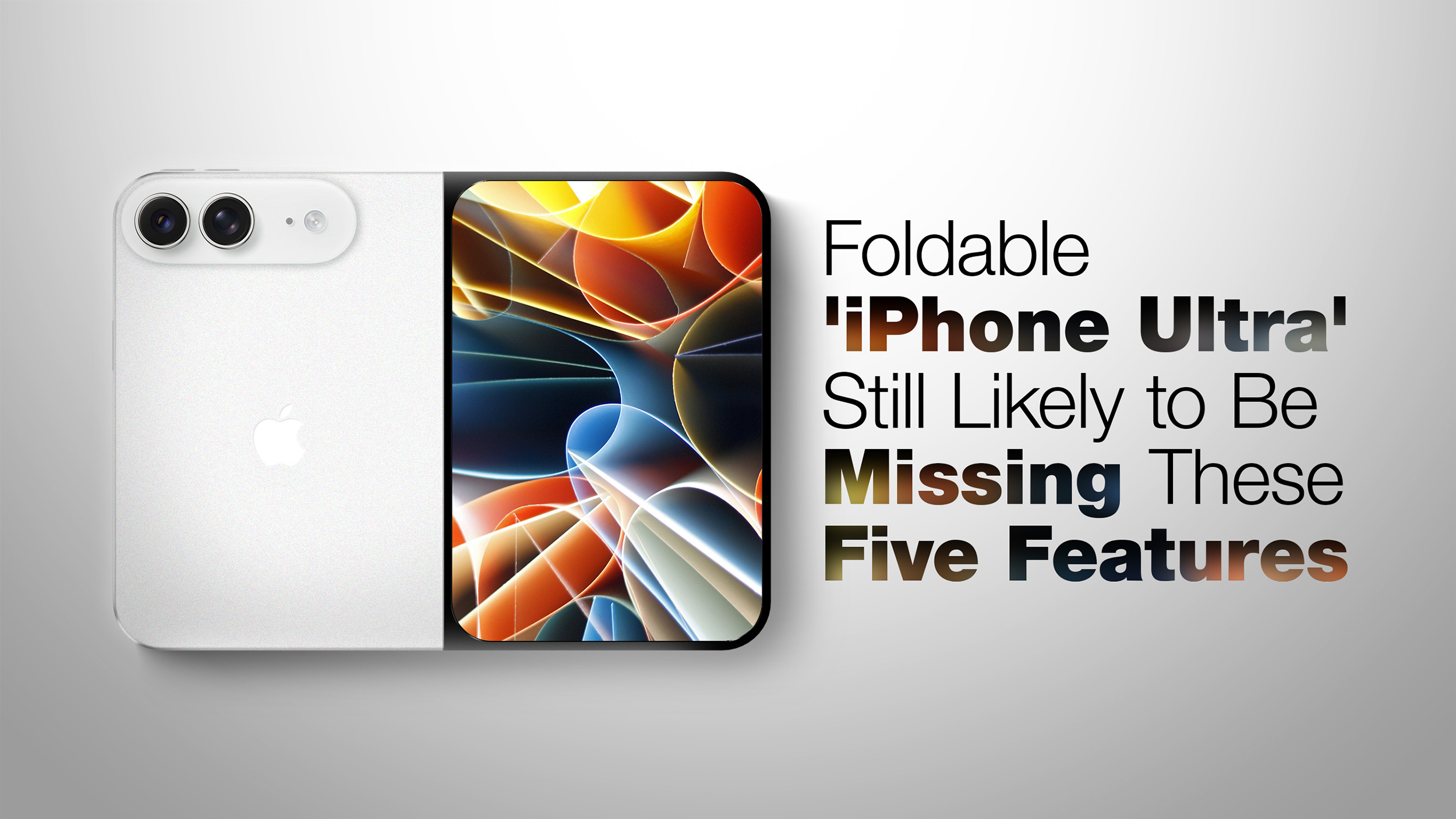
Foldable 'iPhone Ultra' Still Likely to Be Missing These Five Features

Apple's first foldable iPhone, dubbed the "iPhone Ultra," is expected to launch without at least four features that will be present on the iPhone 18 Pro models, despite a price tag of at least $2,000.


The iPhone Air lacks Ultra Wide and Telephoto rear cameras, a SIM card slot, and stereo speakers. With a super thin design, a titanium frame, and a glass back, the ‌iPhone Ultra‌ is expected to be very similar to the ‌iPhone Air‌ in terms of design, and it is possible that similar concessions will be present on the device. There are no indications that the ‌iPhone Ultra‌ will be missing stereo speakers, but it is not out of the question given the other compromises Apple has chosen to make. Based on over a year of reports and rumors, the ‌iPhone Ultra‌ could be missing the following features:


  • Face ID/TrueDepth camera array

  • Telephoto camera/third rear camera

  • Action button

  • Physical SIM card slot

  • mmWave 5G


MagSafe was originally in question earlier in the rumor cycle.


Face ID


The ‌iPhone Ultra‌ is believed to be too thin to accommodate Apple's TrueDepth camera array, which is required for ‌Face ID‌ authentication, so Apple is expected to revert to a Touch ID side button instead.

There will still be a front-facing camera for both displays, with the inner one rumored to be a 24-megapixel under-display sensor, but biometric authentication will be handled by the fingerprint reader.

The last flagship iPhone with Touch ID was 2016's iPhone 7. The ‌iPhone 18 Pro‌ models are moving in the opposite direction, apparently relocating ‌Face ID‌'s flood illuminator beneath the screen to shrink the Dynamic Island.

Telephoto Camera


As visible on dummy models shared by Sonny Dickson, Vadim Yuryev, and others, the ‌iPhone Ultra‌ is expected to sport only two rear cameras. These are believed to be 48-megapixel Wide and Ultra Wide lenses, with no third Telephoto camera of the kind found on the Pro models.

Bloomberg's Mark Gurman said last month that the people who have used the device are impressed by it, but singled out the camera system as the most likely disappointment for buyers.

Action Button


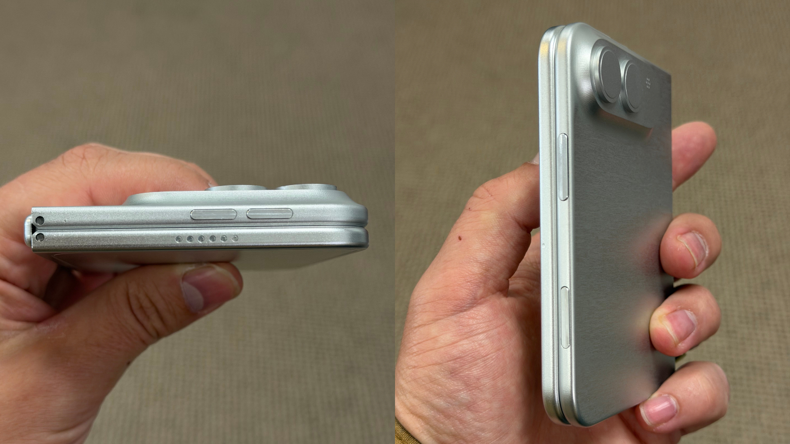
Dummy models continue to point to the absence of the Action button. A power button and volume buttons are clearly visible, with the volume buttons located on the top edge of the device and aligned to the right, similar to the iPad mini, but the left edge appears to be entirely bare. That would make the ‌iPhone Ultra‌ the first iPhone with no Action button or silent switch, some three years after Apple introduced the Action button on the iPhone 15 Pro as a replacement for the switch.

The unusual button layout was first rumored by Weibo leaker "Instant Digital," who said that the motherboard sits on the right side of the device. Rather than run cables across the display to the left side, where the volume buttons are located on every other iPhone, Apple is said to have decided to run them directly upwards to maximize internal space.

Image via Vadim Yuryev.


SIM Card Slot


Rumors indicate that the ‌iPhone Ultra‌ will also lack a SIM card slot, just like the ‌iPhone Air‌, being compatible with eSIM only. Gurman and analyst Ming-Chi Kuo both expect the device to be eSIM only in every market where it launches.

mmWave 5G Connectivity


The device is likely to miss mmWave 5G if it features Apple's in-house C2 modem as rumored, since reports indicate the C2 may still lack mmWave capability. ‌iPhone 18 Pro‌ models sold in the United States are expected to retain Qualcomm hardware because they support the mmWave bands used by American carriers. Apple does not sell mmWave-capable iPhones outside the U.S.

The ‌iPhone Ultra‌'s C2-based configuration would therefore advance Apple's modem transition, just like the ‌iPhone Air‌, but could limit the device to sub-6GHz 5G.

MagSafe?


Bloomberg's ‌Mark Gurman‌ has now indicated that ‌MagSafe‌ will make it into the device after all. Speaking in an interview with Tom's Guide, Gurman said "all indications that I've heard is that ‌MagSafe‌ is in for this foldable phone," pointing to the fact that Apple managed to fit the magnet array into the ‌iPhone Air‌.

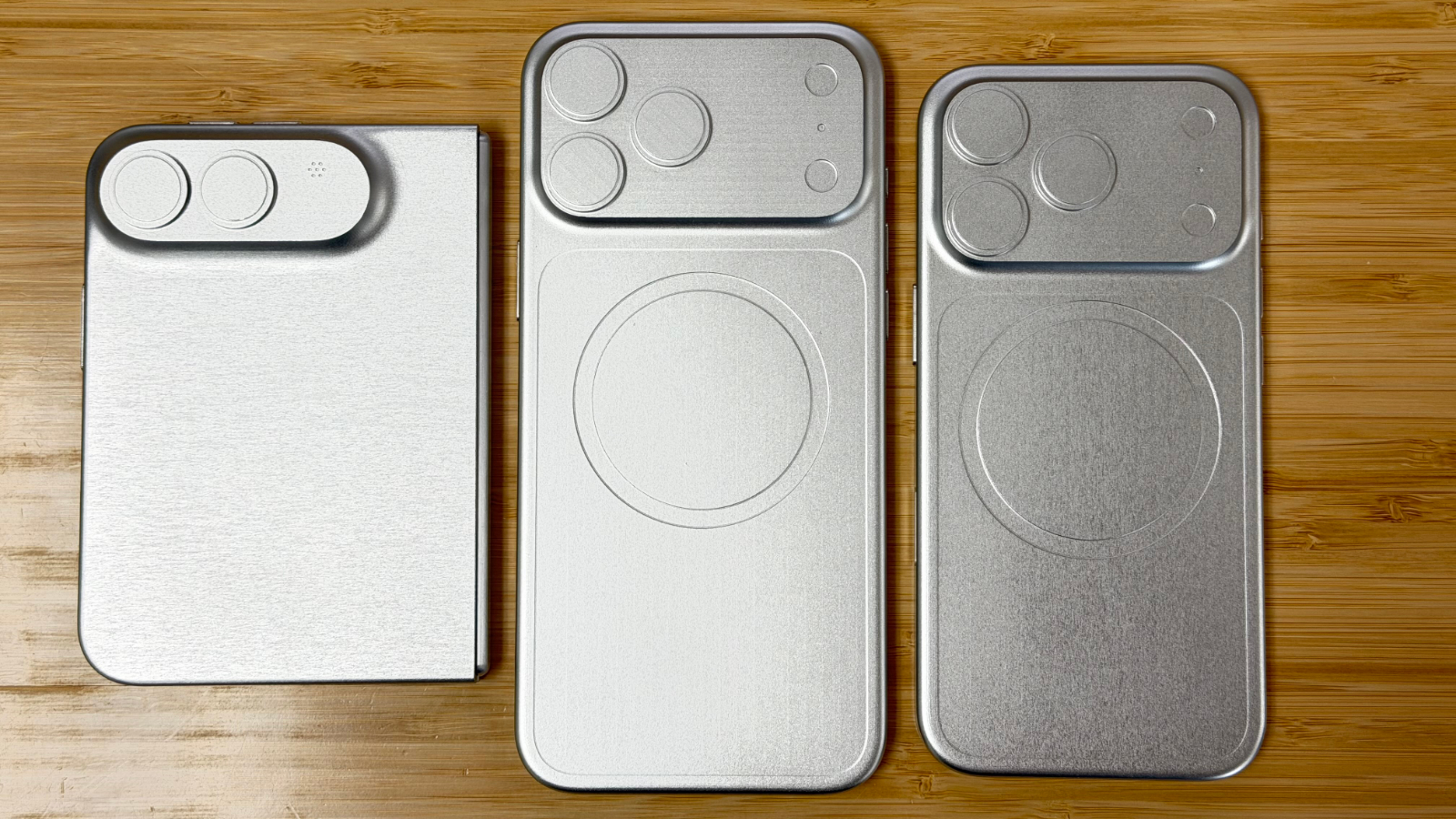
The uncertainty stemmed from the dummy models of the device that emerged earlier this year. Units shared by Dickson and Yuryev showed no indentations for the internal ‌MagSafe‌ magnets, while the mock ‌iPhone 18 Pro‌ and ‌iPhone 18 Pro‌ Max units shown alongside them clearly did. Leaked cases for the foldable, on the other hand, included a magnetic ring, leaving the question open until recently.

Image via Vadim Yuryev.


Price and Launch


The rumored starting price for the ‌iPhone Ultra‌ varies, but reports agree that it will not be below $1,999, with Kuo placing it somewhere between $2,000 and $2,500. The iPhone 17 Pro starts at $1,099 and has all of the above features, and while the ‌iPhone 18 Pro‌ is expected to see a price increase of $200 to $300, the ‌iPhone Ultra‌'s compromises could still prove controversial.

Apple will almost certainly unveil the device alongside the ‌iPhone 18 Pro‌ and ‌iPhone 18 Pro‌ Max at its "Surprise and Shine" event on Wednesday, September 9.
Related Roundup: iPhone Fold

This article, "Foldable 'iPhone Ultra' Still Likely to Be Missing These Five Features" first appeared on MacRumors.com

Discuss this article in our forums

  •  

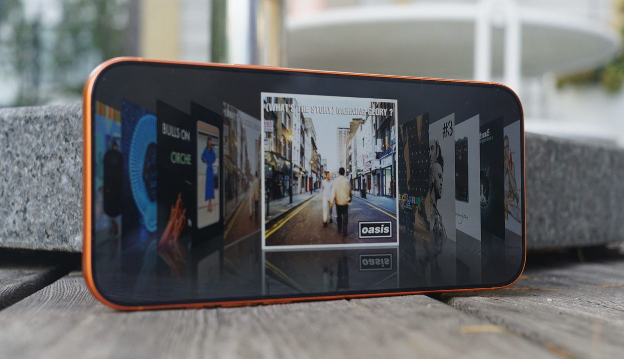
„Sleeve“ zwingt Apple-Music-Alben ins Cover Flow

30. August 2026 um 18:06

„Turn sideways. Glide through your library.“ Sleeve schiebt eure Apple-Music-Bibliothek in eine Old-School-Cover-Flow-Ansicht – inklusive einer Fingerschnippgeste, um das Cover auf die Rückseite zu drehen.

Sleeve, Apple Music, Cover Flow, Album Cover, Musikbibliothek, NostalgicPod, Longplay, Album Wall, Musik-Apps, iPhone

Noch etwas verspielter interpretiert NostalgicPod diese alte iPod-Idee. Die an dieser Stelle erwähnte Software bleibt vorerst jedoch in einer TestFlight-Beta.

Haltet ihr das iPhone hochkant, wechselt die Ansicht zu einer „Album Wall“ – bekannt etwa von Longplay. Diese Wand mit Covern driftet langsam über den Screen – bildschirmschonerähnlich und komplett ohne Steuerelemente.

  •  

Apples Teilenmenü – auch in iOS 27 unverändert

29. August 2026 um 18:59

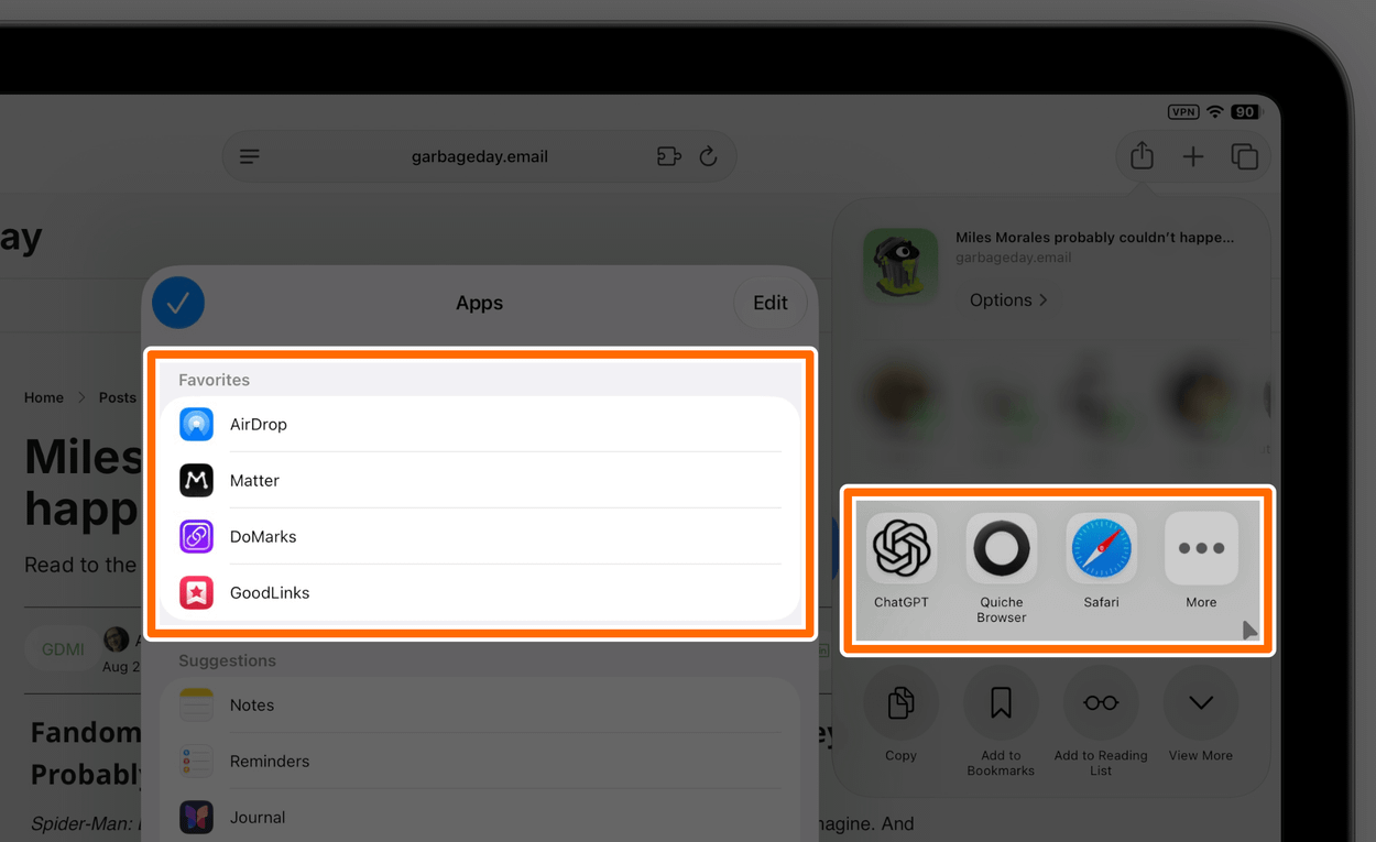
Auch iOS 27 bringt keine strukturellen Änderungen ins Teilenmenü; es bleibt damit mehr oder weniger unverändert seit 2019.

A screenshot showing an iPad share sheet menu with lists of favorite and suggested apps.

Dass Personen dort standardmäßig auftauchen, finde ich weiterhin wild – insbesondere, weil euch dort nicht ausschließlich Freunde und Familie anschauen. Gelegentlich überrascht euch iOS dort etwa mit einem Slack-Arbeitskollegen.

Immerhin lässt sich die komplette Zeile unter Siri ➝ „Beim Teilen anzeigen“ abschalten. So tief verbuddelt findet diese Einstellung aber niemand. Der lange Druck auf den Kopf einer einzelnen Person, um sie „weniger“ vorzuschlagen, hilft mir dagegen wenig. Ich möchte nicht weniger, sondern gar nicht.

Absolut unverständlich ist mir die Unterscheidung zwischen „Suggestions“ und „Favorites“ für Apps, wenn es eigentlich nur um eine prominentere Platzierung geht, zumal sich einige Vorschläge gar nicht ausblenden lassen.

Das „Share Sheet“ ist keine simple Liste der installierten Apps, gibt sich aber so aus. iOS packt Systemdienste, App Extensions sowie Apps, die bestimmte Datentypen verarbeiten, optisch in derselben Reihe – weshalb sich einige Anwendungen über ihren Schalter abknipsen lassen, andere aber nicht.

Und über die dortige Sortierung müssen wir nicht sprechen, oder?

Während die Zeile mit Apps primär der Übergabe von Inhalten dient – „Wohin damit?“ –, fragt die darunterliegende Liste mit Actions: „Was damit tun?“ Oft überschneiden sich hier jedoch Funktionen, was die Unterteilung redundant macht.

Mein grundsätzliches Problem mit dieser Aufzählung aus Aktionen ist aber ihre fehlende Übersichtlichkeit. Nicht alle Bezeichnungen verraten, zu welcher Anwendung eine Funktion gehört. „Convert to PDF“ öffnet etwa PDF Expert; die Action „Annotate“ gehört zu dieser App.

Andererseits muss ich oft zweimal lesen oder aufs App-Icon schauen, um zu checken, dass sich „Add to Play“ auf die Anwendung Play bezieht oder „Ask Assistant“ diese App startet.

Diese Liste benötigt Pflege. Und sind wir ehrlich: Niemand räumt dort auf! Sobald auf einem iPhone ein paar Dutzend Apps installiert sind, traut man sich dort schlicht nicht mehr rein.

Und das ist im Wesentlichen die Standardkonfiguration: So sieht das auf jedem iPhone aus; unverändert seit Jahren.

  •  

„Lock Launcher Introduces ‘No Redirect’ Launchers“

05. August 2026 um 19:17

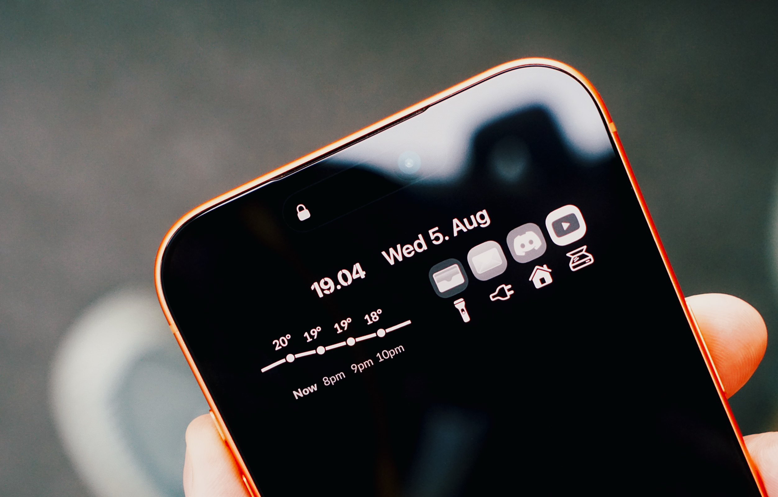
Schneller zu den eigenen Apps: Ich schrieb zwar erst im Januar darüber, aber Lock Launcher erweitert, was der Action-Button und das Kontrollzentrum vorgelegt haben: Abkürzungen zu Shortcuts und Apps.

Nahaufnahme eines orangefarbenen Smartphones in einer Hand. Der Sperrbildschirm im dunklen Design zeigt die Uhrzeit, das Datum, ein Wettervorhersage-Diagramm sowie eine Anordnung verschiedener App-Symbole.

For starters, Lock Launcher now lets you create launcher shortcuts that open apps directly and immediately, rather than redirecting you to the Lock Launcher app first.

For years now, launcher apps on the iPhone have had to employ this workaround: you’d tap on a shortcut that opened, say, Ivory, but you would see the launcher app flash onscreen briefly before redirecting you to the actual destination app you selected. Somehow, Lock Launcher is now circumventing this limitation with a ‘Direct Open’ mode that I haven’t seen in other launcher apps for iOS.

Federico Viticci | MacStories.net

Diesen Redirect benötigt es weiterhin, wenn man vom Sperrbildschirm kommt; über Widgets spart man ihn sich. In beiden Fällen ist das Aufrufen der Apps jedoch pfeilschnell. Wer blinzelt, verpasst die Weiterleitung.

Auf dem Lockscreen liegen bei mir Apps und Shortcuts, die ich vom Homescreen aus erst suchen müsste – ein PDF-Scanner oder unser Live-Stromtarif. Es ist Software, die ich täglich oft genug aufrufe, mit denen ich mir aber nie den Homescreen zupflastern würde.

  •  
❌