Today at the New York International Auto Show, Subaru announced its first three-row electric SUV: the Getaway.
Like Subaru's other EVs, the Getaway is based on Toyota's e-TNGA platform and it shares many features and specs with the 2027 Highlander EV. Initially, all models will come with the company's Symmetrical all-wheel drive system, 420 horsepower and a native NACS-compatible charging port. That said, charging speeds don't look especially impressive as the Getaway's estimated 150kW system is expected to refill its battery from 10 to 80 percent in around 30 minutes.
The first batch of Getaways will arrive late this year as 2027 models featuring a 95.8kWh battery that Subaru says will provide more than 300 miles of range on a single charge and a zero to 60 time of under five seconds. It will also come with preconditioning tech to help maintain charging speeds in cold weather (down to 14 degrees Fahrenheit). Then later in the first half of 2027, Subaru will release a standard-range model with a 77kWh power pack and AWD. The EV SUV offers 8.3 inches of ground clearance while its X-Mode system provides settings for Snow/Dirt, Deep Snow/Mud, Grip control and Downhill Assist along with a tow rating of up to 3,500 pounds.
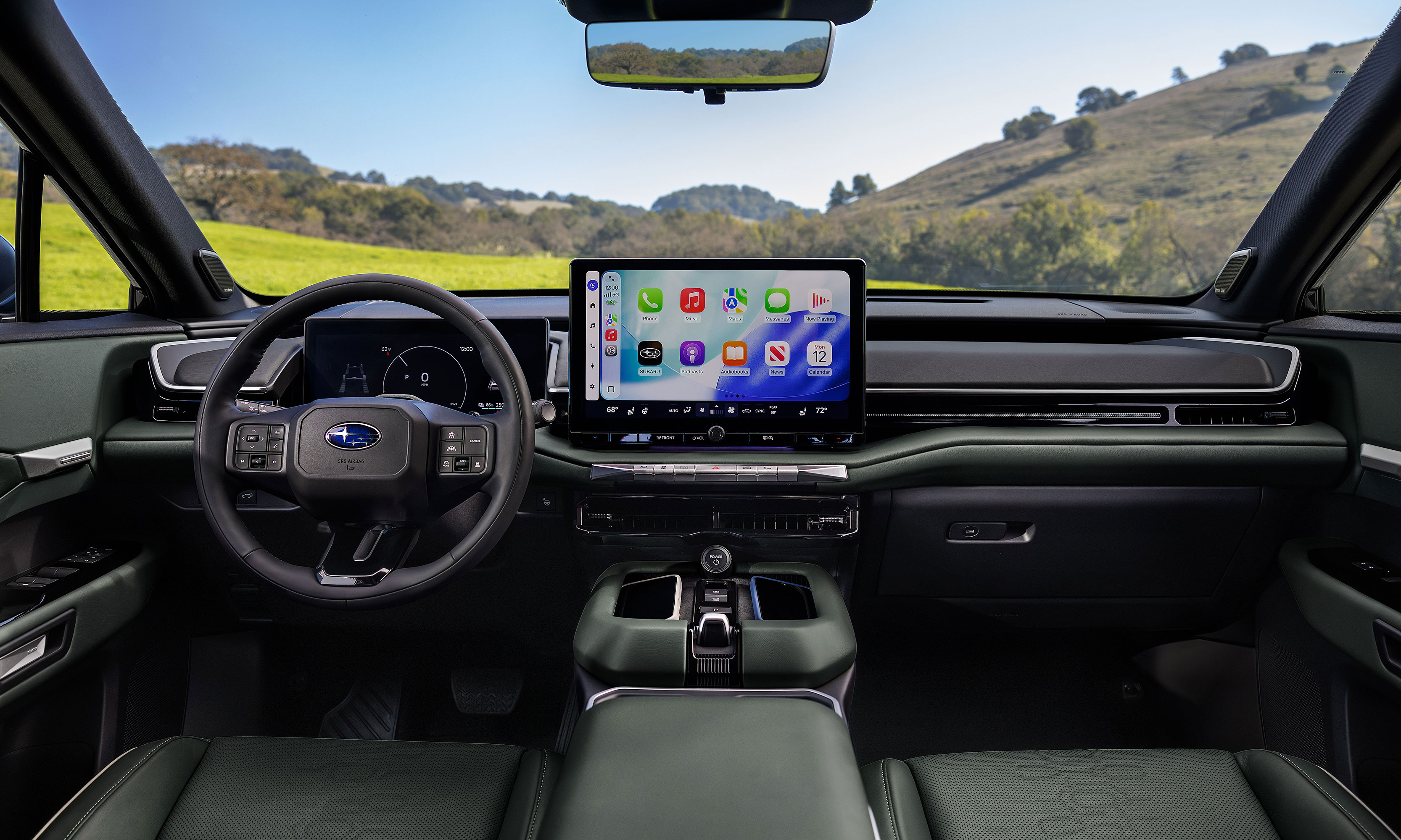
The Getaway's infotainment system is based around a 14-inch touchscreen with support for both Android Auto and CarPlay.
Subaru
On the inside, the Getaway will offer seating for up to seven people by way of a second-row bench, though if you don't mind dropping the passenger count to six, you can also opt for two captain's chairs. Its infotainment system is based around a 14-inch touchscreen with support for both wireless Android Auto and Apple CarPlay, while the driver gets a secondary 12.3-inch digital instrument cluster.
As you'd expect from a Subaru, the Getaway also comes with a lot of outdoorsy features like ladder-type roof rails on "most" trims, plus the option of 19 or 20-inch wheels and up to 45.6 cubic feet of cargo space with the third row seats folded down. Heated front seats will also come standard, with the ability to upgrade to ventilated seats in the first two rows and a heated steering wheel on more premium trims.
Subaru claims the Getaway has more cargo space than a Kia EV 9 with the third row folded.
Subaru
In the end, while the Getaway might not be the most original EV SUV due to its similarities to Toyota's upcoming Highlander EV, for any Subaru fans with larger families, this vehicle could be just what they need to make the jump from gas to electric.
Specific details on pricing and trim levels are expected closer to the Getaway's official release date in late 2026.
This article originally appeared on Engadget at https://www.engadget.com/transportation/evs/the-getaway-is-subarus-first-three-row-electric-suv-142500177.html?src=rss
There's just something magical about a robot that can convert into a car, tank or plane. It seems that Hollywood agrees as there are several major franchises based around that concept. As someone who grew up in the 80s and 90s, Transformers hold a special place in my heart, despite Michael Bay's best efforts at tarnishing its legacy. I spent countless hours as a kid playing with Hasbro and Takara's plastic figures, but there was one type of toy I always wanted but never got: a robot that could transform on its own just like the ones I watched on TV. That changed a few years ago when Robosenlaunched its line of officially licensed auto-converting models, and from what I've seen, its latest release featuring Soundwave might be its best yet.
Design: More than meets the eye
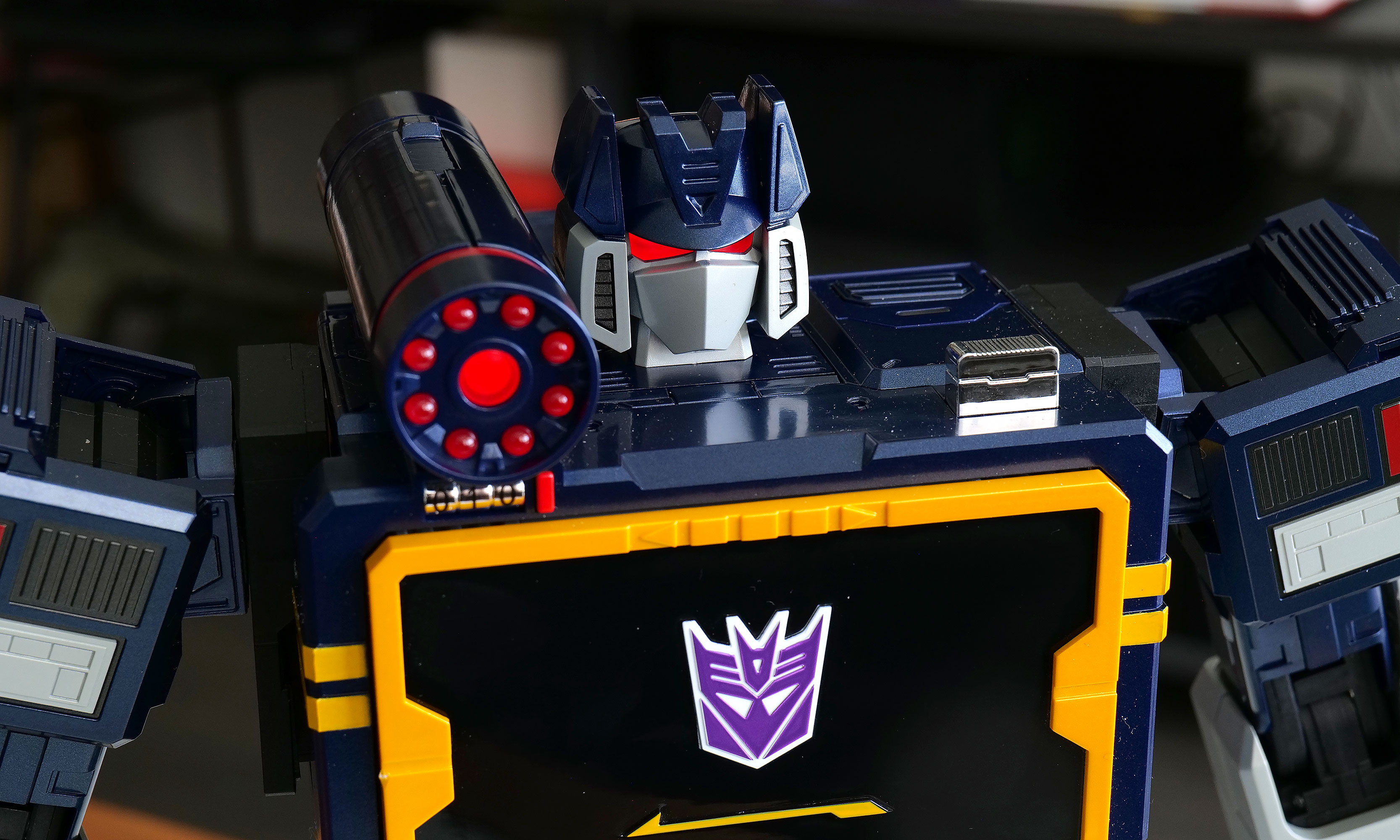
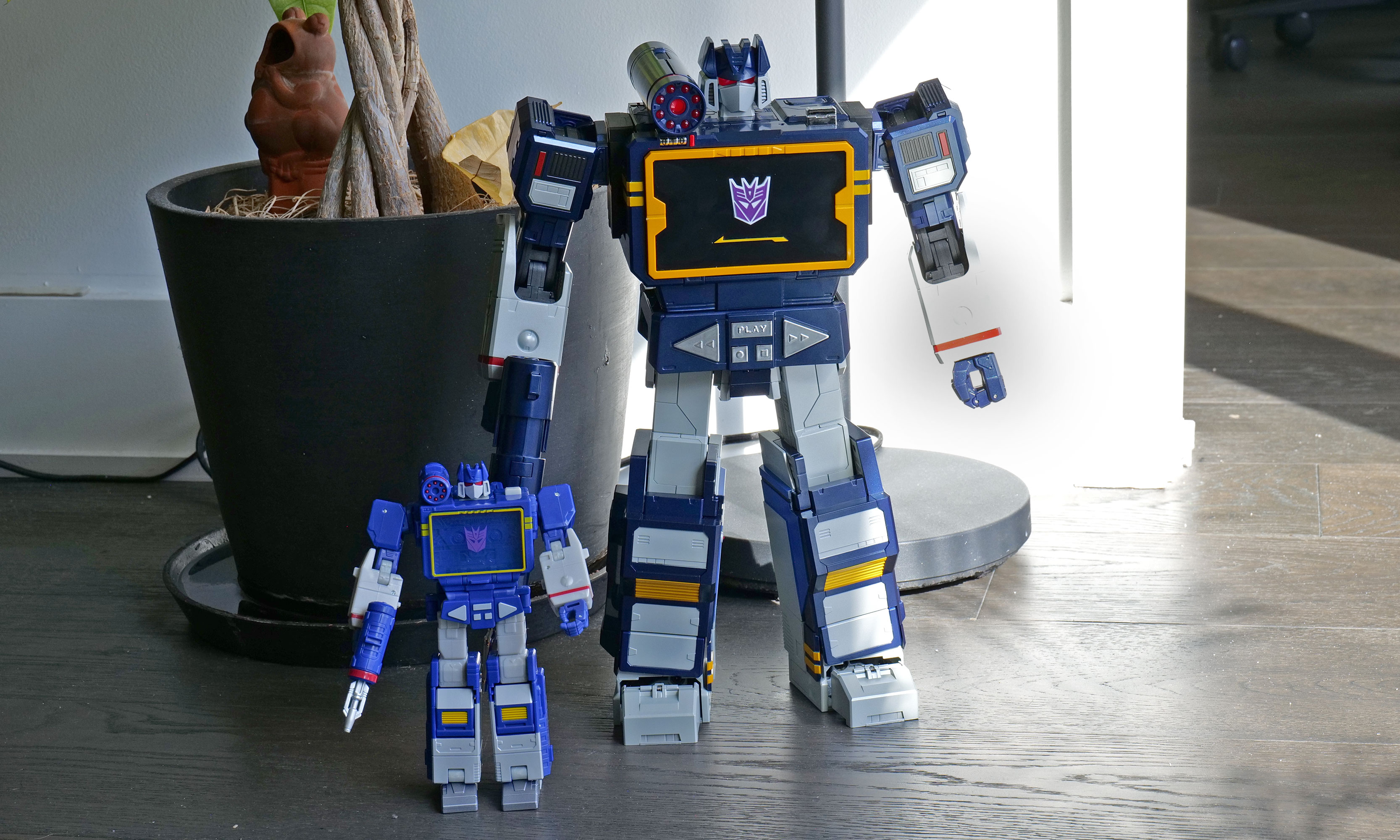
As a follow-up to previous bots featuring Optimus Prime, Megatron, Bumblebee, Grimlock and others, Soundwave was a superior choice, and Robosen has done a more than respectable job of bringing him to life. Not only can he spit out classic lines performed by original voice actor Frank Welker, both his robot and alt modes are a vision straight out of the first-generation (G1) cartoon. Everywhere you look, there are a ton of lovingly crafted details like the working eject button for the cassette slot and all sorts of lights. Robosen's head sculpt is spot on, and it even includes additional LEDs for his eyes and shoulder cannon. Granted, there is a bit of kibble (aka what fans call out of place parts leftover from transformation), like hands that don't properly fold away when Soundwave turns into a boombox, but that's really nitpicking. Between his incredibly accurate design, vocoder-powered vocals and an imposing stature that stands at around 14 inches tall, there's no way you can call this rendition of Soundwave uncharismatic.
A simply superior head sculpt.
Sam Rutherford for Engadget
However, the real magic happens when you turn him on (there's a little button on his back) and say "Hey, Soundwave." From here, you can use more than 50 different voice commands to boss him around like you're the leader of the Decepticons. This includes asking him to say iconic lines, respond to an Autobot attack or just wishing someone a happy birthday. Naturally, the most impressive request is asking him to transform, at which point 28 high-precision servo motors and multiple motion sensors coordinate. This allows Soundwave to convert from boombox mode to robot and back again, complete with the required sound effects. Even as a jaded adult, there's still something incredibly enchanting about watching a Transformer actually transform on its own. But that pales in comparison to the one-of-a-kind reaction my four-year-old son gave me when I repeated the process for him. There was a joy in his face I'm not sure a grown-up can truly express, as he gets to experience this without knowing this bot costs a cool $1,400.
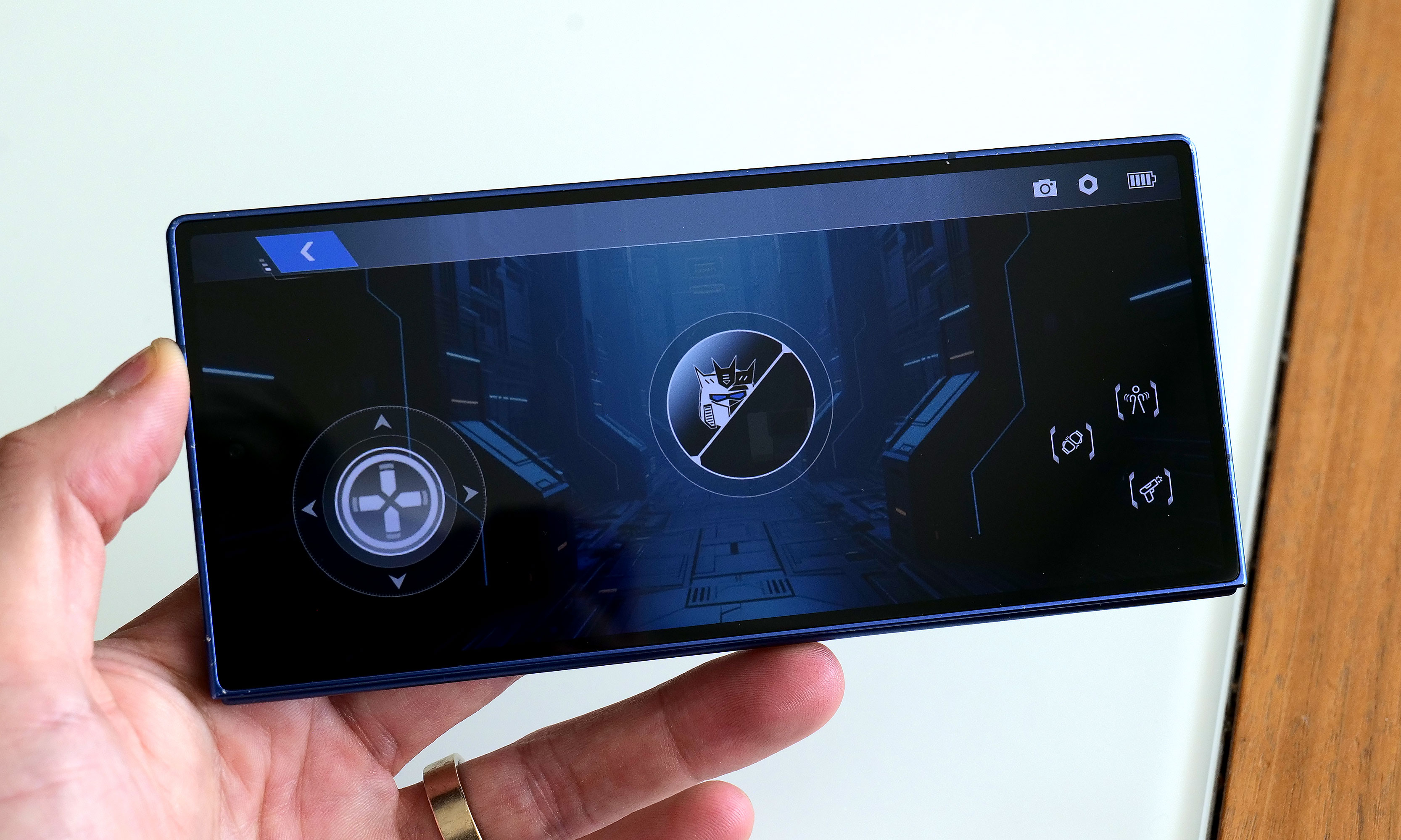
Robosen's free mobile app features a D-pad so you can easily tell the robot where to walk.
Sam Rutherford for Engadget
While testing Soundwave's various commands, I did notice that his voice recognition can be somewhat hit or miss. I found that even a little background noise can cause issues. To be consistently heard, you have to speak louder than you think you should. The real key is being very deliberate with a sharp "Hi" or "Hey" to activate Soundwave's wake phrase properly. Alternatively, if you prefer not to yell at your robots, there's also a free companion app that allows you to send commands by simply pressing a button, which was super easy to set up and quickly became my preferred control scheme.
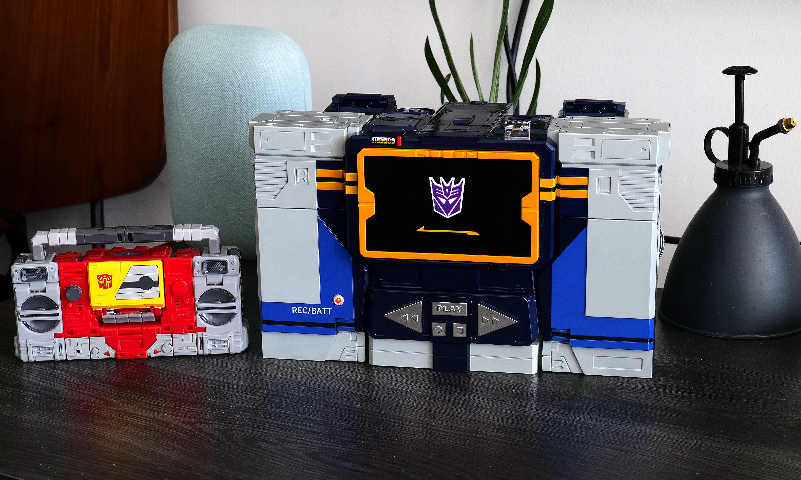
Here is Robosen's version of Soundwave (right) compared to the Studio Series 86 figure (left).
Sam Rutherford for Engadget
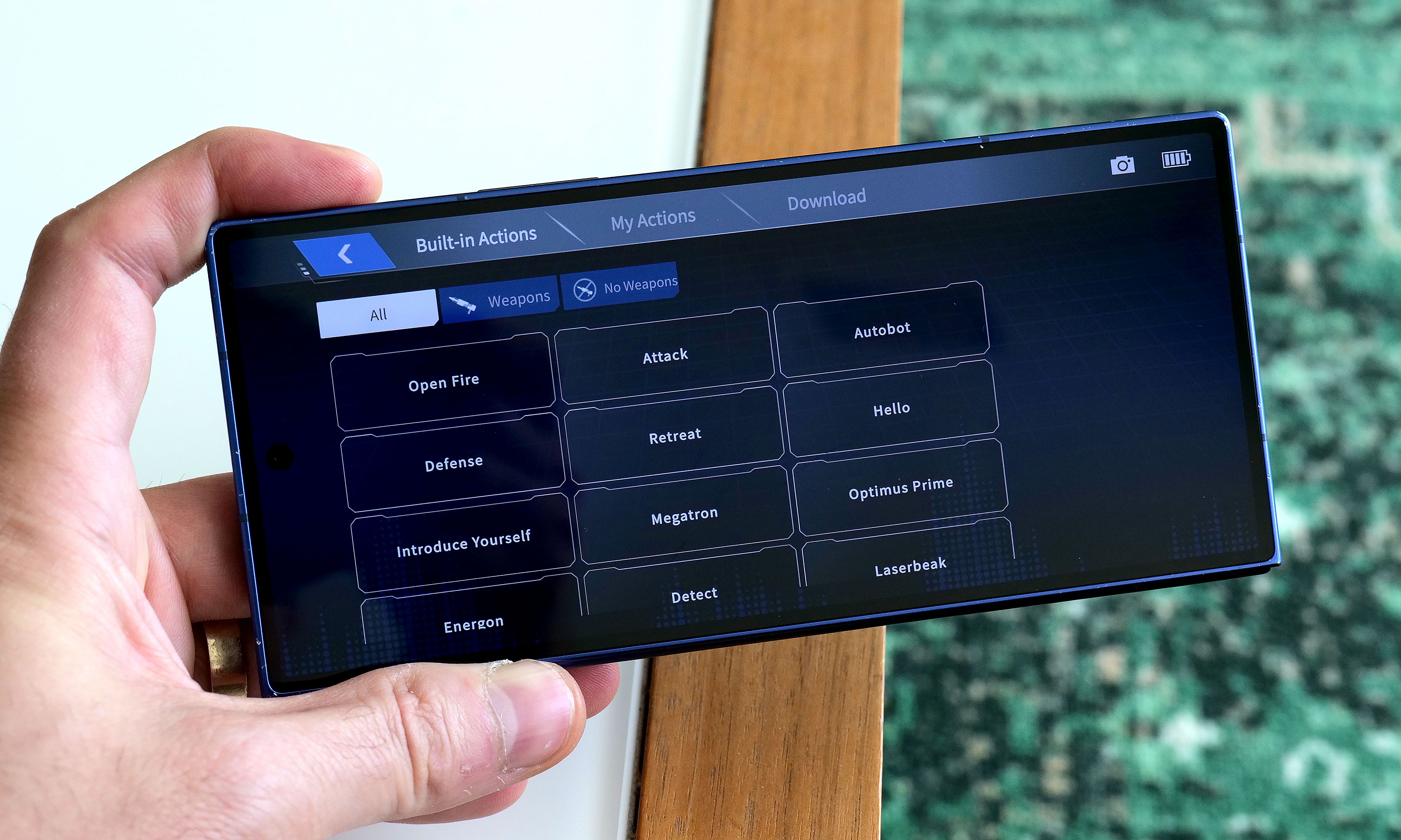
In addition to making it easier to get Soundwave to walk around (it's much more fun to use a virtual D-pad than yell "Walk forward" all the time), the app also provides a more straightforward way of discovering what he can do while reducing the ambiguity of voice commands. There are handy buttons for all his voice lines and poses, plus there’s a toolkit for creating some of your own. You can also download more from the app, though there weren't any for me to test out because Soundwave wasn't officially out yet at the time of writing. There's even a Mini Theatre mode that allows the bot to perform short skits, and if you're lucky enough to own some of Robosen's other Transformers toys, like Megatron, some of these scenes can even be performed in tandem.
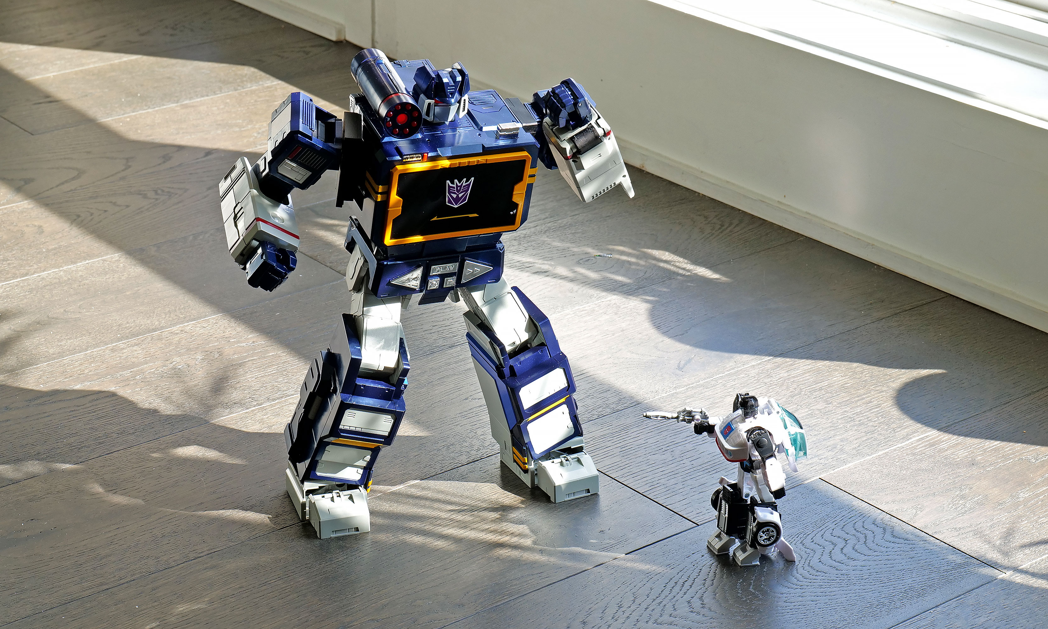
I don't think any Autobots have a chance against a Soundwave this big.
Sam Rutherford for Engadget
One awkward thing about Roboen's more sophisticated approach to toy robots is that Soundwave loses some of his structural integrity when his motors are off. For example, when you power him down in robot mode, he bends over backwards and gets stuck halfway between his humanoid and boombox forms. I assume this is to prevent him from falling over, which is a good thing; it just looks kind of weird. On the flip side, if you pick him up while in stereo mode, his limbs tend to droop. However, perhaps the biggest downside to Soundwave is one inherent to his design. Because his alt mode is a boombox instead of a vehicle like Optimus, Bumblebee and others, he can't pull double duty as a remote control car. But what Soundwave lacks in mobility, he makes up for with his signature acoustic skills.
Audio: Not just a bot, he's a real boombox too
From the front, Soundwave's boombox alt mode looks damn near perfect.
Sam Rutherford for Engadget
Soundwave turning into a boombox that can't play music just wouldn't make sense. Thankfully, that's not an issue as this bot's buttons aren't just for show. Hitting Play lets you listen to original tracks from the G1 cartoon, complete with the ability to pause or skip to the next track. You can also hold the record button to save a personal message for later, though I found this feature has a bit of a learning curve as Soundwave tends to cut out one or two seconds from the beginning and end of a clip.
Inside the app, there's also a big list for all of Soundwave's voice lines and poses.
Sam Rutherford for Engadget
Most importantly, if you want Soundwave to play other tunes, you can pair it with your phone or pretty much any other mobile device and use him just like a typical Bluetooth speaker. Now it probably won't be a surprise when I say that Soundwave's audio quality is mediocre at best. With all the various sensors, motors and moving parts, there probably isn't a ton of room for fancy drivers, so things sound tinny and flat. But in a way, that's kind of endearing because the vast majority of portable speakers back in the 80s didn't sound great either. The one thing I wish Robosen had included was a proper cassette player to really capitalize on Soundwave's classic audio capabilities. That said, even though I still have stacks of CDs and DVDs in my house, I don't have any tapes (despite their resurgence), so I get why that feature didn't make it.
Battery life
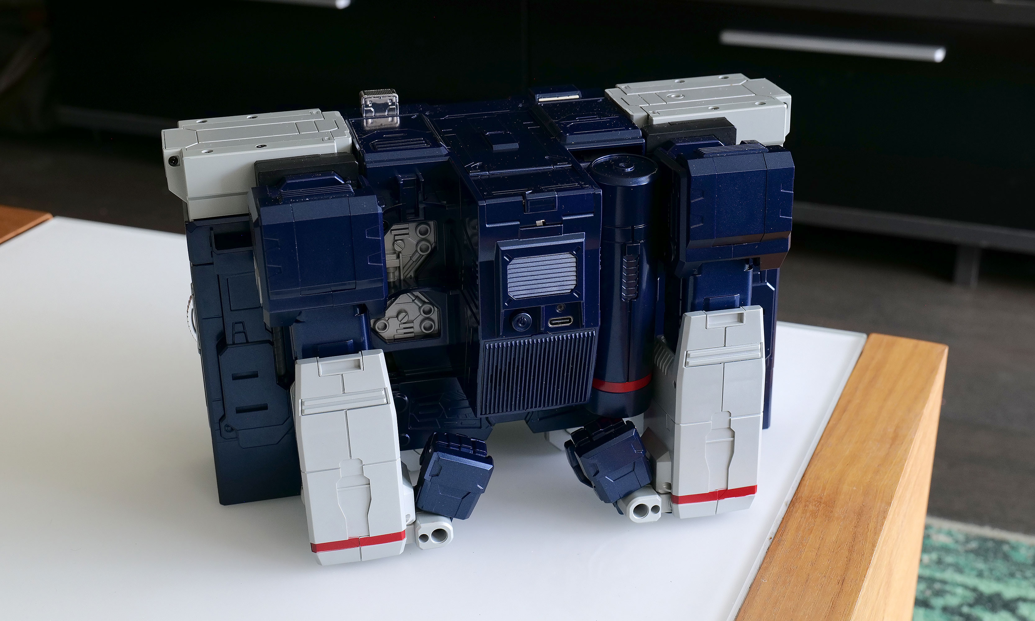
It may not be period accurate, but the addition of a USB-C port around back for power is a really nice touch.
Sam Rutherford for Engadget
Soundwave comes with a built-in 1,650mAh battery which takes about 120 minutes to charge from dead to full while offering a standby time of around 60 minutes. During my testing, I found you can get a solid 20 to 30 minutes of playtime out of him, which felt like plenty. Of course,that depends a ton on how much moving around you tell him to do. And while it certainly isn't period authentic, I really appreciate the inclusion of a USB-C port for charging.
Wrap-up
The funny thing about Robosen's Soundwave is that a toy like this would have been priceless to me as a child. But now that I'm older and I have to attach a value that goes beyond its basic price, things are a lot trickier.
I love Robosen's attention to detail. The figure looks incredible and getting voice lines from the original actor shows there's more than meets the eye to the robot’s design. But most importantly, seeing Soundwave transform on his own and stomp around like he does in the show will never get old.
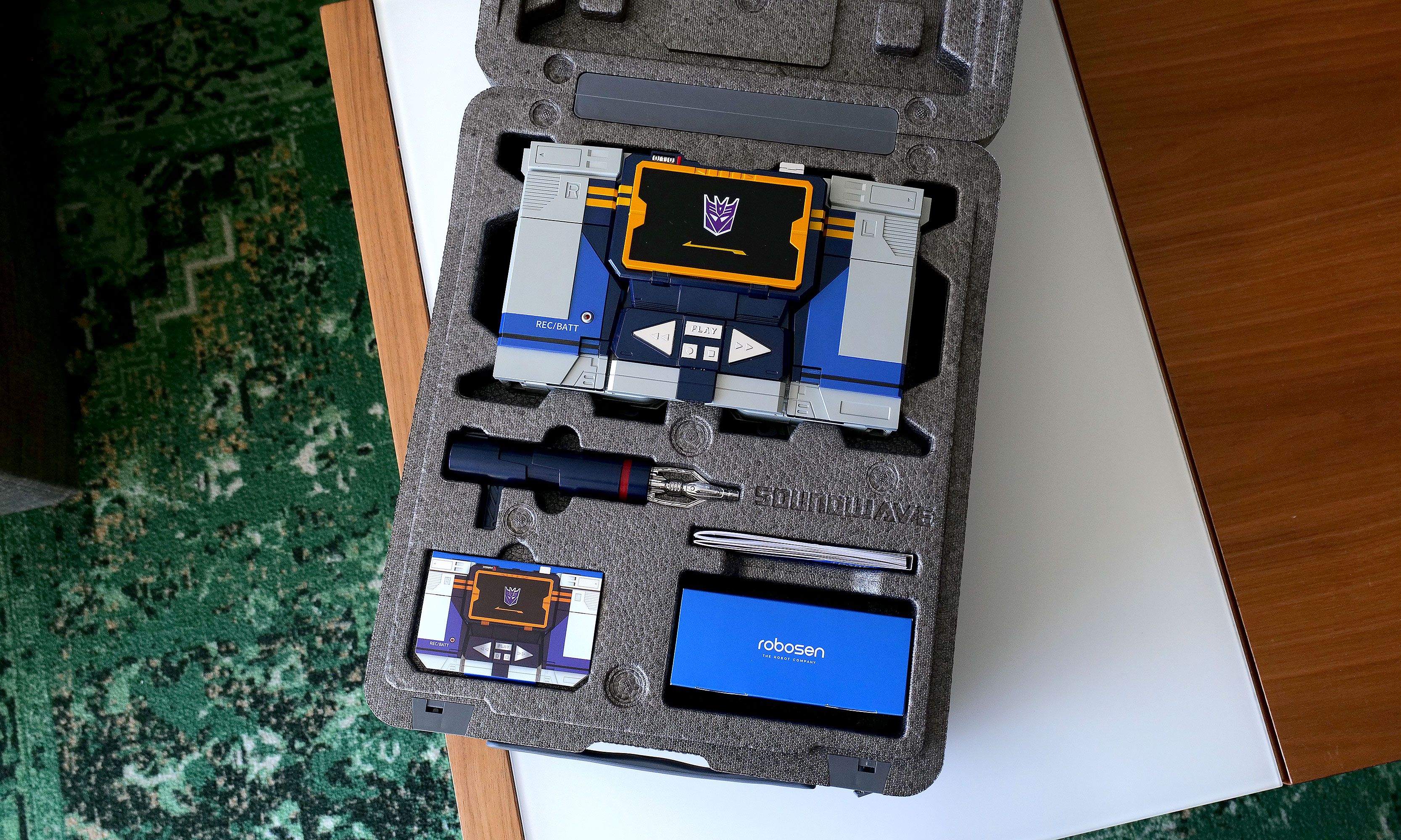
As you'd expect from a toy this expensive, Robosen's packaging is excellent.
Sam Rutherford for Engadget
On the other hand, $1,400 can buy the whole family a nice three-day vacation or more than two dozen regular Transformers toys. That kind of math makes it difficult to add this Cybertronian to the household register. But for anyone who has a budget similar to a Michael Bay movie, this take on Soundwave really does feel like a dream come true. Aside from some of Robosen's other products, this robot is certainly made of sterner stuff.
This article originally appeared on Engadget at https://www.engadget.com/general/robosen-soundwave-review-a-childhood-dream-made-real-120000804.html?src=rss
Last year, Belkin released a couple of cases for the Nintendo Switch 2 just in time for launch, including one that came with a handy battery pack. That one was simple and effective, but it felt a bit crude because it wasn't much more than a basic travel pouch with a generic power cell tossed inside. Now, Belkin is back with a Pro version of its Charging Case for the Nintendo Switch 2, featuring a more sophisticated battery pack along with a higher price tag ($100 vs. $70). So here’s the question for any Switch 2 owners still looking for a way to protect their console while keeping it topped off: Is a more elegant charging solution really worth the extra money?
Case design
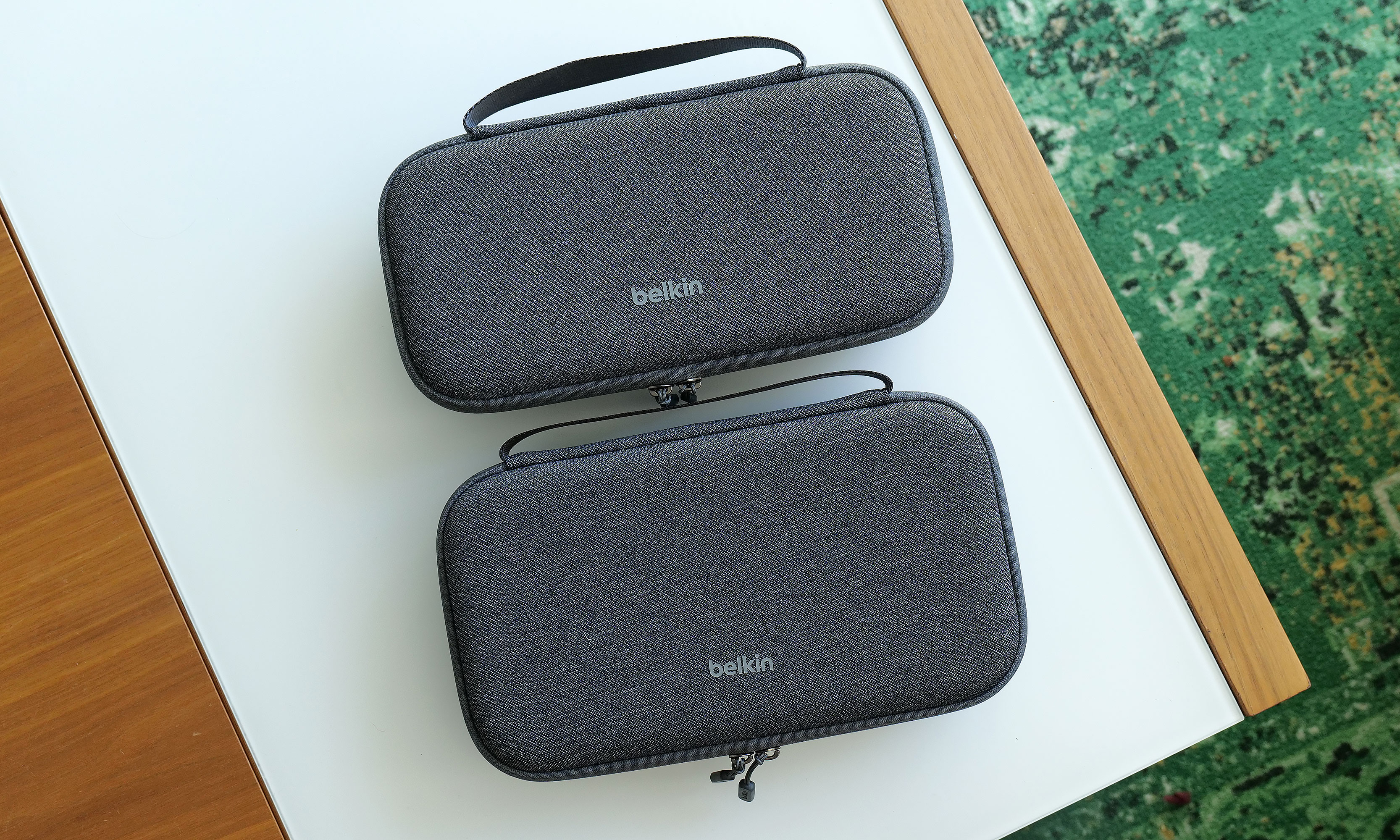
At 11.7 x 6.1 x 2.5 inches and weighing 1 pound 12 ounces, the Pro Charging Case is a touch larger and heavier than its non-pro sibling. It also features a very similar design with the same color options and materials, including a tough polyester outer shell that’s balanced by a softer, velvet-like material and cutouts for your Switch 2 on the inside.
The Pro Charging Case (bottom) is a touch bigger and heavier than the previous model, but aside from that its sports a nearly identical design.
Sam Rutherford for Engadget
Once again, Belkin has done a good job of providing a snug cabin to store your console while still making it easy to take it in and out. That said, if your system also has an extra-thick protector or hardshell case like the Killswitch from Dbrand, it may not fit. There's also a padded flap that swings down to protect your Switch 2's screen that also pulls double duty as a place to stash up to 12 game cartridges, which is a very thoughtful touch.
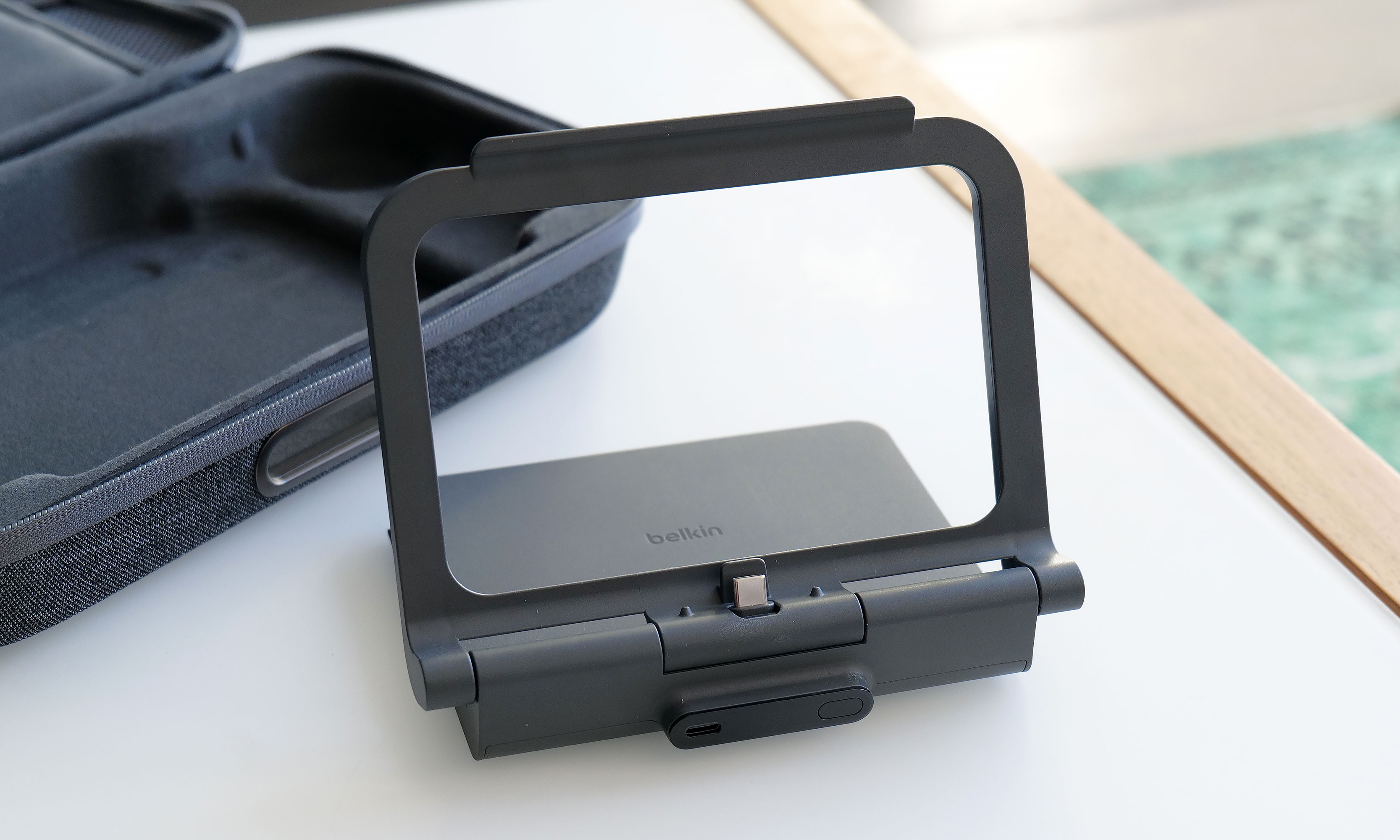
However, the biggest change to the Pro Charging Case's exterior design is a new cutout on the front edge, which allows you to top off other gadgets (or a Switch) by plugging a USB-C cable into Belkin's included battery pack. Unfortunately, the case doesn't come with a cord, which seems a bit odd until you take a closer look at the power pack's layout. That’s because once you open up the case, you’ll see a second port designed to fit right into the bottom power jack on the Switch 2 without the need for a cable.
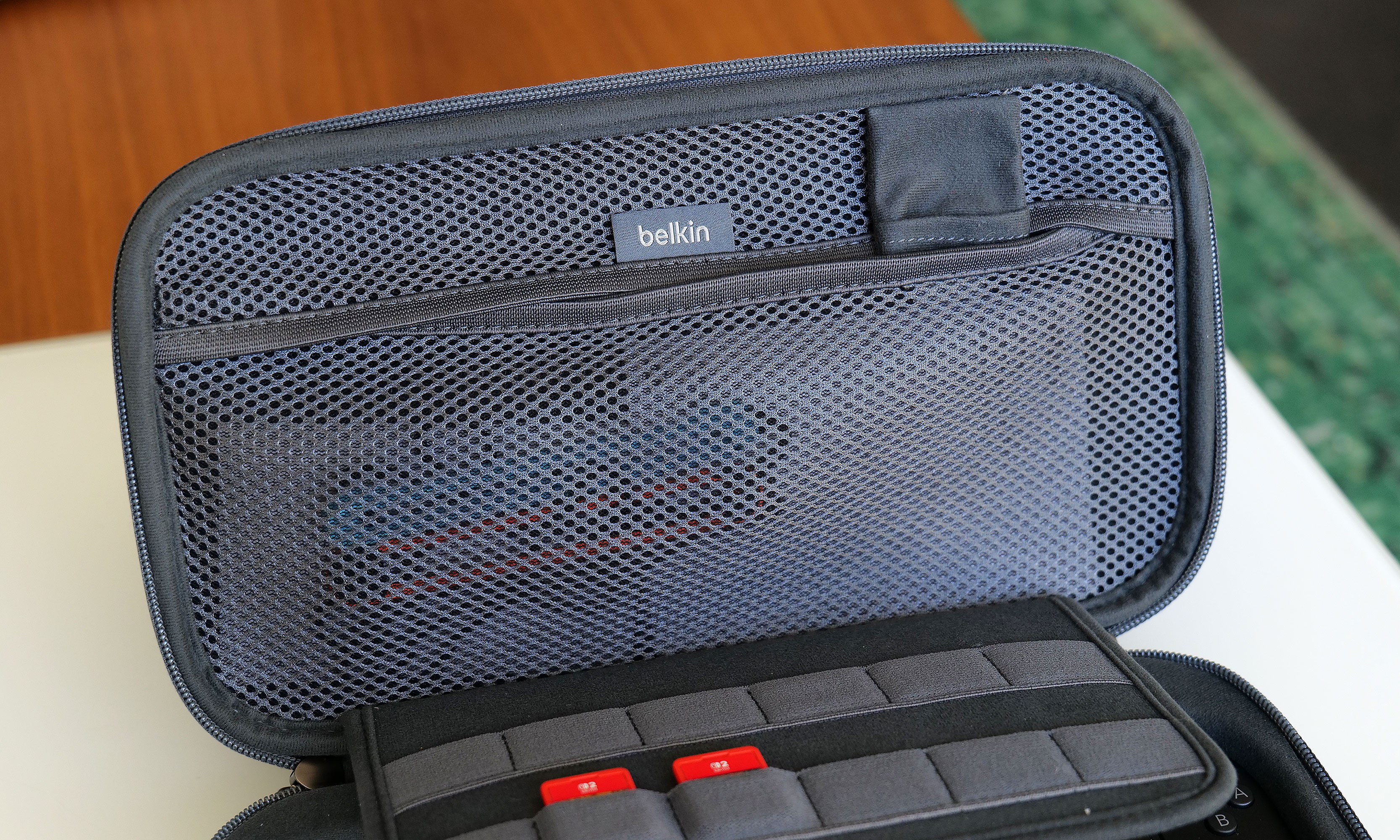
The inside of the Pro Charging Case features a handy mesh pocket, 12 slots for game carts and a hidden AirTag pouch.
Sam Rutherford for Engadget
Other small touches on Belkin's Pro Charging Case include a mesh pocket for storing things like cables, Joy-Con straps or cleaning cloths, which is very handy. However, my favorite thing might be the AirTag pouch that's also hidden inside that pocket, which could give you a fighting chance of recovering your system if it's ever lost or stolen (though I wouldn't count on it).
Battery pack
The arrangement of the included 10,000mAh battery pack and the placement of its internal USB-C port makes it a cinch to recharge your Switch 2 every time you put it in the case.
Sam Rutherford for Engadget
Despite the increased size of the Pro Charging Case's included battery, it has the same 10,000mAh capacity as what you get from its less expensive sibling. That means you'll typically have enough juice for a little more than 1.5 recharges for your Switch 2 and its onboard 5,220mAh cell. Instead of relying on a simple external power pack like before, Belkin's bundled battery comes with a second USB-C port and a kickstand. This makes it super easy to plug in your Switch 2 every time you put it in the case. This way, you know the next time you turn it on, it'll be at 100 percent.
Here's what the battery pack looks like when you take it out of the case. As you can see, its size and shape means it's not a great standalone external power pack any more.
Sam Rutherford for Engadget
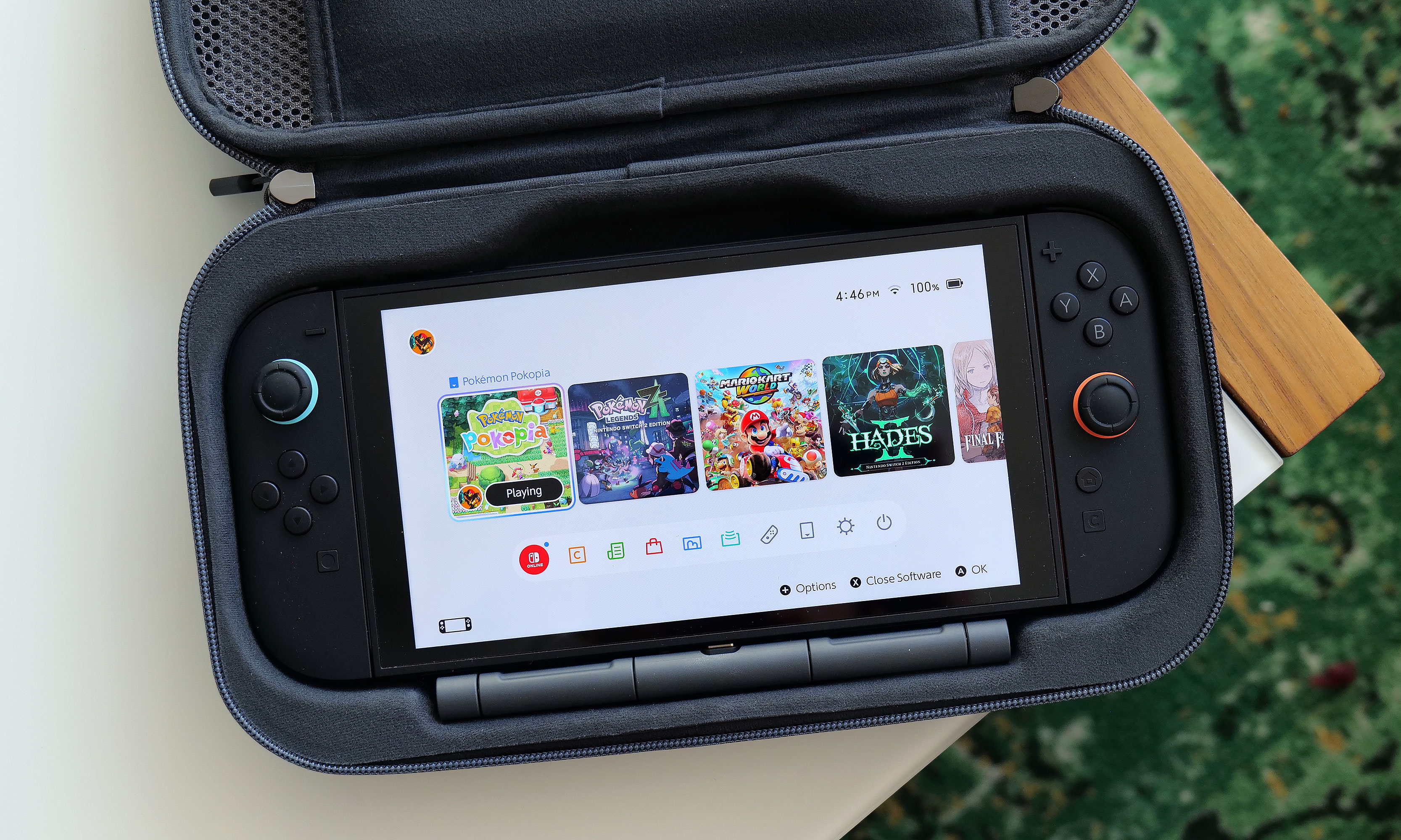
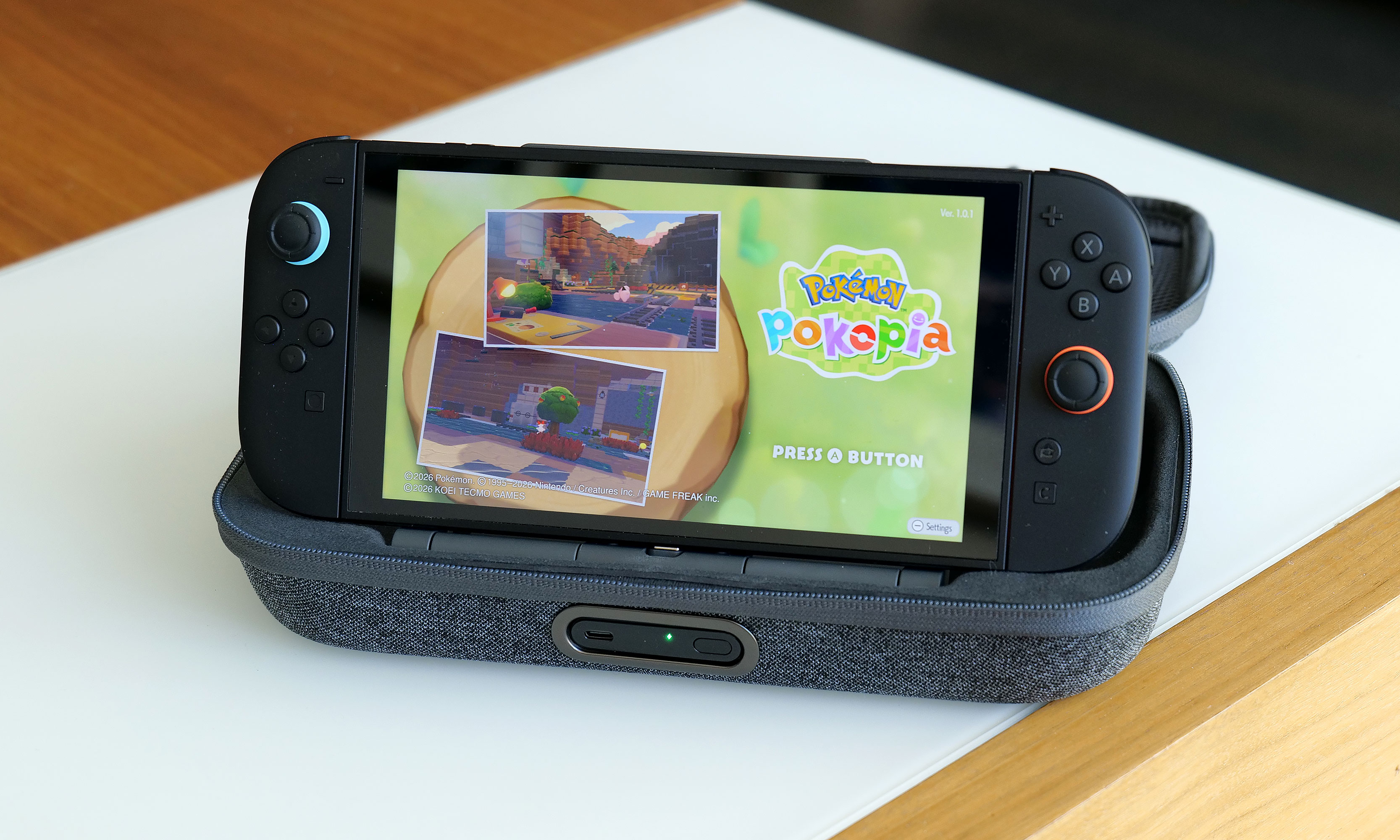
Alternatively, you can raise the kickstand to prop up the Switch 2 and game on it while it stays nestled inside the case. This might seem a bit redundant as Nintendo's console already has its own kickstand, but Belkin’s allows you to continue charging the system while you're playing without needing a cord. There's even a handy display on the side of the battery, so it's super easy to see how much juice is left, even when the case is closed. Furthermore, when you need to recharge the power pack, you can do so without removing it from the case or disconnecting your Switch thanks to that bonus USB-C port on the outside. Compared to the previous model, this is certainly a more elegant solution that provides some subtle quality of life improvements. The one downside is that the battery pack is somewhat awkwardly shaped, so you won't really want to use it on its own.
Wrap-up
There's no doubt the Pro Charging Case's new battery pack is a more premium solution that's easier to use and manage. When you need to recharge it, you can do so from the outside without opening the pouch. It also lets you charge a Switch 2 without ever needing a cable. The built-in kickstand is another bonus that helps elevate the whole kit from a simple case to something closer to a tiny all-in-one gaming booth.
One of the neat things about giving the battery a kickstand is that it turns the case into a mini all-in-one. This makes me wish Belkin gave the included power pack some sort of docking functionality for connecting the Switch 2 to an external display.
Sam Rutherford for Engadget
That said, after using it for a couple of weeks, I'm still not sure the added convenience is worth an extra $30 over the original. Due to the battery packs' new shape, it's less useful as a standalone power cell, and the rest of the case's design is largely unchanged. Of course, it's always nice to have options, and if you're the kind of person who doesn't mind spending a little extra for a more streamlined and convenient kit, Belkin's Pro Charging Case for the Switch 2 is still very much worth consideration.
This article originally appeared on Engadget at https://www.engadget.com/gaming/nintendo/belkin-charging-case-pro-for-switch-2-review-a-more-elegant-solution-144820809.html?src=rss
Ever since making the jump to the Nintendo Switch, there's something that's bugged me about practically every modern Pokémon game, a feeling that has only intensified after spending countless hours in Pokopia. For titles based in big, open worlds and filled with adorable polygonal characters and lovely music, why is nearly every pokémon still saddled with a call that sounds like a dial-up internet connection?
As someone who played Pokémon Red and Blue at launch, I'm very aware that the origin of these sounds is tied directly back to those original titles on Game Boy, which was powered by an 8-bit SM83 processor from Sharp. Back then, it was a herculean challenge to fit the entire game into a single 512KB cartridge. So as a way to save space, the voice (or cry as they are more commonly known) of each of the original 151 Pokémon came from just 38 base cries, which then had their pitch or duration modified to create more unique sounds.
Naturally, this tradition of lo-fi cries continued throughout Pokémon's run on the Game Boy and Game Boy Advance and onto the Nintendo DS and 3DS. And despite the higher-res graphics we got in subsequent titles, the use of sprite-based icons and other nostalgic touches made those bitcrushed calls sound right at home. However, when the series moved to the Switch and Switch 2 and embraced larger 3D worlds, those cries began to feel disconnected, especially for newer players without years of nostalgia to draw from.
The first issue is one of identifiability. They all kind of sound the same, especially in earlier titles like Red and Blue or Gold and Silver, where around one hundred new Pokémon are represented by just 30 base cries. Ideally, a monster's voice would be just as recognizable as its silhouette. Unfortunately, the current lo-fi cries just don't fit the bill.
The second problem is that the continued use of the old-school cries feels out of place in the grand scheme of Pokémon. When you watch the Pokémon anime, monsters don't use the same crunchy screams. Same goes for the movies, including big theatrical releases like Detective Pikachu. At this point, pretty much every new piece of Pokémon media except the games (and the TCG for obvious reasons) features proper voice acting, which sort of brings us to the biggest reasons to ditch the audio clips from the Game Boy era: Pokémon that actually say their name is just super fun and easy to understand.
Sure, it's a bit of a gimmick, but it works. Plus, it kind of resonates with the philosophy that many vexillologists hold that says flags should be simple enough for a child to draw. Kids can say "Charmander," "Greninja" and even "Alomolola." But there ain't no way they are pronouncing this. For a game that's intended to be played by younger audiences, having the reinforcement of hearing a pokémon say its name while also seeing it written out in text isn't just easier to comprehend, it can also be a learning exercise. Also, just ask yourself, when you think of Squirtle, what do you hear in your head: this or this?
Now, there are several reasons why Game Freak hasn't made this leap already. The first is obviously money. Granted, localization costs only make up a fraction of the budget for a Pokémon game, but it's still a lot of work to translate things for various regions across the world, especially with modern titles available in at least nine different languages. This includes adjusting the names of specific monsters to better suit a specific market. For example, in Japanese, Hitmonchan and Hitmonlee are named Ebiwalar and Sawamular as a tribute to some of the country's most famous boxers. So when you consider the need to get different voice actors across the world to perform all of these variations, things get expensive.
Furthermore, there's an argument that creating a canonical voice for a main character like Victor or Gloria from Sword and Shieldtakes away from players' ability to imagine their own. Pokémon is an RPG after all. However, I don't think that reasoning flies when it comes to each monster's individual cry, even though many of them have been upgraded or refined in recent years. Same goes for the idea that a Pokémon that says its name sounds less natural than whatever this is. At the end of the day, these monster calls are iconic, and the Pokémon devs know this, because they've given proper cries to characters like Pikachu and Eevee in certain situations.
Regardless, for a franchise that's one of, if not the most valuable media property on the planet, I really hope that one day we can get proper vocal performances in Pokémon games, even if it costs Game Freak and Nintendo a little extra money. To be clear, I don't hate the old 8-bit cries and I don't think Game Freak needs to delete them entirely. They can simply be an alternate choice for anyone who prefers them over their actual voices. I just feel like after recently celebrating its 30th birthday, it's time for Pokémon to move on and celebrate some of the voice acting that helped make the franchise so popular in the first place.
This article originally appeared on Engadget at https://www.engadget.com/gaming/nintendo/its-time-for-game-freak-to-finally-give-pokemon-some-proper-voice-acting-130000851.html?src=rss
Last year, Dell came this close to abdicating its throne as the maker of the best premium Windows laptops when it announced it was killing off the XPS brand. Thankfully, the company regained its wits, admitted its mistake and doubled down on its flagship notebook line by revealing a full redesign for 2026 with super sleek builds, improved performance and helpful tweaks to nearly everything else we loved about its predecessors. The one blemish to Dell's crown jewel is some keyboard issues on early units. But make no mistake, the king of laptops is back.
Design and display
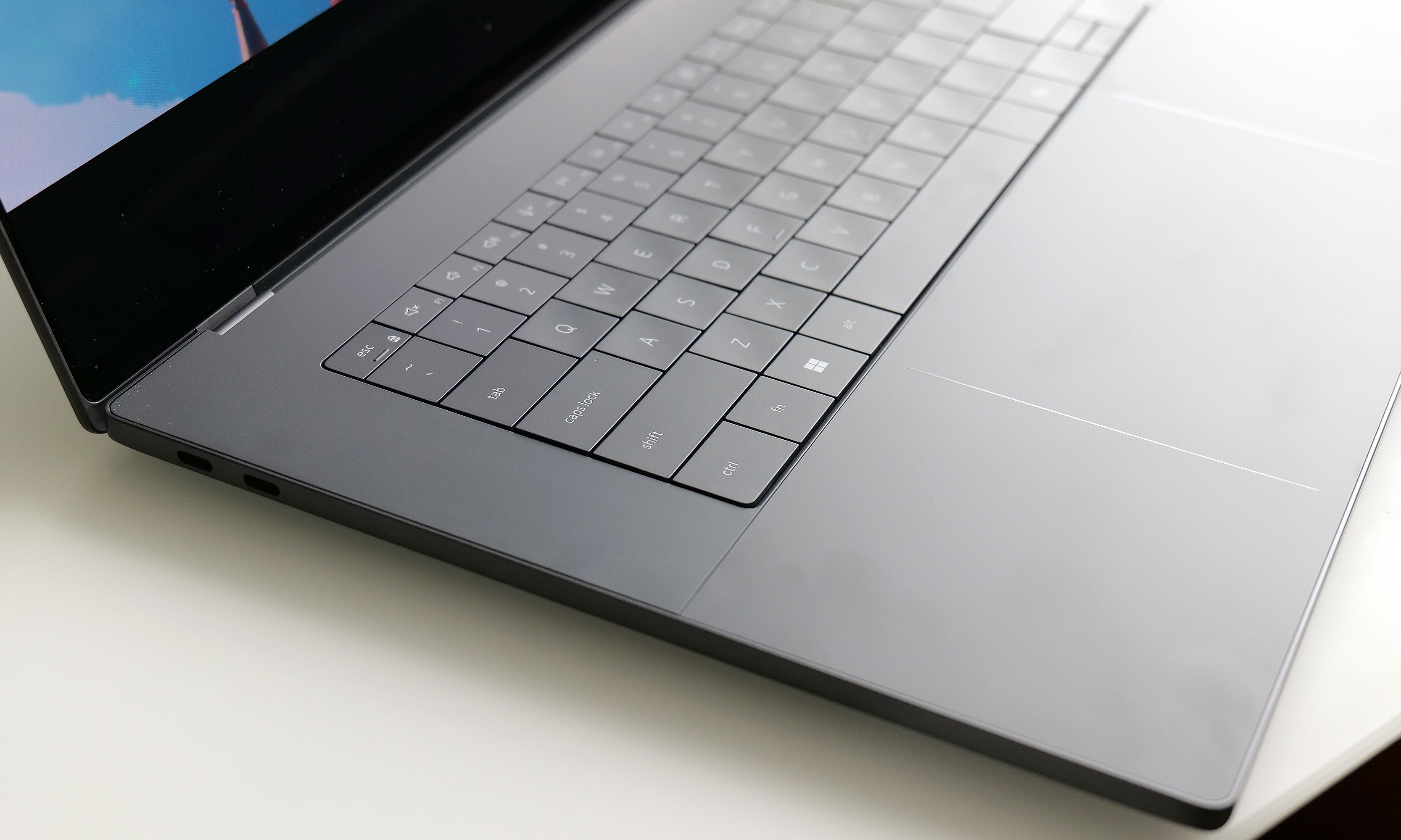
For this revamp, Dell didn't stray away from the XPS line's typical mix of glass and aluminum. However, this time around, the company streamlined pretty much everything. The XPS 16 now weighs just 3.65 pounds (or 3.85 if you opt for the heavier LCD display), which is almost a full pound lighter than its predecessor (4.56 pounds). That's a massive drop and it makes this system closer in heft to a 15-inch MacBook Air (3.3 pounds) than a 16-inch MacBook Pro (4.7 pounds), despite the latter being XPS's usual rival. It's also noticeably thinner at 0.58 to 0.6 inches (depending on the exact configuration), which is once again a sizable decrease from the previous model (0.75 inches). Honestly, this laptop needs to be held to be truly appreciated. Even after using it for a while, it still feels impossibly sleek every time I pick it up.
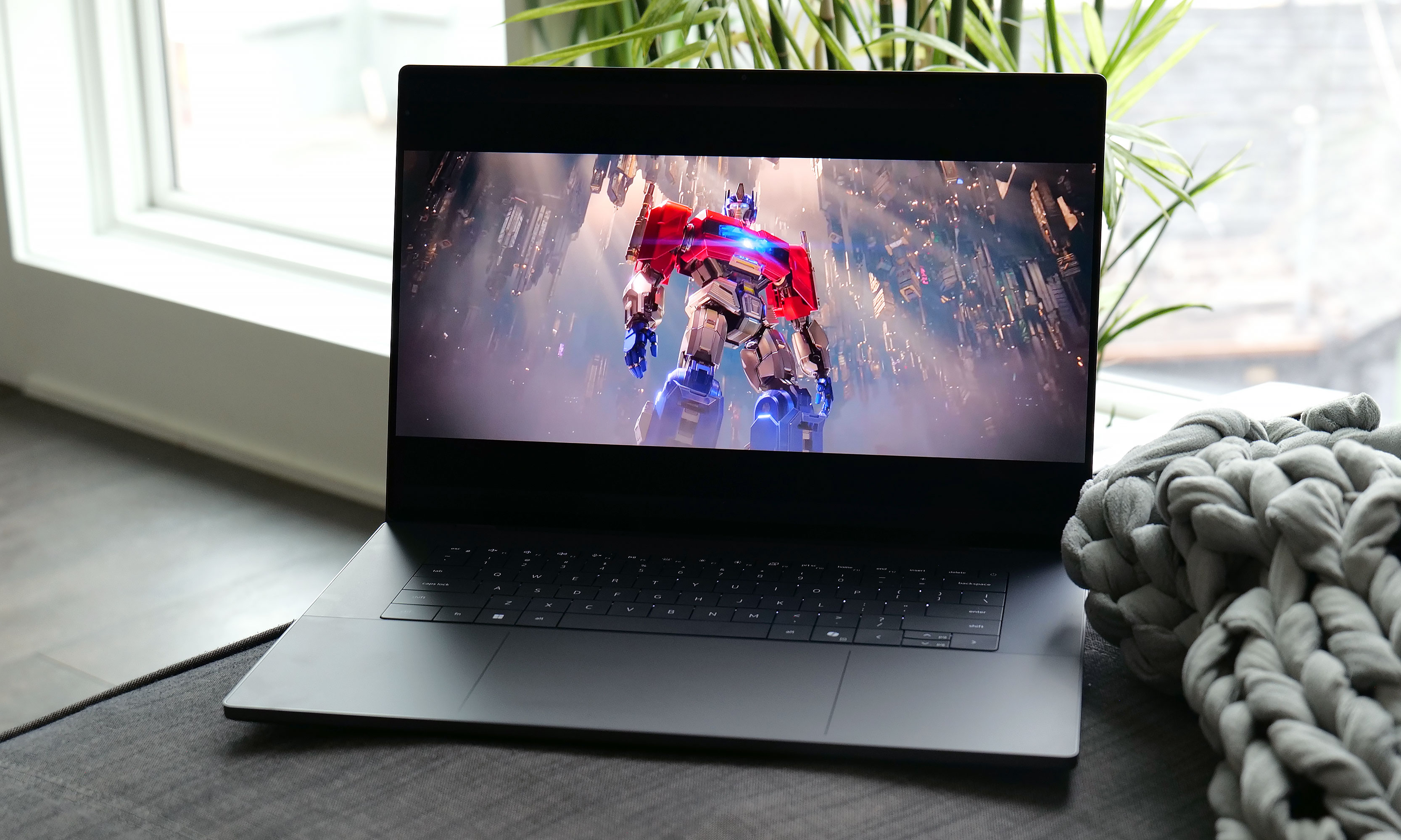
The optional 3.2K OLED display available on the XPS 16 is simply gorgeous.
Sam Rutherford for Engadget
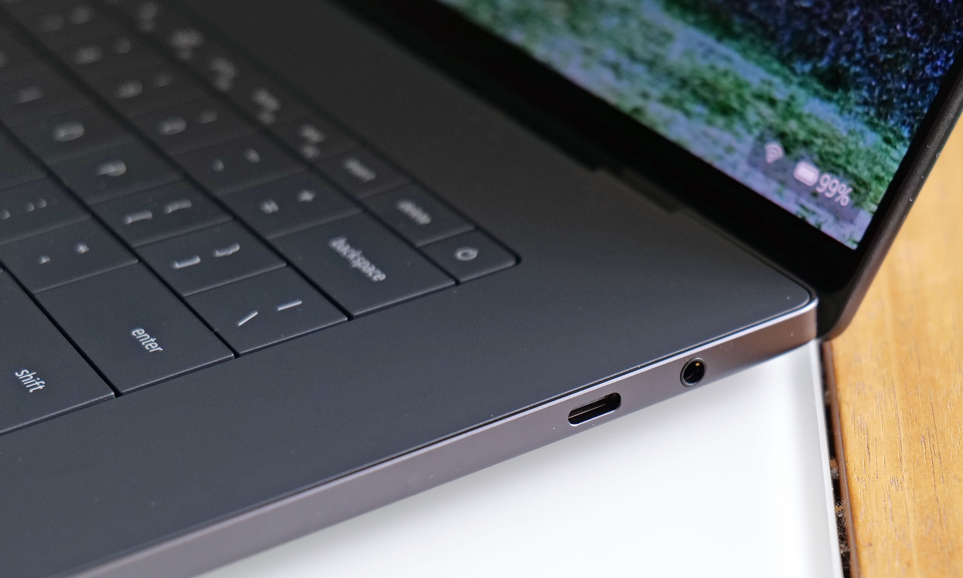
Elsewhere, Dell kept important features like the XPS line's up-firing stereo speakers (which sound great), along with a decent mix of ports, including three USB-C jacks that support Thunderbolt 4, DisplayPort 2.1 and power delivery. The one thing I wish Dell had included though, is some sort of SD card reader. With the XPS 16 being the largest member of the family, it's often a prime option for people who like to edit photos and videos on the go, so having an easy way to transfer media from a camera to the laptop would be really nice.
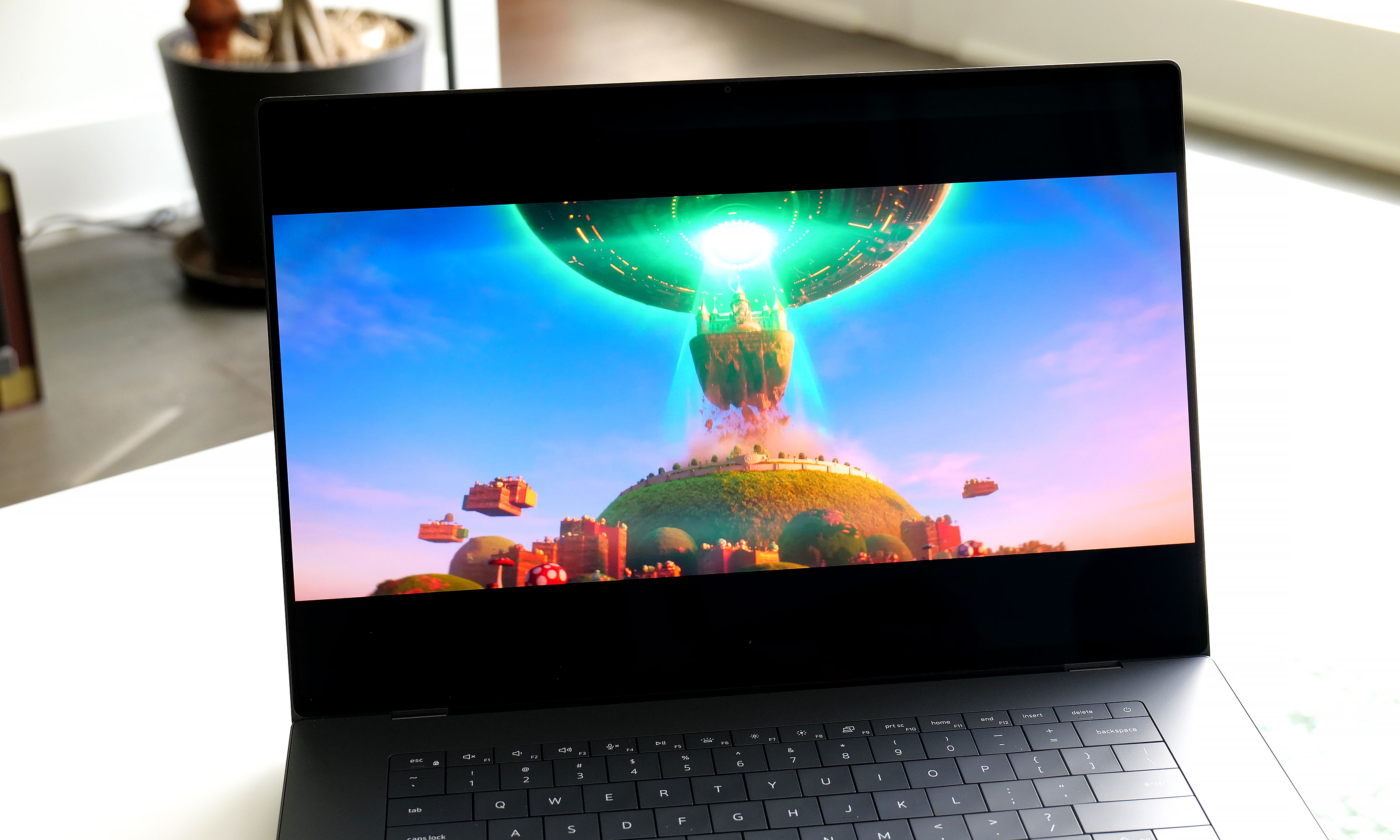
As for its display, Dell's optional 3.2K tandem OLED panel like the one on our review unit reinforces the laptop's role as a mobile editing platform. It produces vibrant hues and features a variable refresh rate that can go between 20 and 120Hz depending on what's on the screen. Despite having a nominal peak brightness of 400 nits, it looks much brighter in person, so you're getting an excellent viewing experience.
Keyboard and touchpad
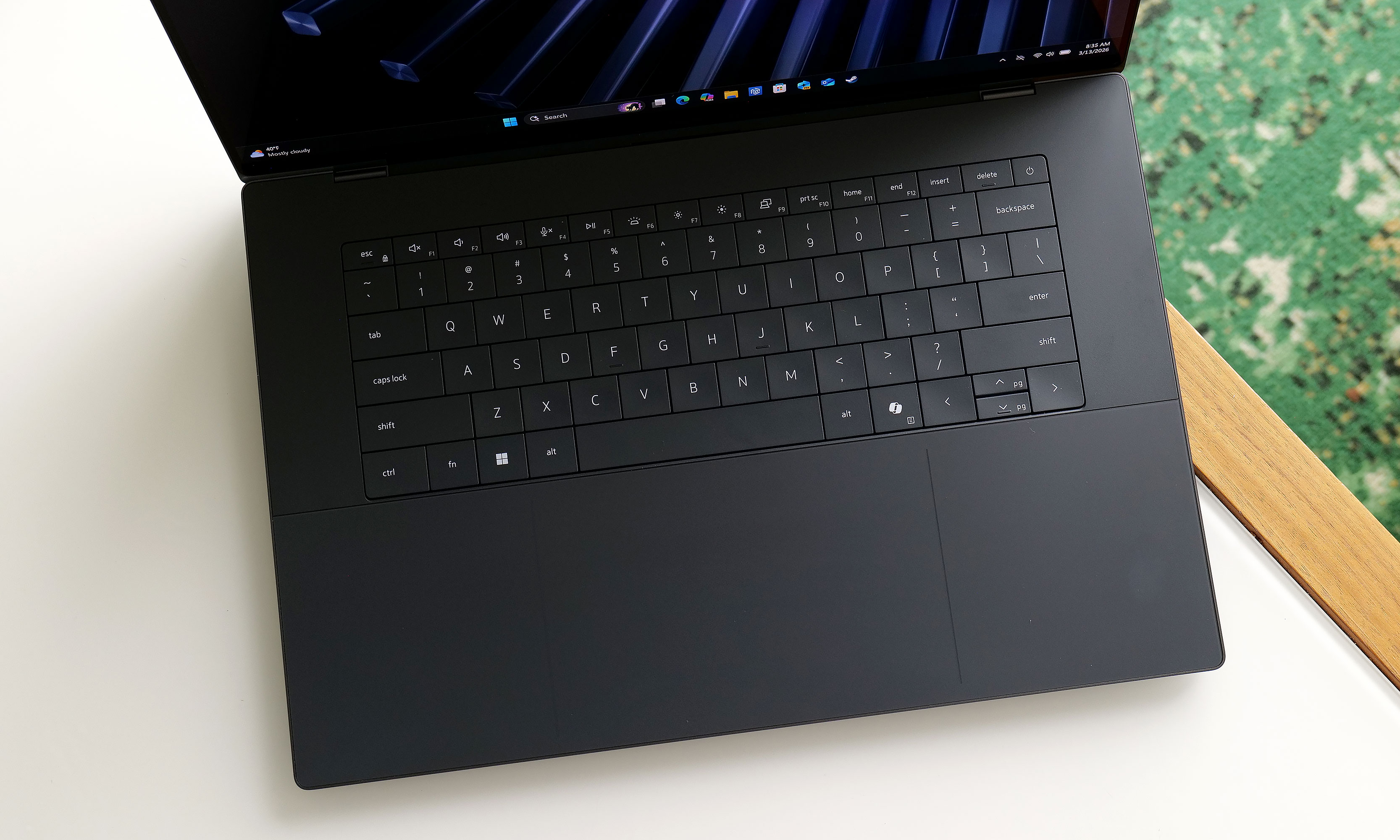
The XPS 16's keyboard looks great, but the lack of an anti-ghosting feature and somewhat shallow key travel aren't ideal.
Sam Rutherford for Engadget
Perhaps the biggest change to the XPS line is its reworked keyboard and touchpad, which brings some ups and downs. Dell kept the glass deck and seamless touchpad used on previous models, except now there's a faint line going around its perimeter, so you never have to guess where it is. The company also replaced the row of capacitive touch function and media controls from its predecessor with regular keys. As a fan of physical buttons, this is just great.
The issue is that for discerning typists, the keyboard seems to be missing anti-ghosting or N-key rollover tech. This means that if you press two keys very quickly one after another, the second press actually gets registered first, which can result in erroneous inputs. We ran into the same problem when testing the XPS 14. Dell claims this issue only impacts the first batch of systems off the line and that units on sale today have had this issue patched already. Furthermore, the company says it will release an update to address the issue on the remaining units, which should be out sometime in March. Though at the time of publication, I haven't received anything yet.
The XPS 16 also features punchy up-firing stereo speakers that don't leave much to complain about.
Sam Rutherford for Engadget
There is another nitpick about the keyboard. While I don't mind that Dell retained its zero-gap layout instead of going with a more traditional chiclet-style design, the more I type on it the more I wish Dell would offer something with a bit more key travel and heavier actuation. For reasons out of my control, my company-assigned work machine is a Dell Precision 5680 from 2023. I don't like it very much aside from its keyboard, which is significantly bouncier and just generally nicer to use than the one on the XPS 16.
Performance
A big reason why Dell was able to make the XPS 16 so thin and light is that the company didn't leave room for discrete graphics. That means you can only choose between a handful of Intel's latest Series 3 Core Ultra chips, ranging from the Ultra 5 325 to the Ultra X7 358H, with the latter being the one I tested here. That's not a bad thing though, as the laptop easily handled all the various productivity tasks I threw at it. And even without a proper GPU, the XPS 16 still pumped out 62 fps in Cyberpunk 2077 at 1920 x 1080, using Ultra settings and Intel's XeSS set to Quality. Those kinds of numbers aren't going to make anyone toss out their dedicated gaming rig, but once again, that's not too shabby for a notebook this easy to carry around.
Battery life
The XPS 16 comes with three USB-C port with Thunderbolt 4 which is nice, but sadly it lacks an SD card reader for quickly transferring media from a camera.
Sam Rutherford for Engadget
Thanks to a larger 99.5Whr battery, the XPS 16 fared better on our rundown test than its smaller sibling. This could be a deciding factor for anyone trying to choose between the two. In PCMark 10's Modern Office battery benchmark, the XPS 16 lasted just shy of 12 hours (11:53), which is more than an hour and a half longer than what we got from the XPS 14 (10:21). As long as you're not going to be gone for more than a day or you're really pushing it, you should be able to leave its power brick at home.
Wrap-up
Instead of killing the XPS name for good, Dell wisely reconsidered and then doubled down. The result is fantastic new version of the XPS 16.
Sam Rutherford for Engadget
When Dell decided to bring back the XPS name, COO Jeff Clake said the company was going to get back to its roots. That's the kind of messaging that's easy to stay on a stage, but after testing out the reborn XPS 16, I can confirm it isn't just flimsy rhetoric.
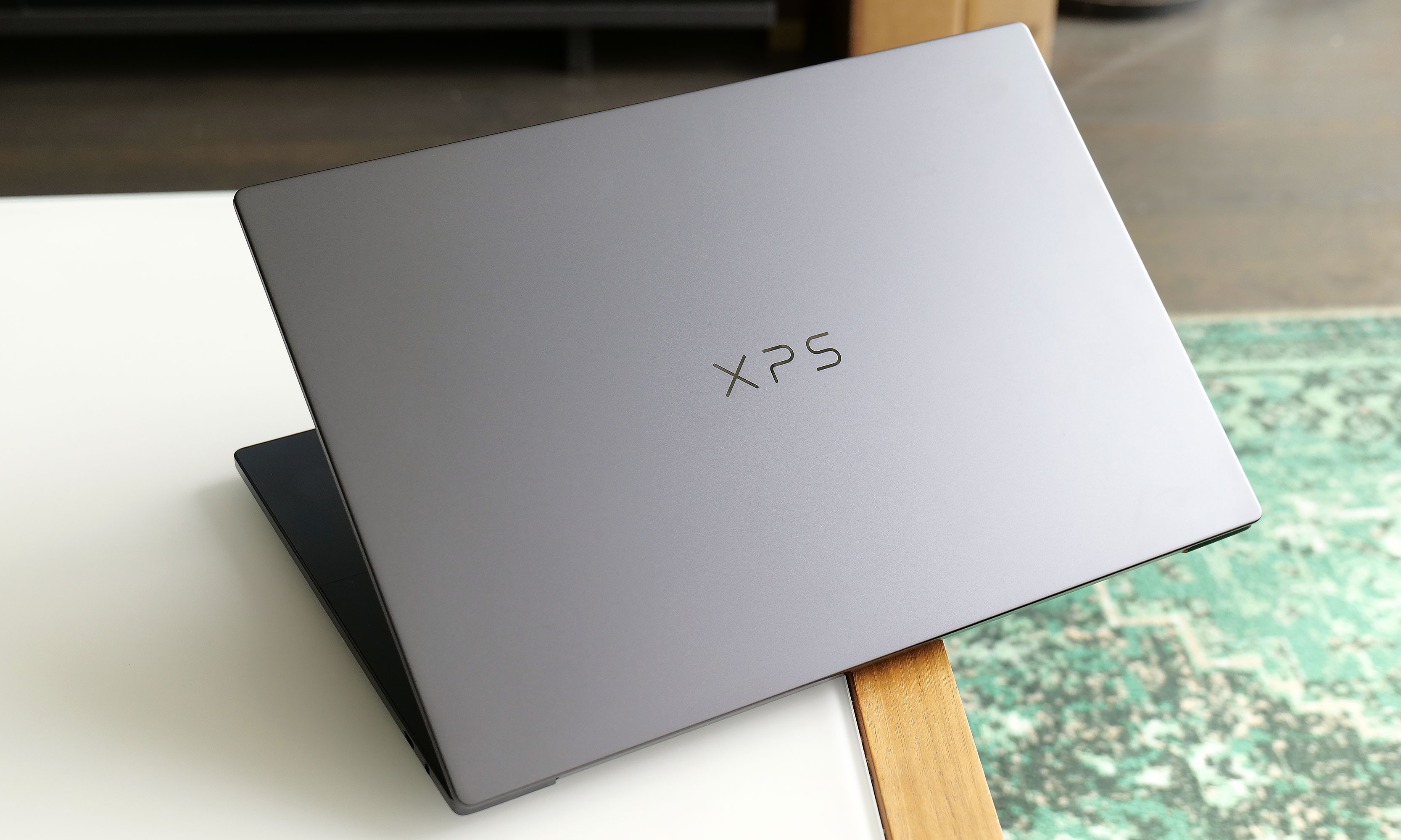
This laptop is a shining example of a premium ultraportable Windows laptop done well. It features a super sleek aluminum chassis, strong performance, solid battery life and an excellent display, particularly if you upgrade to the 3.2K OLED option. The connection to the iconic award-winning systems isn't just skin deep. This thing is just as much an XPS as the ones we loved a decade ago and Dell is driving that point home by letting the XPS logo sit front and center on its lid instead of the company's usual branding.
At just 3.65 pounds, the 2026 XPS 16 is basically a full pound lighter than its predecessor.
Sam Rutherford for Engadget
My one complaint is that I wish Dell would bring back the chiclet-style keyboards we got on models from the early 2020s. Though as long as the company can release updated software to fix the ghosting issues I've encountered, what's on there now is more than good enough. Granted, at $2,349 for our review unit, the XPS 16 is a bit pricey, but that's the going rate for a high-end notebook these days. If you snag a discount similar to the one Dell is currently running , suddenly, you're looking at an even more enticing package at $1,900.
The biggest reason someone might want to hold off for now is if you do need more powerful graphics, as I'm expecting Dell to release an alternate version of the XPS 16 with room for a discrete GPU (and hopefully an SD card reader) sometime before the end of the year. Despite Dell nearly tossing decades of pedigree in the trash just months ago, the XPS 16 has returned to reclaim its spot at the top.
This article originally appeared on Engadget at https://www.engadget.com/computing/laptops/dell-xps-16-2026-review-return-of-the-king-130000906.html?src=rss
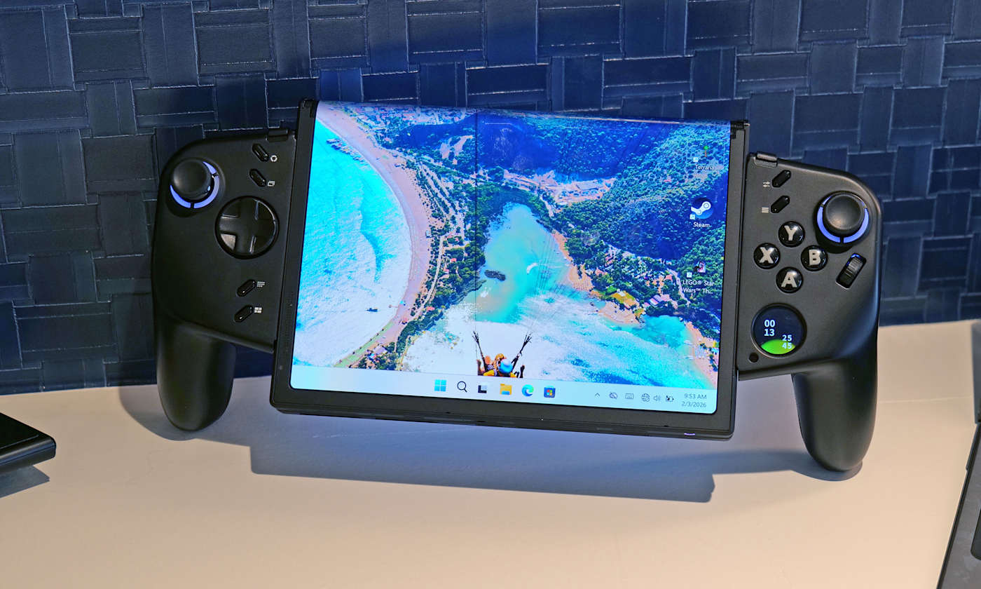
Lenovo already has a large roster of gaminghandhelds. However, it seems there's always room for another because at MWC the company showed off an ambitious concept device based around a flexible OLED display. And while the whole setup looks ungainly, after getting my hands on it, I'm very intrigued by its adaptability.
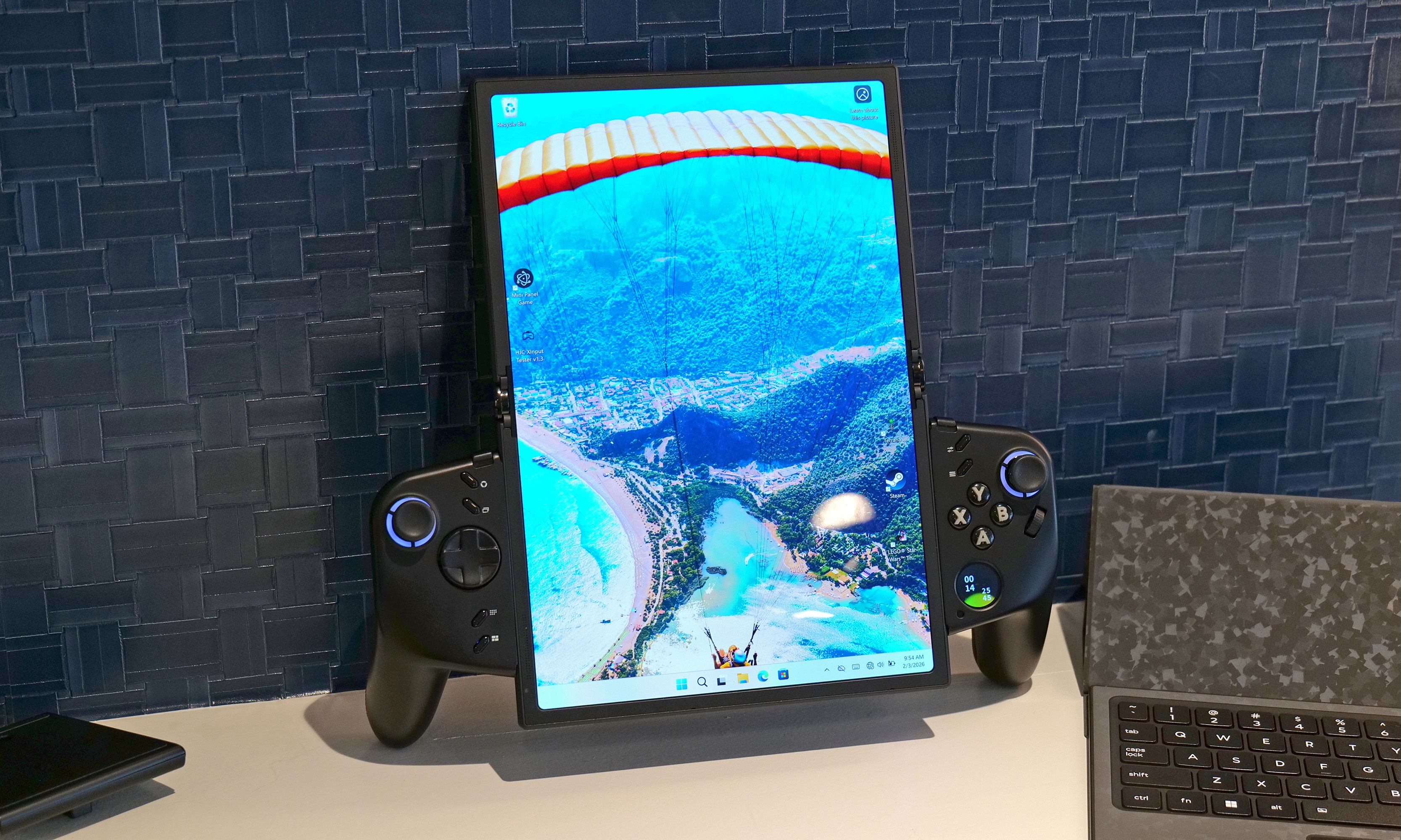
Now I'll be the first to admit that an 11.6-inch display feels oversized on a handheld that, in theory, is meant to be somewhat portable. That said, the beauty of the Legion Go Fold's screen is that it can be bent in half to create a more appropriately-sized 7.7-inch panel. In this configuration, the system feels a lot less cumbersome while also sporting a more traditional aspect ratio. Then, at a moment's notice, you can extend the display to provide extra room when you need it.
How silly does this look when its flexible display is fully extended in portrait mode?
Sam Rutherford for Engadget
However, the thing I like most about the Legion Go Fold is that its controllers are detachable and that the tablet has several different mounting points. This means if you have the space, you can remove the controllers, rotate the display into landscape mode and then reattach them to get an immersive widescreen experience. Alternatively, you can connect the gamepads together using one of Lenovo's accessories (which is similar to Nintendo's Joy-Con Grip) and then prop the system up using the Go Fold's folio cover, which doubles as a kickstand.
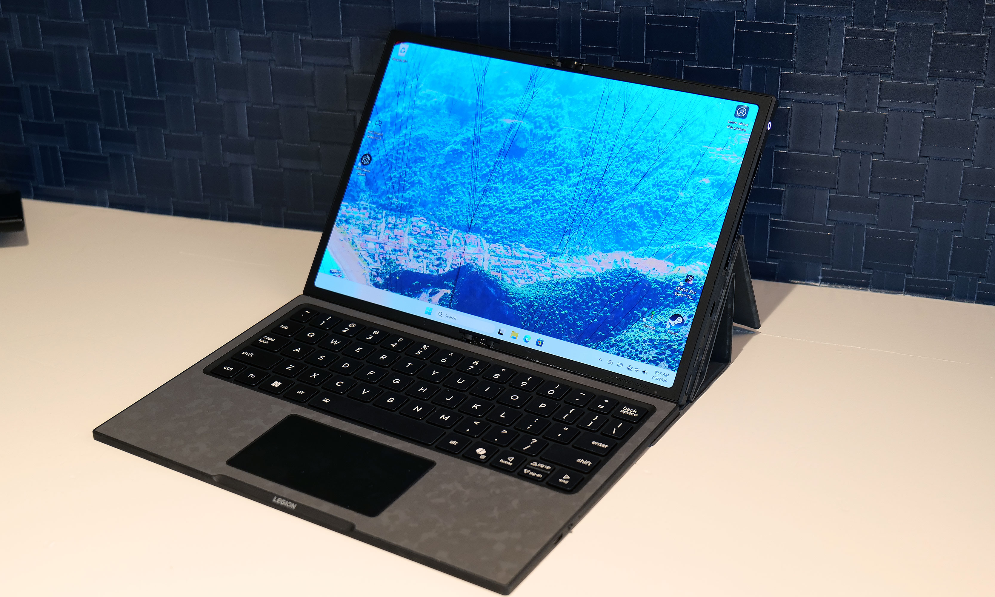
But wait, there's more: The handheld also features a strip of pogo pins for connecting a wireless keyboard, effectively transforming the whole setup into a miniature gaming laptop. Depending on how you're counting, that's at least four different modes you're getting from the Legion Fold, which is really quite impressive and speaks to the versatility of Lenovo's design.
Another feature I really like is the small 1-inch OLED display on the right gamepad. It supports a handful of widgets that can display the time, performance settings and more. It also doubles as a small touchpad, which can be really handy when playing PC titles that were originally developed for mouse and keyboard. And just like on the Legion Go and Legion Go 2, the Fold's right gamepad has a small scroll wheel and a hidden sensor, so it can also turn into a vertical mouse for playing FPS titles.
At this point, it's important to mention that Lenovo doesn't have concrete plans to put this thing into production, so its specs don't really matter. That said, the Legion Go Fold I tried featured an Intel Core Ultra 7 258V chip with 32GB of RAM and a 48WHr battery, which is more than respectable. Though if this thing does become an actual retail device, I would like to see a power cell with a bit more capacity.
I really love how the Legion Go Fold can turn into a miniature laptop just by moving some of its accessories around.
Sam Rutherford for Engadget
But as a concept gadget, I think the Legion Go Fold is a great showcase of how new technology (in this case, a flexible display) can bring new capabilities and greater flexibility to existing categories. And who knows, if a lot of people like the idea, it might encourage Lenovo to refine it and put it on sale for real. I would just be a bit worried about pricing, because all these components won't come cheap.
This article originally appeared on Engadget at https://www.engadget.com/gaming/pc/the-lenovo-legion-go-fold-gaming-handheld-concept-looks-awkward-but-its-versatility-is-endless-230000816.html?src=rss
The potential of modular laptops has never fully translated to the real world. While companies like Framework have made major strides in recent years, there's still quite a bit of room for improvement. At MWC, Lenovo is looking to address that with its Modular AI PC concept. It features not one but two displays and a detachable keyboard to create something that strains the definition of a laptop, thanks to an innovative and very adaptable design.
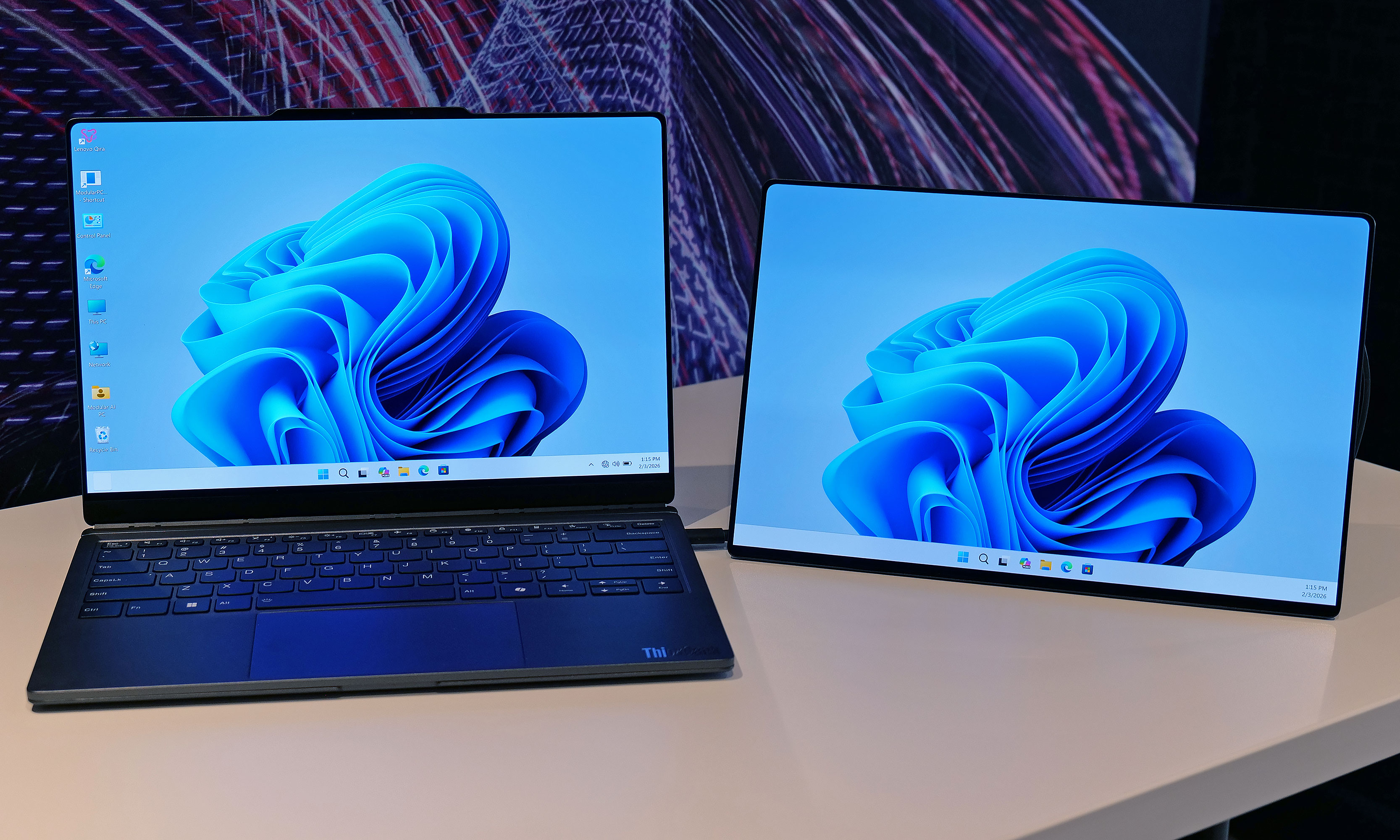
Compared to Framework's gadgets, which primarily use modularity to make upgrading the system and extending its lifespan easier, Lenovo's concept is based around a 14-inch chassis with hot swappable components. This allows you to move its keyboard and secondary display around at will, so the system can better adjust to its environment or workload. By default, its bonus screen is mounted on its lid, allowing you to do easy face-to-face sharing with someone sitting opposite you. However, without even needing to turn the system off, you can yank away the notebook's keyboard and put the display in its place to provide additional real estate.
The Lenovo Modular AI PC concept's second screen can be attached to its lid or moved off to the side like a traditional dual monitor setup.
Sam Rutherford for Engadget
Or if you prefer a more traditional dual-screen setup, you can move it off to the side, prop it up via a built-in kickstand and connect to the laptop over USB-C. You even get the flexibility to arrange the display in vertical or landscape orientation, which is nice if you're doing stuff like coding or writing in a word doc (I feel targeted, but in a good way). And because the keyboard can connect to the notebook using pogo pins or Bluetooth, you have the freedom to position it practically anywhere you want.
Meanwhile, Lenovo borrowed one aspect of Framework's modularity by including the ability to swap ports on the fly. During my demo, the company showed off modules featuring USB-C, USB-A and HDMI connectors, though I was told there are a ton of additional possibilities for those who might need things like a proper Ethernet jack or additional ports for audio.
The Lenovo Modular AI PC concept's keyboard and be completely removed at a moment's notice and positioned anywhere you like thanks to its Bluetooth connectivity.
Sam Rutherford for Engadget
But what impressed me the most was that despite being a concept device, the whole setup felt quite polished. That almost suggests that this thing might be closer to becoming an actual retail product than some of the company's other demo gadgets. Build quality felt really sturdy and I had no issues changing out ports or moving the secondary display around without needing to troubleshoot or reboot the system. Everything just kind of worked. And while Lenovo isn't sharing details about what processor it's running or how much memory it has, its performance felt snappy too.
My only question is that I'm not quite sure where AI fits into all of this. I was able to break down and reconfigure the system without any help from machine learning or a digital assistant. That said, I'm not complaining, because even with a lot of moving parts, its modular design is very approachable and easy to use.
Ports on the Lenovo Modular AI PC concept can be hot swapped between to add USB-C, USB-A and HDMI connectors as needed.
Sam Rutherford for Engadget
Unfortunately, Lenovo isn't planning on turning this concept into a true retail device. But even so, I hope the company will at least consider bringing some of the modular laptop's features like its hot swappable ports to future products.
This article originally appeared on Engadget at https://www.engadget.com/computing/laptops/the-lenovo-modular-ai-pc-concept-is-a-remixed-dual-screen-laptop-with-hot-swappable-ports-230000158.html?src=rss
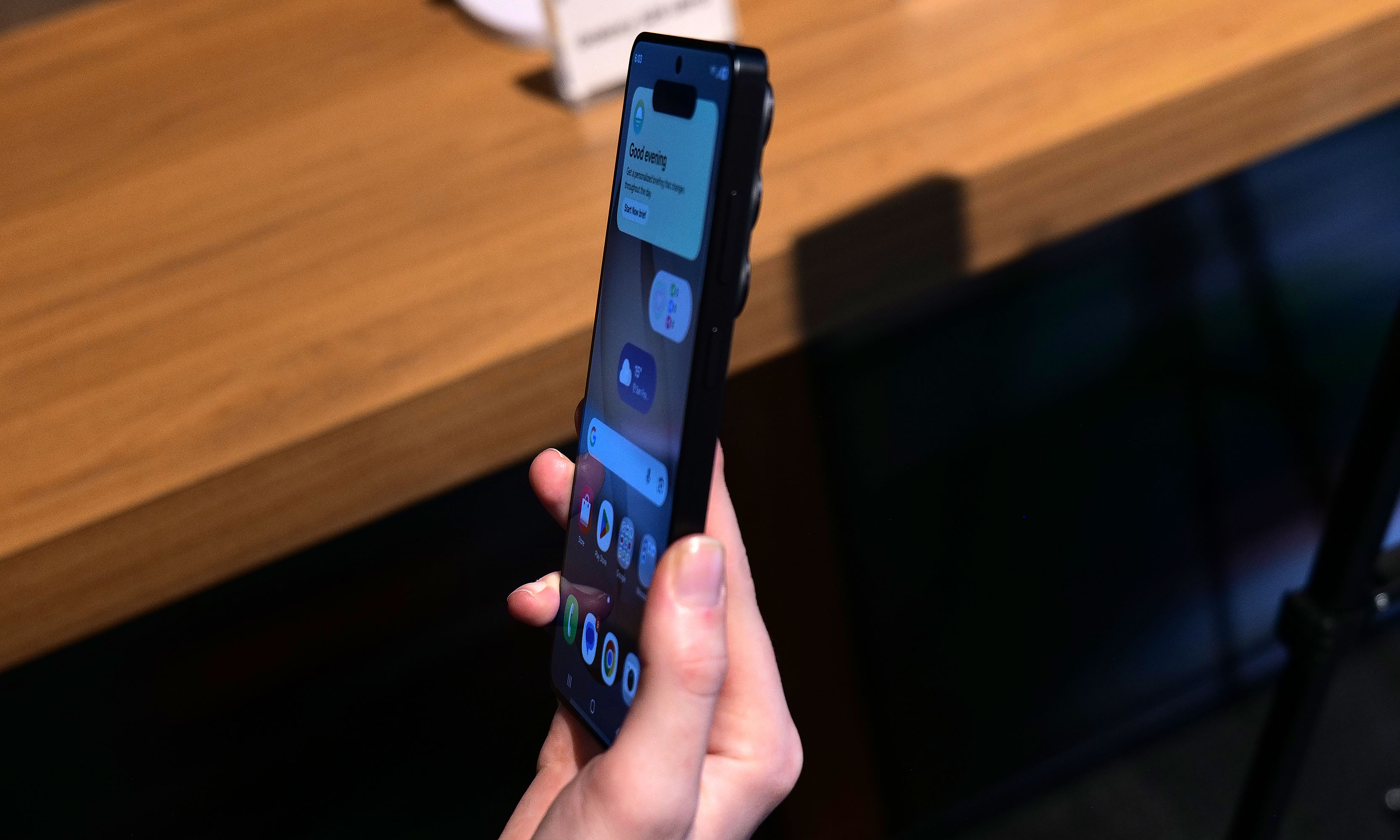
Last year, it felt like Samsung relied a bit too much on AI when trying to convince people to upgrade to its flagship phone. And while there’s no shortage of features that utilize machine learning on the new Galaxy S26 Ultra, it feels like Samsung has done a much better job of filling out the rest of the phone’s kit with fresh hardware, faster charging and a more cohesive design. It’s still rather expensive, but its price has stayed flat year-over-year at $1,300, which when combined with everything else makes it a much more attractive package than its predecessor.
Design and display
Samsung’s Ultra phones are always going to be somewhat boxy and that’s OK. However, for the Galaxy S26 Ultra, the company’s top-of-the-line handset is getting a slightly curvier appearance thanks to rounder corners. There’s also a very (and I do mean very) small reduction in size that technically makes this version the thinnest and lightest Ultra to date (214 grams and 7.9mm thick). That said, considering the previous model weighed 218 grams and measured 8.2mm, it’s incredibly hard to feel a difference even when you know what you’re looking for.
The two biggest changes to the S26 Ultra's exterior design are more rounded corners and an aluminum chassis instead of titanium like we got on the S25U.
Sam Rutherford for Engadget
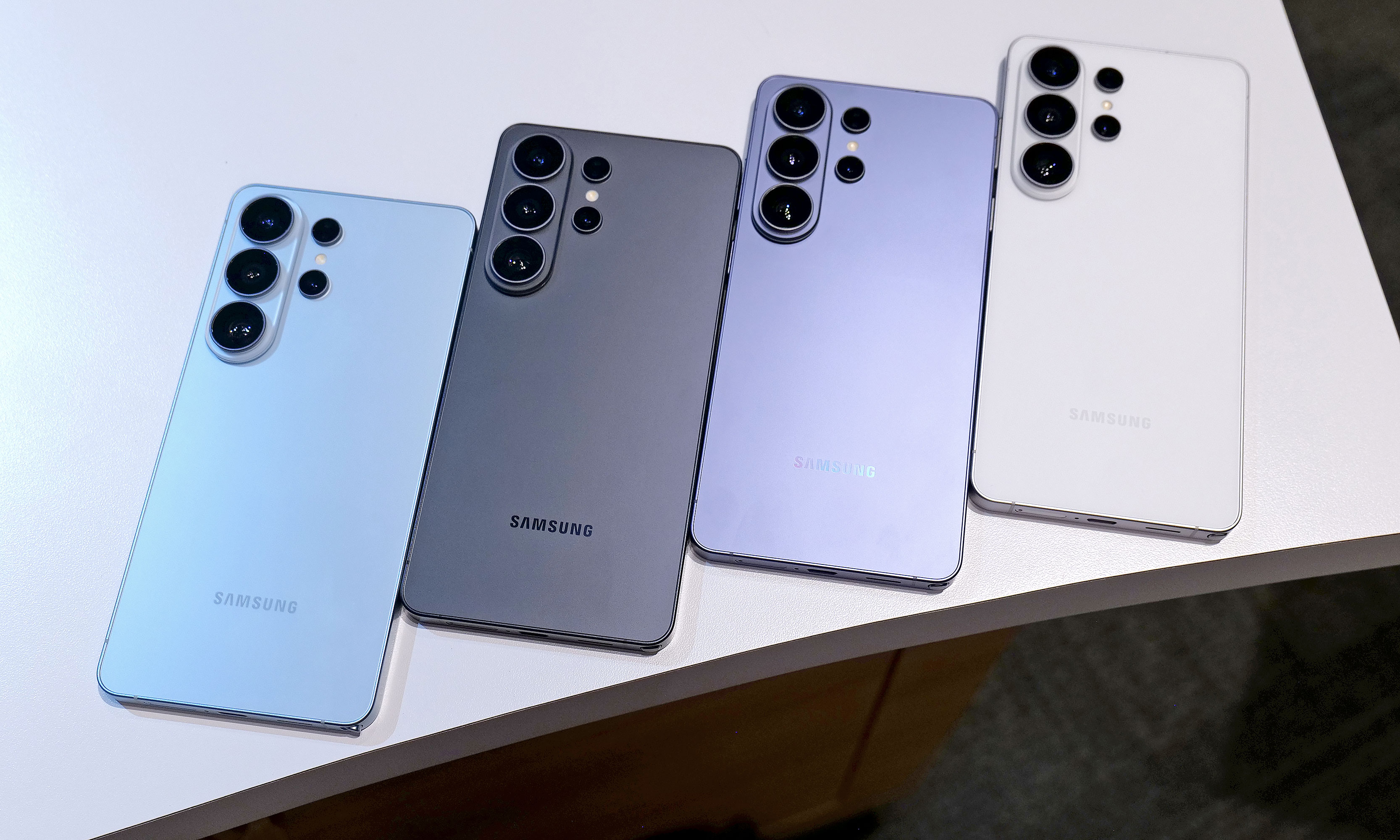
In reality, the biggest exterior change is that Samsung has ditched the titanium frame from last year’s phone in favor of an Armor Aluminum chassis with Corning Gorilla Armor 2 panels in front and back. Samsung says this new design is meant to make the Ultra fit in better with its less expensive siblings while also making it easier to do things like color match the phone’s body to the rest of the device. Also, for anyone who keeps track of Samsung’s palette, the hero color for the S26 Ultra is a rather fetching shade of purple called cobalt violet, with sky blue, white and black available as well (plus silver shadow and pink gold being Samsung’s online exclusive hues).
If you look closely at the top of the phone, you can see where a notification has been blacked out by the S26 Ultra's Privacy Display.
Sam Rutherford for Engadget
However, my favorite new thing on the S26 Ultra is its Privacy Display. When activated, it functions a lot like HP’s Sure View tech, which prevents people from peeking at your screen from acute angles. It works both when viewed from the side or up and down and has a surprising amount of customization. Not only can you set it to turn on automatically when the phone asks you for a password or PIN, it can also be triggered by specific apps or whenever you receive a notification. But perhaps the most impressive thing is that there’s almost no impact on image quality. When Privacy Display is active, there is a minor reduction in overall brightness, but aside from that, it’s really hard to tell when it’s on (at least from the front). Furthermore, the S26 Ultra’s 6.9-inch AMOLED screen has the same underlying specs as last year, including its 120Hz variable refresh rate and 2,600 nit peak brightness, so there are pretty much no trade-offs for the added functionality.
Performance and charging
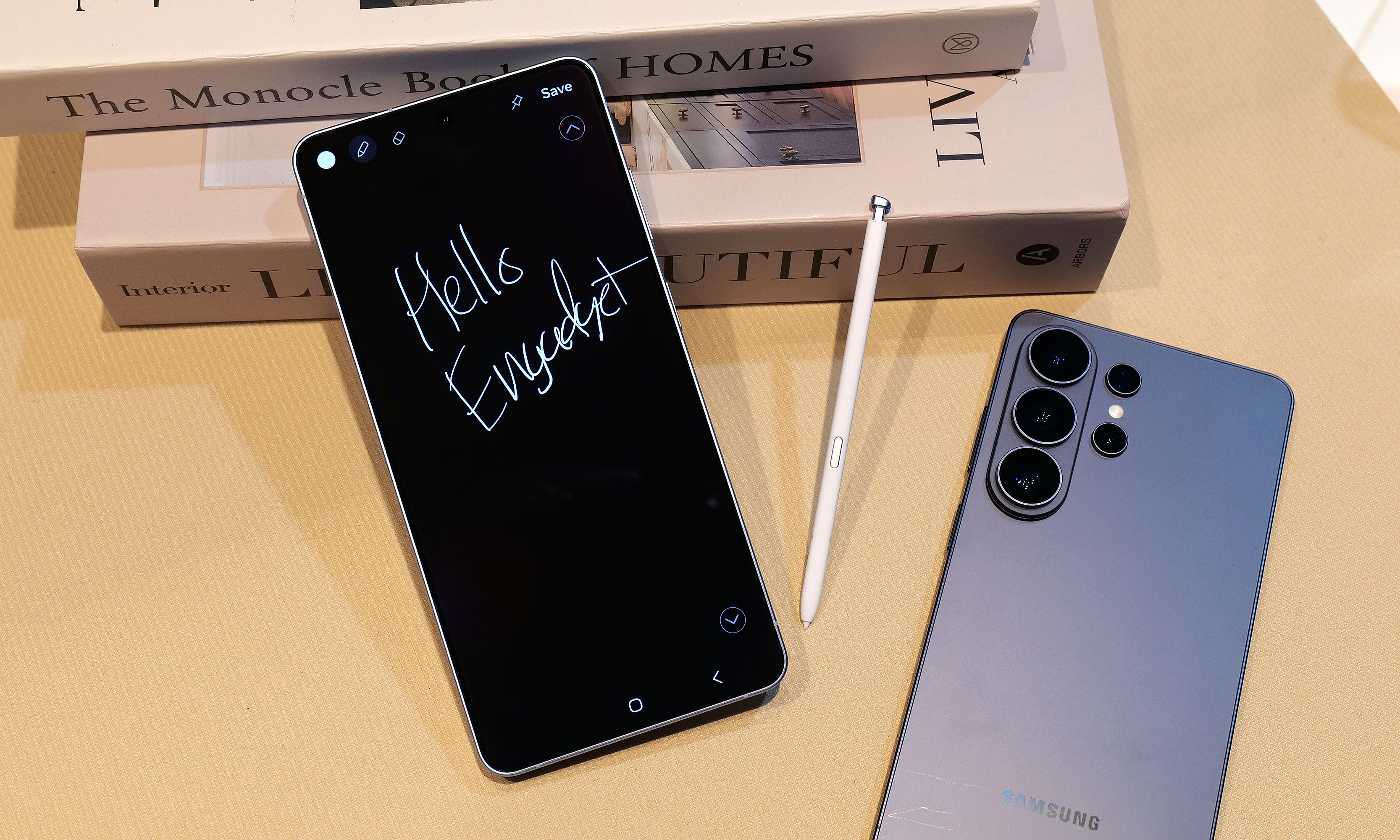
The S26 Ultra still comes with an included S-Pen and a built-in storage slot, but it still doesn't have Bluetooth connectivity like on some of Samsung's older models.
Sam Rutherford for Engadget
Inside, the S26 Ultra features a Qualcomm Snapdragon 8 Elite Gen 5 for Galaxy chip along with either 12GB or 16GB of RAM and up to 1TB of storage. Compared to its predecessor, Samsung claims the NPU’s performance has made the biggest leap with it being 39 percent more powerful year-over-year with respectable increases for its CPU (19 percent faster) and GPU (24 percent faster) as well.
As for charging, both wired and wireless speeds have gotten a big boost with the former now rated at up to 60 watts (up from 45 watts) or 25 watts (up from 15) for the latter when using compatible Qi2 pads. Samsung says buyers will even get a three amp cable in the box, so all you need to do to get those peak wired speeds is to hook it up to the right adapter.
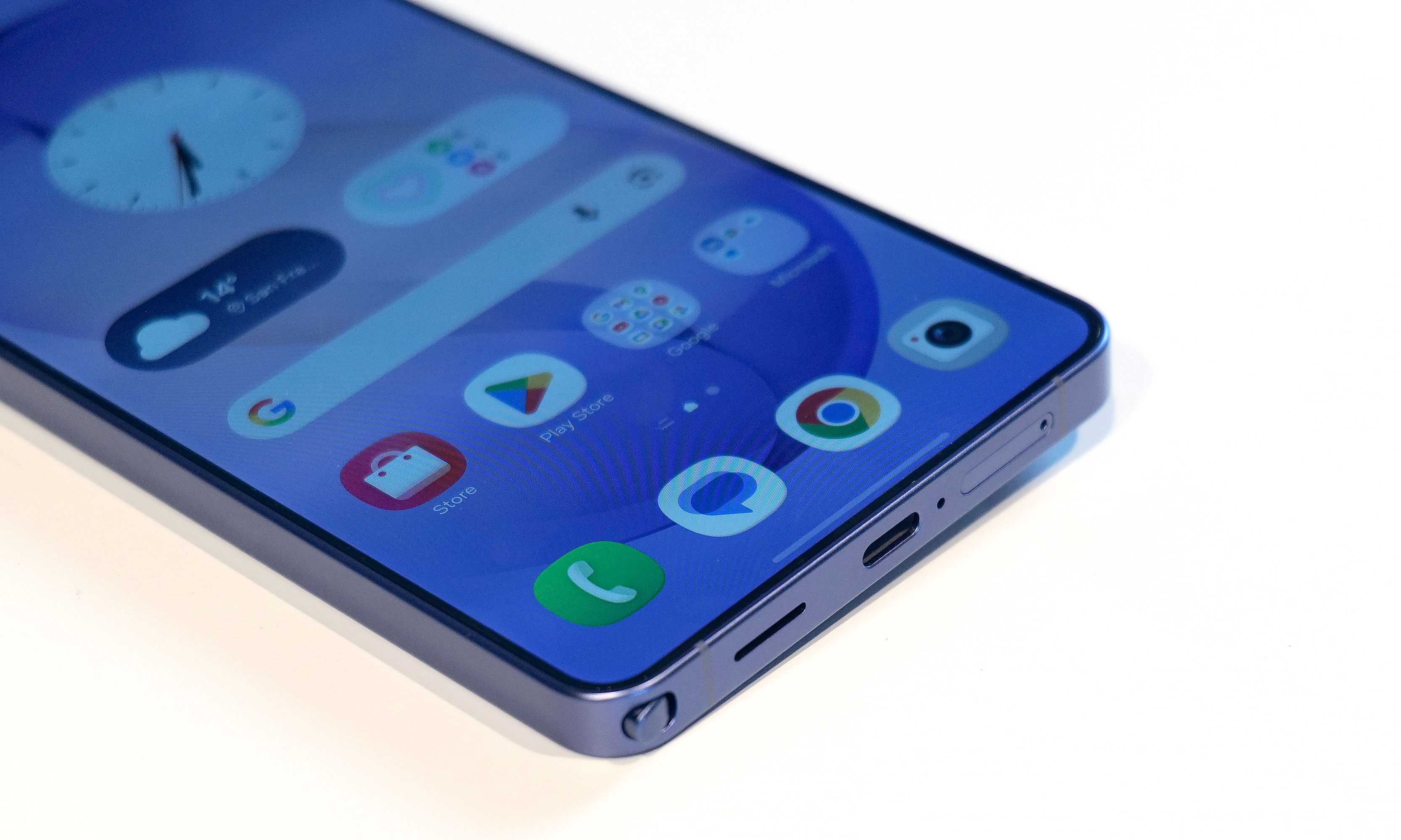
A small quirk with the S26 Ultra's S-Pen is that because the end of the stylus is curved to match the corner of the phone, if you put it in "wrong," it'll stick out a bit.
Sam Rutherford for Engadget
Unfortunately, we’re still not getting a magnetic ring inside the phone, which means if you want to use the S26 Ultra with magnetic accessories, you’ll need to pair the phone with a case that supports that functionality. This is super frustrating because Samsung says this decision was made in part to keep the handset as thin as possible, but when you consider the difference between the S26 Ultra and the S25 Ultra is 0.3mm, that choice feels rather misguided.
Cameras
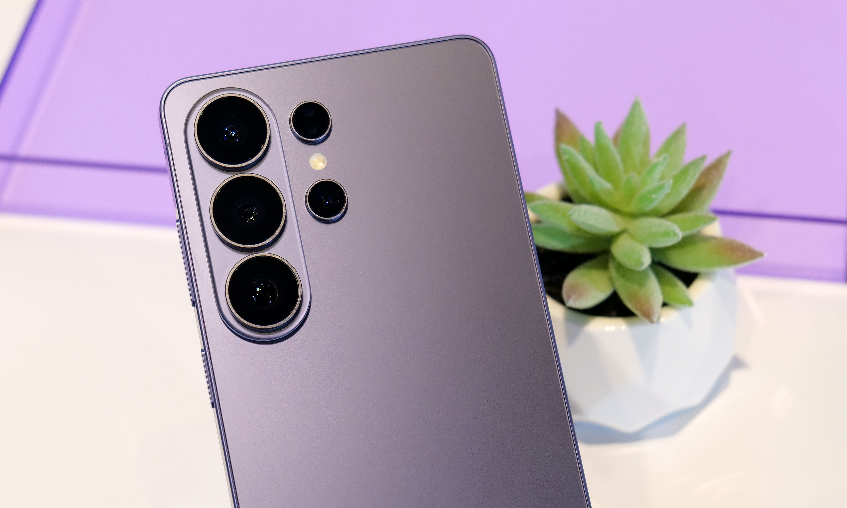
One of my biggest complaints about last year’s S25 Ultra is that the only new hardware was an updated 50MP sensor for its ultra-wide lens, which is the camera I (and probably most people) use the least. Thankfully, it seems Samsung took note of that because while the resolution of its 200MP main cam, 10MP 3x telephoto and 50MP 5X telephoto are the same as before, the S26 Ultra’s main and 5x zoom lenses now have significantly wider apertures (from f/1.7 to f/1.4 and f/3.4 to f/2.9, respectively). This results in as much as 47 percent more light reaching the phone’s primary sensor (or 37 percent for the 5x telephoto), which should result in some major gains in photo quality and low light sensitivity. That said, I wasn’t able to properly test this during my hands-on session, so I’m going to reserve final judgement for a proper review.
The S26 Ultra's 200MP main and 50MP 5x zoon lenses feature significantly larger apertures, which should deliver much improved image quality in low light conditions.
Sam Rutherford for Engadget
Meanwhile, for video capture, Samsung is adding support for the APV codec at up to 8K/30 fps to the S26 Ultra along with a new horizon lock feature that will keep your footage level no matter how much you rotate the phone. Now I will admit that the latter didn’t impress me much when I first heard about it, but after testing it out and spinning the phone a full 360-degrees while recording a clip, I was shocked when the resulting video showed no hint of being whirled around. Samsung also says the handset’s improved Nightography processing uses AI to recognize noise patterns in low light to improve image quality. But similar to the wider apertures bringing in more light, I’ll believe it when I see it.
Finally, there’s a new AI-powered Photo Assist tool that lets you edit or adjust images using natural language prompts. From what I experienced, it’s effective and works as you’d expect. However, with the proliferation of services and devices offering similar functionality over the past year, this feature feels more like Samsung’s attempt to keep up with the Joneses.
AI features
When it comes to AI, the S26 Ultra is getting the same batch of new and improved features as the rest of the S26 family. So if you’re big into machine learning, there’s no need to pay extra for this model. Furthermore, many of the updates for 2026 are tweaks or refinements of existing things like the Gallery app, which now uses AI to automatically sort screenshots into eight different categories so they’re easier to find later. There’s also what Samsung is calling Now Nudge, which functions a lot like Google’s Magic Cue. It’s built into the Samsung keyboard and it can do things like suggest relevant photos based on your conversations.
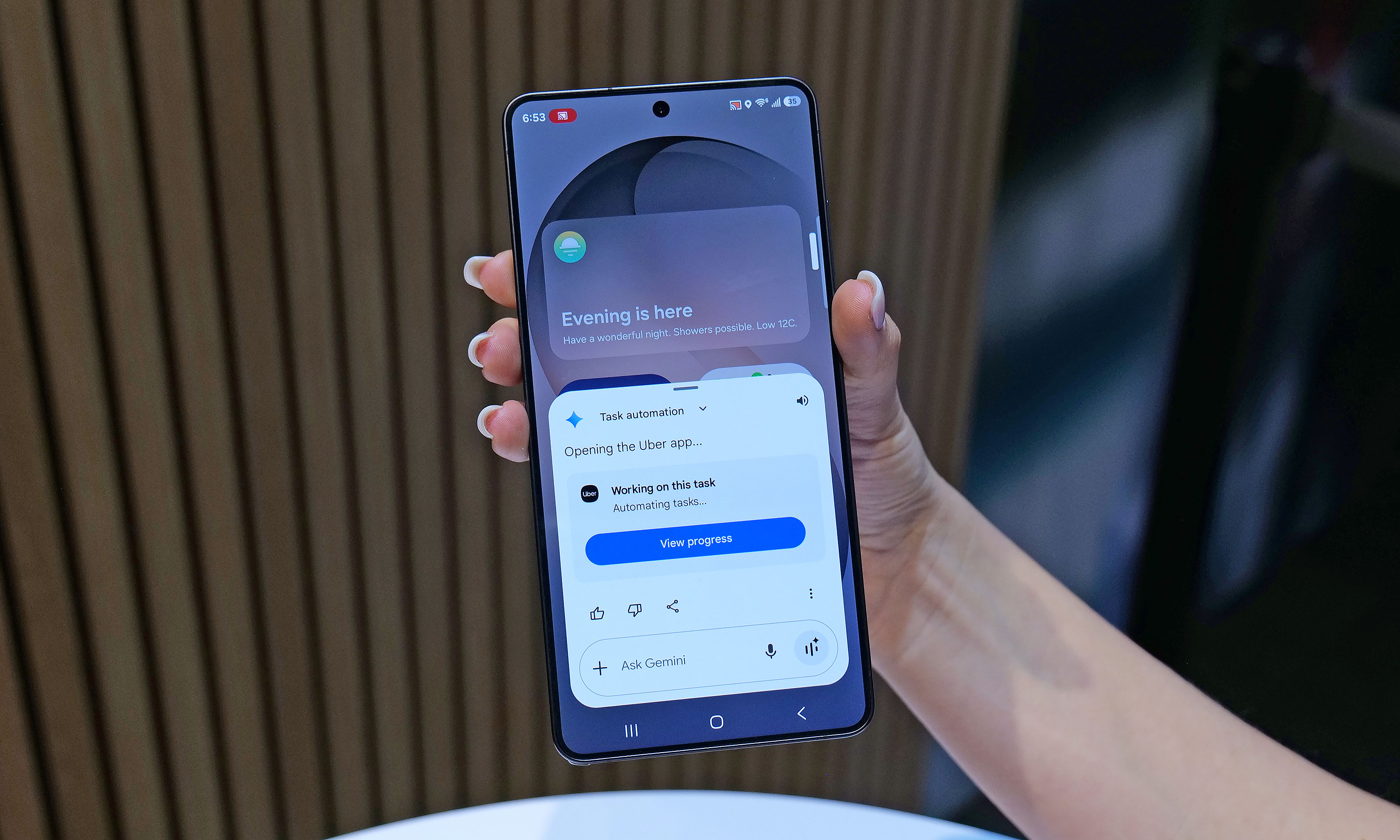
One of the S26's most powerful new AI features is Automated App Actions, which allows the phone to do things like book a car ride via Uber while you continue to use other apps in the foreground.
Sam Rutherford for Engadget
To me, the most impressive of the bunch is the S26’s Automated App Actions, which allow you to ask the phone to do slightly more complicated tasks like ordering an Uber to a specific location. After your initial prompt, Gemini can even complete the task in the background while you go back to doomscrolling or watching videos. When it’s done, you’ll get a notification so you can manually review and confirm the command. Unfortunately, Uber will be the only supported app at launch, though Samsung says it’s working on expanding the feature to others like Instacart.
Early thoughts
The Galaxy S26 Ultra will be available in four main colors: sky blue, black, cobalt violet and white, along with two more online exclusive hues in silver shadow and pink gold.
Sam Rutherford for Engadget
Look, there’s no getting around it: $1,300 is a lot to spend on a phone. That said, considering the RAM shortage that’s going on right now, keeping the S26 Ultra’s price the same as last year’s phone feels like a small blessing. And when you get that on a handset with a more refined design, a beefier chip, a fancy Privacy Display, faster charging and an updated generation of AI-powered tools, Samsung’s latest flagship feels like a much better deal than its predecessor. Really, the only thing that hasn’t been improved is the Ultra’s S-Pen, which as time goes on, is starting to feel more and more like a consolation prize for people who are still nostalgic about the Note line than a true tentpole feature.
Now this doesn’t mean that people with an S25 Ultra or even an S24 Ultra should run out and upgrade. But for anyone with something older than that who’s in the market for a true do-everything phone, the S26 Ultra has quite a bit to offer.
This article originally appeared on Engadget at https://www.engadget.com/mobile/smartphones/samsung-galaxy-s26-ultra-hands-on-meaningful-tweaks-plus-a-slick-new-privacy-display-180000057.html?src=rss
There’s a type of knife tech often seen in science fiction that revolves around vibrating a blade to increase its sharpness. We’ve seen examples of this in franchises like Star Wars (vibroblades), Evangelion (the prog knife), Dune (pulse-swords) and the Marvel universe (vibranium), but what might surprise you is that the underlying science is sound. By vibrating a cutting tool at high frequencies, not only do you reduce friction, you essentially turn the blade into a saw, as tiny oscillations enhance the inherent sharpness of a blade.
However, up until recently, this tech largely only existed in fiction or for large companies that have the money to utilize the tech on an industrial scale. But that's changing in a big way for home cooks this year thanks to Seattle Ultrasonics, which is releasing the world's first ultrasonic chef's knife: the C-200. After chopping, smashing and cooking with it for about a month, I'm convinced that this is the future of kitchen knives.
Design
From afar, the C-200 looks a lot like a regular 8-inch chef's knife, but with a slightly more contemporary design. It features a three-layer san mai blade made from Japanese AUS-10 steel with a 13-degree edge angle per side (26 degrees total). However, upon closer inspection, you'll notice there are some features that seem a bit out of place on a premium knife.
The first is that the C-200 doesn't have a full tang, which is the back end of a blade that ideally extends into the handle to provide added strength and durability. This is usually a major no-no, particularly on a $400 knife. However, when you consider that Seattle Ultrasonics needed somewhere to put its vibration tech, there really isn't any room for it other than inside the knife's grip.
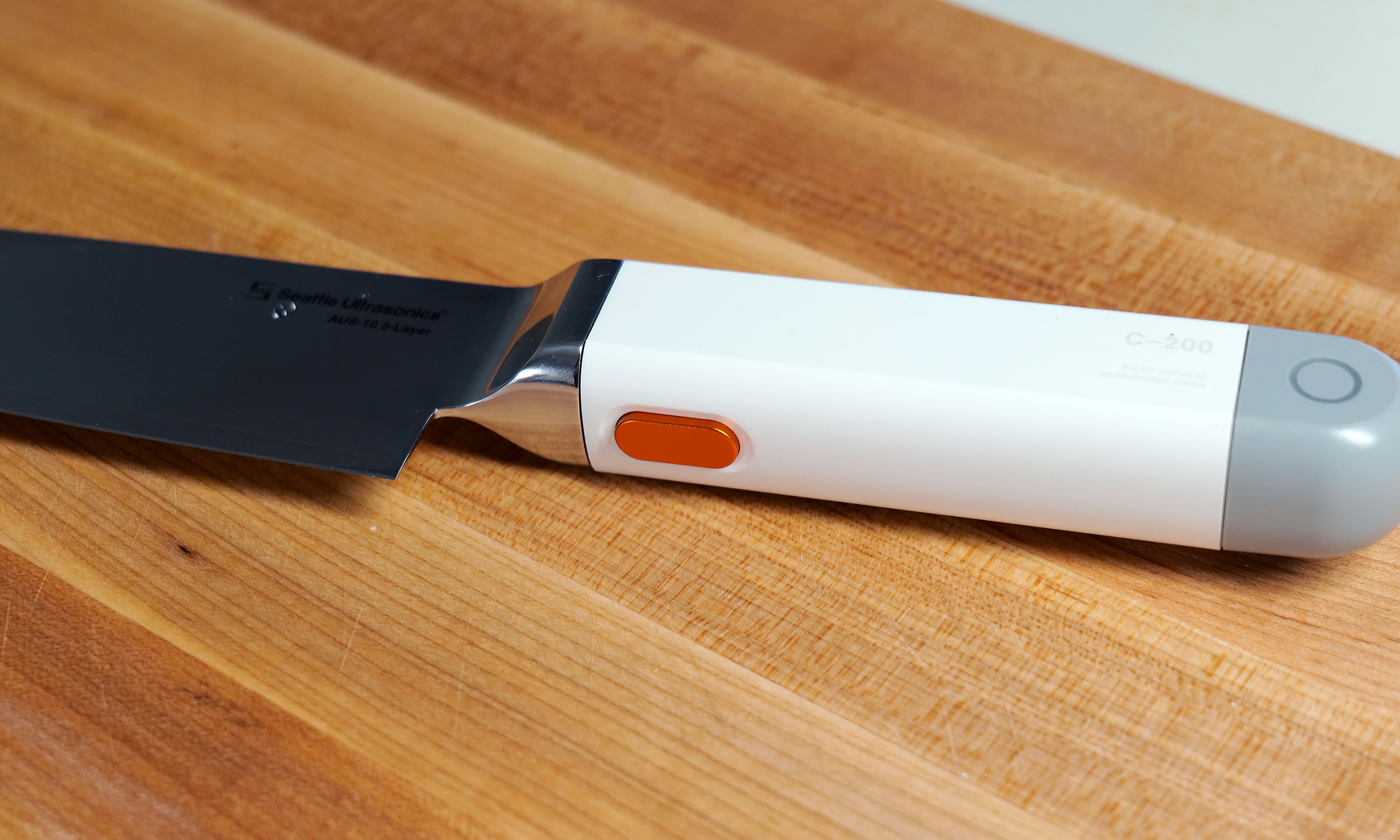
You won't be able to feel it, but pressing this button allows the C-200's blade to vibrate 30,000 times per second.
Sam Rutherford for Engadget
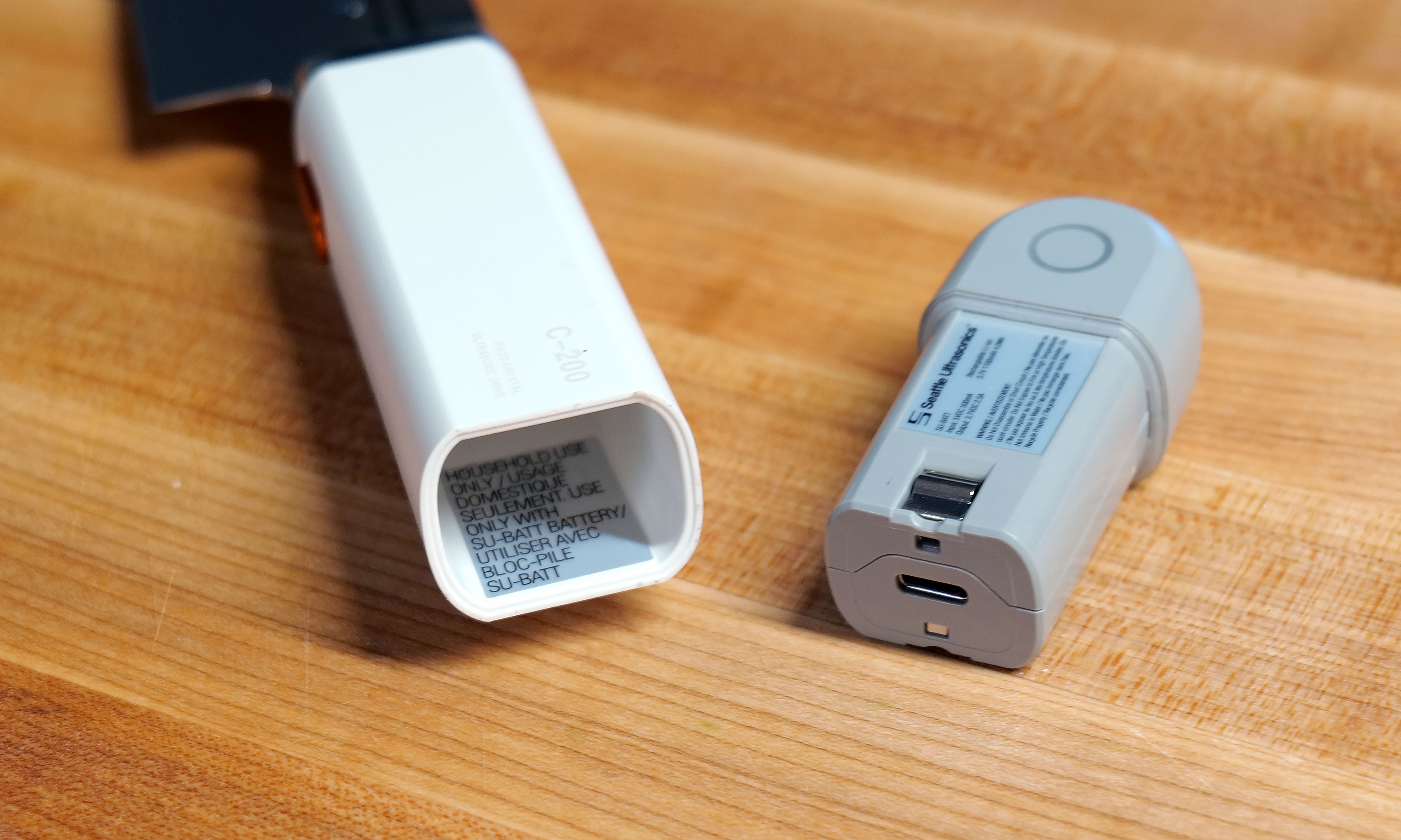
The knife's second quirk is that the back of the plastic handle features small indicator lights on either side, which is obviously a bit weird. Furthermore, the entire gray section can be removed to reveal a small 1,100mAh battery with an onboard USB-C port. Frankly, the presence of a battery in a knife is just kind of funky. But hey, the power to vibrate the knife has to come from somewhere because it definitely isn't being generated by your hands. And while Seattle Ultrasonics doesn't include a charging adapter or cable in the box, I don't mind because the company wisely took cues from the larger gadget industry and went with a power spec that's already widely in use. Honestly, I wish more kitchen tech makers would do the same.
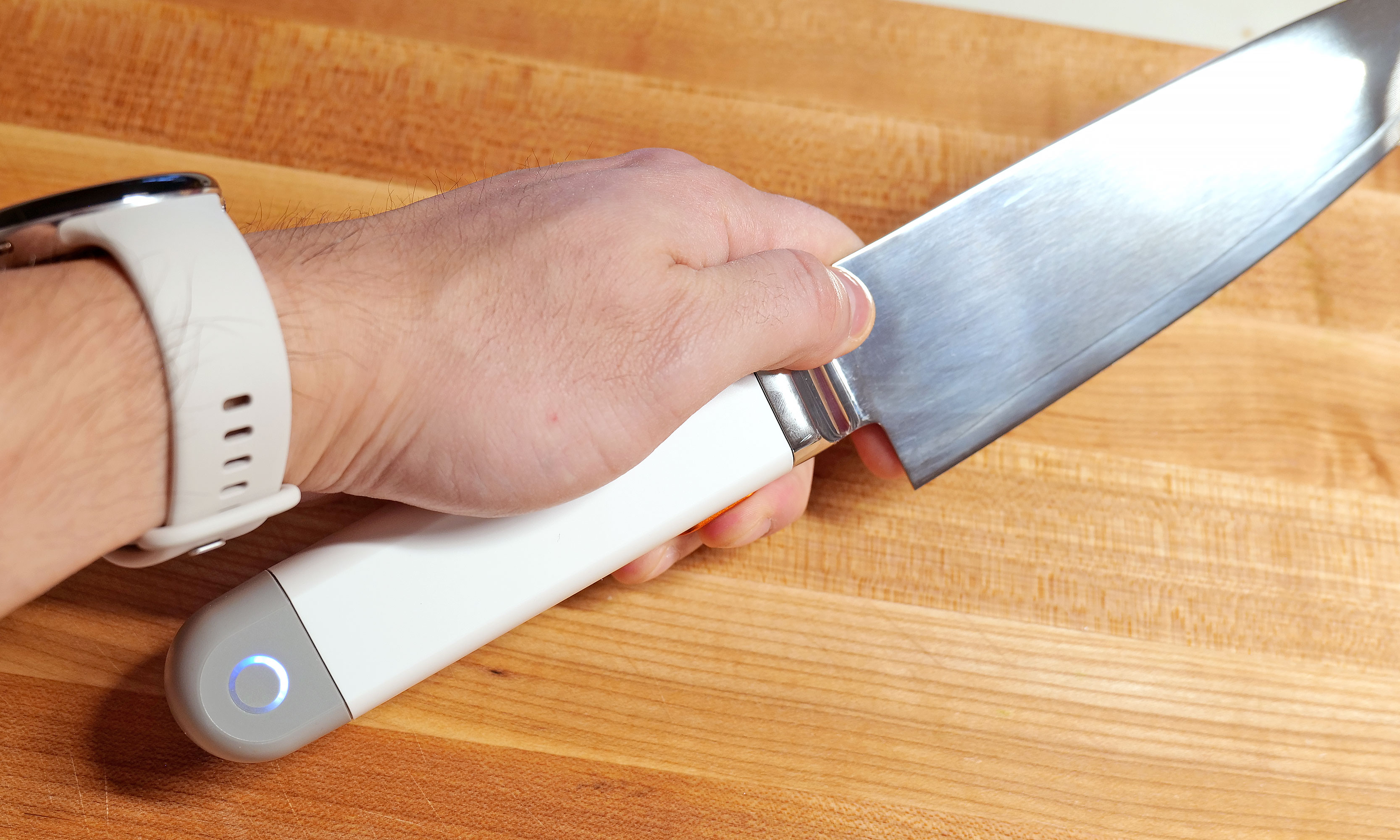
However, the knife's biggest oddity is the big orange button on the bottom of its handle. This is what you use to make the blade vibrate, which it does at 33kHz. It's positioned well so that it's easy to press regardless of whether you do a traditional pinch grip or if you're a bit more casual and prefer to hold the knife only using its handle. In the future, I can see this button becoming a touch-sensitive sensor, but for now, it's simple and effective.
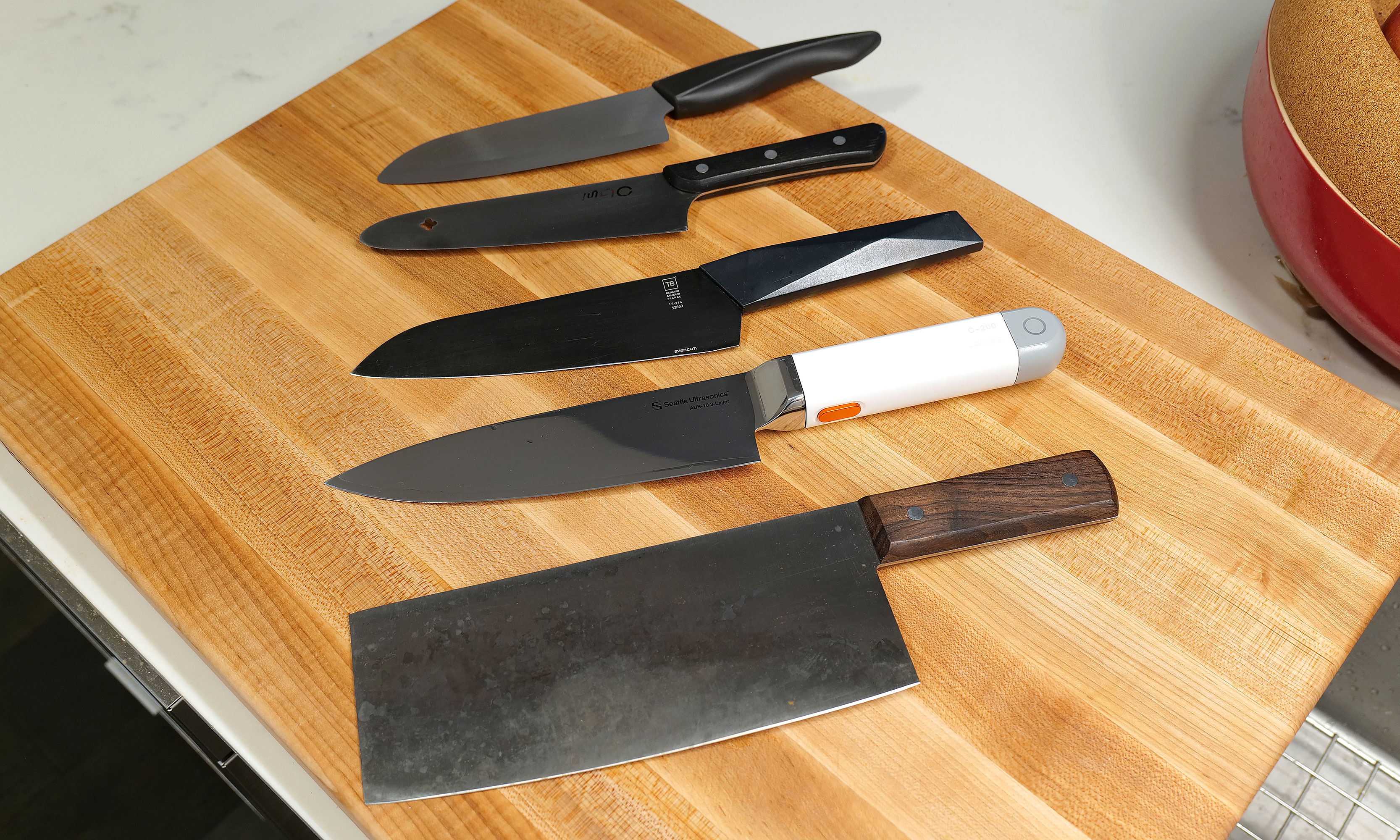
Here's a small selection of knives I own sorted by weight (from top to bottom) compared to the C200: 6-inch Kyocera ceramic knife (97 grams), MAC molybdenum steel chef's knife (110g), Furtif Evercut titanium carbide chef's knife (190g), Seattle Ultrasonics C-200 (328g), Korin carbon steel cleaver (396g).
Sam Rutherford for Engadget
The main downside to the C-200's design is that at 328 grams (around 0.75 pounds) it's heavier and bulkier than a typical knife. When compared to other knives I own, which are made from a wide variety of materials including, ceramic, molybdenum steel, carbon steel and even titanium carbide, it weighs more than everything else aside from my big Chinese cleaver (396 grams). And while it fits nicely in my hand, my wife said it takes a bit more effort for her to wield. It's not too much to the point where you don't want to use it. But for quick tasks, sometimes I found myself subconsciously reaching for lighter options like my 6-inch ceramic knife, which weighs just 97 grams.
How it works
From a user standpoint, putting the C-200 to work couldn't be simpler. Just press the button and let the knife do its thing. The big difference from how knives like this work in sci-fi is that there's no audible hum or detectable vibration when it's on. It's practically silent (well, most of the time, but more on that later), so you have to trust that it's on or check the indicator light on the handle. That said, if you still don't believe anything is happening, you can run the edge of the blade under water or scrape it over some cut citrus, at which point the blade's vibration will atomize nearby liquid into a fine mist. It's a cool party trick that also doubles as a way to amp up a cocktail by adding a faint essence of lemon, lime or anything else you can think of.
Pushing the C-200's button is super easy, regardless of what kind of knife grip you prefer.
Sam Rutherford for Engadget
Inside, the knife relies on PZT-8 piezoelectric ceramic crystals to generate up to 30,000 vibrations per second, which propagate down the blade and make the knife function as if it's sharper than it actually is. This all sounds rather fantastic, so how does it function in the real world?
In-use
To really put the C-200 through its paces, I cooked over a dozen meals that involved neatly slicing or preparing a wide variety of foods — including Hasselback potatoes, flank steak, pork belly, chives, sushi-grade tuna and all sorts of fruit.
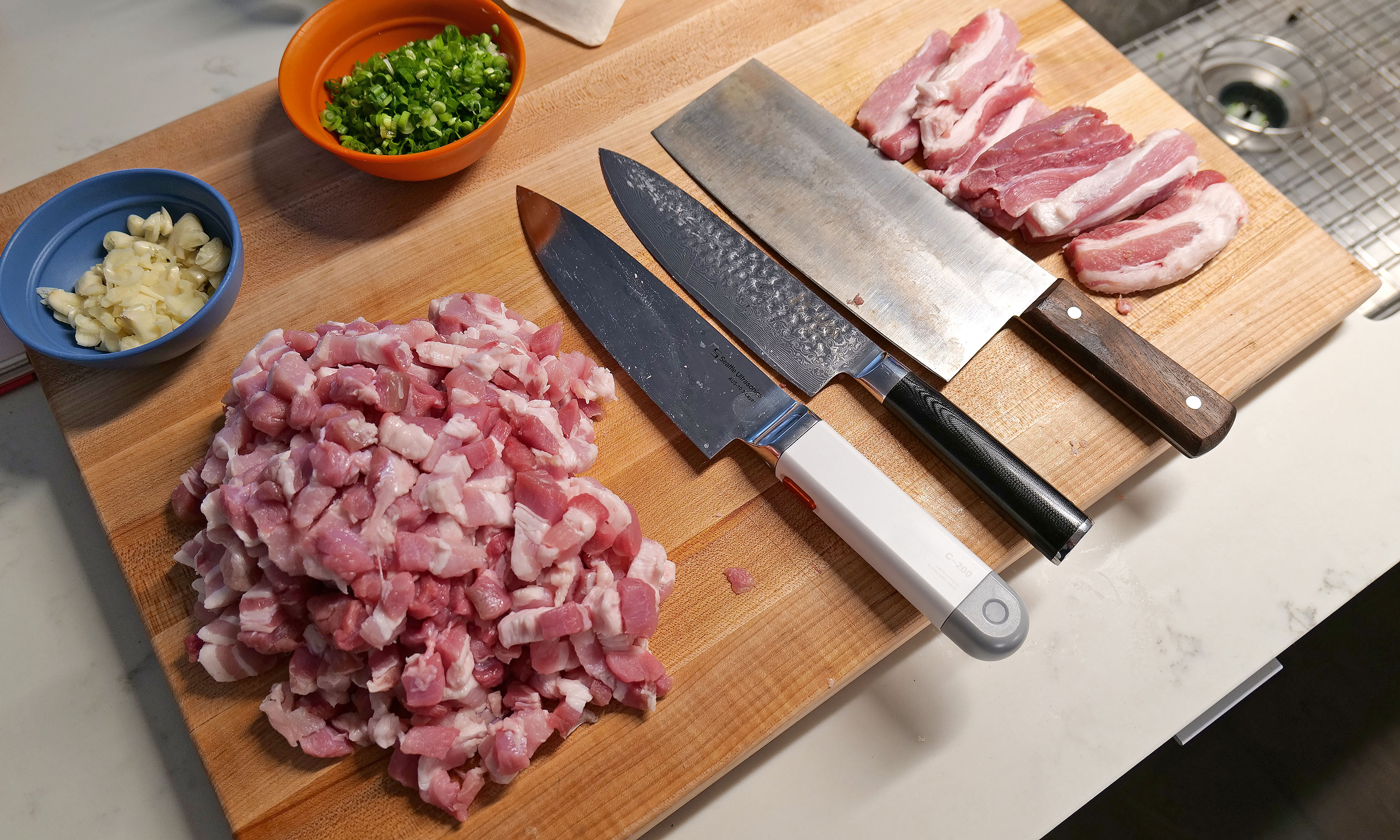
After prepping four pounds of pork belly with various knives, the C-200 really showed off how much of a difference its vibration tech makes.
Sam Rutherford for Engadget
In short, the C-200's effectiveness depends a lot on what you're chopping. For soft things like strawberries or a piece of cake, I didn't notice much of a difference. To make things even more difficult, the knife arrived out of the box with an incredibly fine edge — the kind that makes shearing through a sheet of paper child's play. So even though Seattle Ultrasonics says its knife can reduce cutting effort by up to 50 percent, there's not much gain to be had when slicing foods that could just as easily be cut by a butter knife.
However, as I used it more, I found that the C-200 excels at cutting through delicate items like tomatoes, scallions and fish, where using a dull knife often results in bruising the food as you chop. This was most evident when I made poke at home, where Seattle Ultrasonic's knife delivered cleaner, more precise cuts than anything else I own.
For me, the C-200's $399 price tag is almost worth it just so I have an an easier time making my one of my all-time favorite dishes (lu rou fan).
Sam Rutherford for Engadget
When I whipped up some pico de gallo, I distinctly noticed how neatly the C-200 sliced through the skin of a tomato, instead of initially putting a crease in it before cleanly passing through its interior — which often happens when using dull knives. An additional benefit is that because of the vibrations, I found some foods like garlic didn't stick to the side of the blade as much. This made it easier to keep track of how much I chopped while simultaneously reducing the mess from things falling willy-nilly during prep. But perhaps the most obvious demonstration of the knife's prowess was when I diced an onion. When using my other knives or the C-200 without powering it on, I could feel when I tried to cut through thicker, more sturdy layers. But then, at the touch of a button, I was able to slice down with practically no resistance. It's almost shocking because it feels like magic.
The C-200 truly excels at cutting denser foods like flank steak. Sadly mine ended up closer to medium than medium rare, but that's not the knife's fault.
Sam Rutherford for Engadget
The C-200 even has the ability to reduce the importance of certain knife techniques. Anyone who's seen all the posts on r/kitchenconfidential about cutting chives will already know what I'm talking about. As J Kenji Lopez-Alt neatly demonstrated, the ideal way to get crisp, clean slices is to do a subtle forward or back cut instead of simply chopping straight down. But with Seattle Ultrasonics' knife, I've found that it's so sharp you can get away with almost any motion and still get good results. And if you do it the right way, things are even better.
Other types of food that makes the C-200 really shine are denser ingredients like meat and potatoes, where you can really feel the added cutting power. Previously, when I had to break down thick cuts of protein, I sometimes wished I owned a serrated electric knife. You know, the kind you break out once a year on Thanksgiving and then it sits and gathers dust for the other 364 days. But the C-200 made that desire a thing of that past, as it quickly and easily worked through flank steak while once again producing neat, uniform slices.
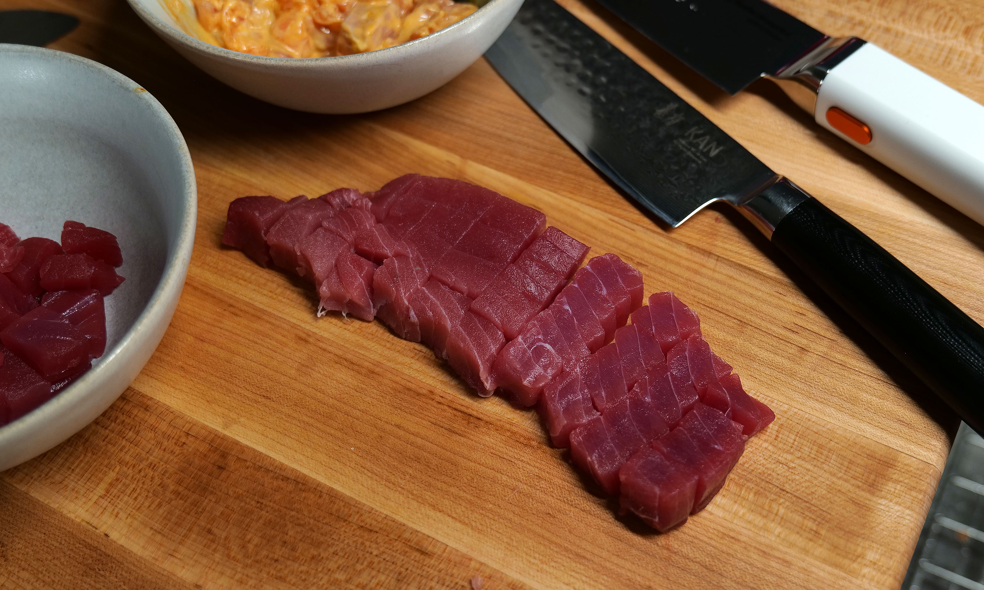
Sushi-grade tuna is another food that really shows off how the C-200's increased sharpness is better at preserving the delicate texture of the fish.
Sam Rutherford for Engadget
My favorite application of the C-200 was when I was doing prep for Taiwanese braised pork (aka 滷肉飯). Despite this being one of my most beloved dishes that I taught myself how to cook because I couldn't easily find it from local restaurants, I don't make it very often because it's a lot of work to cut multiple pounds of pork belly into small lardon-shaped pieces. Here, the knife's vibrations made it so much easier to cut through all those layers of meat, fat and skin. If there's any situation where the C-200 makes it 50 percent easier to slice through something, it's this.
It might be hard to tell, but I was able to cut chives a little finer and more neatly with the C-200 (left) than with my other knives.
Sam Rutherford for Engadget
During my testing, two small issues cropped up. While it was quite rare, the knife would sometimes emit a faint high-pitched whine. When I asked Seattle Ultrasonic's founder Scott Heimendinger about this behavior, he was rather frank, saying that this can occur when water or moisture accumulates in just the right spots on the blade. Furthermore, he said this only happens on a small number of V1 models, which the company is working to fix in the future. Thankfully, I don't mind, but if it bothers you, making the noise go away is as easy as wiping down the knife down with a cloth or paper towel.
The C-200s battery can be easily removed for cleaning and charging.
Sam Rutherford for Engadget
The other complication came while I was working through the multiple pounds of pork belly I mentioned earlier. After 10 to 15 minutes of continuous use, the knife beeped and its indicator light turned red. Turns out the knife had overheated, which was something I had not even considered. This led to higher-than-normal temperatures inside the knife's sealed electronics causing it to shut off. But after just 30 seconds, it returned to form. During later uses, I learned that simply taking my finger off the button between tasks, which happens naturally as you prep anyway, was more than enough to stop that situation from happening ever again.
On the flipside, I was happy to discover that despite lacking a full tang, the C-200 can handle fairly rough tasks, including laying the knife on its side to smash garlic or jamming it into an avocado to remove its pit. That said, I would really recommend against doing the latter, because between its inherent sharpness and its vibration tech, this is the first knife I've used that can slice cleanly through an entire avocado with almost no extra effort.
Cleaning and care
The Seattle Ultrasonics C-200 8-inch chef's knife features an IP65 rating for the whole device, though the front half is actually a bit more resistant thanks to an IP67 rating for its button and bolster.
Sam Rutherford for Engadget
The last big concern about a knife with built-in electronics is how it handles clean-up. Thankfully, the C-200 features an IP65 rating for dust and water resistance. That means it can withstand rinsing and splashes without issue. And it's actually even tougher than that, because the front of the knife, including its bolster and button, are rated IP67. This means it can take full submersions in water if need be. However, just because you can, doesn't mean you should. Good kitchen protocol says you don't throw knives you care about in the sink and forget them, just like how you wouldn't put one in the dishwasher either.
But perhaps the greatest advantage of this tech is that it allows you to go longer between needing to get your knives sharpened, which if you're like most home cooks, is probably never. To be clear, I haven't tested this and in some respects I wish I had been able to test out a dull version of the C-200. That said, science dictates that slice for slice, an ultrasonic knife will simply cut better than an equivalent blade without the extra tech. So if you believe in the adage that a dull knife is more dangerous than a sharp one because you need to apply more force to get the same results, this is another bonus for both safety and convenience.
The not-so-optional accessory
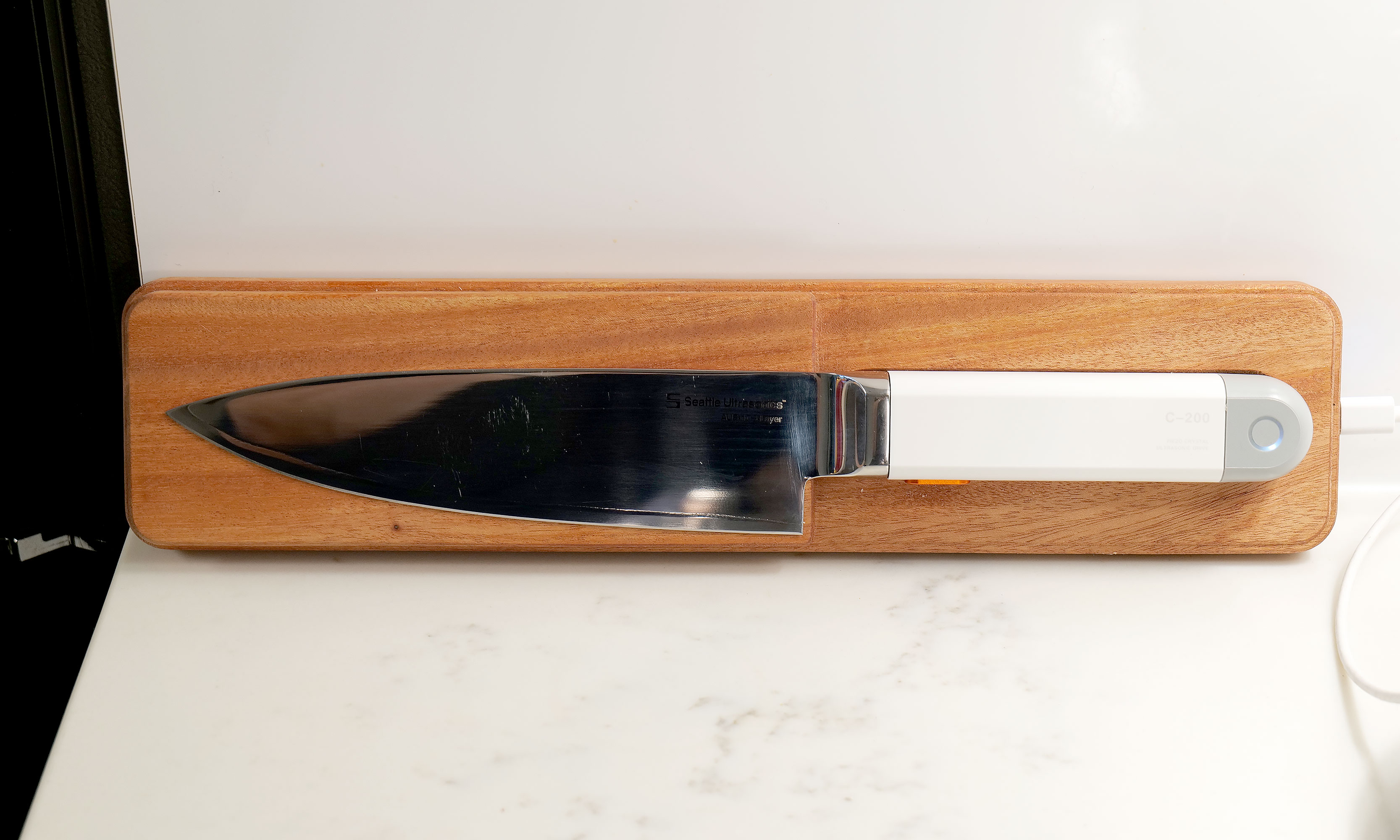
Seattle Ultrasonics' wireless charging tile makes it incredibly easy to forget that the C-200 needs to be topped up between uses.
Sam Rutherford for Engadget
I fully admit the need to keep a knife charged up is a major annoyance and something I or anyone else probably doesn't want to do. Thankfully, Seattle Ultrasonics thought of that by including support for wireless charging via the C-200's magnetic tile and it's dead simple to use. Just toss it on the charger when you're not using and it will take care of itself, so you never have to worry about how much of its normal 20-minute runtime it may or may not have left. There are also holes around back so you can easily mount the charger on a wall or shelf. In short, the added convenience the charging tile brings is so valuable that I don't really consider it an optional accessory. If you're getting the C-200, you need to buy this too, which sadly means you're looking at an all-in price of $500 for the bundle instead of just $400 for the knife by itself.
Wrap-up
As much as I love old-school knives, they'll simply never be as sharp an equivalent blade with this newfound tech.
Sam Rutherford for Engadget
After using the C-200, I don't think people need to rush out and throw all their old-school knives in the trash. The beauty of an ultrasonic blade like this is that it can handle everything your old cutlery is meant for, but with the touch of a button, it delivers sharpness unlike anything you've experienced before. And while it has some quirks, they're nothing like the kind you typically encounter on first-gen gadgets. Its biggest drawback is that its magnetic charging tile feels like an essential accessory, but it adds extra cost on top of a product that already has a deservedly premium price tag.
Even though I'm sure knife makers will continue tweaking blade shapes and alloy mixes from now until the end of time, the addition of ultrasonic vibrations to a chef's knife unlocks a completely new tier of performance. That's because this technology is additive. All it does is enhance what a blade already does best. And when you look at related gadgets in the maker space, I don't think it's a coincidence that there's a similar revolution that resulted in Adam Savage of Mythbusters fame naming a sonic cutter as one of his favorite things of 2025. When viewed that way, it makes me even more confident that the C-200 is the flagbearer for a new breed of kitchen knives.
This article originally appeared on Engadget at https://www.engadget.com/home/kitchen-tech/seattle-ultrasonics-c-200-review-this-is-the-future-of-kitchen-knives-140000051.html?src=rss
Getting a solid Android phone doesn’t necessitate spending a small fortune. The best budget models strike a great balance between price and performance, giving you smooth everyday use without cutting too many corners. Whether you’re scrolling social media, streaming your favorite shows or snapping photos of a night out, there’s an affordable Android phone that can handle it all.
Cheaper phones have come a long way in recent years. Many now feature bright, fast displays, reliable cameras and battery life that lasts well into the next day. You might miss out on top-tier extras like the latest processor or ultra-high-resolution zoom, but what you get instead is value that makes sense. Some models even surprise with cameras that rival far pricier flagships, making them ideal for casual photographers or anyone who just wants to capture a great shot on the go.
We’ve tested budget Android phones from brands like Google, Samsung and OnePlus to find the ones that deliver the most for less. These are the models that prove you don’t need a flagship price tag to get a dependable Android phone.
Best budget Android phones for 2026
How cheap should you go for an Android phone?
We tend to define a budget smartphone as costing between $150 and $350. Any lower and the device runs the risk of suffering from too many compromises in function, and above that, you cross over to pricier midrange handsets (if you're open to spending more, we shouted out a couple of our favorite flagship phones at the very end of this guide).
But for those with a little wiggle room, there are some things to consider. For example, a child may be better off with a cheaper device, especially if it’s intended mainly for emergencies, WiFi browsing or texting parents (and not social media). On the higher end of this price spectrum, sub-$350 Samsung phones and other Android devices have come a long way thanks to improved performance, better phone cameras with low-light capabilities, fast charging, and nicer displays like AMOLED panels. This makes them a viable alternative to, say, a flagship handset with a premium design, even if you have the flexibility to spend more.
What to look for in a cheap Android phone
When it comes to cheap phones, you get what you pay for. Most smartphones in this price range are made out of plastic, though the fit and finish of a specific model can vary a lot based on price. A bright screen is also important. Typically you’ll get LCD panels with a 60Hz or 90Hz refresh rate, but some phones may have OLED or AMOLED screens with increased color saturation. Long battery life is critical as well, so we tend to favor devices with larger power cells of around 5,000 mAh. In this price range, performance can vary a lot, so look for devices with at least 8GB of RAM and processors that can deliver stutter-free visuals. It’s also important to consider support length: as periodic security updates and lengthy software support can extend the longevity of your device, which will save you money in the long run.
Android phone FAQs
What's the price difference for a cheap Android vs a cheap iPhone?
iPhones tend to be more expensive compared to Android phones — even the cheapest iPhone, the iPhone SE, which starts from $429, is a harder pill to swallow compared to a cheap Android phone. In contrast, you can get your hands on a cheap Android device for as low as $100.
This article originally appeared on Engadget at https://www.engadget.com/mobile/smartphones/best-cheap-android-phone-160029703.html?src=rss
Toy Fair 2026 just wrapped earlier this week and while I would have liked to spend even more time there, I have my own kids (and all their toys and trinkets) to look after. That said, there were a ton of cool new products on display at the Javits Center in New York City that set the stage for the rest of the year, so here's a quick look at some of the most interesting releases from the largest toy show in the Western Hemisphere.
To celebrate the 40th anniversary of Transformers: The Movie, Hasbro is launching an apology tour to make up for traumatizing theatergoers with the death of the most beloved Autobot back in 1986. To kick things off, Hasbro is releasing a handful of new figures alongside re-releases for some popular bots including Astrotrain, Skywarp, Snarl and Shockwave. I want to give a special shout-out to the model for Kranix, which looks incredibly accurate, as if he just leapt off the movie screen. And even though his duck-billed spaceship alt-mode might look a bit awkward, I wouldn't have it any other way.
The crown jewel of the line might be a near-life-size version of The Matrix of Leadership, which measures more than 15 inches wide and even plays Stan Bush's iconic song "The Touch" with the push of a button. Unfortunately, the appeal of the Matrix is so powerful that it's already sold out, including at third-party retailers like Big Bad Toy Store, which thankfully is still taking pre-orders for the rest of the lineup after the initial stock from Hasbro dried up.
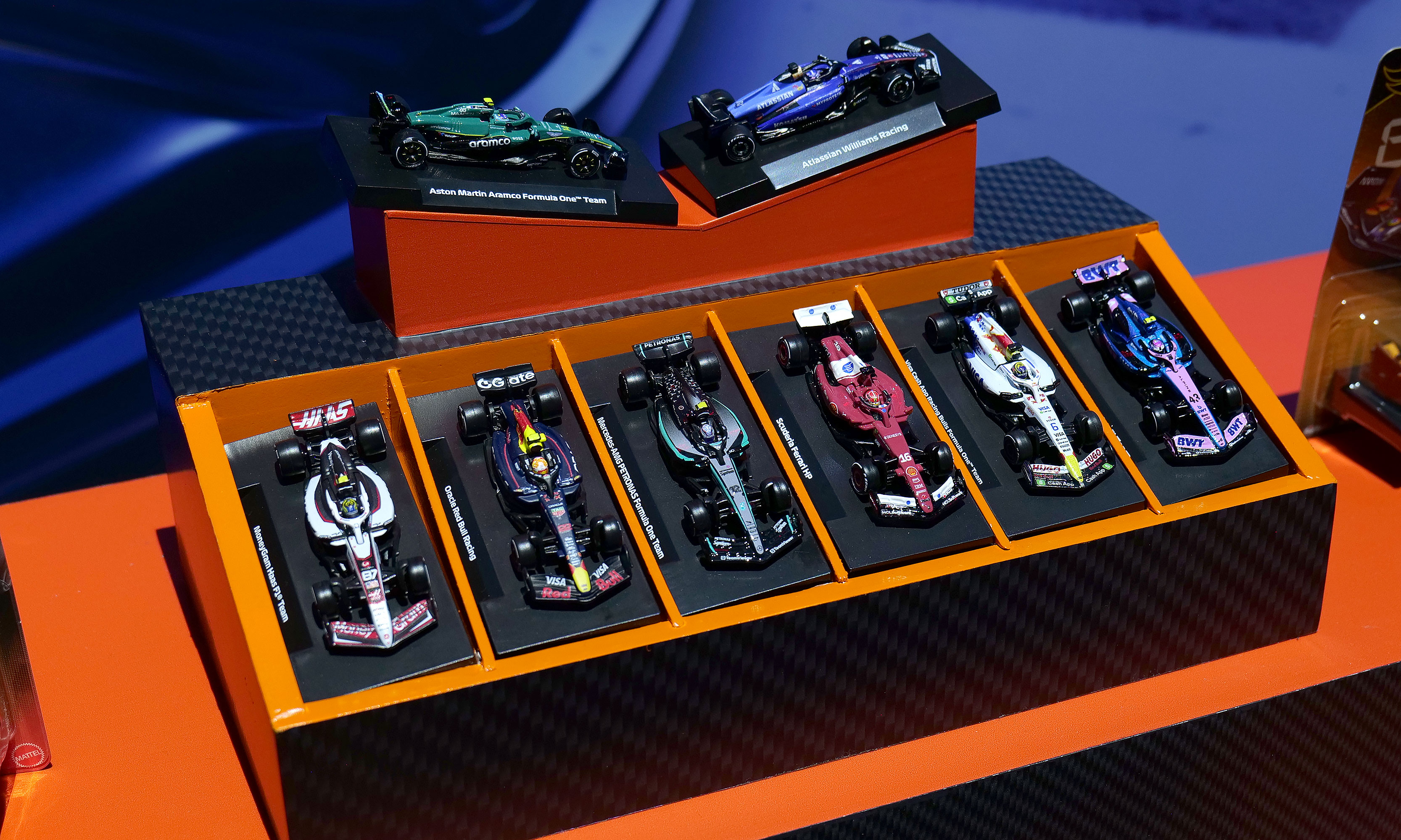
A collection of some of the new F1 Hot Wheels cars for 2026.
Sam Rutherford for Engadget
Hot Wheels has big plans for 2026 including a new line of Pantone-colored cars, Brick Shop models like the Elite Series Aston Martin (which comes with its own 1:64 scale car) and a Monster Truck Mutant Chaos set with actual slime. However, I'd argue the company's new F1 offerings are the cream of the crop. Not only are there a bunch of incredibly detailed 1:64 scale racecars with metal bodies, real rubber tires and accurate livery for all the big teams, there's also a new Downhill Circuit Race course that comes with three official vehicles (Mercedes, Haas and Ferrari) featuring multiple levels and the ability to overtake or crash into other cars. If you're like a lot of Americans who have recently fallen down the F1 rabbit hole due to Netflix's Drive to Survive, these new officially licensed miniatures are sure to hit the spot.
The first five-pack set of cars is available now, with more arriving later this spring before the Downhill Circuit Race course drives by sometime this fall.
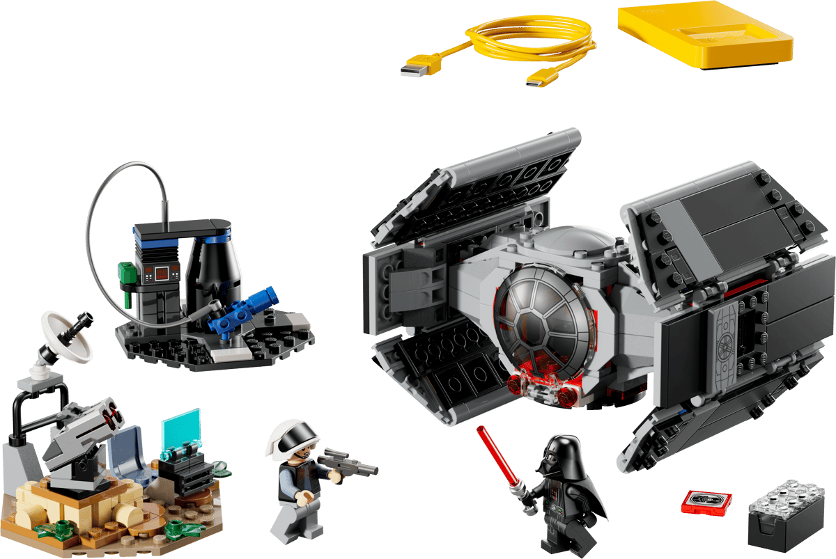
Darth Vader's TIE fighter is an all-in-one set, which means it comes included with one of Lego's Smart Bricks, which isn't true for every kit.
Lego
We've been eagerly awaiting the first batch of playsets featuring Lego's nifty Smart Brick after it debuted at CES. But now that the company has detailed eight new sets featuring its latest innovation, we're even more intrigued. For me, the three standout kits are the Millennium Falcon, Luke's Red Five X-Wing and Darth Vader's TIE fighter because acting out the Death Star trench run complete with reactive lights and sounds will never get old. I also have a soft spot for the Ewok minifigs that come with the AT-ST set. Alternatively, the Mos Eisley Cantina kit seems like a great way to highlight the smart brick's ability to play music or kick out some rowdy droids. The one thing to look out for, though, is the tag on the set that says whether it's Smart Play compatible or if it's an all-in-one set, because the former will need Smart Bricks from other kits to deliver Lego's newfound interactivity.
Pre-orders for these are live now, with sets slated to ship on March 1.
All the new K-pop Demon Hunters toys
The HUNTR/X Battle Rumi Deluxe Fashion Doll (right) might be my favorite of the bunch.
Sam Rutherford for Engadget
Rumi, Mira and Zoey may have been the biggest breakout stars of 2025 and Mattel is looking to keep that momentum going with a ton of new toys and figures for everyone's favorite demon hunters. There are three new singing dolls that can belt out the trio's hit "Golden" at the touch of a button and a deluxe figure of Rumi complete with her Four Tiger Sword. There are also a ton of other dolls and miniatures showcasing HUNTR/X, the Saja Boys and more. The one downside is that these products aren't coming out until the fall, so you'll have to tide yourself over with other K-pop-themed products for now.
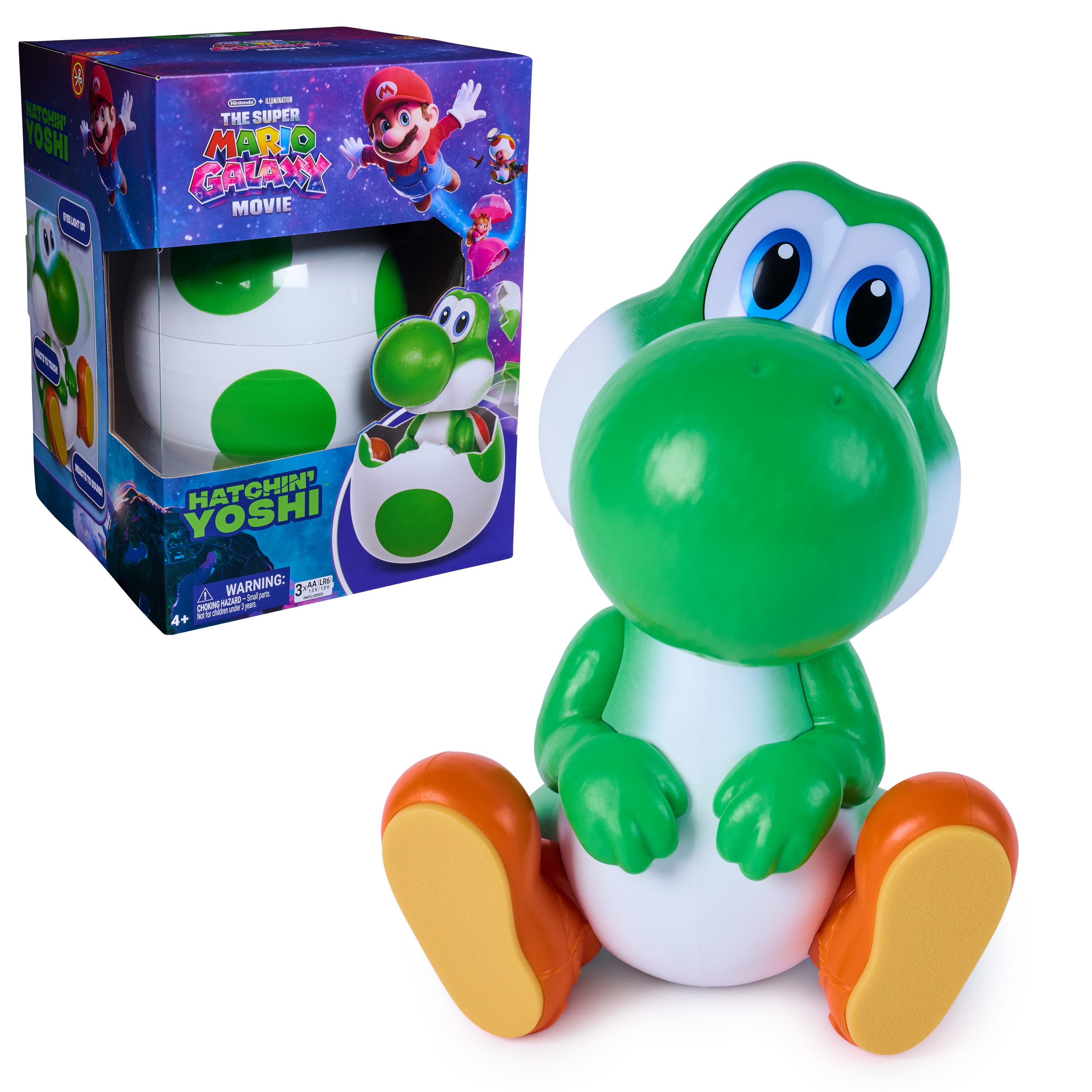
If Rosalina isn't careful, Yoshi will become the biggest draw of the new Mario movie.
Spin Masters
Yoshi seems poised to steal the spotlight from Rosalina in the upcoming Super Mario Galaxy Movie and this release from Spin Masters is only reinforcing the lovable green dino's aura. From inside his shell, Yoshi can burst out with his signature yell. After that, you can pat his nose to make his eyes light up or get him to rock when he's really happy. But if you want one, you're going to have to be vigilant. Pre-orders are already sold out, so you'll need to keep a close eye on retailers like Walmart when he officially goes on sale on February 20.
Not only do the SolarFlowers look great, they're educational too.
Thames & Kosmos
Technically, these went on sale last month, but Thames & Kosmos' SolarFlowers caught my eye again at Toy Fair due to their combination of art and science. Available in four different styles, each kit features a model that you can build yourself or with your kids (recommended age 8+) that turns into a lasting showpiece. After putting the kinetic sculpture together, you can connect the included solar panel to bring the whole kit to life (no batteries required) and make the flowers spin for perpetual entertainment.
Honorable mentions
Upcoming Masters of the Universe figures
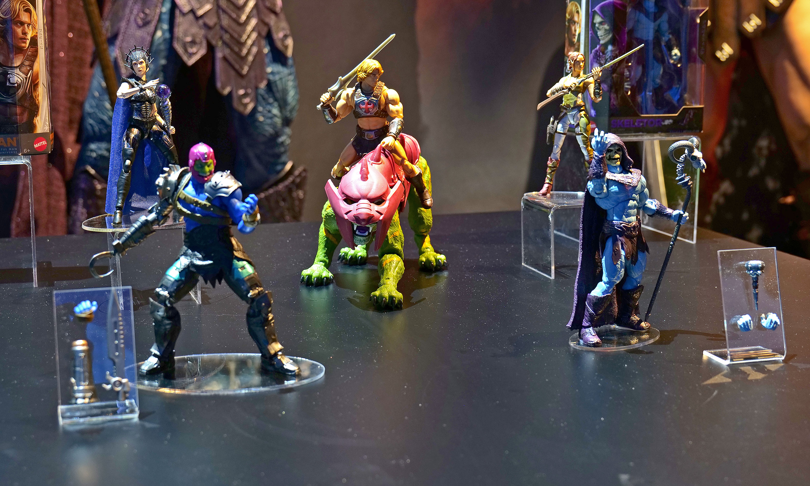
Some upcoming figures from Mattel's line of Masters of the Universe figures.
Sam Rutherford for Engadget
As someone who grew up during the 80s and 90s, I'm trying to be optimistic about He-Man's return to the big screen later this summer and Mattel's new line of figures is certainly helping. To help prime people for the movie, there's a big range of upcoming toys highlighting He-Man, Skeletor, Battle Cat and more, all of which I would have absolutely loved as a kid. Those will be available later this spring.
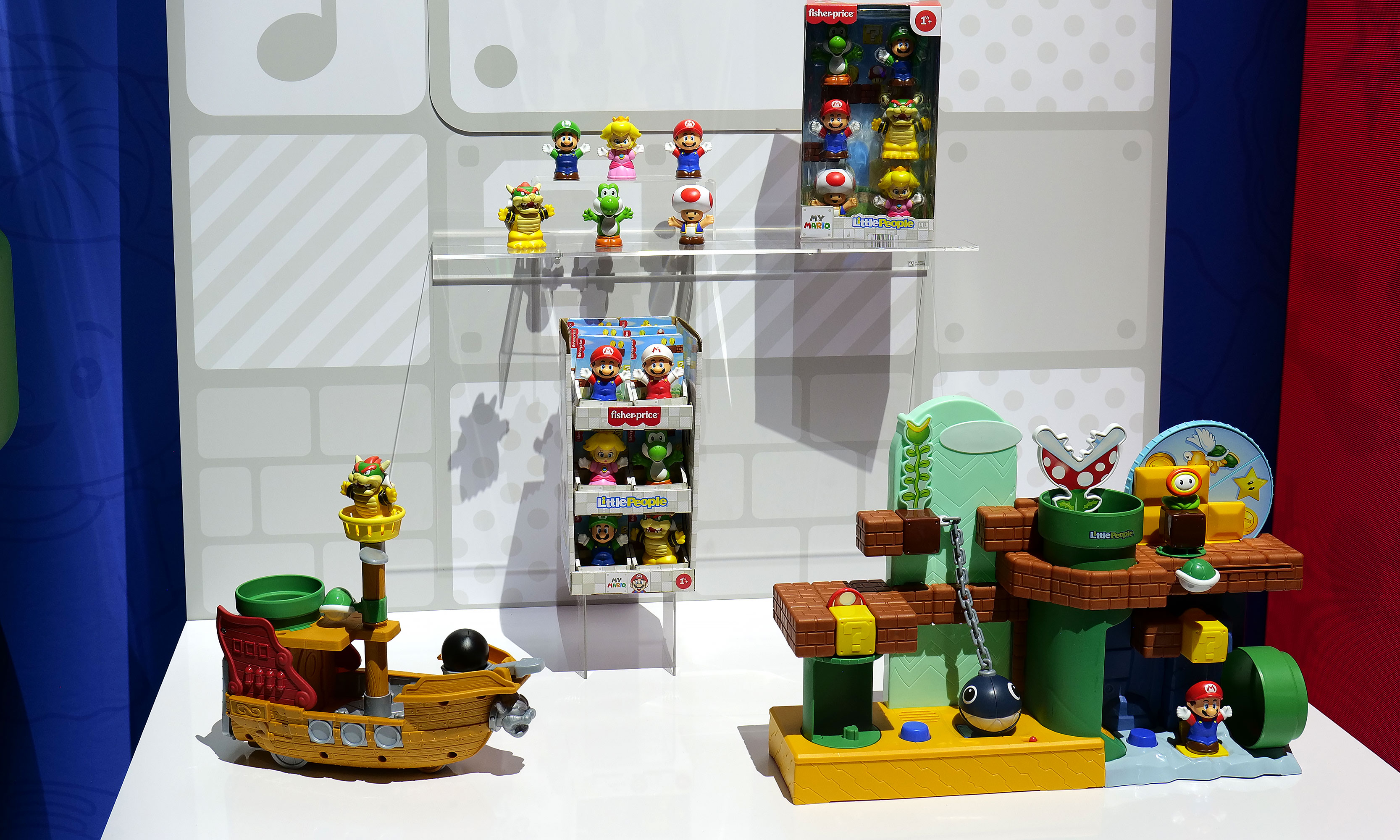
It's hard to gauge the excitement of toys aimed at one-year-olds when they can't read or get into Toy Fair. But as the parent of a toddler, I adore the partnership between Fisher-Price and Nintendo that has resulted in a line of Mario-themed Little People. All the big names are here, including Peach, Luigi and Bowser and there's even a couple of super cute playsets to go with them. But perhaps the best part is that a six-pack of figures and Bower's Airship costs under $25, which means your kid could be in for hours of fun without you spending a ton of money.
This article originally appeared on Engadget at https://www.engadget.com/entertainment/here-are-my-favorite-things-from-toy-fair-2026-183356720.html?src=rss
Google's A-series phones have offered some of the best value among midrange handsets for years, and after checking out the new Pixel 10a, I don't see that trend stopping anytime soon.
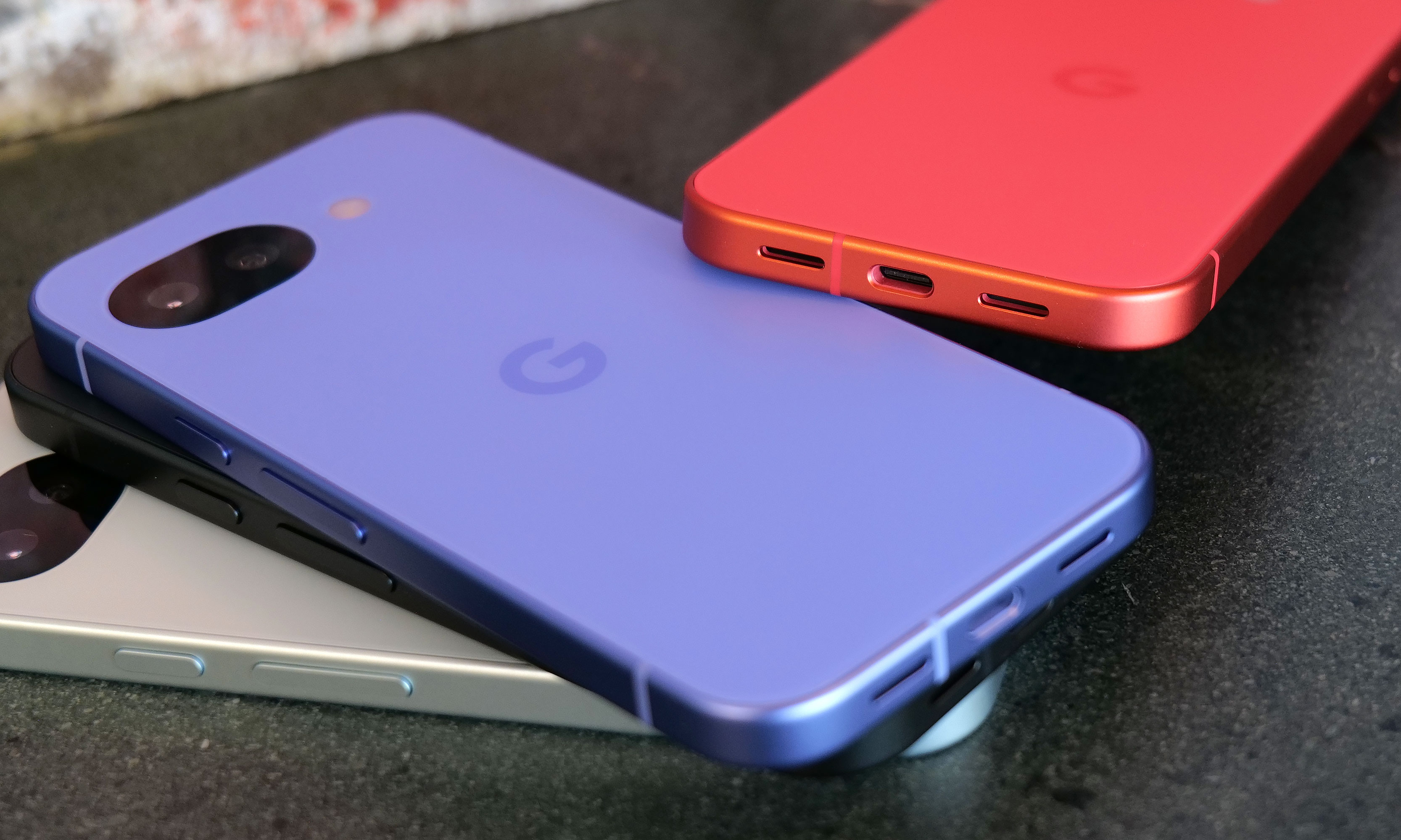
Let's start with the specs. Starting at just $499, you get a vivid 6.3-inch OLED screen with a 120Hz refresh rate and 3,000 nits of peak brightness, 8GB of RAM and either 128GB or 256GB of onboard storage. The phone also features a durable aluminum frame along with a stronger Corning Gorilla Glass 7i panel in front and a composite plastic back with a lovely matte finish. As a nod towards sustainability, Google says the P10a's chassis is made from 100 percent recycled material, while the rear panel comes in at 81 percent. And just like its predecessor, you still get an IP68 rating for dust and water resistance and the same battery capacity (5,100mAh) — except now it charges even faster, both wired (30 watts, up from 23) and wirelessly (10 watts, up from 5).
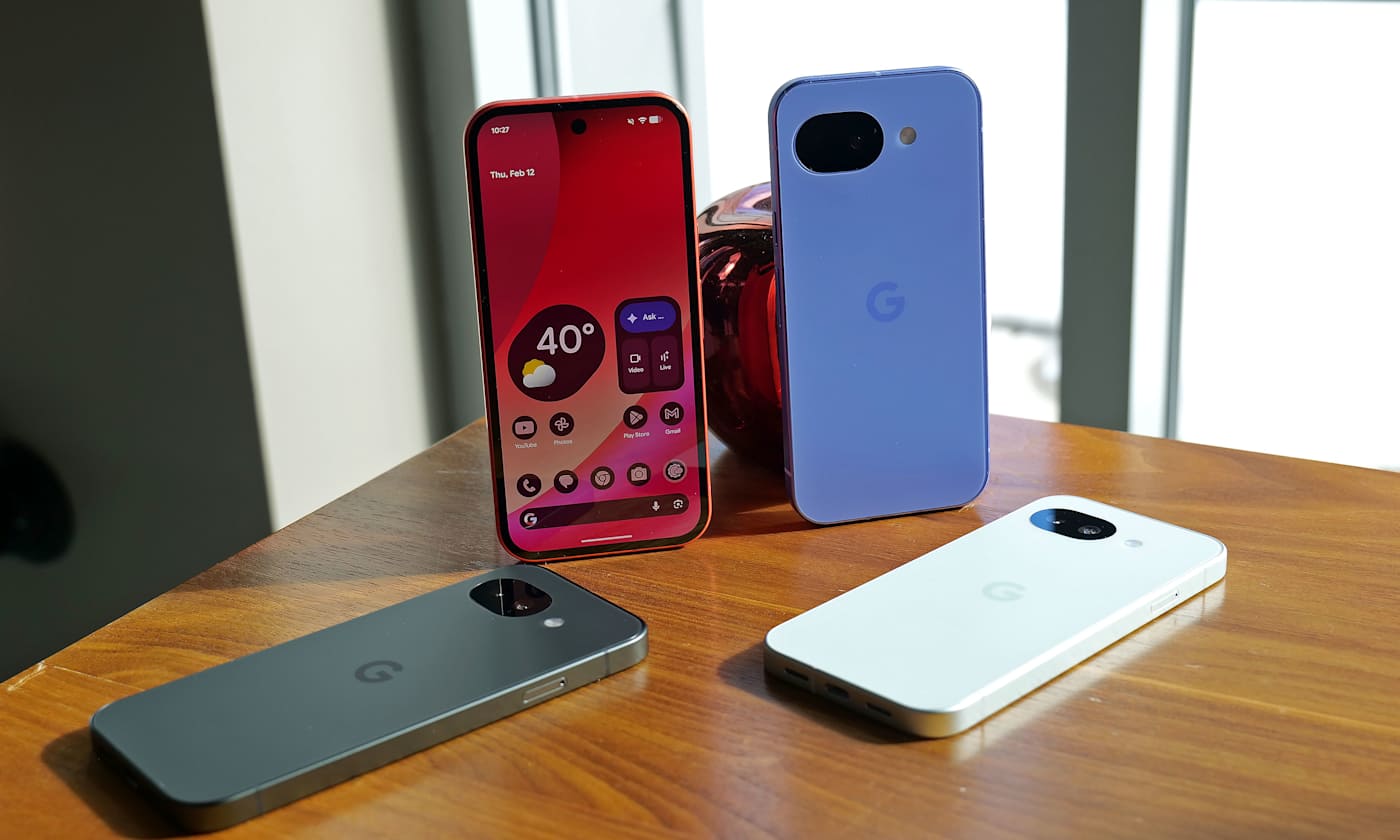
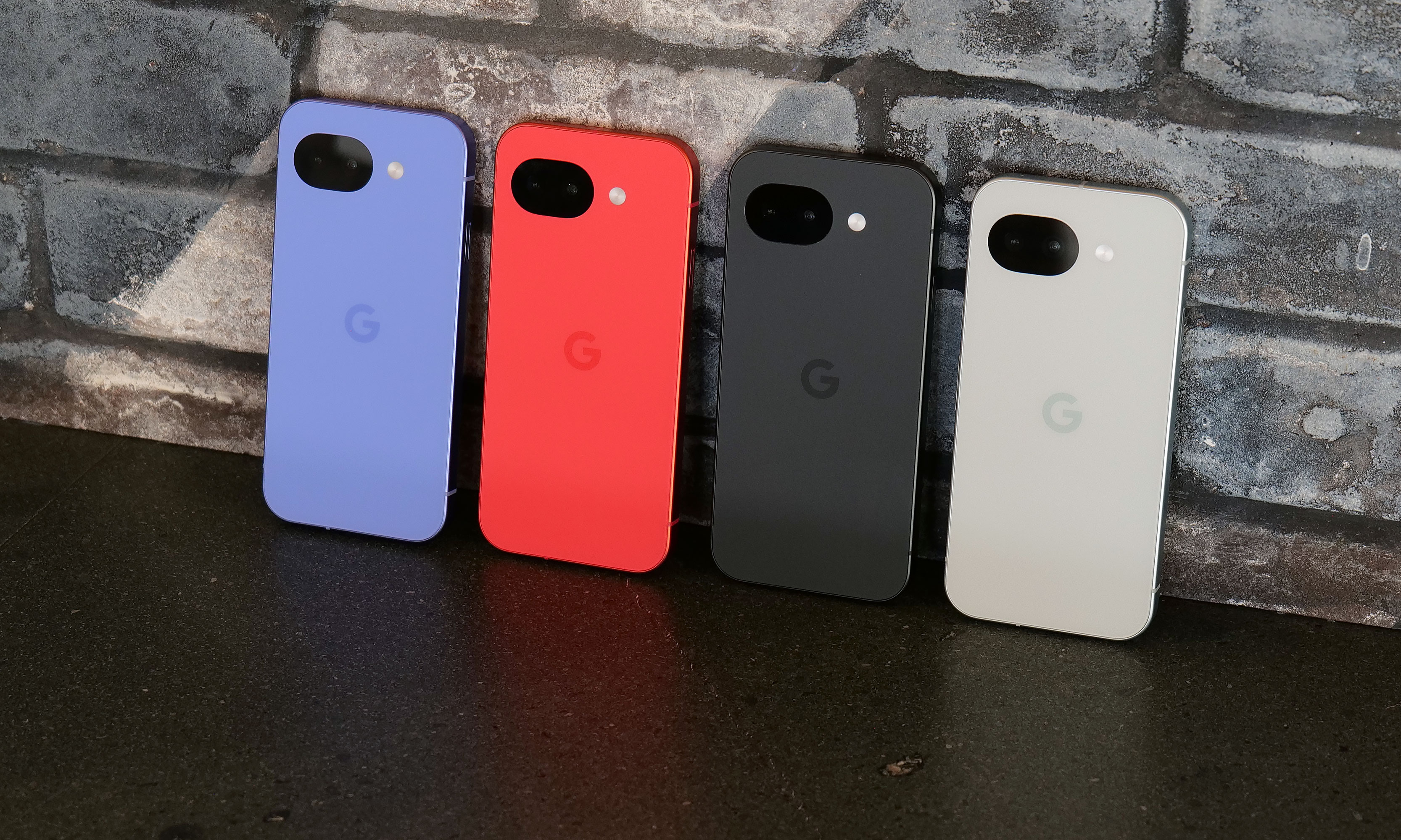
While lavender is the new hero color for the Pixel 10a, berry is the hue I'd pick.
Sam Rutherford for Engadget
The one place where the Pixel 10a might come up a touch short is that unlike its more expensive siblings, it features an older Tensor G4 processor instead of the Tensor G5 chip used on the main Pixel 10 line. Google says the decision to go with an older SoC is due to budget constraints. While it might not be the first choice for gamers or power users, I've never really had an issue with the day-to-day performance of Google's recent homegrown silicon.
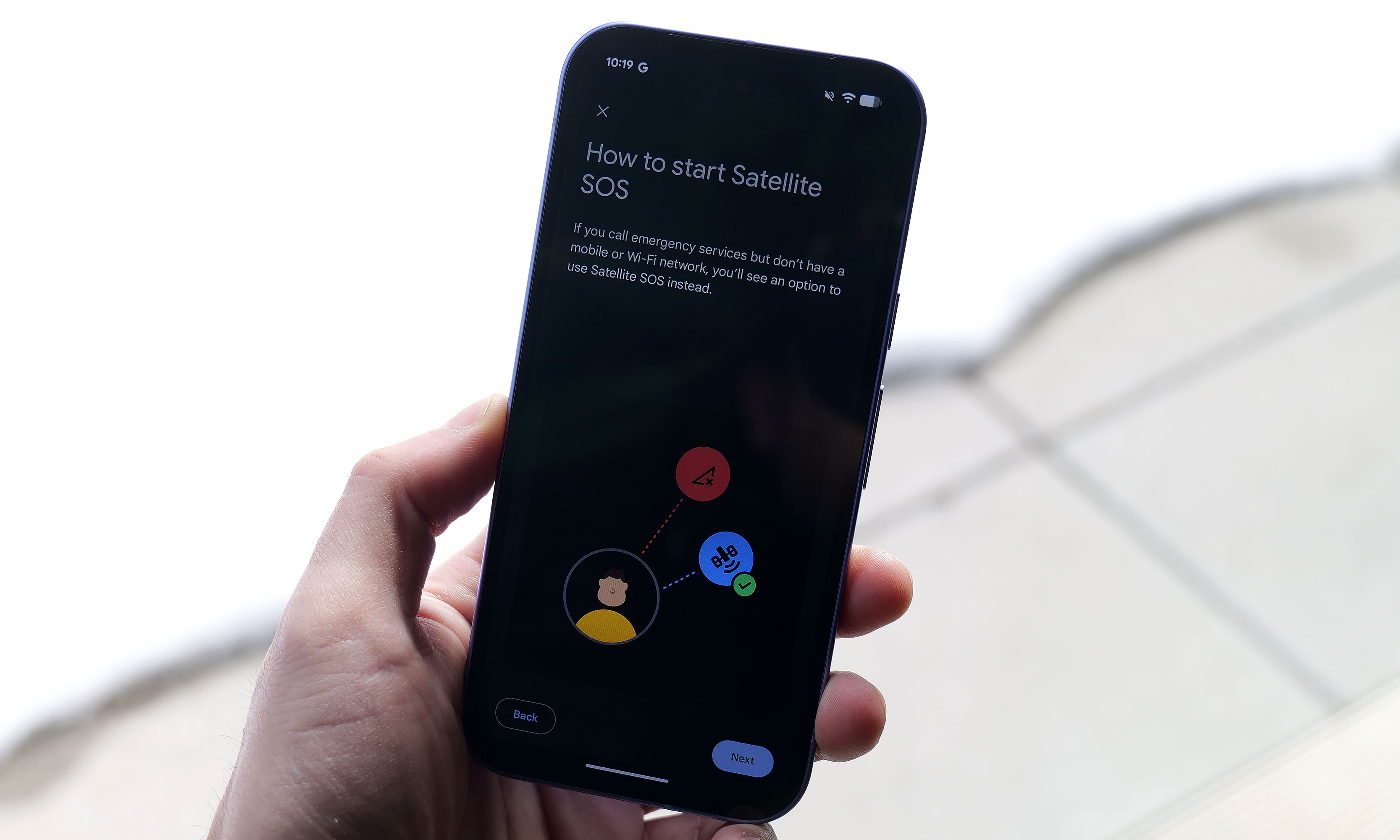
However, even with a one-year-old chip, Google found a way to port over three flagship features to the Pixel A series for the first time. Camera Coach uses AI to help you compose and come up with more interesting shots. Meanwhile, Auto Best Take is designed to ensure that everyone in a group shot ends up with their finest expression. Finally, Satellite SOS allows you to call for help during emergencies, even when you don't have proper cell service.
Satellite SOS support is one of three new features coming to the Google's A-series phones for the first time.
Sam Rutherford for Engadget
As for its cameras, the P10a looks to be using the same sensors as before, including a 48MP main camera, a 13MP ultra-wide and a 13MP selfie shooter in front. That might be a bummer for some, but considering that the Pixel 9a offered by far the best image quality of any phone in its price bracket, I'm not that bothered. Also, it's quite likely that if Google had opted for new hardware, it may have pushed the phone above $500.
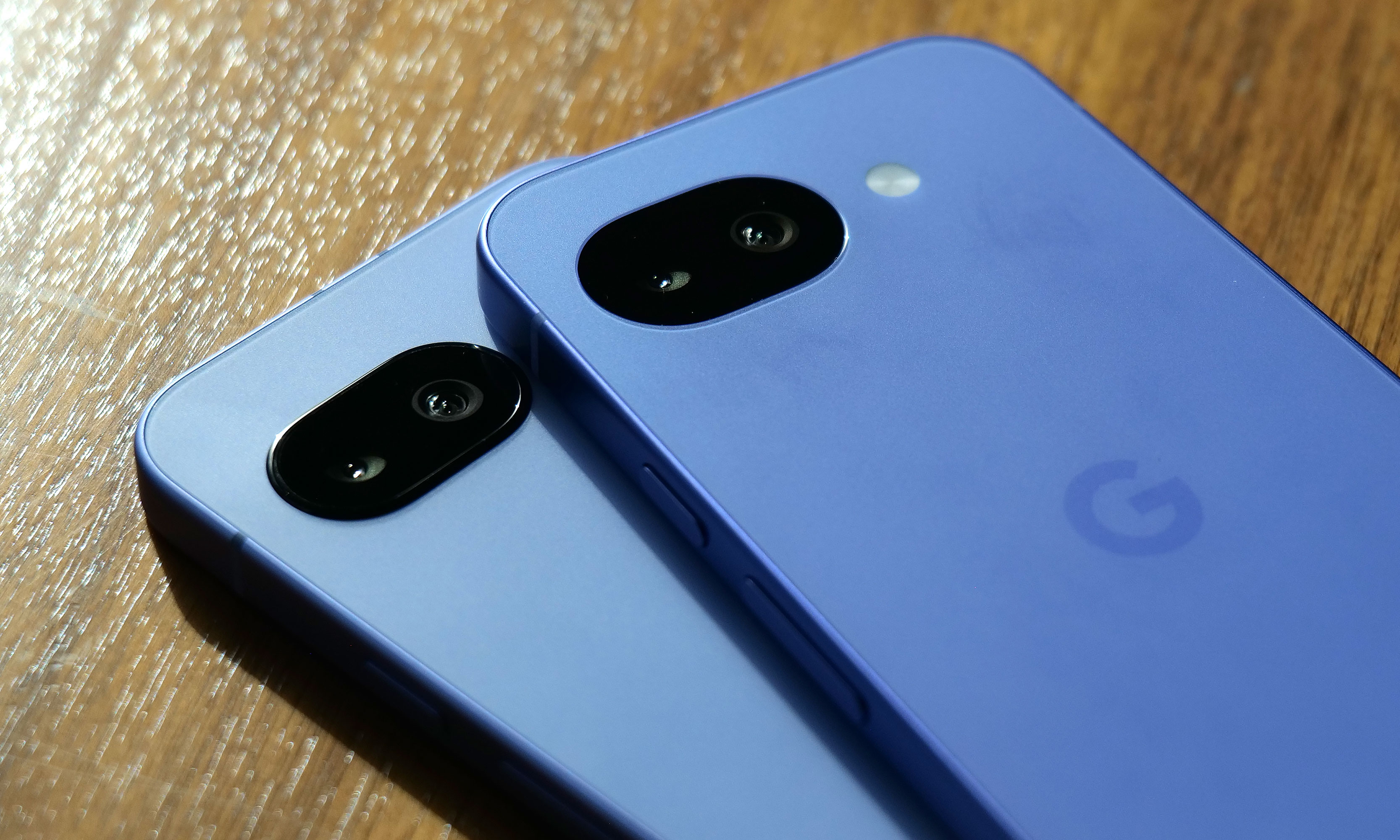
After seeing the positive response to the barely-there camera bump on its predecessor, Google leaned in and made the Pixel 10a’s rear camera module completely flat, and it’s my favorite thing about the phone. There's no hump or protrusions to speak of, and when combined with the rest of the phone's design, it results in a really sleek, minimalist look. Plus, after almost a decade of big and bulky camera warts on the back of phones, it's just nice seeing the Pixel 10a go the opposite direction.
I really appreciate how Google double downed on feedback regarding the Pixel 9a's tiny camera bump (left) by making the Pixel 10a's camera (right) completely flat.
Sam Rutherford for Engadget
On the flipside, my biggest complaint about the P10a is that Google didn't include Pixelsnap support (aka magnetic Qi2 compatibility). It's another feature that got cut due to cost and it's a real bummer because after introducing it on last year's main Pixel 10 line, I was hoping that it would become a standard inclusion on all Google phones going forward. Thankfully, when I asked about the lack of Pixelsnap support, Google representatives were able to confirm that there will be third-party accessory makers such as Casefinite, Dbrand and Spigen that will offer cases with built-in magnetic rings, so anyone hoping to attach magnetic peripherals will still have an avenue to do so.
The Pixel 10a's charging speeds have been improved to 30 watts for wired and 10 watts wirelessly.
Sam Rutherford for Engadget
Regardless, for Android phone owners who are in the market for a simple, no-nonsense upgrade that covers all the basics without breaking the bank, the Pixel 10a is looking like another top contender.
The Pixel 10a is available for pre-order today in lavender, berry, fog and obsidian with official sales slated for March 5.
This article originally appeared on Engadget at https://www.engadget.com/mobile/smartphones/pixel-10a-hands-on-google-locks-down-the-midrange-phone-game-150000513.html?src=rss
Pokémon Pokopia can be described as a pocket monster-themed take on Animal Crossing with a hint of Stardew Valley thrown in for good measure. And if you're like me, that alone is probably enough to sell you on the game. However, after getting a chance to play a preview of it for around half an hour, it became immediately clear that the game's coziness levels are off the charts, but it also offers some fun twists on the genre.
Co-developed by The Pokémon Company, GAME FREAK and KOEI TECMO, instead of playing as a generic trainer, you take control of a lonely Ditto who wakes up in a cave only to be greeted by Professor Tangrowth, the last surviving inhabitant of what used to be a bustling town. While the professor might look like an extra-large version of the original pokémon with glasses, its role is to guide you as you rebuild and hopefully repopulate the surrounding area.
One of the best things about Pokopia is actually being able to talk to the other 'mons.
Nintendo
As a Ditto, you naturally have the ability to transform into other Pokémon, though the process is sort of incomplete, meaning you can only learn one skill from the monsters you befriend instead of their entire moveset like in the mainline games. This is where the first twist on the traditional life sim comes in. Instead of crafting them or earning money to buy tools, you can transform into other Pokémon (like Lapras or Dragonite) to use their abilities to traverse obstacles or shape the world around you. For example, turning into a Squirtle lets you shoot a water gun that will revitalize dry patches or thirsty plants, while transforming into a Scyther lets you slice through objects similar to the HM Cut.
From there, you can use these skills to do things like create clusters of shrubs that will serve as homes for other Pokémon, allowing you to entice fellow creatures to return to the once desolate landscape. Another twist I really appreciate is that after appearing, new monsters will give you quests or just hang out. They will even talk and respond, and I don't mean like the 8-bit cries from other Pokémon games. They speak in full sentences, which is a wonderful departure from previous titles that really gives you the feeling that you're making friends and rebuilding a community instead of just being on a crusade to catch them all.
The Stardew Valley part of the equation comes into play after you leave the first tutorial area and you come upon an abandoned Pokémon Center that's in dire need of a renovation. You can do things like collect materials and do more quests to clean up the area to eventually turn the building in the heart of the town. Unfortunately, that's where my preview ended, aside from quickly hopping into a multiplayer session where I was able to see a much more developed village, complete with multiple buildings, roads and benches. You know, all the sorts of things you used to furnish and decorate your island with in Animal Crossing.
This gave me a nice glimpse at just how many things you can build in Pokopia and how easy it is to visit other people's towns. However, it didn't answer some of my bigger questions about the game, like what's the deal with Peakychu and Mosslax, whom we've seen before in previous trailers. Are they just one-off versions of existing ‘mons with unusual typings (i.e. ghost and grass) only for this game, or are they going to be a bigger part of the Pokémon world going forward? Perhaps more importantly, it was hard to tell if there will be any sort of PVE content like The Mines or Skull Cavern in Stardew Valley. I'm really hoping there is because it seems like Ditto's abilities could translate quite seamlessly to spelunking or battling your way through dungeons in search of rare items or building materials.
I love how derpy Ditto looks when it transforms into other Pokémon.
Nintendo
That said, just being able to build a community of friendly monsters while injecting life back into a forgotten town has good vibes radiating from every corner. So if you need a super cozy game to keep you busy this winter/spring, Pokémon Pokopia is shaping up to be the digital version of a fluffy blanket and a cup of hot chocolate filled to the brim with all of your favorite 'mons.
Pokémon Pokopia is available for pre-order now, with official sales slated for March 5.
This article originally appeared on Engadget at https://www.engadget.com/gaming/nintendo/pokemon-pokopia-is-so-damn-cozy-140000954.html?src=rss
New Mario sports games typically only come around once in a generation. So to get a fresh installment of tennis featuring a deep roster of characters this early in the Switch 2's lifecycle is rather exciting. And after getting a chance to play Mario Tennis Fever prior to its official release on February 12, the best entry to the franchise yet might only be a couple of weeks away.
Once again, Mario Tennis Fever relies on the series' familiar mix of topspin, slice and flat (power) shots used in previous games. The big new mechanic for this title is that instead of Zone Shots from Mario Tennis Aces, you can equip each character with a different racket, similar to how you can choose between a range of vehicles in Mario Kart. Every racket features a different special ability that you can charge up by rallying back and forth. When the gauge is full, you can unleash a Fever Shot to potentially devastating results.
The Fever Shot is just one of the special abilities from the 30 different rackets available in Mario Tennis Fever.
Nintendo
For example, the Fire Racket turns the ball into a fireball that leaves multiple embers on the court. If your opponent gets burned, they will slowly lose health, which will make them move slower or knock them out (but only temporarily) if you're playing doubles. Alternatively, the Pokey Racket can summon the giant cactus monster it's named after onto the court, which not only blocks your view but gets in the way as you chase down shots. And just like the game's large stable of characters (38 in total), there are almost just as many different Fever Rackets (30) to choose from.
The thing I like most is that compared to special shots in previous titles, Fever Shots have built-in counterplay. Zone Shots from Mario Tennis Aces sometimes made it feel like you were playing a fighting game as people battled to conserve meter, while signature moves in Mario Tennis: Ultra Smash often turned into automatic points. If someone sends a Fever Shot at you, you can send it back simply by returning the ball before it bounces. This naturally sets up some frenetic sequences as characters try to volley back and forth without letting the ball hit the ground in order to prevent the Fever Shot from taking effect on their side of the court. This is exactly the kind of chaos that makes Mario Tennis so fun — it just feels a bit more balanced now.
Pokey is here to be a thorn on your court.
Nintendo
That said, if you prefer a different kind of mayhem, there are also new Wonder Court Matches, which borrow the titular blue flower seeds from Mario's most recent 2D platformer. This game mode nixes Fever Rackets in favor of changing up the rules of the sport on the fly in weird and unexpected ways. Don't be surprised when you have a hard time hitting seeds with your shots to activate wondrous effects while spike balls get tossed at you or a parade of piranha decides to have a party on top of the net.
Unfortunately, I wasn't able to play Mario Tennis Fever's Adventure mode, which is a bit of a shame as I've heard that it's deeper and more fleshed out. This is a welcome upgrade from the somewhat thin single-player campaign from Aces. Thankfully, the game still supports motion controls for younger players or anyone who'd rather swing a virtual racket instead of mashing buttons. I also appreciate that Nintendo is making it easy to get into multiplayer matches, as the game supports both online matches (ranked and unranked) and local wireless connectivity (LAN). For the latter, you can also use the Switch 2's Game Share feature to send the title to other nearby systems so people can try out Mario Tennis Fever for themselves, even if they don't own a copy.
Wonder Court Matches are another new way to upend the rules of Mario Tennis.
Nintendo
So if you're like me and you've always preferred sports games that are more bombastic instead of realistic, Mario Tennis Fever ($70) is shaping up to be a real grand slam. Pre-orders are live now ahead of the title's official release on February 12.
This article originally appeared on Engadget at https://www.engadget.com/gaming/nintendo/mario-tennis-fever-preview-a-racket-smashing-blast-140000408.html?src=rss
Even in 2026, VR still feels like tech that isn't quite ready for prime time. When Nintendo released the original Virtual Boy way back in 1995, it was hard for my 10-year-old brain to comprehend a 3D console with a bipod, a facemask and a monochrome red display. Then, when you factor in weak sales that led to the system being discontinued after only a year, you end up with a gadget that felt more like a mythical creature than something you could actually buy. But that's changing later this month when the Virtual Boy returns as an add-on for the Switch 2. After getting an early demo of Nintendo's new accessory, I can confirm that this thing feels just as weird and quirky as it did when it first came out more than 30 years ago.
The biggest difference on the new model is that it uses the Switch 2's screen as its main display and processor.
Sam Rutherford for Engadget
The most impressive thing about the revamped Virtual Boy is how much it looks and feels like the original. It still features that classic red and black color scheme along with a stand for propping it up. The biggest difference is that instead of having a built-in display, there's a slot where you can slide in a Switch 2 (with its Joy-Con detached). This brings several advantages: Since the Switch 2 has its own battery, there's no need for cords anymore. It also means you don't have to worry about swapping in individual game carts, as software can be downloaded directly from Nintendo's online store. Graphics also look much sharper than I remember, though I admit that could just be me getting old. Finally, instead of reviving the Virtual Boy's archaic gamepad, Nintendo smartly opted to let us use the Switch 2's current lineup of controllers. The end result is a design that's faithful to the original but doesn't suffer from many of the pitfalls that plagued so many 90s gadgets — like tangled wires, awkward controls and fuzzy displays.
One thing Nintendo didn't change is Virtual Boy's monochrome red visuals.
Sam Rutherford for Engadget
However, even with a fair bit of modernization, it's hard to prepare your mind for the journey back in time that happens when you actually use it. Unlike every other contemporary VR headset, you still don't strap the new Virtual Boy onto your face. Instead, you have to adjust its bipod so that its facemask is level with your face and then you kind of just lean in to immerse yourself in a world where red is the only color. It's definitely a bit awkward, but it works. Nintendo even included a way to adjust IPD, so visuals look just as crisp (if not moreso) as they did on the original.
That said, the clunkiest thing about the Virtual Boy is its games. While Nintendo updated its exterior and internals, the company didn't really mess with its software — for better and worse. This means you get a relatively unadulterated look at where people thought VR was headed 30 years ago, which becomes immediately evident as soon as you boot into one of the console's first seven games. Galactic Pinball is slow and trying to time when to hit the flippers to prevent the ball from getting past you is an exercise in frustration. Meanwhile, Red Alarm feels like a cheap port of Battlezone, just with a vaguely Arwing-shaped plane instead of a tank. And once again, the pacing on this aerial shooter is glacial. Then there's 3D Tetris, which just kind of hurts your head as you try to drop pieces from a top-down perspective while the entire stage pivots around and never stops moving. The only title that really stands out is Virtual Boy Wario Land, which was and still is the best game on the entire platform.
There's no getting around it, the Virtual Boy's bipod is just kind of awkward.
Sam Rutherford for Engadget
After playing with the revamped Virtual Boy for just under half an hour, it's just as eccentric and ungainly as the original was three decades ago. But you know what, I wouldn't have it any other way because this thing is just as much of a time capsule as it is a nostalgic revival of a forgotten system. And if you want to experience a hazy concept of what people thought the future was going to be, there still isn't anything like the Virtual Boy.
The Virtual Boy add-on for the Switch 2 officially goes on sale on February 17 for $100, with the caveat that buyers will need an active Nintendo Switch Online + Expansion pack membership. Also, in addition to the seven games available at launch, Nintendo is planning to add nine more throughout the year including Mario's Tennis and previously unreleased titles such as Zero Racers and D-Hopper.
This article originally appeared on Engadget at https://www.engadget.com/gaming/nintendo/the-switch-2s-virtual-boy-is-a-tribute-to-nintendos-wackiest-console-140000003.html?src=rss
At their core, refrigerators are relatively simple devices. If you're the type of person to view every extra feature as a component that could potentially go wrong, basic iceboxes are probably the kind you go for. But for those on the other end of the spectrum, Samsung's latest Bespoke Refrigerators with AI inside have more bells and whistles than you might think possible — including an optional 32-inch screen.
Editor's note: The model we tested for this review came out in the second half of 2025 and will continue to be on sale throughout 2026. Hardware will remain the same, the only changes will come in the form of an OTA software update slated for later this year that will add support for Google Gemini, improved food recognition/labeling and more.
Design: As sleek as a fridge can be
If you're into faux vintage appliances like Smeg's retro-inspired models, Samsung's offerings might not be for you. For everyone else, the Bespoke family does minimalist design better than practically any other line of fridges on the market. Granted, the counter-depth French Door AI model I tested is a bit of a departure thanks to a huge 32-inch screen embedded in its right-side door. That said, there are a ton of configurations, including the choice of a smaller 9-inch panel or models without a display at all. The latter looks like a big rectangle, but in a way that Dieter Rams would probably appreciate (I'm just guessing, I don't have his contact info). Other options include setups ranging from four-door models to side-by-side two-door variants or even a single-panel upright model.
Glare is one of the tiny downsides of a fridge with a glass front.
Sam Rutherford for Engadget
On my review unit, the fresh food section is a touch smaller (16.5 cubic feet) than you might expect from a fridge this size, though I've never really felt limited by the amount of available storage. Samsung does a good job of optimizing interior space by providing a number of adjustable shelves, including a sliding one on the right side that makes it easy to store taller items without completely sacrificing flat space for others. The shelves are also spill proof and made out of tempered glass, so they resist scratches and just look a bit nicer than those made from lower-quality materials. I also appreciate how Samsung found a spot between the two crisper drawers for the water filter, instead of just sticking it in the top corner like a lot of competitors.
Even with the FlexZone drawer stealing some space, the main section of this Bespoke model still features 16.5 cubic feet of storage.
Sam Rutherford for Engadget
Meanwhile, in exchange for a slightly smaller main cabinet, this model has what Samsung calls a FlexZone drawer, which might be my second favorite thing about this fridge. It's perfectly designed for storing things like 12-ounce cans and juice boxes, and as someone who always likes to keep a couple of chilled Coke Zeros on standby, it's super convenient. That said, taller bottled drinks may need to be stored on their sides, which doesn't feel quite as efficient. But really, you can put anything you want in there and if you have young children like me, it's an excellent place to keep refrigerated kids' snacks. My four-year-old can go in there on his own without needing help from an adult to reach stuff higher up. Samsung even gives you the ability to set a different temperature for the FlexDrawer, which is a nice touch.
The optional FlexZone drawer is amazing for stashing drinks or having a refrigerated section that's easy for kids to reach.
Sam Rutherford for Engadget
Additionally, along with some rivals from LG, this fridge also has touch sensors at the bottom of each door that let you open them with a light tap. While I still prefer to just grab the built-in handles (which are located both above and below each door), this is a nice inclusion, particularly on a fridge that doesn't have giant handgrips bolted to the outside. My one small gripe with Samsung's exterior design is that its top isn't completely flat as it dips down in back. Admittedly, this hasn't stopped me from storing stuff like sheet pans and roasting trays above the fridge, but it would be nicer if things were fully level up there.
Water and ice dispensing: Samsung's Beverage Center reigns supreme
I've already gone on record about how Samsung's Beverage Center is the best new feature to land on any fridge in years, so without belaboring the point, but I'll happily wax poetic about it again. Instead of having a water dispenser installed smack dab on the outside of the door, Samsung opted to hide things behind an exterior flap on the left side of the fridge. This accomplishes several things. Not only does it feel a bit more hygienic because the spigot isn't subjected directly to all the germs swirling around the kitchen or a cough or sneeze from anyone passing by, it also simplifies the fridge's exterior design. This might sound a bit weird, but I've always thought that putting water dispensers on the outside of a fridge was kind of like installing a shower in the middle of a room. It's just kind of awkward. Furthermore, by opening the Beverage Center's door, you also have access to one of the fridge's interior shelves, which makes it quick and easy to grab things like ketchup, mustard or any other sauces you might need for a meal. My wife stashes her matcha there, so it's readily available first thing in the morning.
Samsung's Beverage Center is one of the best fridge innovations and years. It includes both a water dispenser and a built-in pitcher that refills itself automatically.
Sam Rutherford for Engadget
But the most important thing is that right next to the spigot, there's also a built-in water pitcher that automatically refills itself after every use. This means there's pretty much always 40+ ounces of ice-cold water (depending on the specific model) that you can pull out and pour. This allows you to fill up everyone's cup in seconds like a server at a restaurant, instead of blocking the entire fridge while you slowly top off each glass individually. To me, it's the difference between an active process where you can dictate your own pace versus having to stand there while the machine takes its sweet time. Plus, if you like infusing your water with fruit or tea, there's a built-in basket filter for that too. The Beverage Center is a truly useful innovation and one of Samsung’s biggest advantages over its rivals, and because the company patented it, it'll be years before competitors can come up with copies.
The top shelf in the freezer also contains the ice maker, which comes with an included scoop and the ability to make two difference kinds of cubes.
Sam Rutherford for Engadget
As for ice, the model I'm testing can produce two different types: regular cubes and smaller pebbles. There's also an included scooper and a dedicated shelf for storing it. Now I will admit that the smaller pebbles aren't quite as good as what you get from a standalone nugget-style icemaker, but in my experience they're more than good enough for anyone who likes variety in their frozen water. My small critique for Samsung is that I've heard the ice trays on other models come with sliders that have actual ball bearings instead of plastic rails and I wish the latter were a standard inclusion on every model. There's never so much friction that anything would get properly stuck, it would just be nice if things slid a bit more smoothly.
The screen: A welcome addition to a digital lifestyle
The fridge's 32-inch display can be used to write memos or draw, along with a ton of other functions.
Sam Rutherford for Engadget
Of course, one of the biggest potential objections about Samsung's latest fridges may also be one of its biggest strengths: their optional displays. With the continued intrusion of screens into our daily lives, I'm not here to tell you that you need one more. However, even though I was skeptical at first, I've grown to really appreciate having one on the fridge and I'd argue that unless you're skipping the feature entirely, the larger 32-inch panel is what you want.
The main reason is that, at least for my family, so much of what we do is already digital. Things like calendars, shopping lists, recipes and family photos already live on my phone and being able to share all of that with the fridge directly via Wi-Fi is a major plus. Frankly, it's easier to upload a picture to the fridge's display than it is to print one out and post it, which goes double for Samsung's Bespoke line since its glass front means magnets don't stick. Even though I already have a smart display in our kitchen, the size of Samsung's screen, along with support for a handful of important apps, have turned the fridge into a better family hub than anything else we own. Because there's so much space, there's room for photos, memos, the weather, filter status and a full 30-day calendar — the latter of which has significantly improved my family's planning and coordination.
You can even watch TV or YouTube videos right on the fridge's display.
Sam Rutherford for Engadget
The fridge runs Samsung's Tizen OS, which is basically the company's lightweight take on Android, so it's super easy to use. You can swipe left and right to add additional widgets to your screen, play music or even watch videos (YouTube, Samsung TV Plus, etc.) if you're so inclined. That said, sometimes I wish the screen was a bit more responsive, because even though I don't think it's a dealbreaker, after having reviewed several generations of the company's phones, I know Samsung can do better. There are also some settings from its handsets that I wish would get ported over to its fridges — like a dedicated dark mode. When I grab a glass of water later at night, the last thing I need is the entire display blasting my kitchen like a pair of hi-beams.
AI Inside: A work in progress with benefits today
With seemingly every tech company trying to shoehorn AI into its latest products, it's easy to roll your eyes at the idea of adding that into a fridge as well. And I think even Samsung would admit that its efforts to integrate machine learning into the Bespoke line are a work in progress. I've found that while it certainly isn't essential, the AI features found here can be a handy bonus in the right situations.
Bespoke models with AI feature a camera mounted to the top of the fridge that can recognize and take pictures of the food you put inside.
Sam Rutherford for Engadget
AI Vision is the headline feature in Samsung's package, which uses machine learning and a camera mounted to the roof of the fridge to automatically recognize and record items you put inside. However, there are some limitations. Currently, Samsung's AI can detect 37 different food items like fresh fruit and veggies, along with an additional 50 kinds of packaged goods like yogurt. Furthermore, the camera only records what goes into the fridge's main cabinet, so anything you put in the FlexZone drawer, freezer or either door won't get recorded. Regardless of whether an item is recognized or not, the fridge will then take a photo of the item (and tag it with the name of the food if it can be properly identified). You can then view a list of everything in the fridge via a dedicated tab on its screen (assuming your model has one) or from your phone via Samsung's SmartThings app. From there, you can do things like set names for anything uncategorized or add an expiration date, though I wish the fridge would do that last part on its own.
The fridge uses AI to automatically track food that it can recognize and applies labels to the corresponding photo.
Sam Rutherford for Engadget
In practice, this means you just put items in the fridge like you would normally and let the AI sort things out on its own. You can always go through the main list to see if you have a specific item or let the fridge automatically delete things when you take them out. That said, the AI doesn't get things right every time, because while Samsung's programming does clear things out after a certain amount of time, you will still need to delete food manually from time to time. Thankfully, for items in the door, the fridge can show you a live feed of what's there, so if you're at the store and can't remember if you have milk or not, you can simply pull out your phone and see for yourself.
Because the camera is mounted to the top of the fridge, you might not get the clearest picture or you may end up with your hand covering part of the food as the fridge takes a picture as you put items inside. Even so, that's still more than enough for me to be able to tell what something is just by looking at a small icon. I've found that Samsung AI Vision legitimately makes it easier to grocery shop by allowing me to see what food I have at a glance, regardless of whether I'm at home or at the store.
Samsung also uses AI to suggest recipes based on ingredients you already have in the fridge. You can even specific things like food preferences and dietary restrictions.
Sam Rutherford for Engadget
On top of that, the fridge also has built-in meal planning capabilities. This means you can ask the fridge to come up with a dish based on ingredients you already have, and it's surprisingly good. Not only do you have the ability to specify preferences and dietary restrictions, there's a wide variety of recipes it can choose from. On several occasions, I even found that when asked to suggest a recipe, the fridge came up with dishes I already had in mind. Alternatively, it will highlight when you're missing items for a potential dish, so you can grab them the next time you're at the store. This is one of the most helpful features, because often at the end of the week, I find myself with a handful of leftover ingredients. So when the fridge uses that info to suggest recipes that use those items, it helps reduce food waste.
Sadly, the weakest part of Samsung's AI is Bixby. In addition to being overeager when listening for voice prompts, which ended up causing a lot of inadvertent triggers, Samsung also put the Bixby icon near the bottom left corner of the screen. That's right next to the sensor and handle for the door, resulting in even more unwanted summons. After using this fridge for four months, I wish Bixby would just go away, and it seems Samsung agrees. Sometime later this year, the company is adding support for Google Gemini, which should deliver a massive upgrade to the fridge's voice-controlled capabilities.
A word on ads
You can disable ads that show up on the fridge's cover screen, though that will also get rid of the news and weather widgets. Thankfully that doesn't impact that widgets on the fridge's main home screen.
Sam Rutherford for Engadget
Last fall, to the dismay of many, Samsung announced that it was adding ads to its Family Hub fridges, including Bespoke models with built-in displays. Now no one likes being taunted with commercials, especially when they're on expensive appliances located in the busiest room of their home. Thankfully, I've found that these ads only show up on the Cover Screen, which only appears after no one has used the fridge in a while, kind of like a screensaver on a desktop. Furthermore, you can disable these ads entirely. The downside is that doing so also gets rid of the rotating news and weather widgets that appear on the home screen. But in my experience, that's just fine, because I don't need what is effectively the fridge's lock screen to have that much going on. Plus, when you open the fridge or touch its screen, it instantly reverts to the main home menu, which includes its own set of widgets that you can customize how you like.
Some quick notes and observations
For some reason, the door to the Beverage Center doesn't soft close like the rest of the doors do.
Sam Rutherford for Engadget
The Bespoke fridge’s screen does collect smudges, but so does stainless steel, and it doesn't really impact viewability. And on white glass models like my review unit, the simple design makes it easier to clean and maintain than typical metal-clad rivals.
The door to the Beverage Center doesn't soft-close like you'd normally expect on a fridge. It's more of a clack, which isn't a bad thing on its own, though I hope Samsung changes its design to match the other doors on future models for consistency's sake.
Because the fridge runs Tizen and not full Android, there aren't nearly as many choices for widgets. For example, there's a widget for Spotify and Amazon Music, but not YouTube or Apple Music. There's also only a single option for weather and a widget for pinning your favorite websites, but very little choice when it comes to dedicated news options. In my testing, the SmartThings integration worked better on Samsung phones compared to standard Android handsets, but your experience may vary.
If you are so inclined, you can create shopping lists directly on the fridge and then order them from partners including Instacart, Amazon Fresh, Walmart and others.
Wrap-up
AI in a fridge might sound ridiculous, but it allows for some genuinely useful features, even if the tech suffers from growing pains. And while this might sound preposterous, I think Samsung should actually double down on the tech by adding even more cameras, so the fridge has more angles and viewpoints to choose from as its algorithms evolve. The ability to automatically track what goes in and out of the fridge makes it easier to both shop and plan meals, and this is just in the early stages of the tech.
That said, obsessing over AI is sort of besides the point because even without it, Samsung's Bespoke French Door fridge is a first-class icebox. For tech-savvy people, its big screen helps simplify and organize our digital lives while simultaneously allowing the fridge to be helpful in ways you might not have even considered. It's also well-built and exquisitely designed to fit in seamlessly with other modern devices, which feels refreshing considering how often appliances feel like they are lagging years or decades behind gadgets like phones and laptops. And I can't overstate how much I like Samsung's Beverage Center, which in my opinion, is so good it's worth going with a Bespoke fridge just for that one feature.
In the end, the two biggest factors you'll need to consider are price and your appetite to digitize your kitchen, and by extension, your life. Starting at $3,500 for AI-equipped Bespoke models, Samsung's top-of-the-line fridges are far from cheap. Thankfully, versions without machine learning can be had for much less. But more importantly, you have to be willing to embrace technology's role in your home. You may not agree or want to pay this much for features like this just yet, but Samsung's Bespoke AI 4-Door French Door refrigerator has convinced me there's a happy home for smarter iceboxes.
This article originally appeared on Engadget at https://www.engadget.com/home/kitchen-tech/samsung-bespoke-fridge-with-ai-review-all-the-bells-and-whistles-140000099.html?src=rss
Gone are the days in which you needed to spend a fortune to get a good smartphone. In 2026, features once exclusive to high-end smartphones – big batteries, multi-camera arrays, high refresh rate OLED displays and more – have made their way down to more affordable models. Yes, you’ll still need to buy a flagship smartphone to get the best camera or fastest processor, but you don't have to make nearly as many compromises as you once did if you have a strict budget to adhere to when you go shopping for your next smartphone. If you have less than $600 to spend, let us help you figure out what features to prioritize when trying to find the best midrange smartphone.
While the term frequently appears in articles and videos, there isn’t an agreed-upon definition for “midrange” beyond a phone that isn’t a flagship or an entry-level option. Most of our recommendations cost between $400 and $600 — any less and you should expect significant compromises. If you have more to spend, you might as well consider flagships like the Apple iPhone 17 and the Samsung Galaxy S25 if you want the best smartphone experience. Devices like Pixel phones often sit in this price range too, offering some of the best value for Android buyers.
What to consider before buying a midrange smartphone
Buying a new device can be intimidating, but a few questions can help guide you through the process. First: what platform do you want to use? If the answer is iOS, that narrows your options down to exactly one phone. (Thankfully, it’s great.) And if you’re an Android fan, there’s no shortage of compelling options. Both platforms have their strengths, so you shouldn’t rule either out.
Of course, also consider how much you’re comfortable spending. Even increasing your budget by $100 more can get you a dramatically better product. Moreover, manufacturers tend to support their more expensive devices for longer with software updates and security updates, so it’s worth buying something toward the top limit of what you can afford.
Having an idea of your priorities will help inform your budget. Do you want a long battery life or fast charging? Do you value speedy performance above all else? Or would you like the best possible cameras with high megapixel counts? While they continue to improve every year, even the best midrange smartphones still demand some compromises, and knowing what’s important to you will make choosing one easier.
What won’t you get from a midrange smartphone?
Every year, the line between midrange and flagship phones blurs as more upmarket features and functions trickle down to more affordable models. When Engadget first published this guide in 2020, it was tricky to find a $500 phone with waterproofing and 5G. In 2026, the biggest thing you might miss out on is wireless charging – and even then, that’s becoming less true.
One thing your new phone probably won’t come with is a power adapter; many companies have stopped including chargers with all of their smartphones. Performance has improved in recent years, but can still be hit or miss as most midrange phones use slower processors that can struggle with multitasking. Thankfully, their camera systems have improved dramatically, and you can typically expect at least a dual-lens system on most midrange smartphones below $600 with decent camera quality, selfie performance and software support to keep things running smoothly for years to come..
Midrange smartphone FAQs
How long do midrange phones get software updates?
Support varies by brand, but most midrange phones receive around three to five years of software and security updates. Apple tends to support iPhones longer while companies like Google and Samsung now promise several years of Android and security patches for their midrange models. Budget-focused brands might offer less so it’s worth checking the update policy before you buy.
Are midrange phones good for gaming?
Yes, many midrange phones handle gaming well, especially popular titles like Fortnite, Genshin Impact and Call of Duty Mobile. They usually include capable processors, though you won’t always get the smoothest performance in the most demanding mobile games or at max settings. If you play casually or stick to less graphically intensive titles a midrange phone will feel more than adequate.
Georgie Peru contributed to this report.
This article originally appeared on Engadget at https://www.engadget.com/mobile/smartphones/best-midrange-smartphone-183006463.html?src=rss
Lumus got a major boost in brand recognition when one of its waveguides was selected for use in the Meta Ray-Ban Display glasses. But that already feels like old tech now because at CES 2026, the company brought some of its latest components to the show and based on what I saw, they seem poised to seriously elevate the optical quality of the next wave of high-end smartglasses.
When the Meta Ray-Ban Displays glasses came out, they wowed users as they were (and still are) one of a handful of smartglassess to feature a full-color in-lens display with at least a 20-degree field of view. But going by the specs on Lumus’ newest waveguides, we’re set for a major upgrade in terms of future capabilities.
If you look closely, you can see where light from the waveguide propagates into the one of the smartglasses' lenses.
Sam Rutherford for Engadget
The first model I tried featured Lumus’ optimized Z-30 waveguides, which not only offer a much wider 30-degree FOV, they are also 30 percent lighter and 40 percent thinner than previous generations. On top of that, Lumus says they are also more power efficient with the waveguides capable of hitting more than 8,000 nits per watt. This is a big deal because smartglasses are currently quite limited by the size of batteries they can use, especially if you want to make them small and light enough to wear all day. When I tried them on, I was dazzled by both the brightness and sharpness I saw from the Z-30s despite them being limited to 720 x 720 resolution. Not only did the increase in FOV feel much larger than 10 degrees, colors were very rich, including white, which is often one of the most difficult shades to properly reproduce.
I had to take a photo of one of Lumus' non-functioning smartglasses with the company's 70-degree FOV waveguide, because two out of three of the working ones had already broke and the last one that I used was being held together by tape.
Sam Rutherford for Engadget
However, even after seeing how good that first model was, I was totally not prepared for Lumus’ 70-degree FOV waveguides. I was able to view some videos and a handful of test images and I was completely blown away with how much area they covered. It was basically the entire center portion of the lens, with only small unused areas around the corners. And while I did notice some pincushion distortion along the sides of the waveguide’s display, a Lumus representative told me that it will be possible to correct for that in final retail units. But make no mistake, these waveguides undoubtedly produced some of the sharpest, brightest and best-looking optics I’ve seen from any smartglasses, from either retail models or prototypes or. It almost made me question how much wider FOV these types of gadgets really need, though to be clear, I don’t think we’ve hit the point of diminishing returns yet.
This is one of Lumus' thinnest waveguides measuring in at just 0.8mm.
Sam Rutherford for Engadget
Other advantages of Lumus’ geometric reflective waveguides include better overall efficiency than their refractive counterparts along with the ability to optically bond the displays to smartglasses lenses. That means unlike a lot of rivals, Lumus’ waveguides can be paired with transitions lenses instead of needing to resort to clip-on sunglass attachments when you go outside. Lumus also claims its designs also simplifies the manufacturing process, resulting in thinner waveguides (as small as 0.8mm) and generally higher yields.
Unfortunately, taking high-quality photos of content from smartglasses displays is incredibly challenging, especially when you’re using extremely delicate prototypes, so you’ll just have to take my word for now. But with Lumus in the process of ramping up production of its new waveguides with help from partners including Quanta and SCHOTT, it feels like there will be a ton of smartglasses makers clamoring for these components as momentum continues to build around the industry’s pick for the next “big” thing.
This article originally appeared on Engadget at https://www.engadget.com/wearables/lumus-brought-a-massively-wider-fov-to-smartglasses-at-ces-2026-233245949.html?src=rss
Last year Razer showed off Project Ava as a digital assistant that lived inside your computer to help adjust settings or provide gaming tips. But now at CES 2026, the company’s AI companion platform has gotten a major glow-up while moving into some new digs.
Now, in lieu of being constrained entirely to your PC’s screen, Razer has given Project Ava a real home in the form of a small tube that can display a 5.5-inch animated hologram of the AI’s avatar. You’ll still need to connect it to your computer via USB-C to provide Ava with the power and data it needs. However, all of your companion’s other components are built into its abode, including dual far-field mics so you can talk to it, a down-firing full-range speaker so it can talk and an HD camera with an ambient light sensor so the AI can see and react to its surroundings.
But perhaps the biggest upgrade to the project is that instead of just Ava, who Razer describes as “a calm, reliable source of energy to help you keep things clear, efficient, and always on point,” there are three or four new personas (depending on how we’re counting) joining the roster. Kira looks like a TikTok e-girl decked out in a frilly outfit complete with Razer neon green accents, while Zane is her edgy masculine alternative who kind of reminds me of the Giga Chad meme, but with extra snake tattoos. Then there’s Sao, who appears to be directly inspired by iconic Japanese salary woman Saori Araki. Finally, there’s an avatar made in the likeness of Faker (Lee Sang-hyeok), the most successful and well-known League of Legends player of all time and one of Razer's sponsored esports athletes.
The new peripheral for Project Ava is a cylinder that can display a 5.5-inch hologram of an AI companion.
Sam Rutherford for Engadget
The idea now is that instead of being trapped inside your computer, Ava or one of Razer’s other personas can sit on your desk and be your companion for everything. They can remind you of upcoming events, respond to questions or even comment on your outfit using Razer’s built-in camera. That said, if you need some privacy, the device’s mics can be muted and the company says its planning on putting a physical camera shutter on final retail models. Of course, Ava or any of the other avatars can still hang out while you game and give you advice. During my demo, Kira helped pick out a loadout in Battlefield 6 based on user criteria and even provided pros and cons for some of the game’s other equipment options.
Project Ava's expanded roster of AI companions
Razer
Unfortunately, while I did get to see Kira and Zane talk, dance and sway in their little bottles, Sao and Faker weren’t quite ready to make their holographic debuts. But according to Razer, that’s sort of by design as Project Ava is very much a work in progress. Currently, the avatars’ responses are generated by X AI’s Grok (yikes!), but the platform was created as a sort of open-source project that will support other models like Gemini or ChatGPT.
Down the line, Razer is hoping to add the ability for users to create their own unique avatars and companions based on their input or inspiration from real-world objects. Meanwhile, for avatars like Faker's because he’s also an actual person, Razer wants additional time to make the AI companion helpful with topics like real-time League of Legends coaching.
Say hello to Giga Chad, I mean Zane.
Sam Rutherford for Engadget
That said, while some folks might find Project Ava a bit weird or unnerving, it actually feels pretty tame (almost cute even) in an era where people are already marrying their AI partners. And if you’re the kind of person who prefers digital companions over flesh-and-blood alternatives (you know, people), I guess it’s kind of nice to have a more tangible representation of your electronic waifus and husbandos.
Faker's avatar was only viewable in this nearly life-size mock up.
Sam Rutherford for Engadget
Sadly, Razer has not provided full pricing for Project Ava’s holographic peripheral, though a representative said that it will be in the same ballpark as the company’s other peripherals. I’m estimating a final cost of around $200. Reservations for Project Ava are currently live with a $20 deposit before official shipments begin sometime in the second half of 2026.
This article originally appeared on Engadget at https://www.engadget.com/gaming/pc/razer-put-a-waifu-in-a-bottle-at-ces-2026-205315908.html?src=rss
The latest generation of smartglasses can create huge virtual screens without the need to lug around giant monitors are a real boon to frequent travelers. However, their specs aren’t often tailored to the needs of gamers, so at CES 2026, ASUS and XREAL partnered to make a pair with two very important features you don’t normally get from rivals.
The new ROG XREAL R1 AR glasses are based on the existing XREAL One Pro, so naturally they share a lot of the same components and specs including dual micro-OLED displays with a per-eye resolution of 1,920 x 1,080, three degrees of freedom (natively), 700-nit peak brightness, 57-degree FOV and built-in speakers tuned by Bose. However, the big difference on the R1s is that instead of maxing out with a 120Hz refresh rate, ASUS and XREAL’s collab goes all the way up to 240Hz. That’s a pretty nice bump, especially for people with older hardware or anyone who might not have access to a high refresh rate display or just doesn’t want to lower their standards while traveling.
The ROG XREAL R1 AR smartglasses deliver 1,920 x 1,080 resolution to each eye with a 240Hz refresh rate and 57-degree FOV.
Sam Rutherford for Engadget
The other big addition is the R1’s included ROG Control Dock, which from what I’ve seen is slightly better suited for home use. It’s designed to be a simple hub with two HDMI 2.0 jacks, one DisplayPort 1.4 connector and a couple of USB-C slots (one is for power), so you can quickly switch between multiple systems like your desktop and console with a single touch. That said, depending on the situation you might not even need the dock at all because the R1s can also be connected to compatible PCs or gaming handhelds like the ROG Ally X and ROG Xbox Ally X (see the synergy there?) directly via USB-C.
When I got to try them out at CES, the R1s delivered a very easy to use and relatively streamlined kit. At 91 grams, they are barely heavier than the original XREAL One Pro (87g) so they don’t feel too weighty or cumbersome. I also really like the inclusion of electrochromic lenses, which allow you to change the tint of the glasses with the touch of a button. This lets you adjust how much or little light you want to come in through the front to best suit your environment. And thanks to support for three DOF, you have the ability to pin your virtual screen in one location or let it follow you around.
Of course, ASUS and XREAL couldn't resist putting RGB lighting on the ROG XREAL R1 AR smartglasses.
Sam Rutherford for Engadget
Now it is important to remember that in order to get 240Hz on the smartglasses, you need hardware capable of pushing the kind of performance. So depending on the title, when the R1s are connected to something like a gaming handheld, you might not be able to get there. Luckily, I had the chance to use the specs when connected to a PC as well, which let me really appreciate the smoothness you get from faster refresh rates. General image quality was also quite good thanks to the glasses’ 1080p resolution, so I had no trouble reading text or discerning small UI elements.
The ROG Control dock makes it easy to connect multiple devices to the ROG XREAL R1 AR smartglasses, but it may be a bit too bulky to pull out in tight situations like on a plane.
Sam Rutherford for Engadget
My one small gripe is that I kind of wish its 57-degree FOV was a tiny bit bigger, but that’s more of a limitation of current optical technology as there aren't a ton of similarly sized specs that can go much higher (at least not yet). That said, even with its current FOV, you can still create up to a 171-inch virtual screen at four meters away, which is massively bigger than any portable screen you might entertain carrying around.
Unfortunately, ASUS and XREAL haven’t announced official pricing or a release date for the R1s yet, but hopefully they won’t cost too much more than the XREAL One Pro, which are currently going for $649.
This article originally appeared on Engadget at https://www.engadget.com/gaming/pc/asus-and-xreal-teamed-up-at-ces-to-make-gaming-smartglasses-with-two-important-upgrades-190500897.html?src=rss

 Anmelden