Google's A-series phones have offered some of the best value among midrange handsets for years, and after checking out the new Pixel 10a, I don't see that trend stopping anytime soon.
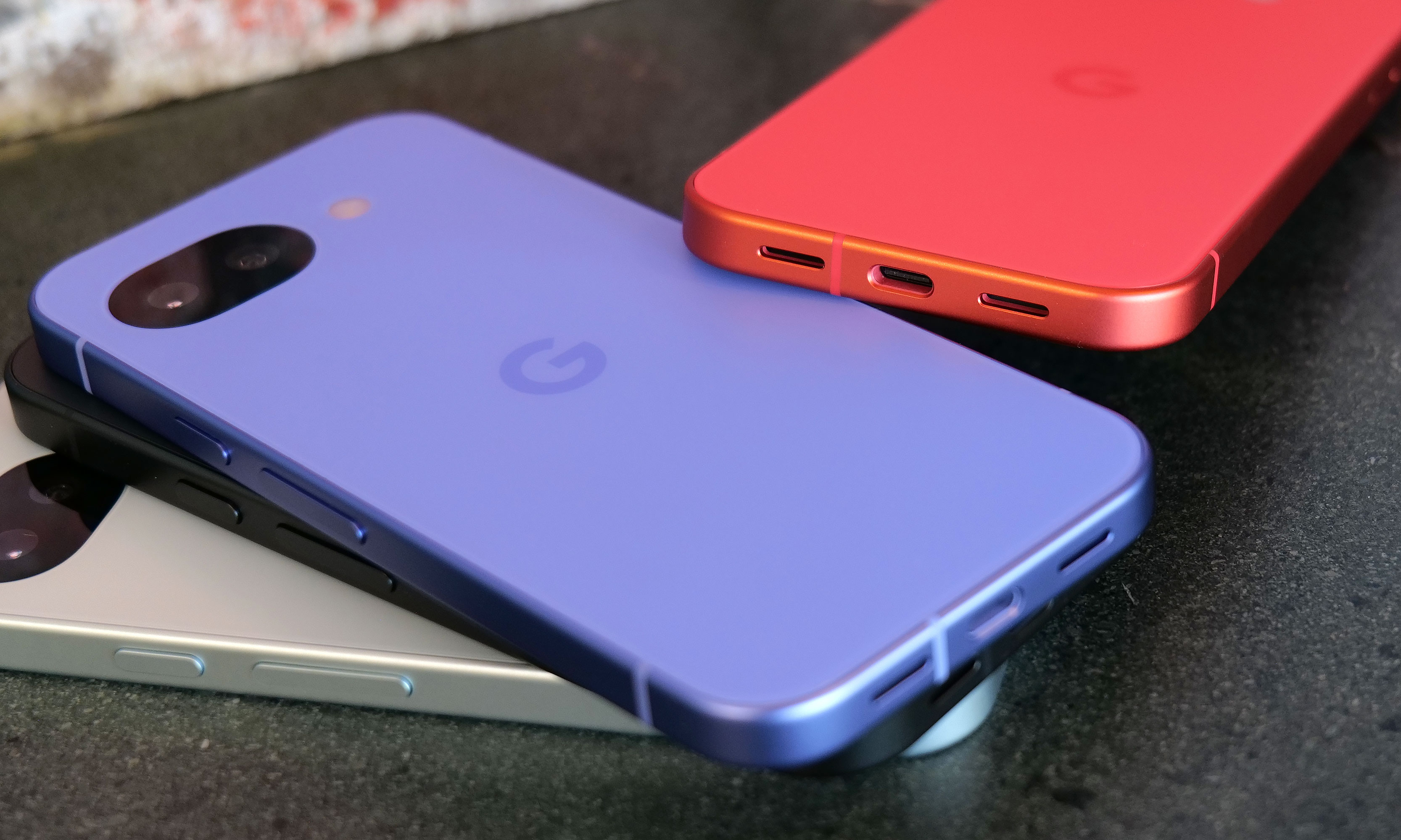
Let's start with the specs. Starting at just $499, you get a vivid 6.3-inch OLED screen with a 120Hz refresh rate and 3,000 nits of peak brightness, 8GB of RAM and either 128GB or 256GB of onboard storage. The phone also features a durable aluminum frame along with a stronger Corning Gorilla Glass 7i panel in front and a composite plastic back with a lovely matte finish. As a nod towards sustainability, Google says the P10a's chassis is made from 100 percent recycled material, while the rear panel comes in at 81 percent. And just like its predecessor, you still get an IP68 rating for dust and water resistance and the same battery capacity (5,100mAh) — except now it charges even faster, both wired (30 watts, up from 23) and wirelessly (10 watts, up from 5).
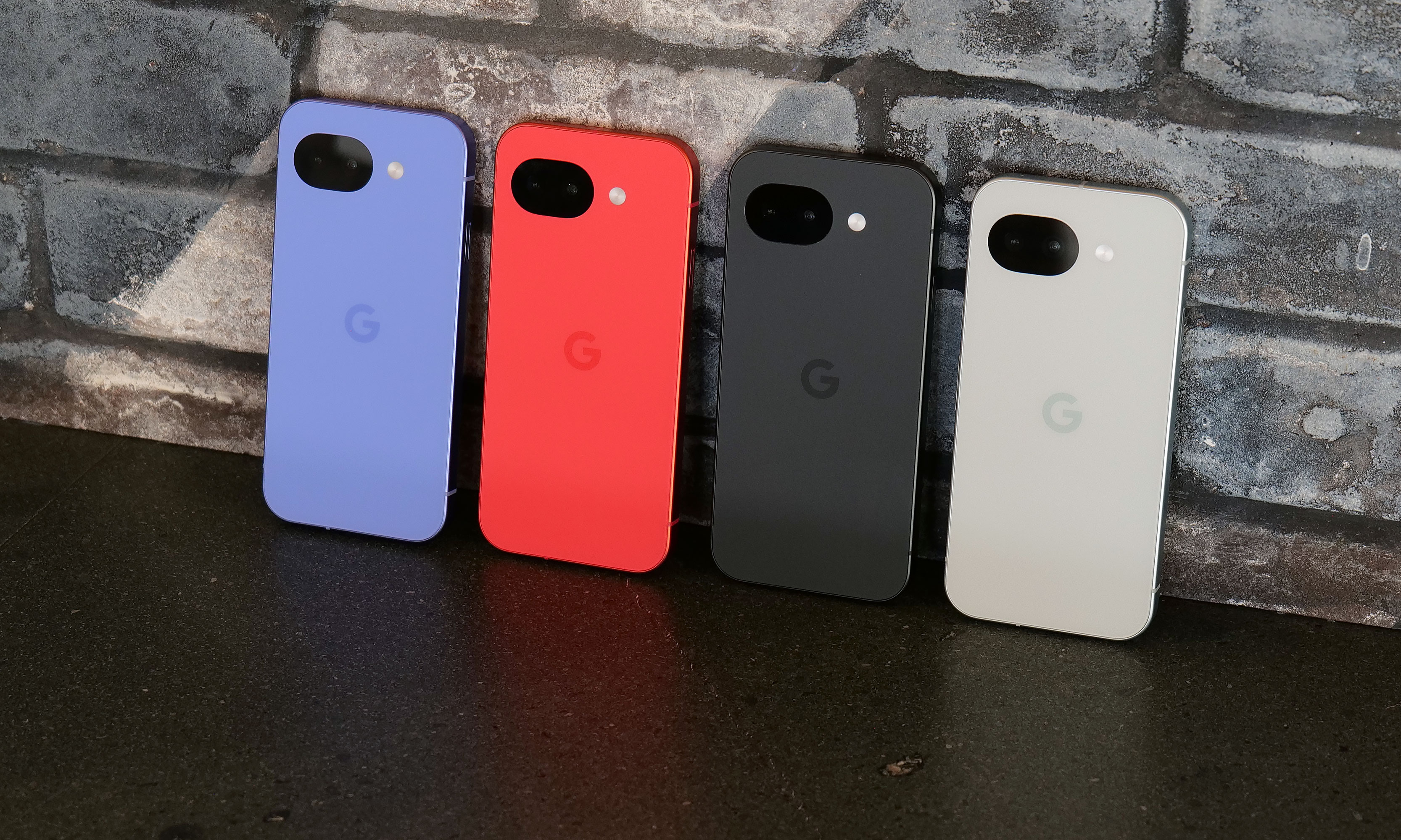
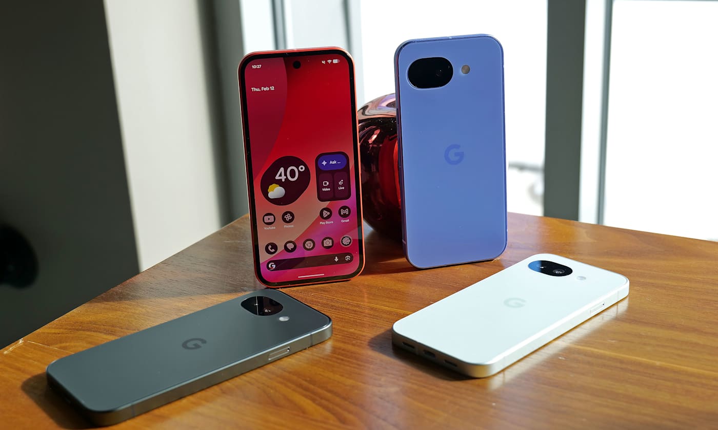
While lavender is the new hero color for the Pixel 10a, berry is the hue I'd pick.
Sam Rutherford for Engadget
The one place where the Pixel 10a might come up a touch short is that unlike its more expensive siblings, it features an older Tensor G4 processor instead of the Tensor G5 chip used on the main Pixel 10 line. Google says the decision to go with an older SoC is due to budget constraints. While it might not be the first choice for gamers or power users, I've never really had an issue with the day-to-day performance of Google's recent homegrown silicon.
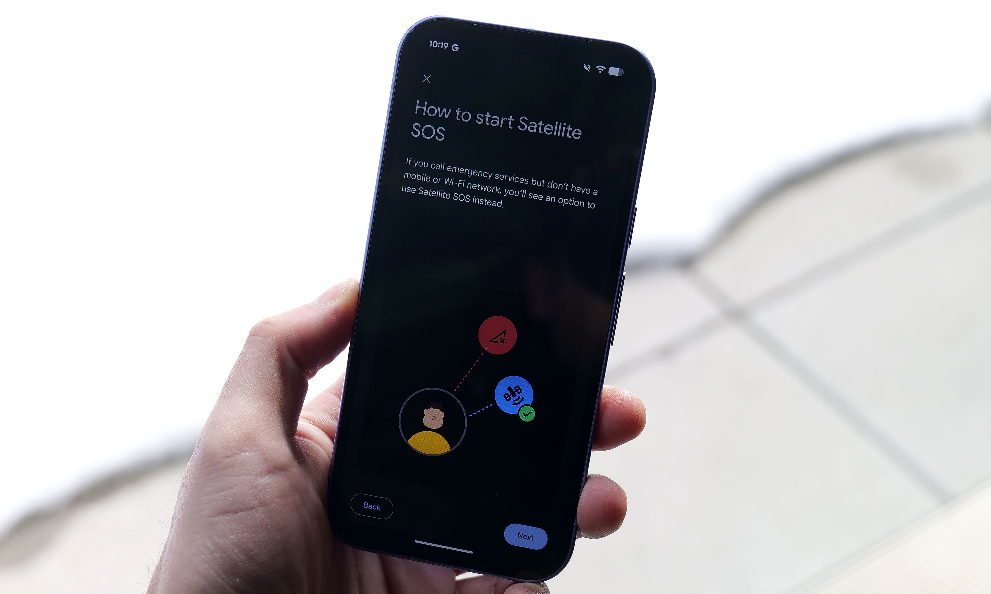
However, even with a one-year-old chip, Google found a way to port over three flagship features to the Pixel A series for the first time. Camera Coach uses AI to help you compose and come up with more interesting shots. Meanwhile, Auto Best Take is designed to ensure that everyone in a group shot ends up with their finest expression. Finally, Satellite SOS allows you to call for help during emergencies, even when you don't have proper cell service.
Satellite SOS support is one of three new features coming to the Google's A-series phones for the first time.
Sam Rutherford for Engadget
As for its cameras, the P10a looks to be using the same sensors as before, including a 48MP main camera, a 13MP ultra-wide and a 13MP selfie shooter in front. That might be a bummer for some, but considering that the Pixel 9a offered by far the best image quality of any phone in its price bracket, I'm not that bothered. Also, it's quite likely that if Google had opted for new hardware, it may have pushed the phone above $500.
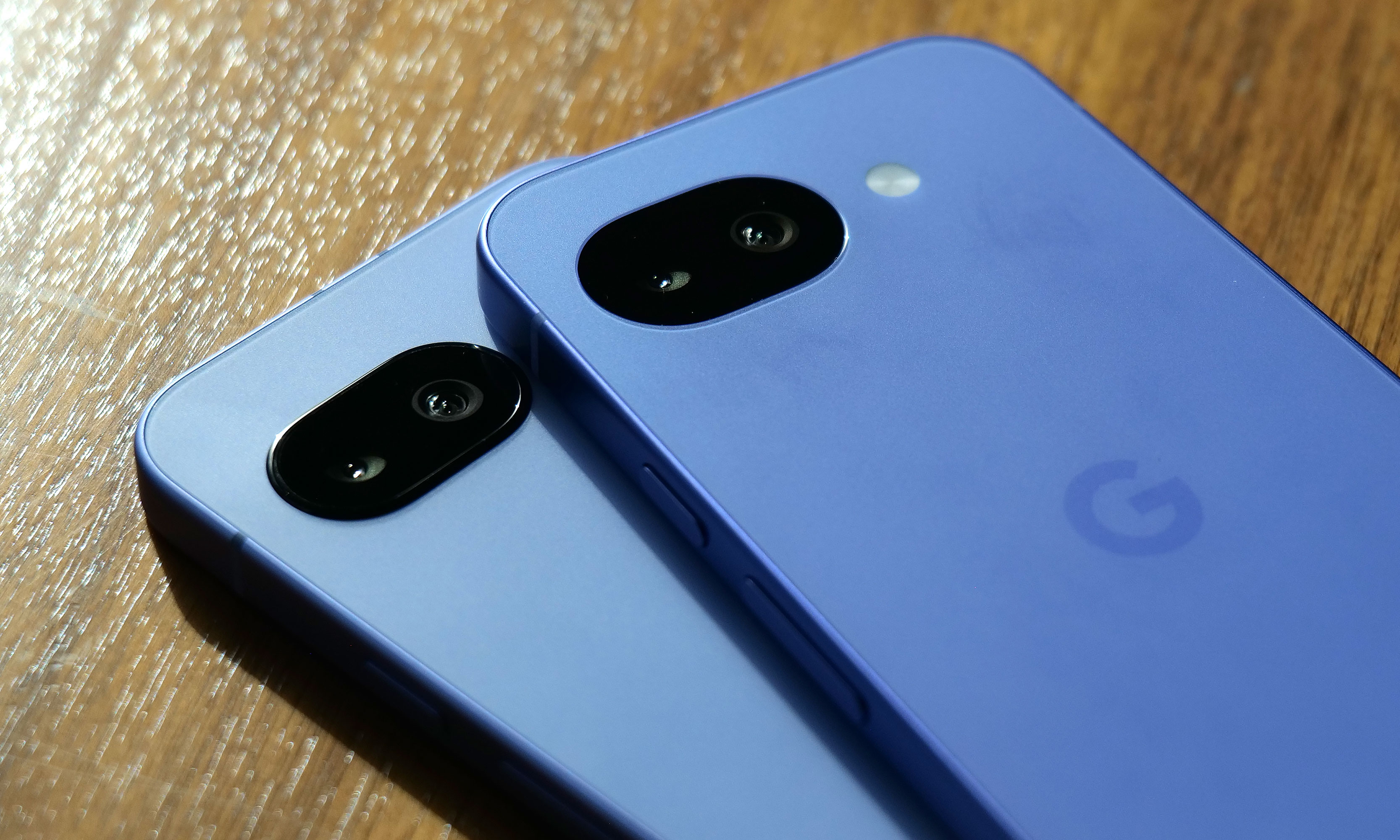
After seeing the positive response to the barely-there camera bump on its predecessor, Google leaned in and made the Pixel 10a’s rear camera module completely flat, and it’s my favorite thing about the phone. There's no hump or protrusions to speak of, and when combined with the rest of the phone's design, it results in a really sleek, minimalist look. Plus, after almost a decade of big and bulky camera warts on the back of phones, it's just nice seeing the Pixel 10a go the opposite direction.
I really appreciate how Google double downed on feedback regarding the Pixel 9a's tiny camera bump (left) by making the Pixel 10a's camera (right) completely flat.
Sam Rutherford for Engadget
On the flipside, my biggest complaint about the P10a is that Google didn't include Pixelsnap support (aka magnetic Qi2 compatibility). It's another feature that got cut due to cost and it's a real bummer because after introducing it on last year's main Pixel 10 line, I was hoping that it would become a standard inclusion on all Google phones going forward. Thankfully, when I asked about the lack of Pixelsnap support, Google representatives were able to confirm that there will be third-party accessory makers such as Casefinite, Dbrand and Spigen that will offer cases with built-in magnetic rings, so anyone hoping to attach magnetic peripherals will still have an avenue to do so.
The Pixel 10a's charging speeds have been improved to 30 watts for wired and 10 watts wirelessly.
Sam Rutherford for Engadget
Regardless, for Android phone owners who are in the market for a simple, no-nonsense upgrade that covers all the basics without breaking the bank, the Pixel 10a is looking like another top contender.
The Pixel 10a is available for pre-order today in lavender, berry, fog and obsidian with official sales slated for March 5.
This article originally appeared on Engadget at https://www.engadget.com/mobile/smartphones/pixel-10a-hands-on-google-locks-down-the-midrange-phone-game-150000513.html?src=rss
Pokémon Pokopia can be described as a pocket monster-themed take on Animal Crossing with a hint of Stardew Valley thrown in for good measure. And if you're like me, that alone is probably enough to sell you on the game. However, after getting a chance to play a preview of it for around half an hour, it became immediately clear that the game's coziness levels are off the charts, but it also offers some fun twists on the genre.
Co-developed by The Pokémon Company, GAME FREAK and KOEI TECMO, instead of playing as a generic trainer, you take control of a lonely Ditto who wakes up in a cave only to be greeted by Professor Tangrowth, the last surviving inhabitant of what used to be a bustling town. While the professor might look like an extra-large version of the original pokémon with glasses, its role is to guide you as you rebuild and hopefully repopulate the surrounding area.
One of the best things about Pokopia is actually being able to talk to the other 'mons.
Nintendo
As a Ditto, you naturally have the ability to transform into other Pokémon, though the process is sort of incomplete, meaning you can only learn one skill from the monsters you befriend instead of their entire moveset like in the mainline games. This is where the first twist on the traditional life sim comes in. Instead of crafting them or earning money to buy tools, you can transform into other Pokémon (like Lapras or Dragonite) to use their abilities to traverse obstacles or shape the world around you. For example, turning into a Squirtle lets you shoot a water gun that will revitalize dry patches or thirsty plants, while transforming into a Scyther lets you slice through objects similar to the HM Cut.
From there, you can use these skills to do things like create clusters of shrubs that will serve as homes for other Pokémon, allowing you to entice fellow creatures to return to the once desolate landscape. Another twist I really appreciate is that after appearing, new monsters will give you quests or just hang out. They will even talk and respond, and I don't mean like the 8-bit cries from other Pokémon games. They speak in full sentences, which is a wonderful departure from previous titles that really gives you the feeling that you're making friends and rebuilding a community instead of just being on a crusade to catch them all.
The Stardew Valley part of the equation comes into play after you leave the first tutorial area and you come upon an abandoned Pokémon Center that's in dire need of a renovation. You can do things like collect materials and do more quests to clean up the area to eventually turn the building in the heart of the town. Unfortunately, that's where my preview ended, aside from quickly hopping into a multiplayer session where I was able to see a much more developed village, complete with multiple buildings, roads and benches. You know, all the sorts of things you used to furnish and decorate your island with in Animal Crossing.
This gave me a nice glimpse at just how many things you can build in Pokopia and how easy it is to visit other people's towns. However, it didn't answer some of my bigger questions about the game, like what's the deal with Peakychu and Mosslax, whom we've seen before in previous trailers. Are they just one-off versions of existing ‘mons with unusual typings (i.e. ghost and grass) only for this game, or are they going to be a bigger part of the Pokémon world going forward? Perhaps more importantly, it was hard to tell if there will be any sort of PVE content like The Mines or Skull Cavern in Stardew Valley. I'm really hoping there is because it seems like Ditto's abilities could translate quite seamlessly to spelunking or battling your way through dungeons in search of rare items or building materials.
I love how derpy Ditto looks when it transforms into other Pokémon.
Nintendo
That said, just being able to build a community of friendly monsters while injecting life back into a forgotten town has good vibes radiating from every corner. So if you need a super cozy game to keep you busy this winter/spring, Pokémon Pokopia is shaping up to be the digital version of a fluffy blanket and a cup of hot chocolate filled to the brim with all of your favorite 'mons.
Pokémon Pokopia is available for pre-order now, with official sales slated for March 5.
This article originally appeared on Engadget at https://www.engadget.com/gaming/nintendo/pokemon-pokopia-is-so-damn-cozy-140000954.html?src=rss
New Mario sports games typically only come around once in a generation. So to get a fresh installment of tennis featuring a deep roster of characters this early in the Switch 2's lifecycle is rather exciting. And after getting a chance to play Mario Tennis Fever prior to its official release on February 12, the best entry to the franchise yet might only be a couple of weeks away.
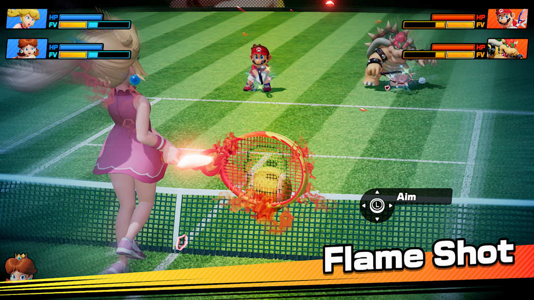
Once again, Mario Tennis Fever relies on the series' familiar mix of topspin, slice and flat (power) shots used in previous games. The big new mechanic for this title is that instead of Zone Shots from Mario Tennis Aces, you can equip each character with a different racket, similar to how you can choose between a range of vehicles in Mario Kart. Every racket features a different special ability that you can charge up by rallying back and forth. When the gauge is full, you can unleash a Fever Shot to potentially devastating results.
The Fever Shot is just one of the special abilities from the 30 different rackets available in Mario Tennis Fever.
Nintendo
For example, the Fire Racket turns the ball into a fireball that leaves multiple embers on the court. If your opponent gets burned, they will slowly lose health, which will make them move slower or knock them out (but only temporarily) if you're playing doubles. Alternatively, the Pokey Racket can summon the giant cactus monster it's named after onto the court, which not only blocks your view but gets in the way as you chase down shots. And just like the game's large stable of characters (38 in total), there are almost just as many different Fever Rackets (30) to choose from.
The thing I like most is that compared to special shots in previous titles, Fever Shots have built-in counterplay. Zone Shots from Mario Tennis Aces sometimes made it feel like you were playing a fighting game as people battled to conserve meter, while signature moves in Mario Tennis: Ultra Smash often turned into automatic points. If someone sends a Fever Shot at you, you can send it back simply by returning the ball before it bounces. This naturally sets up some frenetic sequences as characters try to volley back and forth without letting the ball hit the ground in order to prevent the Fever Shot from taking effect on their side of the court. This is exactly the kind of chaos that makes Mario Tennis so fun — it just feels a bit more balanced now.
Pokey is here to be a thorn on your court.
Nintendo
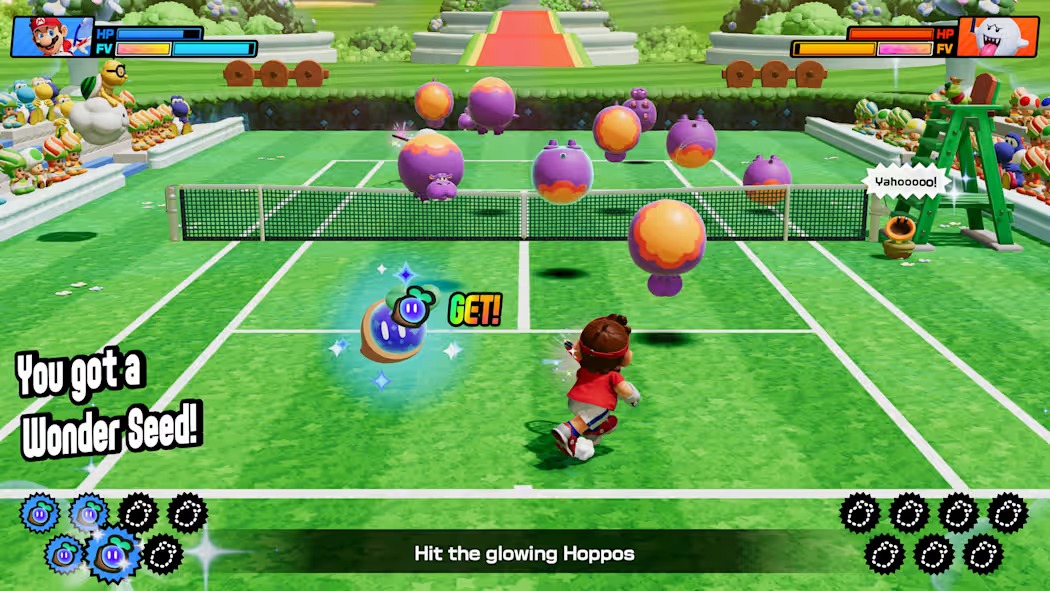
That said, if you prefer a different kind of mayhem, there are also new Wonder Court Matches, which borrow the titular blue flower seeds from Mario's most recent 2D platformer. This game mode nixes Fever Rackets in favor of changing up the rules of the sport on the fly in weird and unexpected ways. Don't be surprised when you have a hard time hitting seeds with your shots to activate wondrous effects while spike balls get tossed at you or a parade of piranha decides to have a party on top of the net.
Unfortunately, I wasn't able to play Mario Tennis Fever's Adventure mode, which is a bit of a shame as I've heard that it's deeper and more fleshed out. This is a welcome upgrade from the somewhat thin single-player campaign from Aces. Thankfully, the game still supports motion controls for younger players or anyone who'd rather swing a virtual racket instead of mashing buttons. I also appreciate that Nintendo is making it easy to get into multiplayer matches, as the game supports both online matches (ranked and unranked) and local wireless connectivity (LAN). For the latter, you can also use the Switch 2's Game Share feature to send the title to other nearby systems so people can try out Mario Tennis Fever for themselves, even if they don't own a copy.
Wonder Court Matches are another new way to upend the rules of Mario Tennis.
Nintendo
So if you're like me and you've always preferred sports games that are more bombastic instead of realistic, Mario Tennis Fever ($70) is shaping up to be a real grand slam. Pre-orders are live now ahead of the title's official release on February 12.
This article originally appeared on Engadget at https://www.engadget.com/gaming/nintendo/mario-tennis-fever-preview-a-racket-smashing-blast-140000408.html?src=rss
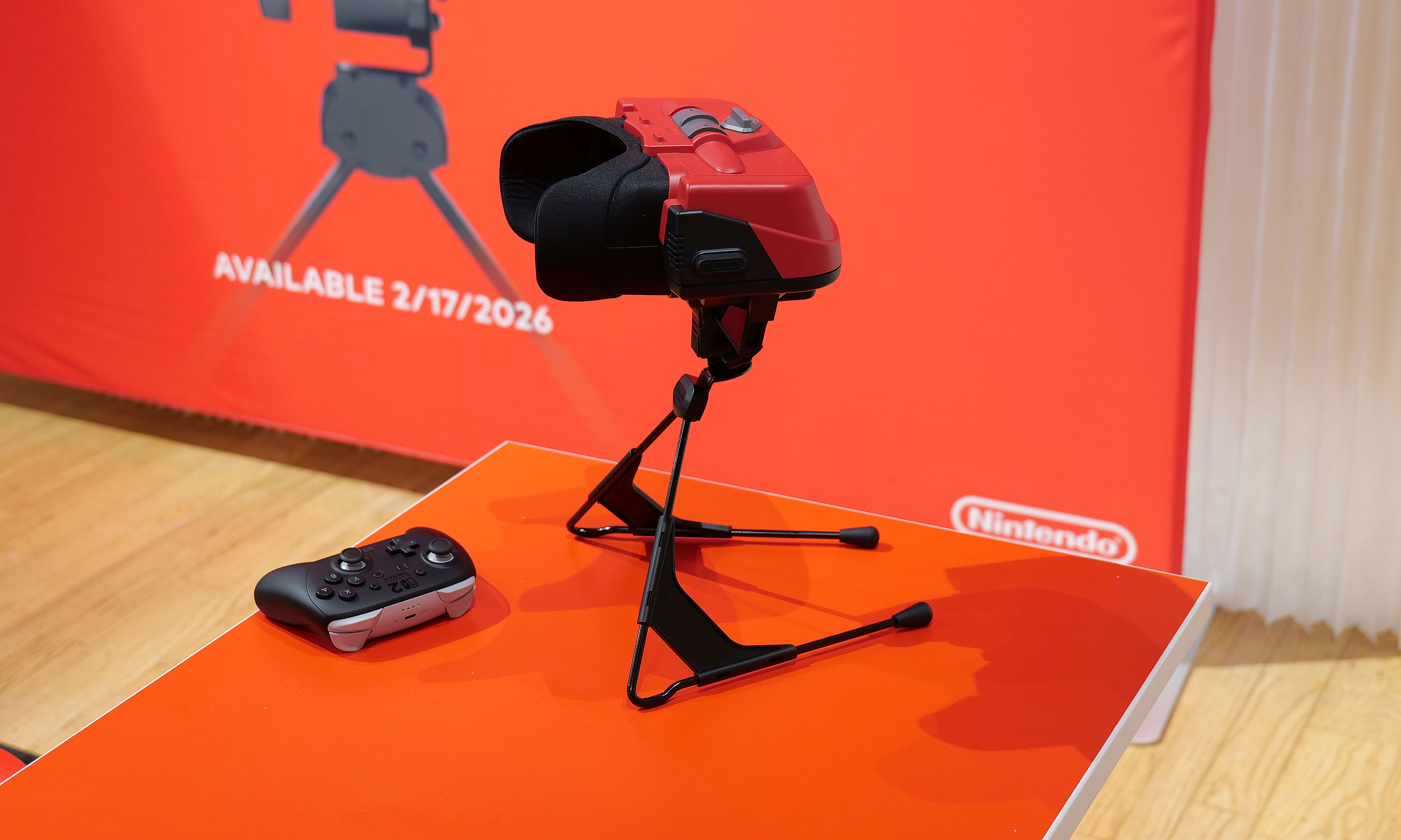
Even in 2026, VR still feels like tech that isn't quite ready for prime time. When Nintendo released the original Virtual Boy way back in 1995, it was hard for my 10-year-old brain to comprehend a 3D console with a bipod, a facemask and a monochrome red display. Then, when you factor in weak sales that led to the system being discontinued after only a year, you end up with a gadget that felt more like a mythical creature than something you could actually buy. But that's changing later this month when the Virtual Boy returns as an add-on for the Switch 2. After getting an early demo of Nintendo's new accessory, I can confirm that this thing feels just as weird and quirky as it did when it first came out more than 30 years ago.
The biggest difference on the new model is that it uses the Switch 2's screen as its main display and processor.
Sam Rutherford for Engadget
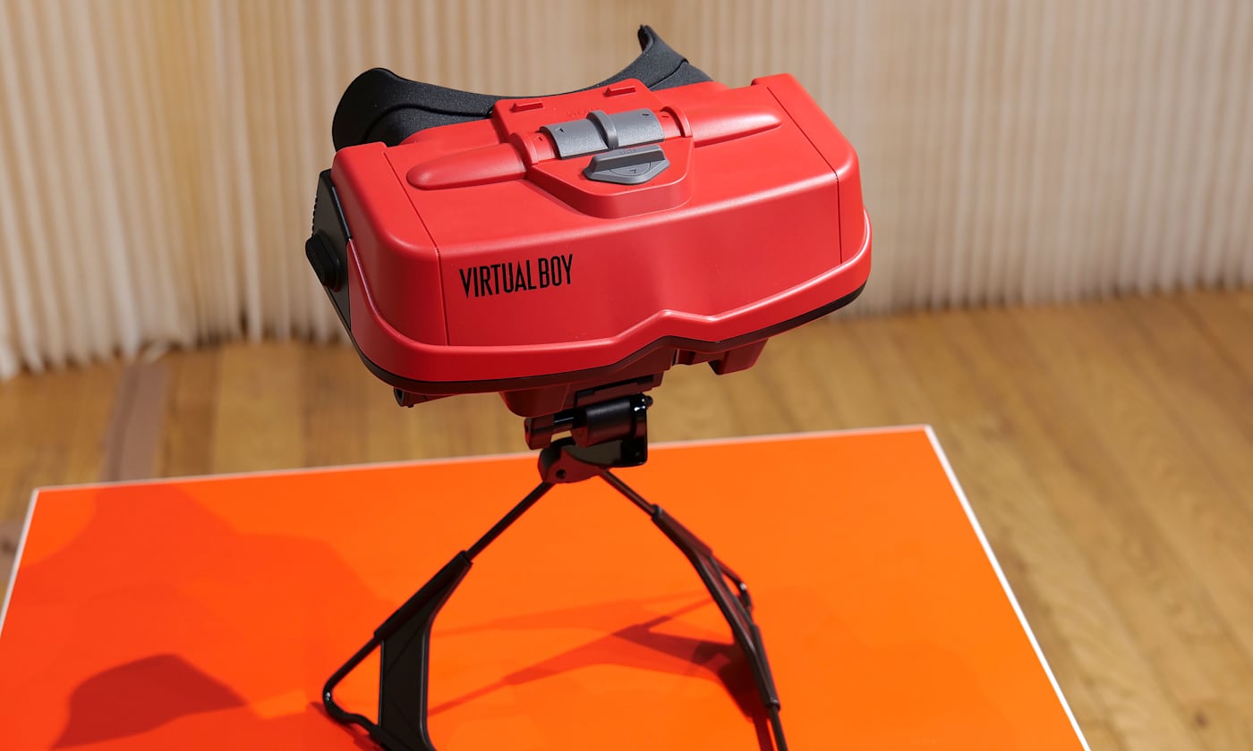
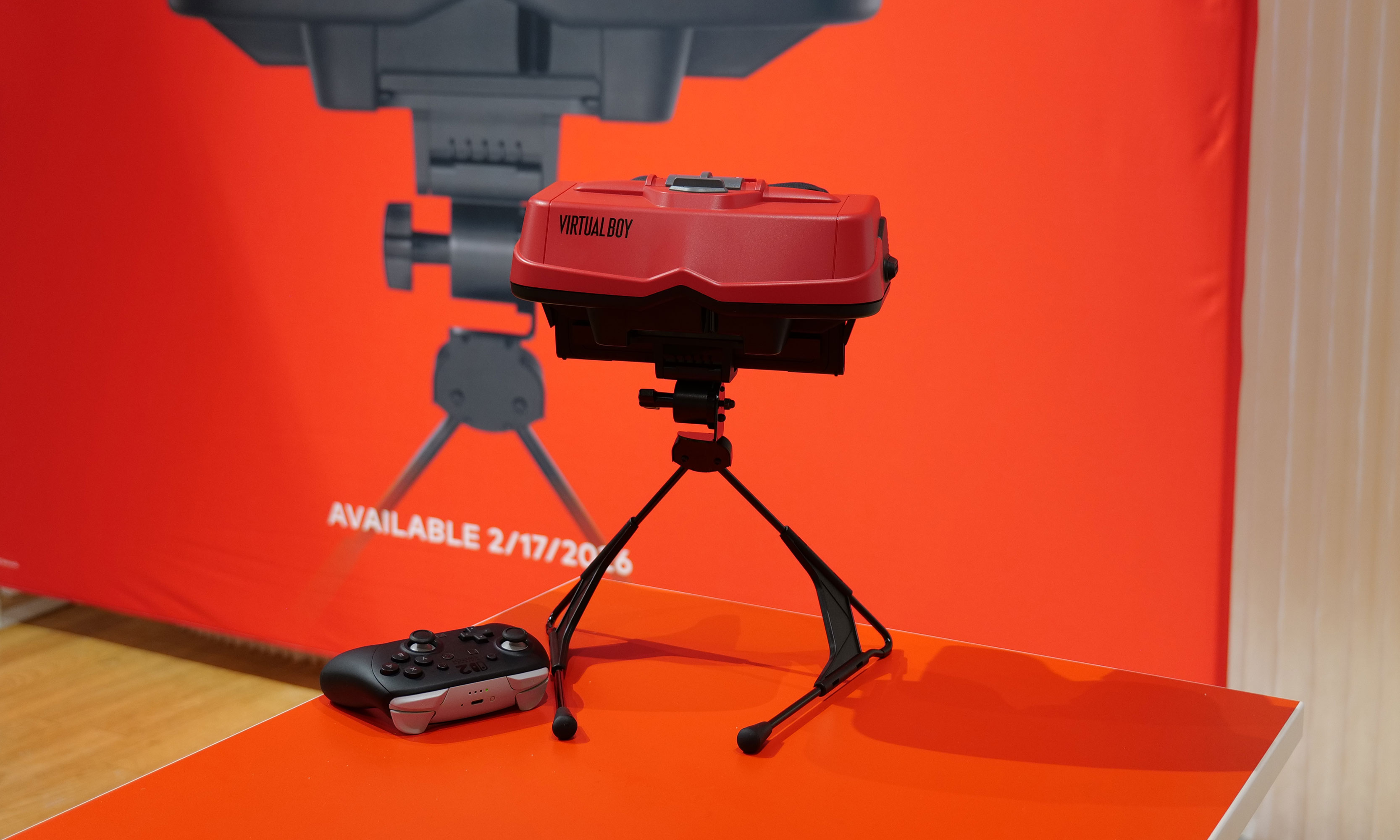
The most impressive thing about the revamped Virtual Boy is how much it looks and feels like the original. It still features that classic red and black color scheme along with a stand for propping it up. The biggest difference is that instead of having a built-in display, there's a slot where you can slide in a Switch 2 (with its Joy-Con detached). This brings several advantages: Since the Switch 2 has its own battery, there's no need for cords anymore. It also means you don't have to worry about swapping in individual game carts, as software can be downloaded directly from Nintendo's online store. Graphics also look much sharper than I remember, though I admit that could just be me getting old. Finally, instead of reviving the Virtual Boy's archaic gamepad, Nintendo smartly opted to let us use the Switch 2's current lineup of controllers. The end result is a design that's faithful to the original but doesn't suffer from many of the pitfalls that plagued so many 90s gadgets — like tangled wires, awkward controls and fuzzy displays.
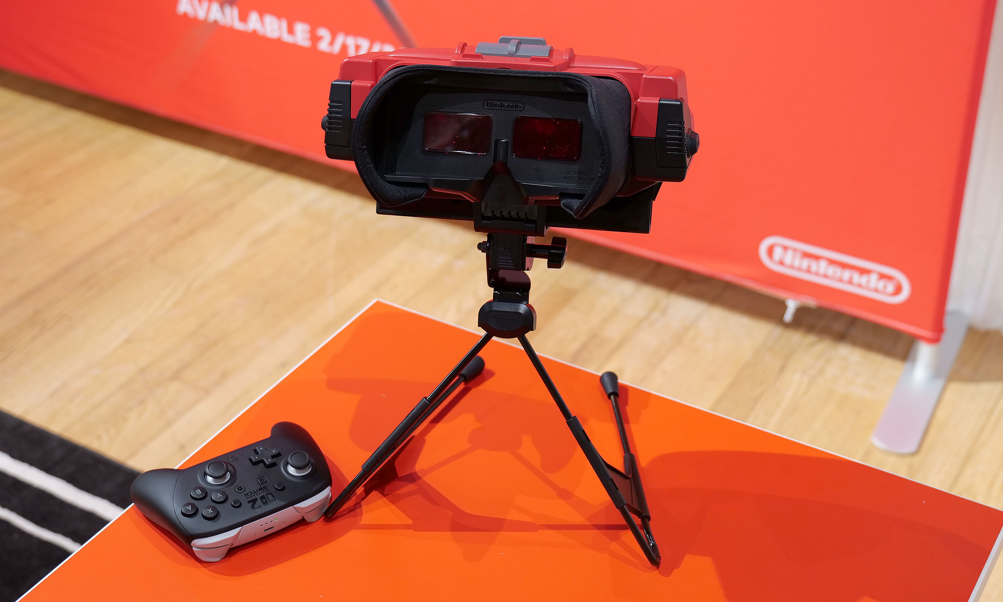
One thing Nintendo didn't change is Virtual Boy's monochrome red visuals.
Sam Rutherford for Engadget
However, even with a fair bit of modernization, it's hard to prepare your mind for the journey back in time that happens when you actually use it. Unlike every other contemporary VR headset, you still don't strap the new Virtual Boy onto your face. Instead, you have to adjust its bipod so that its facemask is level with your face and then you kind of just lean in to immerse yourself in a world where red is the only color. It's definitely a bit awkward, but it works. Nintendo even included a way to adjust IPD, so visuals look just as crisp (if not moreso) as they did on the original.
That said, the clunkiest thing about the Virtual Boy is its games. While Nintendo updated its exterior and internals, the company didn't really mess with its software — for better and worse. This means you get a relatively unadulterated look at where people thought VR was headed 30 years ago, which becomes immediately evident as soon as you boot into one of the console's first seven games. Galactic Pinball is slow and trying to time when to hit the flippers to prevent the ball from getting past you is an exercise in frustration. Meanwhile, Red Alarm feels like a cheap port of Battlezone, just with a vaguely Arwing-shaped plane instead of a tank. And once again, the pacing on this aerial shooter is glacial. Then there's 3D Tetris, which just kind of hurts your head as you try to drop pieces from a top-down perspective while the entire stage pivots around and never stops moving. The only title that really stands out is Virtual Boy Wario Land, which was and still is the best game on the entire platform.
There's no getting around it, the Virtual Boy's bipod is just kind of awkward.
Sam Rutherford for Engadget
After playing with the revamped Virtual Boy for just under half an hour, it's just as eccentric and ungainly as the original was three decades ago. But you know what, I wouldn't have it any other way because this thing is just as much of a time capsule as it is a nostalgic revival of a forgotten system. And if you want to experience a hazy concept of what people thought the future was going to be, there still isn't anything like the Virtual Boy.
The Virtual Boy add-on for the Switch 2 officially goes on sale on February 17 for $100, with the caveat that buyers will need an active Nintendo Switch Online + Expansion pack membership. Also, in addition to the seven games available at launch, Nintendo is planning to add nine more throughout the year including Mario's Tennis and previously unreleased titles such as Zero Racers and D-Hopper.
This article originally appeared on Engadget at https://www.engadget.com/gaming/nintendo/the-switch-2s-virtual-boy-is-a-tribute-to-nintendos-wackiest-console-140000003.html?src=rss
At their core, refrigerators are relatively simple devices. If you're the type of person to view every extra feature as a component that could potentially go wrong, basic iceboxes are probably the kind you go for. But for those on the other end of the spectrum, Samsung's latest Bespoke Refrigerators with AI inside have more bells and whistles than you might think possible — including an optional 32-inch screen.
Editor's note: The model we tested for this review came out in the second half of 2025 and will continue to be on sale throughout 2026. Hardware will remain the same, the only changes will come in the form of an OTA software update slated for later this year that will add support for Google Gemini, improved food recognition/labeling and more.
Design: As sleek as a fridge can be
If you're into faux vintage appliances like Smeg's retro-inspired models, Samsung's offerings might not be for you. For everyone else, the Bespoke family does minimalist design better than practically any other line of fridges on the market. Granted, the counter-depth French Door AI model I tested is a bit of a departure thanks to a huge 32-inch screen embedded in its right-side door. That said, there are a ton of configurations, including the choice of a smaller 9-inch panel or models without a display at all. The latter looks like a big rectangle, but in a way that Dieter Rams would probably appreciate (I'm just guessing, I don't have his contact info). Other options include setups ranging from four-door models to side-by-side two-door variants or even a single-panel upright model.
Glare is one of the tiny downsides of a fridge with a glass front.
Sam Rutherford for Engadget
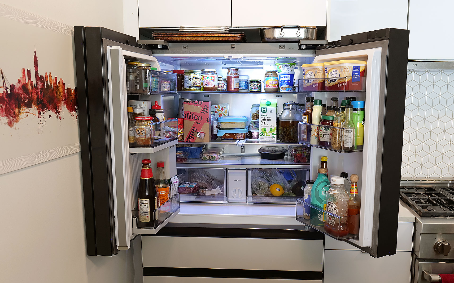
On my review unit, the fresh food section is a touch smaller (16.5 cubic feet) than you might expect from a fridge this size, though I've never really felt limited by the amount of available storage. Samsung does a good job of optimizing interior space by providing a number of adjustable shelves, including a sliding one on the right side that makes it easy to store taller items without completely sacrificing flat space for others. The shelves are also spill proof and made out of tempered glass, so they resist scratches and just look a bit nicer than those made from lower-quality materials. I also appreciate how Samsung found a spot between the two crisper drawers for the water filter, instead of just sticking it in the top corner like a lot of competitors.
Even with the FlexZone drawer stealing some space, the main section of this Bespoke model still features 16.5 cubic feet of storage.
Sam Rutherford for Engadget
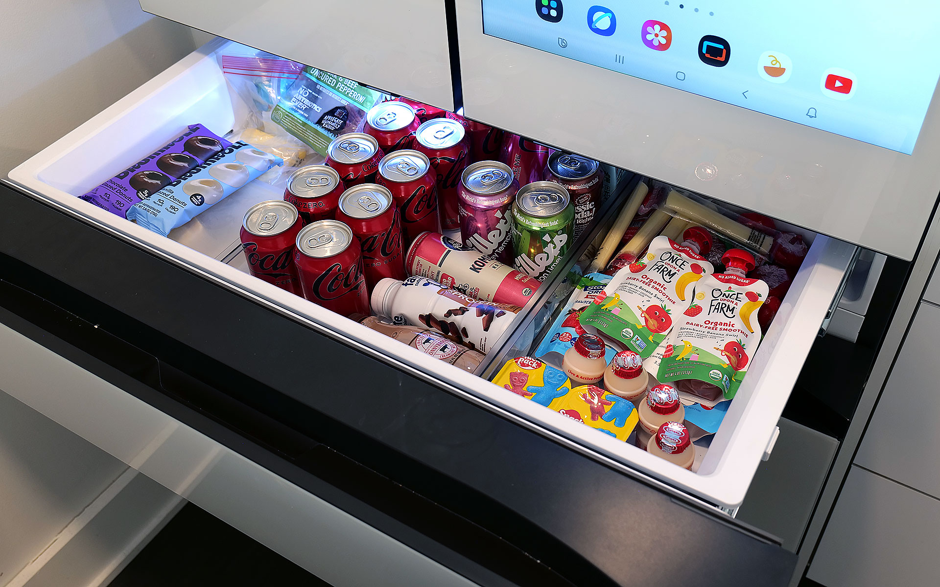
Meanwhile, in exchange for a slightly smaller main cabinet, this model has what Samsung calls a FlexZone drawer, which might be my second favorite thing about this fridge. It's perfectly designed for storing things like 12-ounce cans and juice boxes, and as someone who always likes to keep a couple of chilled Coke Zeros on standby, it's super convenient. That said, taller bottled drinks may need to be stored on their sides, which doesn't feel quite as efficient. But really, you can put anything you want in there and if you have young children like me, it's an excellent place to keep refrigerated kids' snacks. My four-year-old can go in there on his own without needing help from an adult to reach stuff higher up. Samsung even gives you the ability to set a different temperature for the FlexDrawer, which is a nice touch.
The optional FlexZone drawer is amazing for stashing drinks or having a refrigerated section that's easy for kids to reach.
Sam Rutherford for Engadget
Additionally, along with some rivals from LG, this fridge also has touch sensors at the bottom of each door that let you open them with a light tap. While I still prefer to just grab the built-in handles (which are located both above and below each door), this is a nice inclusion, particularly on a fridge that doesn't have giant handgrips bolted to the outside. My one small gripe with Samsung's exterior design is that its top isn't completely flat as it dips down in back. Admittedly, this hasn't stopped me from storing stuff like sheet pans and roasting trays above the fridge, but it would be nicer if things were fully level up there.
Water and ice dispensing: Samsung's Beverage Center reigns supreme
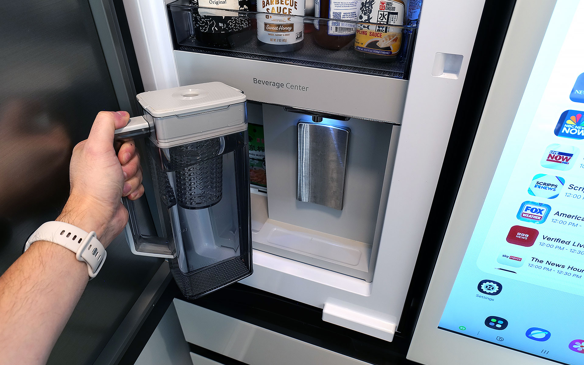
I've already gone on record about how Samsung's Beverage Center is the best new feature to land on any fridge in years, so without belaboring the point, but I'll happily wax poetic about it again. Instead of having a water dispenser installed smack dab on the outside of the door, Samsung opted to hide things behind an exterior flap on the left side of the fridge. This accomplishes several things. Not only does it feel a bit more hygienic because the spigot isn't subjected directly to all the germs swirling around the kitchen or a cough or sneeze from anyone passing by, it also simplifies the fridge's exterior design. This might sound a bit weird, but I've always thought that putting water dispensers on the outside of a fridge was kind of like installing a shower in the middle of a room. It's just kind of awkward. Furthermore, by opening the Beverage Center's door, you also have access to one of the fridge's interior shelves, which makes it quick and easy to grab things like ketchup, mustard or any other sauces you might need for a meal. My wife stashes her matcha there, so it's readily available first thing in the morning.
Samsung's Beverage Center is one of the best fridge innovations and years. It includes both a water dispenser and a built-in pitcher that refills itself automatically.
Sam Rutherford for Engadget
But the most important thing is that right next to the spigot, there's also a built-in water pitcher that automatically refills itself after every use. This means there's pretty much always 40+ ounces of ice-cold water (depending on the specific model) that you can pull out and pour. This allows you to fill up everyone's cup in seconds like a server at a restaurant, instead of blocking the entire fridge while you slowly top off each glass individually. To me, it's the difference between an active process where you can dictate your own pace versus having to stand there while the machine takes its sweet time. Plus, if you like infusing your water with fruit or tea, there's a built-in basket filter for that too. The Beverage Center is a truly useful innovation and one of Samsung’s biggest advantages over its rivals, and because the company patented it, it'll be years before competitors can come up with copies.
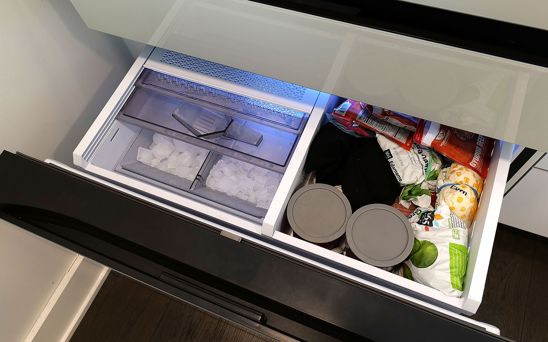
The top shelf in the freezer also contains the ice maker, which comes with an included scoop and the ability to make two difference kinds of cubes.
Sam Rutherford for Engadget
As for ice, the model I'm testing can produce two different types: regular cubes and smaller pebbles. There's also an included scooper and a dedicated shelf for storing it. Now I will admit that the smaller pebbles aren't quite as good as what you get from a standalone nugget-style icemaker, but in my experience they're more than good enough for anyone who likes variety in their frozen water. My small critique for Samsung is that I've heard the ice trays on other models come with sliders that have actual ball bearings instead of plastic rails and I wish the latter were a standard inclusion on every model. There's never so much friction that anything would get properly stuck, it would just be nice if things slid a bit more smoothly.
The screen: A welcome addition to a digital lifestyle
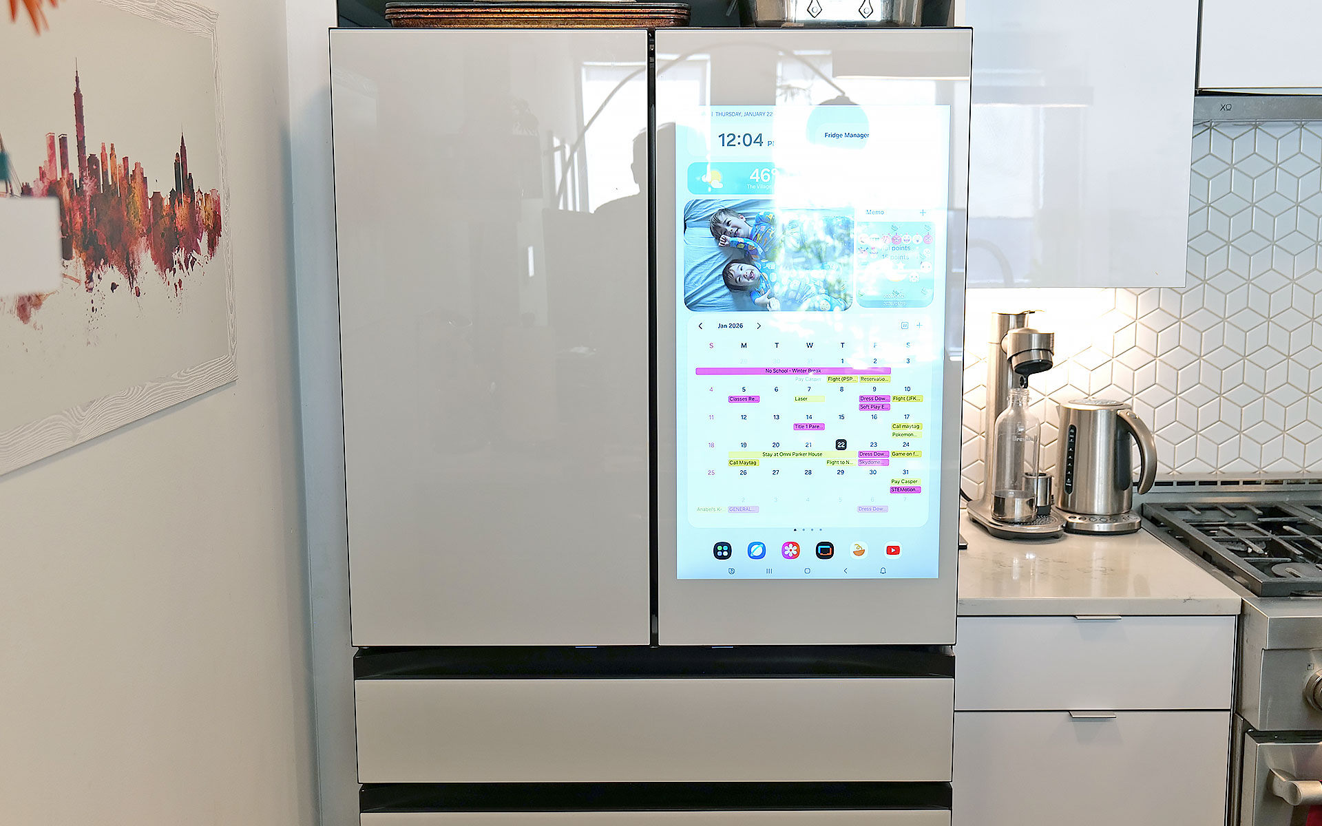
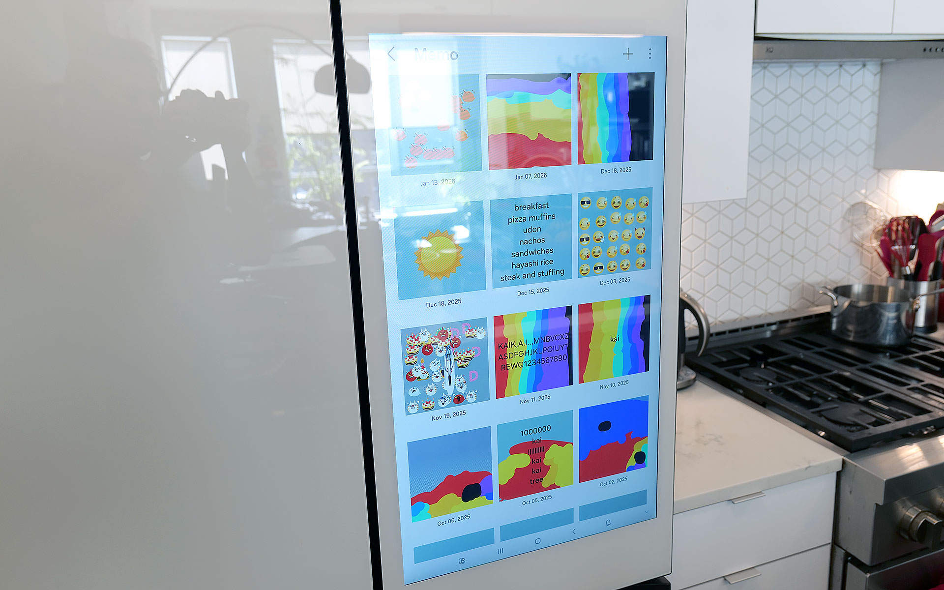
The fridge's 32-inch display can be used to write memos or draw, along with a ton of other functions.
Sam Rutherford for Engadget
Of course, one of the biggest potential objections about Samsung's latest fridges may also be one of its biggest strengths: their optional displays. With the continued intrusion of screens into our daily lives, I'm not here to tell you that you need one more. However, even though I was skeptical at first, I've grown to really appreciate having one on the fridge and I'd argue that unless you're skipping the feature entirely, the larger 32-inch panel is what you want.
The main reason is that, at least for my family, so much of what we do is already digital. Things like calendars, shopping lists, recipes and family photos already live on my phone and being able to share all of that with the fridge directly via Wi-Fi is a major plus. Frankly, it's easier to upload a picture to the fridge's display than it is to print one out and post it, which goes double for Samsung's Bespoke line since its glass front means magnets don't stick. Even though I already have a smart display in our kitchen, the size of Samsung's screen, along with support for a handful of important apps, have turned the fridge into a better family hub than anything else we own. Because there's so much space, there's room for photos, memos, the weather, filter status and a full 30-day calendar — the latter of which has significantly improved my family's planning and coordination.
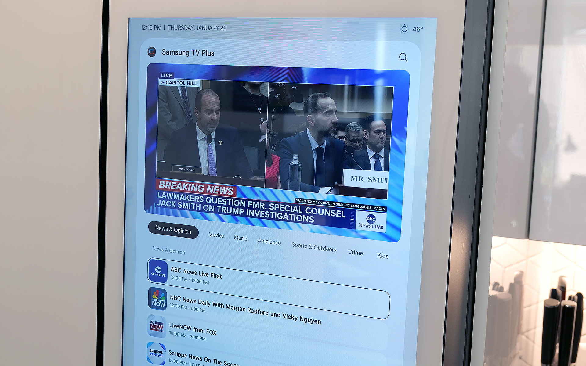
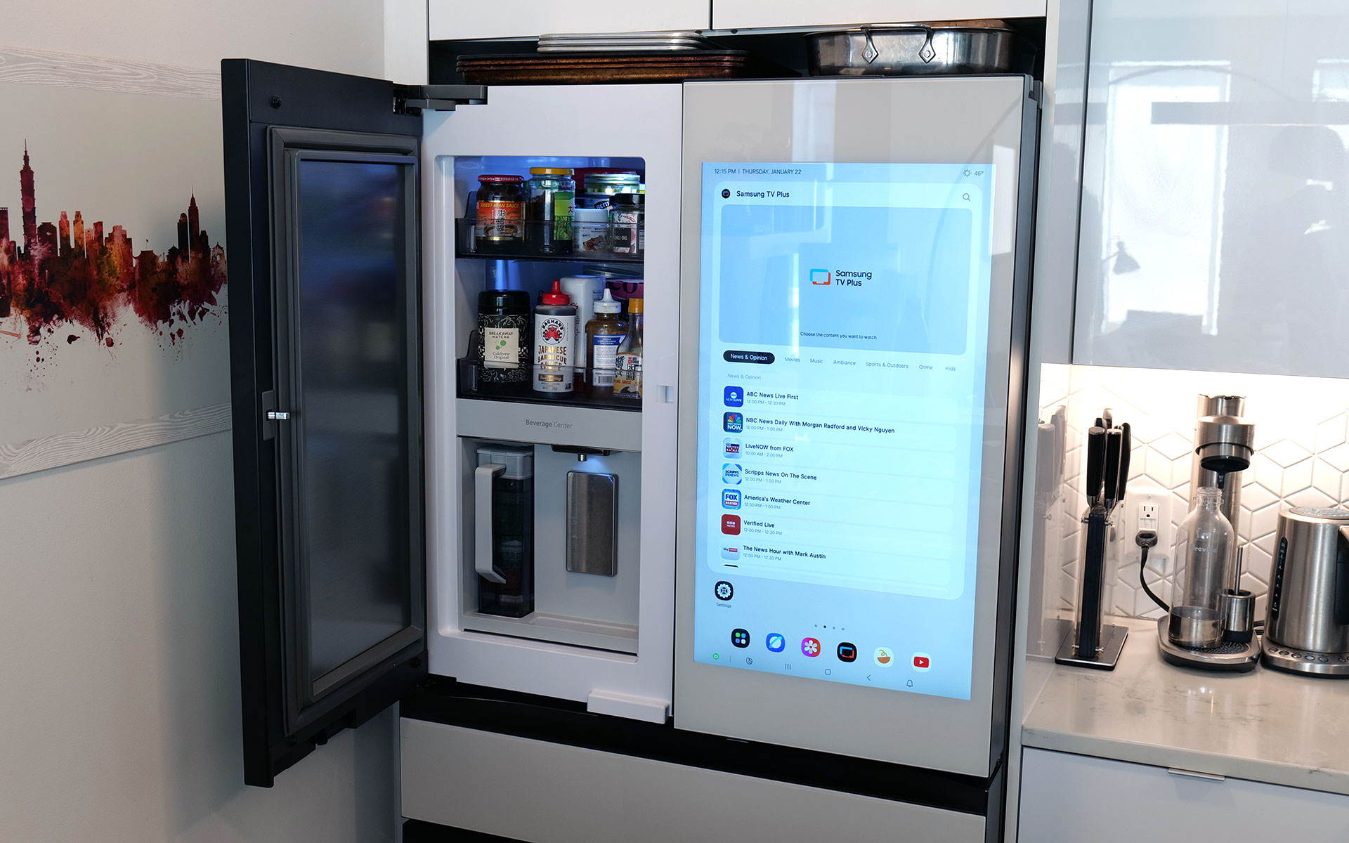
You can even watch TV or YouTube videos right on the fridge's display.
Sam Rutherford for Engadget
The fridge runs Samsung's Tizen OS, which is basically the company's lightweight take on Android, so it's super easy to use. You can swipe left and right to add additional widgets to your screen, play music or even watch videos (YouTube, Samsung TV Plus, etc.) if you're so inclined. That said, sometimes I wish the screen was a bit more responsive, because even though I don't think it's a dealbreaker, after having reviewed several generations of the company's phones, I know Samsung can do better. There are also some settings from its handsets that I wish would get ported over to its fridges — like a dedicated dark mode. When I grab a glass of water later at night, the last thing I need is the entire display blasting my kitchen like a pair of hi-beams.
AI Inside: A work in progress with benefits today
With seemingly every tech company trying to shoehorn AI into its latest products, it's easy to roll your eyes at the idea of adding that into a fridge as well. And I think even Samsung would admit that its efforts to integrate machine learning into the Bespoke line are a work in progress. I've found that while it certainly isn't essential, the AI features found here can be a handy bonus in the right situations.
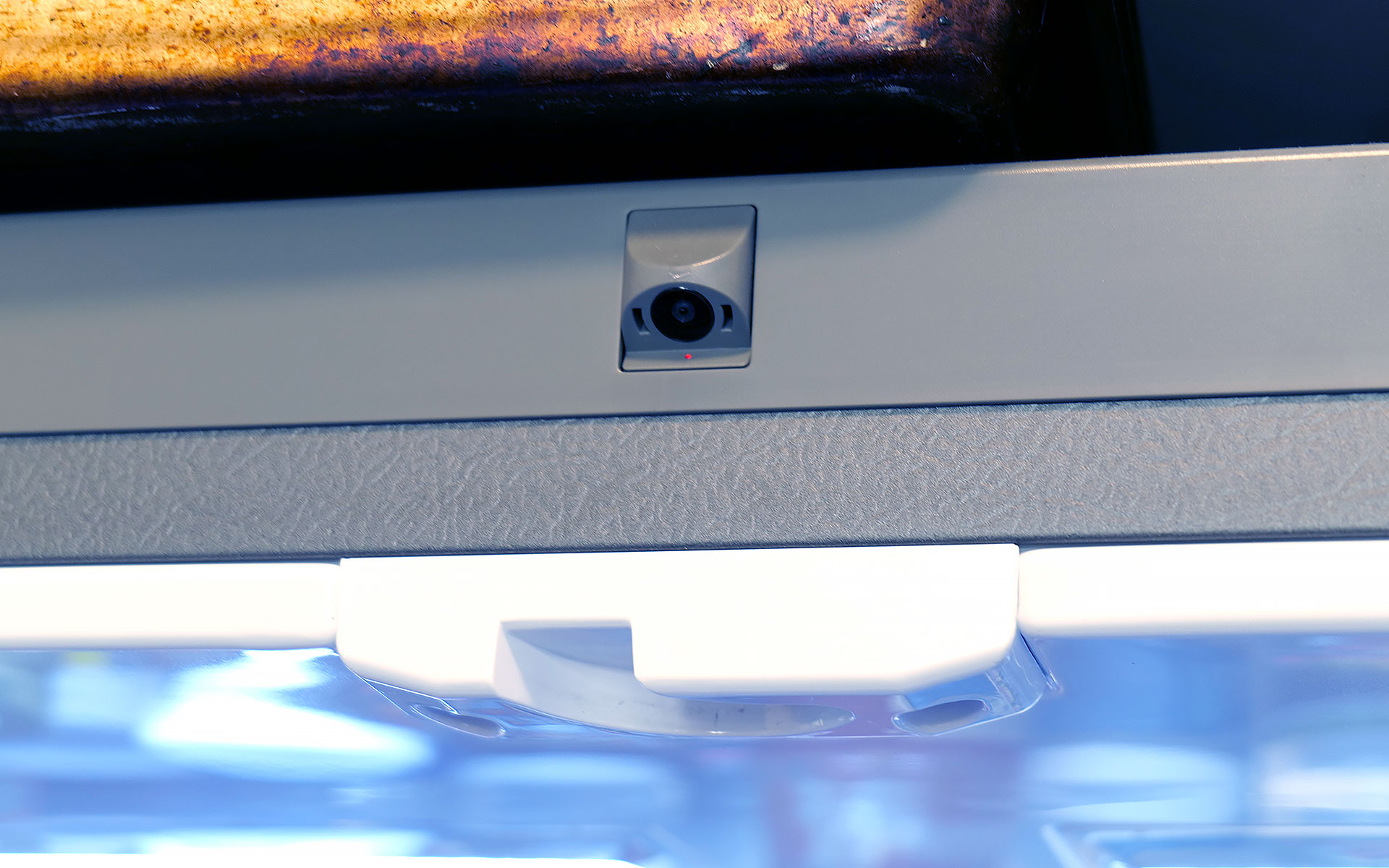
Bespoke models with AI feature a camera mounted to the top of the fridge that can recognize and take pictures of the food you put inside.
Sam Rutherford for Engadget
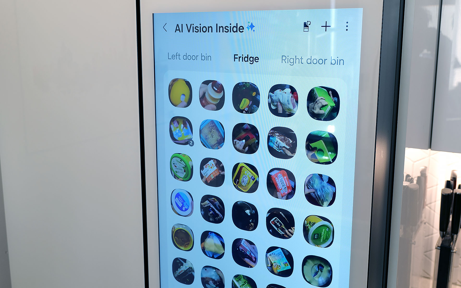
AI Vision is the headline feature in Samsung's package, which uses machine learning and a camera mounted to the roof of the fridge to automatically recognize and record items you put inside. However, there are some limitations. Currently, Samsung's AI can detect 37 different food items like fresh fruit and veggies, along with an additional 50 kinds of packaged goods like yogurt. Furthermore, the camera only records what goes into the fridge's main cabinet, so anything you put in the FlexZone drawer, freezer or either door won't get recorded. Regardless of whether an item is recognized or not, the fridge will then take a photo of the item (and tag it with the name of the food if it can be properly identified). You can then view a list of everything in the fridge via a dedicated tab on its screen (assuming your model has one) or from your phone via Samsung's SmartThings app. From there, you can do things like set names for anything uncategorized or add an expiration date, though I wish the fridge would do that last part on its own.
The fridge uses AI to automatically track food that it can recognize and applies labels to the corresponding photo.
Sam Rutherford for Engadget
In practice, this means you just put items in the fridge like you would normally and let the AI sort things out on its own. You can always go through the main list to see if you have a specific item or let the fridge automatically delete things when you take them out. That said, the AI doesn't get things right every time, because while Samsung's programming does clear things out after a certain amount of time, you will still need to delete food manually from time to time. Thankfully, for items in the door, the fridge can show you a live feed of what's there, so if you're at the store and can't remember if you have milk or not, you can simply pull out your phone and see for yourself.
Because the camera is mounted to the top of the fridge, you might not get the clearest picture or you may end up with your hand covering part of the food as the fridge takes a picture as you put items inside. Even so, that's still more than enough for me to be able to tell what something is just by looking at a small icon. I've found that Samsung AI Vision legitimately makes it easier to grocery shop by allowing me to see what food I have at a glance, regardless of whether I'm at home or at the store.
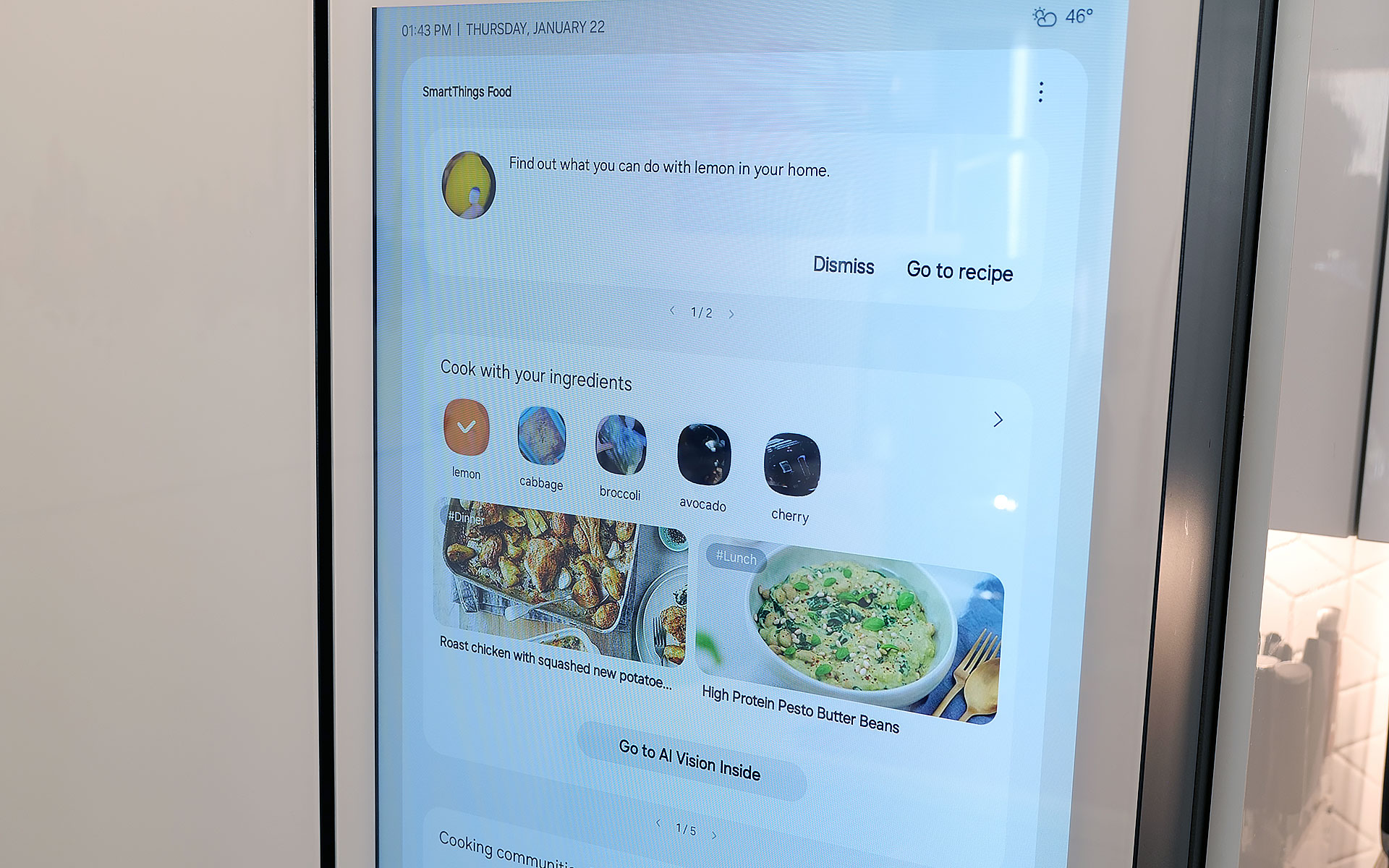
Samsung also uses AI to suggest recipes based on ingredients you already have in the fridge. You can even specific things like food preferences and dietary restrictions.
Sam Rutherford for Engadget
On top of that, the fridge also has built-in meal planning capabilities. This means you can ask the fridge to come up with a dish based on ingredients you already have, and it's surprisingly good. Not only do you have the ability to specify preferences and dietary restrictions, there's a wide variety of recipes it can choose from. On several occasions, I even found that when asked to suggest a recipe, the fridge came up with dishes I already had in mind. Alternatively, it will highlight when you're missing items for a potential dish, so you can grab them the next time you're at the store. This is one of the most helpful features, because often at the end of the week, I find myself with a handful of leftover ingredients. So when the fridge uses that info to suggest recipes that use those items, it helps reduce food waste.
Sadly, the weakest part of Samsung's AI is Bixby. In addition to being overeager when listening for voice prompts, which ended up causing a lot of inadvertent triggers, Samsung also put the Bixby icon near the bottom left corner of the screen. That's right next to the sensor and handle for the door, resulting in even more unwanted summons. After using this fridge for four months, I wish Bixby would just go away, and it seems Samsung agrees. Sometime later this year, the company is adding support for Google Gemini, which should deliver a massive upgrade to the fridge's voice-controlled capabilities.
A word on ads
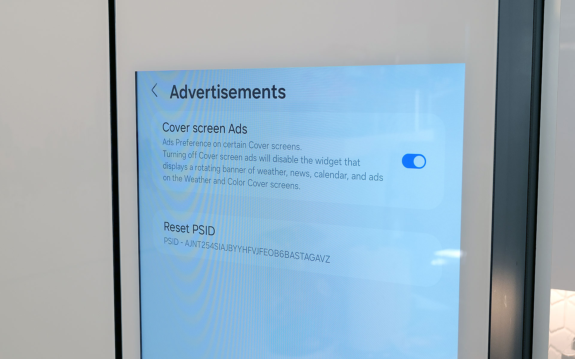
You can disable ads that show up on the fridge's cover screen, though that will also get rid of the news and weather widgets. Thankfully that doesn't impact that widgets on the fridge's main home screen.
Sam Rutherford for Engadget
Last fall, to the dismay of many, Samsung announced that it was adding ads to its Family Hub fridges, including Bespoke models with built-in displays. Now no one likes being taunted with commercials, especially when they're on expensive appliances located in the busiest room of their home. Thankfully, I've found that these ads only show up on the Cover Screen, which only appears after no one has used the fridge in a while, kind of like a screensaver on a desktop. Furthermore, you can disable these ads entirely. The downside is that doing so also gets rid of the rotating news and weather widgets that appear on the home screen. But in my experience, that's just fine, because I don't need what is effectively the fridge's lock screen to have that much going on. Plus, when you open the fridge or touch its screen, it instantly reverts to the main home menu, which includes its own set of widgets that you can customize how you like.
Some quick notes and observations
For some reason, the door to the Beverage Center doesn't soft close like the rest of the doors do.
Sam Rutherford for Engadget
The Bespoke fridge’s screen does collect smudges, but so does stainless steel, and it doesn't really impact viewability. And on white glass models like my review unit, the simple design makes it easier to clean and maintain than typical metal-clad rivals.
The door to the Beverage Center doesn't soft-close like you'd normally expect on a fridge. It's more of a clack, which isn't a bad thing on its own, though I hope Samsung changes its design to match the other doors on future models for consistency's sake.
Because the fridge runs Tizen and not full Android, there aren't nearly as many choices for widgets. For example, there's a widget for Spotify and Amazon Music, but not YouTube or Apple Music. There's also only a single option for weather and a widget for pinning your favorite websites, but very little choice when it comes to dedicated news options. In my testing, the SmartThings integration worked better on Samsung phones compared to standard Android handsets, but your experience may vary.
If you are so inclined, you can create shopping lists directly on the fridge and then order them from partners including Instacart, Amazon Fresh, Walmart and others.
Wrap-up
AI in a fridge might sound ridiculous, but it allows for some genuinely useful features, even if the tech suffers from growing pains. And while this might sound preposterous, I think Samsung should actually double down on the tech by adding even more cameras, so the fridge has more angles and viewpoints to choose from as its algorithms evolve. The ability to automatically track what goes in and out of the fridge makes it easier to both shop and plan meals, and this is just in the early stages of the tech.
That said, obsessing over AI is sort of besides the point because even without it, Samsung's Bespoke French Door fridge is a first-class icebox. For tech-savvy people, its big screen helps simplify and organize our digital lives while simultaneously allowing the fridge to be helpful in ways you might not have even considered. It's also well-built and exquisitely designed to fit in seamlessly with other modern devices, which feels refreshing considering how often appliances feel like they are lagging years or decades behind gadgets like phones and laptops. And I can't overstate how much I like Samsung's Beverage Center, which in my opinion, is so good it's worth going with a Bespoke fridge just for that one feature.
In the end, the two biggest factors you'll need to consider are price and your appetite to digitize your kitchen, and by extension, your life. Starting at $3,500 for AI-equipped Bespoke models, Samsung's top-of-the-line fridges are far from cheap. Thankfully, versions without machine learning can be had for much less. But more importantly, you have to be willing to embrace technology's role in your home. You may not agree or want to pay this much for features like this just yet, but Samsung's Bespoke AI 4-Door French Door refrigerator has convinced me there's a happy home for smarter iceboxes.
This article originally appeared on Engadget at https://www.engadget.com/home/kitchen-tech/samsung-bespoke-fridge-with-ai-review-all-the-bells-and-whistles-140000099.html?src=rss
Gone are the days in which you needed to spend a fortune to get a good smartphone. In 2026, features once exclusive to high-end smartphones – big batteries, multi-camera arrays, high refresh rate OLED displays and more – have made their way down to more affordable models. Yes, you’ll still need to buy a flagship smartphone to get the best camera or fastest processor, but you don't have to make nearly as many compromises as you once did if you have a strict budget to adhere to when you go shopping for your next smartphone. If you have less than $600 to spend, let us help you figure out what features to prioritize when trying to find the best midrange smartphone.
While the term frequently appears in articles and videos, there isn’t an agreed-upon definition for “midrange” beyond a phone that isn’t a flagship or an entry-level option. Most of our recommendations cost between $400 and $600 — any less and you should expect significant compromises. If you have more to spend, you might as well consider flagships like the Apple iPhone 17 and the Samsung Galaxy S25 if you want the best smartphone experience. Devices like Pixel phones often sit in this price range too, offering some of the best value for Android buyers.
What to consider before buying a midrange smartphone
Buying a new device can be intimidating, but a few questions can help guide you through the process. First: what platform do you want to use? If the answer is iOS, that narrows your options down to exactly one phone. (Thankfully, it’s great.) And if you’re an Android fan, there’s no shortage of compelling options. Both platforms have their strengths, so you shouldn’t rule either out.
Of course, also consider how much you’re comfortable spending. Even increasing your budget by $100 more can get you a dramatically better product. Moreover, manufacturers tend to support their more expensive devices for longer with software updates and security updates, so it’s worth buying something toward the top limit of what you can afford.
Having an idea of your priorities will help inform your budget. Do you want a long battery life or fast charging? Do you value speedy performance above all else? Or would you like the best possible cameras with high megapixel counts? While they continue to improve every year, even the best midrange smartphones still demand some compromises, and knowing what’s important to you will make choosing one easier.
What won’t you get from a midrange smartphone?
Every year, the line between midrange and flagship phones blurs as more upmarket features and functions trickle down to more affordable models. When Engadget first published this guide in 2020, it was tricky to find a $500 phone with waterproofing and 5G. In 2026, the biggest thing you might miss out on is wireless charging – and even then, that’s becoming less true.
One thing your new phone probably won’t come with is a power adapter; many companies have stopped including chargers with all of their smartphones. Performance has improved in recent years, but can still be hit or miss as most midrange phones use slower processors that can struggle with multitasking. Thankfully, their camera systems have improved dramatically, and you can typically expect at least a dual-lens system on most midrange smartphones below $600 with decent camera quality, selfie performance and software support to keep things running smoothly for years to come..
Midrange smartphone FAQs
How long do midrange phones get software updates?
Support varies by brand, but most midrange phones receive around three to five years of software and security updates. Apple tends to support iPhones longer while companies like Google and Samsung now promise several years of Android and security patches for their midrange models. Budget-focused brands might offer less so it’s worth checking the update policy before you buy.
Are midrange phones good for gaming?
Yes, many midrange phones handle gaming well, especially popular titles like Fortnite, Genshin Impact and Call of Duty Mobile. They usually include capable processors, though you won’t always get the smoothest performance in the most demanding mobile games or at max settings. If you play casually or stick to less graphically intensive titles a midrange phone will feel more than adequate.
Georgie Peru contributed to this report.
This article originally appeared on Engadget at https://www.engadget.com/mobile/smartphones/best-midrange-smartphone-183006463.html?src=rss
Lumus got a major boost in brand recognition when one of its waveguides was selected for use in the Meta Ray-Ban Display glasses. But that already feels like old tech now because at CES 2026, the company brought some of its latest components to the show and based on what I saw, they seem poised to seriously elevate the optical quality of the next wave of high-end smartglasses.
When the Meta Ray-Ban Displays glasses came out, they wowed users as they were (and still are) one of a handful of smartglassess to feature a full-color in-lens display with at least a 20-degree field of view. But going by the specs on Lumus’ newest waveguides, we’re set for a major upgrade in terms of future capabilities.
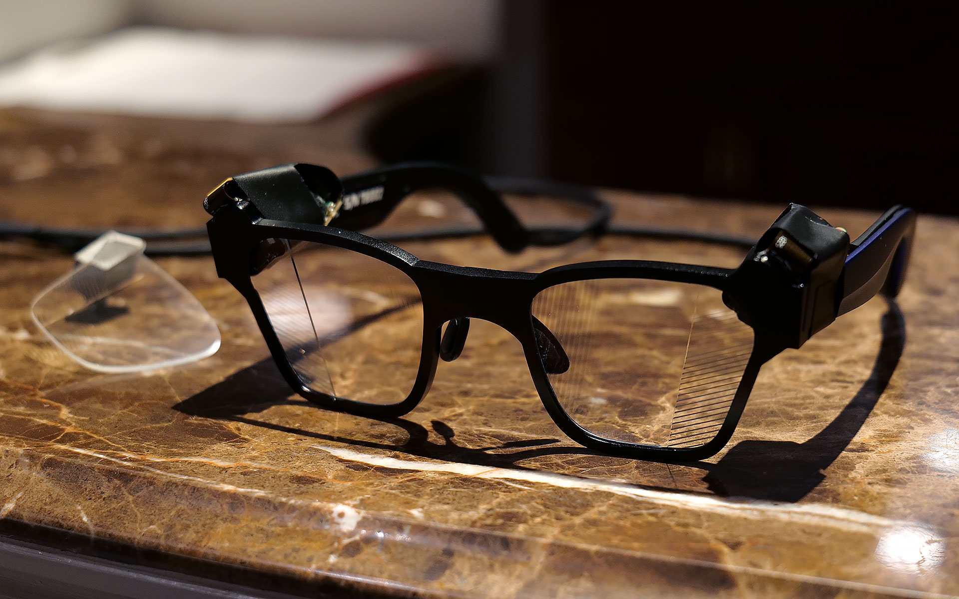
If you look closely, you can see where light from the waveguide propagates into the one of the smartglasses' lenses.
Sam Rutherford for Engadget
The first model I tried featured Lumus’ optimized Z-30 waveguides, which not only offer a much wider 30-degree FOV, they are also 30 percent lighter and 40 percent thinner than previous generations. On top of that, Lumus says they are also more power efficient with the waveguides capable of hitting more than 8,000 nits per watt. This is a big deal because smartglasses are currently quite limited by the size of batteries they can use, especially if you want to make them small and light enough to wear all day. When I tried them on, I was dazzled by both the brightness and sharpness I saw from the Z-30s despite them being limited to 720 x 720 resolution. Not only did the increase in FOV feel much larger than 10 degrees, colors were very rich, including white, which is often one of the most difficult shades to properly reproduce.
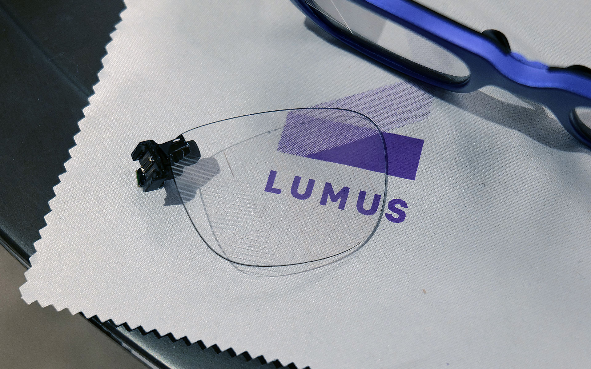
I had to take a photo of one of Lumus' non-functioning smartglasses with the company's 70-degree FOV waveguide, because two out of three of the working ones had already broke and the last one that I used was being held together by tape.
Sam Rutherford for Engadget
However, even after seeing how good that first model was, I was totally not prepared for Lumus’ 70-degree FOV waveguides. I was able to view some videos and a handful of test images and I was completely blown away with how much area they covered. It was basically the entire center portion of the lens, with only small unused areas around the corners. And while I did notice some pincushion distortion along the sides of the waveguide’s display, a Lumus representative told me that it will be possible to correct for that in final retail units. But make no mistake, these waveguides undoubtedly produced some of the sharpest, brightest and best-looking optics I’ve seen from any smartglasses, from either retail models or prototypes or. It almost made me question how much wider FOV these types of gadgets really need, though to be clear, I don’t think we’ve hit the point of diminishing returns yet.
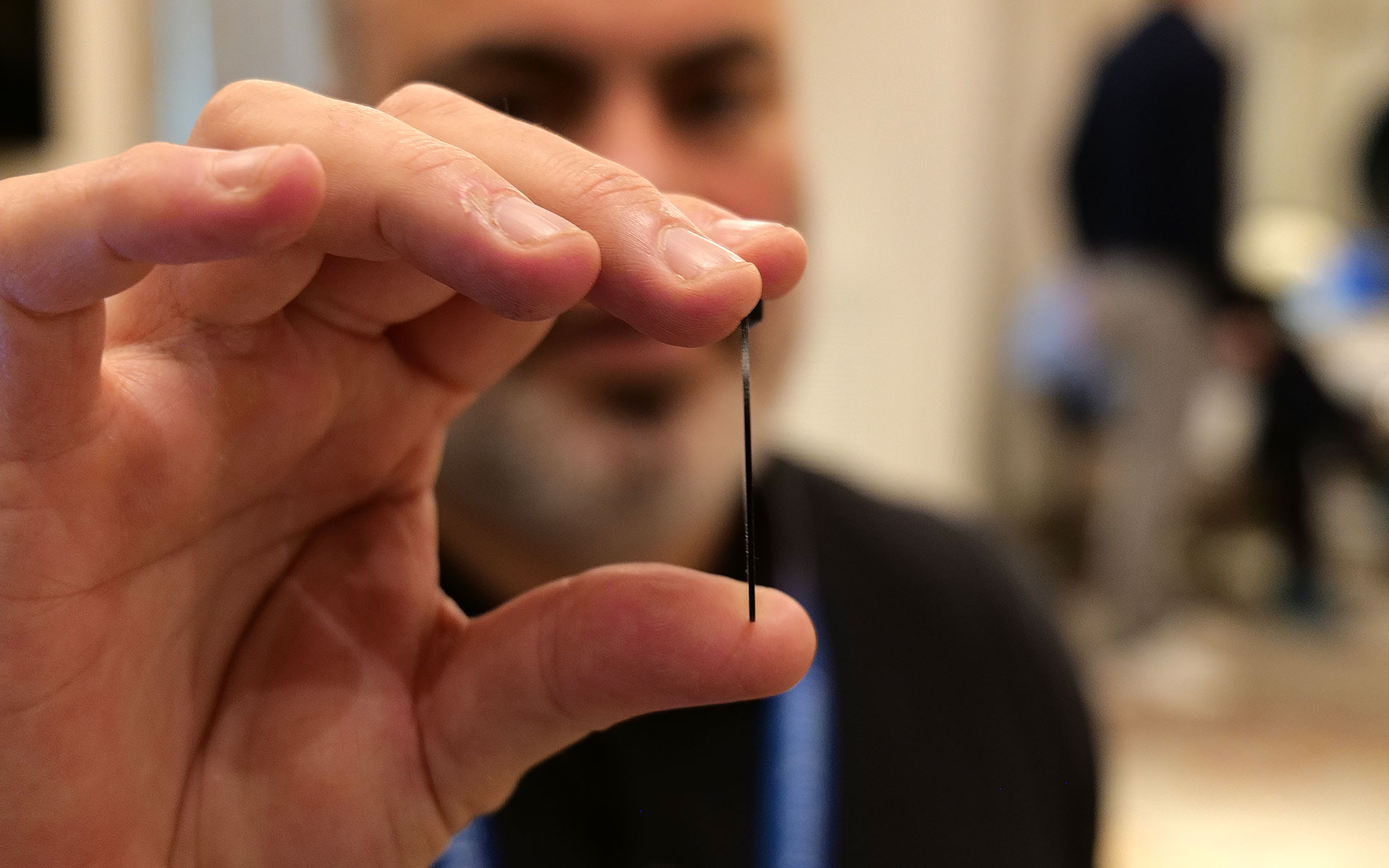
This is one of Lumus' thinnest waveguides measuring in at just 0.8mm.
Sam Rutherford for Engadget
Other advantages of Lumus’ geometric reflective waveguides include better overall efficiency than their refractive counterparts along with the ability to optically bond the displays to smartglasses lenses. That means unlike a lot of rivals, Lumus’ waveguides can be paired with transitions lenses instead of needing to resort to clip-on sunglass attachments when you go outside. Lumus also claims its designs also simplifies the manufacturing process, resulting in thinner waveguides (as small as 0.8mm) and generally higher yields.
Unfortunately, taking high-quality photos of content from smartglasses displays is incredibly challenging, especially when you’re using extremely delicate prototypes, so you’ll just have to take my word for now. But with Lumus in the process of ramping up production of its new waveguides with help from partners including Quanta and SCHOTT, it feels like there will be a ton of smartglasses makers clamoring for these components as momentum continues to build around the industry’s pick for the next “big” thing.
This article originally appeared on Engadget at https://www.engadget.com/wearables/lumus-brought-a-massively-wider-fov-to-smartglasses-at-ces-2026-233245949.html?src=rss
Last year Razer showed off Project Ava as a digital assistant that lived inside your computer to help adjust settings or provide gaming tips. But now at CES 2026, the company’s AI companion platform has gotten a major glow-up while moving into some new digs.
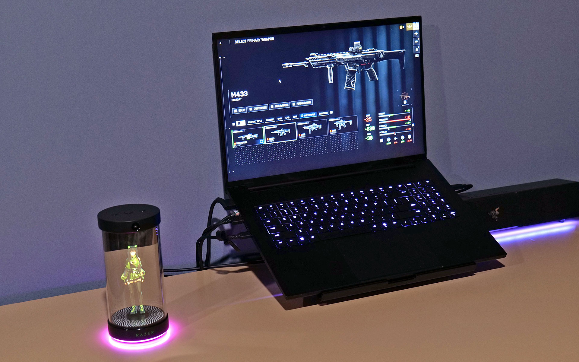
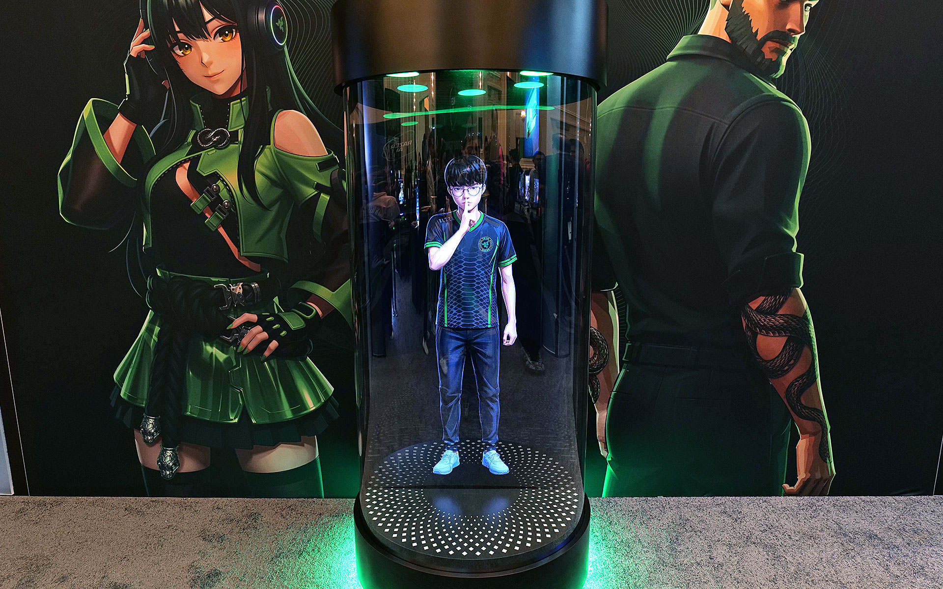
Now, in lieu of being constrained entirely to your PC’s screen, Razer has given Project Ava a real home in the form of a small tube that can display a 5.5-inch animated hologram of the AI’s avatar. You’ll still need to connect it to your computer via USB-C to provide Ava with the power and data it needs. However, all of your companion’s other components are built into its abode, including dual far-field mics so you can talk to it, a down-firing full-range speaker so it can talk and an HD camera with an ambient light sensor so the AI can see and react to its surroundings.
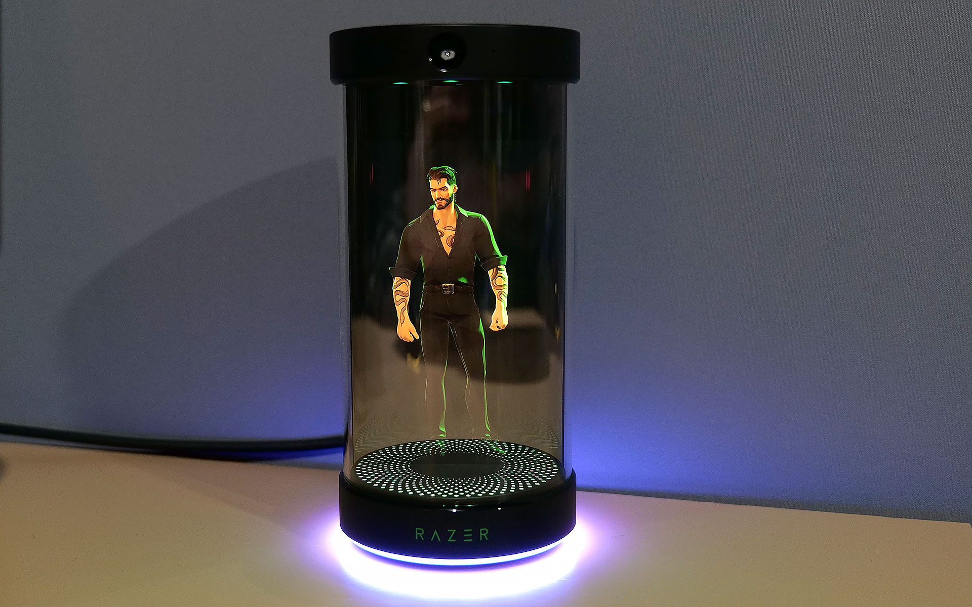
But perhaps the biggest upgrade to the project is that instead of just Ava, who Razer describes as “a calm, reliable source of energy to help you keep things clear, efficient, and always on point,” there are three or four new personas (depending on how we’re counting) joining the roster. Kira looks like a TikTok e-girl decked out in a frilly outfit complete with Razer neon green accents, while Zane is her edgy masculine alternative who kind of reminds me of the Giga Chad meme, but with extra snake tattoos. Then there’s Sao, who appears to be directly inspired by iconic Japanese salary woman Saori Araki. Finally, there’s an avatar made in the likeness of Faker (Lee Sang-hyeok), the most successful and well-known League of Legends player of all time and one of Razer's sponsored esports athletes.
The new peripheral for Project Ava is a cylinder that can display a 5.5-inch hologram of an AI companion.
Sam Rutherford for Engadget
The idea now is that instead of being trapped inside your computer, Ava or one of Razer’s other personas can sit on your desk and be your companion for everything. They can remind you of upcoming events, respond to questions or even comment on your outfit using Razer’s built-in camera. That said, if you need some privacy, the device’s mics can be muted and the company says its planning on putting a physical camera shutter on final retail models. Of course, Ava or any of the other avatars can still hang out while you game and give you advice. During my demo, Kira helped pick out a loadout in Battlefield 6 based on user criteria and even provided pros and cons for some of the game’s other equipment options.
Project Ava's expanded roster of AI companions
Razer
Unfortunately, while I did get to see Kira and Zane talk, dance and sway in their little bottles, Sao and Faker weren’t quite ready to make their holographic debuts. But according to Razer, that’s sort of by design as Project Ava is very much a work in progress. Currently, the avatars’ responses are generated by X AI’s Grok (yikes!), but the platform was created as a sort of open-source project that will support other models like Gemini or ChatGPT.
Down the line, Razer is hoping to add the ability for users to create their own unique avatars and companions based on their input or inspiration from real-world objects. Meanwhile, for avatars like Faker's because he’s also an actual person, Razer wants additional time to make the AI companion helpful with topics like real-time League of Legends coaching.
Say hello to Giga Chad, I mean Zane.
Sam Rutherford for Engadget
That said, while some folks might find Project Ava a bit weird or unnerving, it actually feels pretty tame (almost cute even) in an era where people are already marrying their AI partners. And if you’re the kind of person who prefers digital companions over flesh-and-blood alternatives (you know, people), I guess it’s kind of nice to have a more tangible representation of your electronic waifus and husbandos.
Faker's avatar was only viewable in this nearly life-size mock up.
Sam Rutherford for Engadget
Sadly, Razer has not provided full pricing for Project Ava’s holographic peripheral, though a representative said that it will be in the same ballpark as the company’s other peripherals. I’m estimating a final cost of around $200. Reservations for Project Ava are currently live with a $20 deposit before official shipments begin sometime in the second half of 2026.
This article originally appeared on Engadget at https://www.engadget.com/gaming/pc/razer-put-a-waifu-in-a-bottle-at-ces-2026-205315908.html?src=rss
The latest generation of smartglasses can create huge virtual screens without the need to lug around giant monitors are a real boon to frequent travelers. However, their specs aren’t often tailored to the needs of gamers, so at CES 2026, ASUS and XREAL partnered to make a pair with two very important features you don’t normally get from rivals.
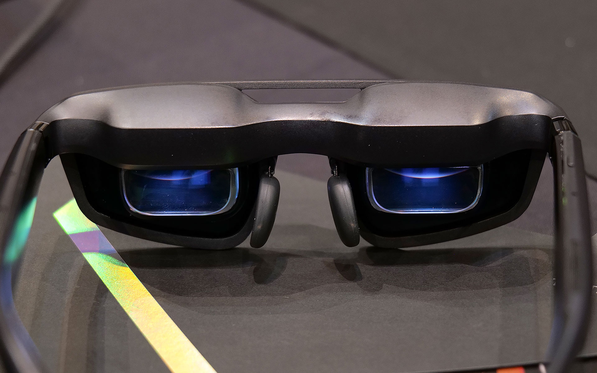
The new ROG XREAL R1 AR glasses are based on the existing XREAL One Pro, so naturally they share a lot of the same components and specs including dual micro-OLED displays with a per-eye resolution of 1,920 x 1,080, three degrees of freedom (natively), 700-nit peak brightness, 57-degree FOV and built-in speakers tuned by Bose. However, the big difference on the R1s is that instead of maxing out with a 120Hz refresh rate, ASUS and XREAL’s collab goes all the way up to 240Hz. That’s a pretty nice bump, especially for people with older hardware or anyone who might not have access to a high refresh rate display or just doesn’t want to lower their standards while traveling.
The ROG XREAL R1 AR smartglasses deliver 1,920 x 1,080 resolution to each eye with a 240Hz refresh rate and 57-degree FOV.
Sam Rutherford for Engadget
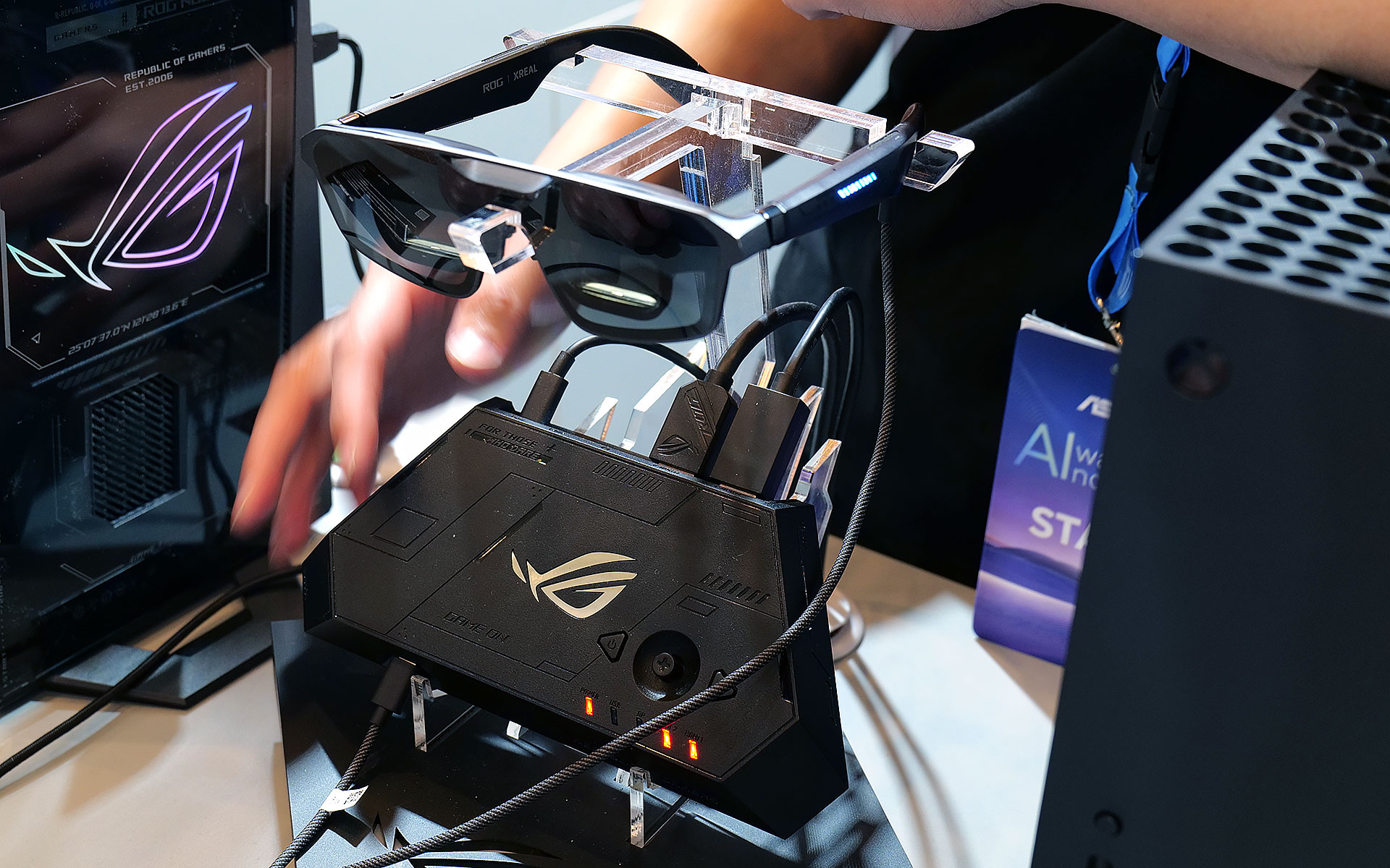
The other big addition is the R1’s included ROG Control Dock, which from what I’ve seen is slightly better suited for home use. It’s designed to be a simple hub with two HDMI 2.0 jacks, one DisplayPort 1.4 connector and a couple of USB-C slots (one is for power), so you can quickly switch between multiple systems like your desktop and console with a single touch. That said, depending on the situation you might not even need the dock at all because the R1s can also be connected to compatible PCs or gaming handhelds like the ROG Ally X and ROG Xbox Ally X (see the synergy there?) directly via USB-C.
When I got to try them out at CES, the R1s delivered a very easy to use and relatively streamlined kit. At 91 grams, they are barely heavier than the original XREAL One Pro (87g) so they don’t feel too weighty or cumbersome. I also really like the inclusion of electrochromic lenses, which allow you to change the tint of the glasses with the touch of a button. This lets you adjust how much or little light you want to come in through the front to best suit your environment. And thanks to support for three DOF, you have the ability to pin your virtual screen in one location or let it follow you around.
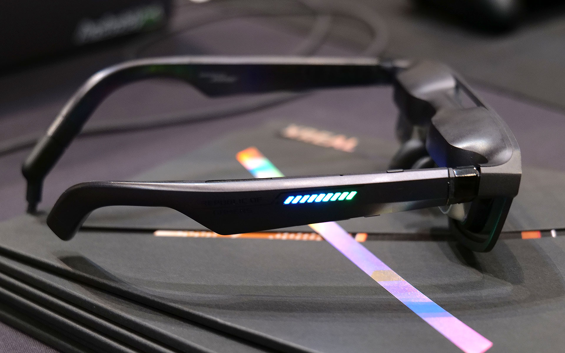
Of course, ASUS and XREAL couldn't resist putting RGB lighting on the ROG XREAL R1 AR smartglasses.
Sam Rutherford for Engadget
Now it is important to remember that in order to get 240Hz on the smartglasses, you need hardware capable of pushing the kind of performance. So depending on the title, when the R1s are connected to something like a gaming handheld, you might not be able to get there. Luckily, I had the chance to use the specs when connected to a PC as well, which let me really appreciate the smoothness you get from faster refresh rates. General image quality was also quite good thanks to the glasses’ 1080p resolution, so I had no trouble reading text or discerning small UI elements.
The ROG Control dock makes it easy to connect multiple devices to the ROG XREAL R1 AR smartglasses, but it may be a bit too bulky to pull out in tight situations like on a plane.
Sam Rutherford for Engadget
My one small gripe is that I kind of wish its 57-degree FOV was a tiny bit bigger, but that’s more of a limitation of current optical technology as there aren't a ton of similarly sized specs that can go much higher (at least not yet). That said, even with its current FOV, you can still create up to a 171-inch virtual screen at four meters away, which is massively bigger than any portable screen you might entertain carrying around.
Unfortunately, ASUS and XREAL haven’t announced official pricing or a release date for the R1s yet, but hopefully they won’t cost too much more than the XREAL One Pro, which are currently going for $649.
This article originally appeared on Engadget at https://www.engadget.com/gaming/pc/asus-and-xreal-teamed-up-at-ces-to-make-gaming-smartglasses-with-two-important-upgrades-190500897.html?src=rss
When Dell made the decision to kill off its XPS laptop name last year, it felt like a big mistake. We said so, in fact, multipletimes. But at CES 2026, the company is righting its past wrongs by resurrecting the iconic laptop brand — and this time, this decision feels like the right move both for Dell as a whole and its flagship consumer devices.
Even more than the words the letters XPS are meant to represent (Extreme Performance Systems), over the last decade, Dell’s signature laptop brand stood for excellent design, quality engineering and top notch performance. And it was precisely those laptops that landed the company at the top of nearly every best Windows laptop guide every year for the last decade. So to replace XPS with a generic tag like premium felt like a big step backwards.
Now if you were living under a rock (at least when it comes to Windows laptops), you can sort of squint your eyes and see the reasoning behind Dell’s misguided rebranding. Premium means good, typically something much better than average. By putting that word in front of its top-tier systems, there’s no way anyone could be confused about what kind of device they were buying, right? Take for example the Dell Premium 14, which was the new moniker for what was previously called the XPS 14. A laptop like that has to be decent. I mean, it’s right there in the product name. The issue is that XPS already meant good. Actually, way better than that, if we were just going by the sheer number of accolades previous-gen models got, like Dell’s 2020-era machines which we called practically perfect (which it was). Going away from that wasn’t just reductive, it was throwing the best part of Dell’s consumer business in the trash for no real reason.
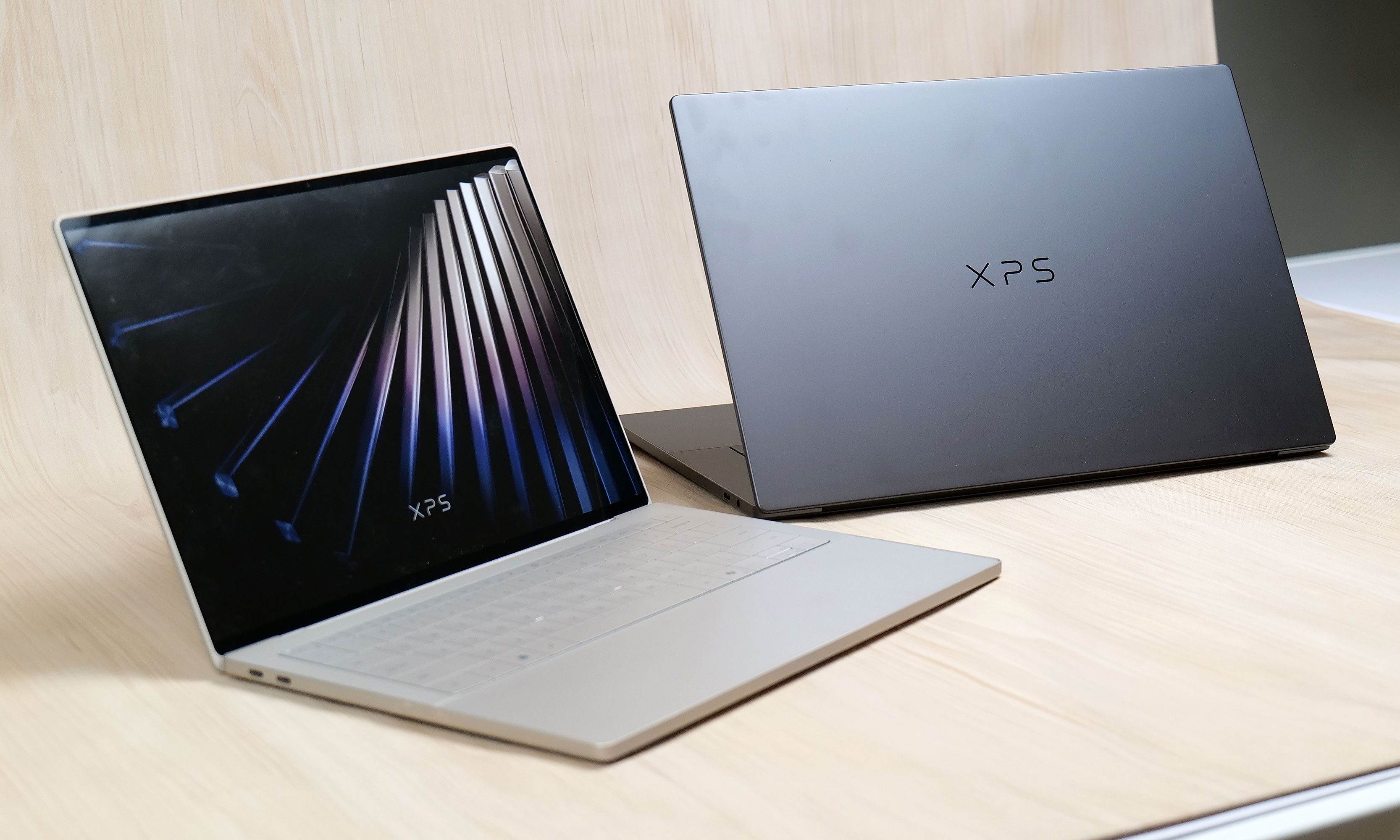
The first two new XPS machines will be the XPS 14 and XPS 16.
Sam Rutherford for Engadget
Additionally, Dell’s new naming strategy was intended to simplify its product portfolio, and it failed to deliver on that original goal. COO Jeff Clarke was refreshingly honest about this when announcing the return of XPS at a CES media preview in early December. Not only did Dell lose its signature XPS brand last year, it actually made things more confusing for consumers when it simultaneously created a full range of Dell Pro and Pro Max systems. Unlike Apple’s MacBook Pros and iPhone Pro Maxes, those devices were actually meant for enterprise customers instead of regular Joes.
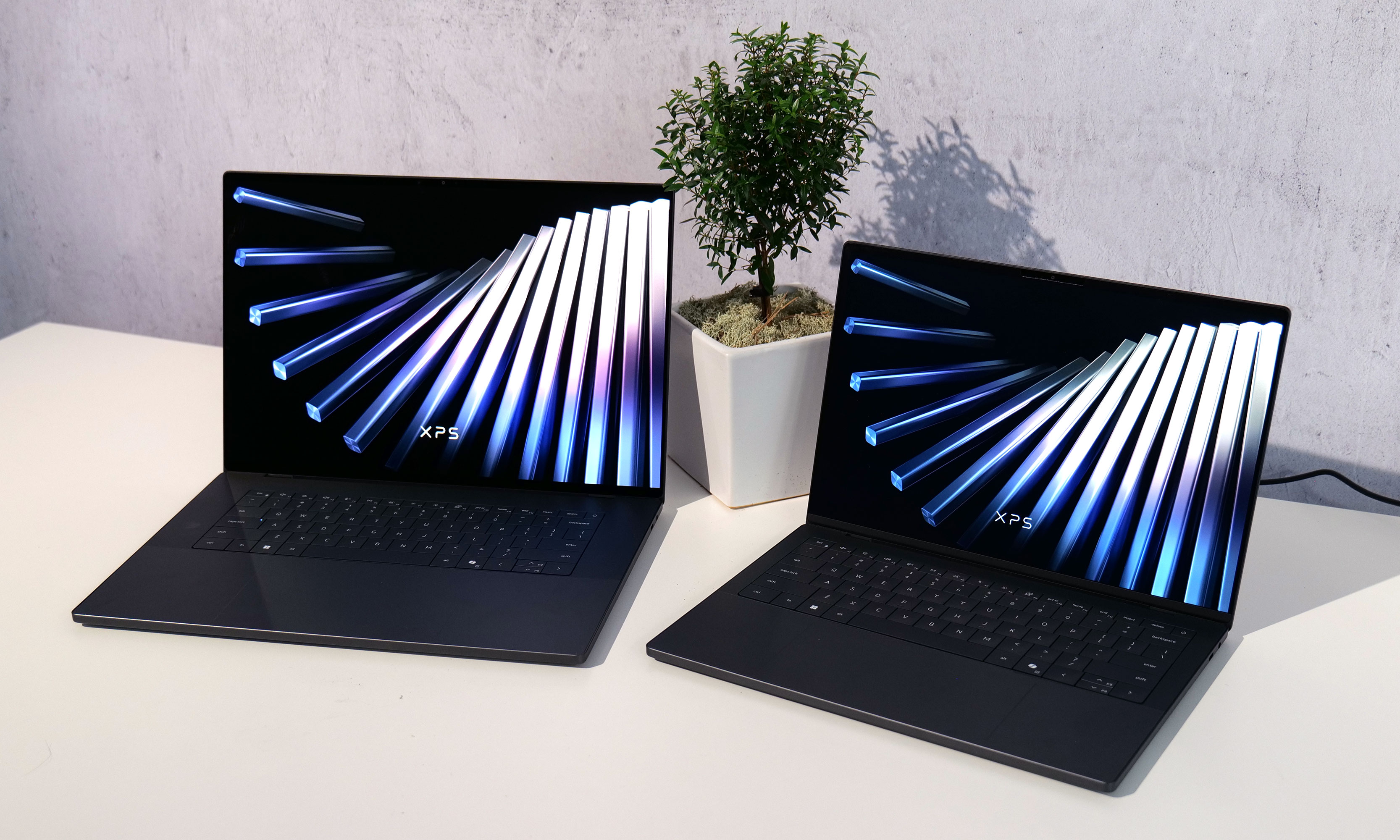
Another photo of the new XPS 14 and 16, which have a bunch of welcome changes and then some.
Sam Rutherford for Engadget
Amidst its rebrand, the company also eliminated a lot of its budget and entry-level models. That left a lot of people turning to more expensive mid-range “Plus” systems or waiting for a proper redesign of its top tier Premium laptops, which weren’t expected to arrive until 2026 anyway.
So where is Dell going from here? Well as Clarke put it quite succinctly, “We’re getting back to our roots.” Starting in 2026, the company is planning to create its broadest PC portfolio ever including, a full line of XPS laptops. This includes an all-new version of the XPS 13, which is going to be the thinnest and lightest model to date, along with complete overhauls for the XPS 14 and XPS 16. But Dell isn’t stopping there because on a slide it showed at its press event, there were two additional placeholders for future XPS systems coming at some later date.
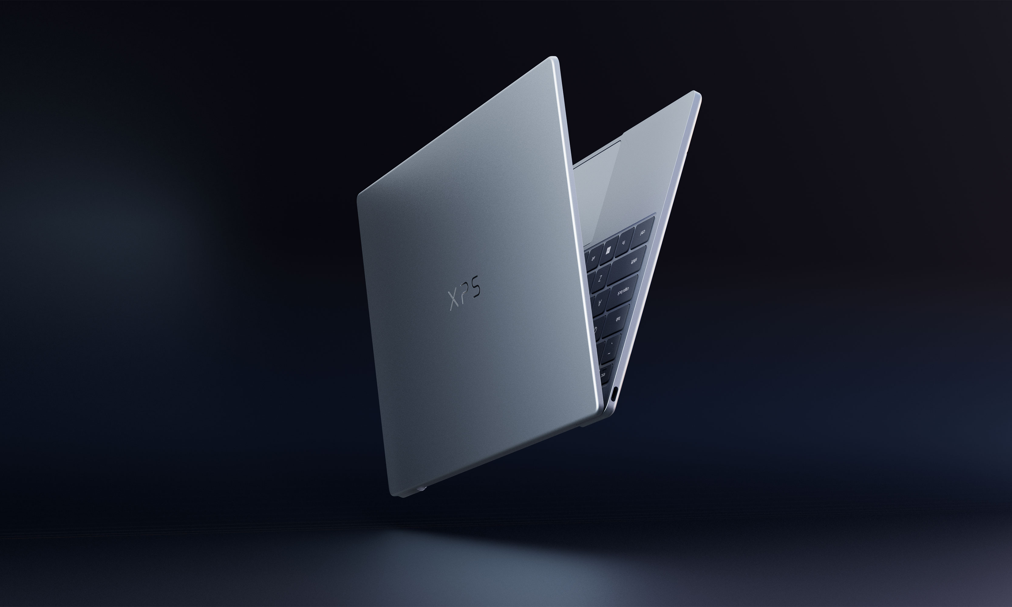
Dell wouldn't let me take photos of the XPS 13 prototype model, but here's a teaser it provided for CES.
Dell
Even when it comes to specific features and components on individual models, Dell is finally acknowledging some of the criticism it has received over the past few years by returning to segmented touchpads instead of seamless all-glass slates and ditching capacitive function keys for good ‘ol buttons. Dell isn’t just bringing the XPS line back, it’s kind of on a revenge tour (even if the original wound was self-inflicted).
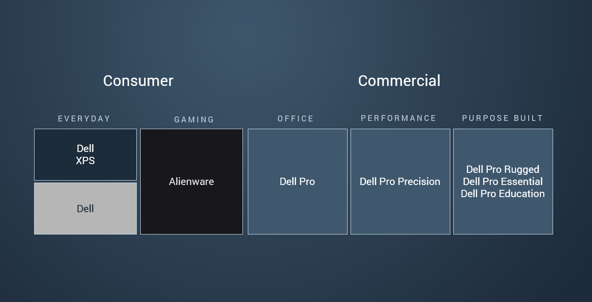
On top of that, the consumer device team will be reporting directly to Clarke while the company retools itself internally. Dell is also updating its naming scheme to finally deliver on the promise of making things clear and simple. XPS will once again be the company’s flagship consumer brand with the XPS logo (not Dell’s) front and center on the lid of every laptop, while everything else will fall under the general Dell umbrella. Alienware will continue to do its own thing for gaming and the Dell Pro family will remain aimed strictly at enterprise businesses, professional services (like first responders) and education. No more confusion. And underlying all of that is a very straightforward motto from Clarke that “great products win.”
After ditching the XPS brand, Dell is now bring it back for 2026 in its rightful spot at the top of the company's consumer portfolio.
Dell
In the end, even though Dell’s big plan from last year ended up being a mess, I appreciate when a company is self aware enough to know it messed up and has come up with a plan to fix things. Regardless of whether it's a corporation or a single person, admitting mistakes is always hard. Oftentimes, what you learn in the process is the real prize and from what I’ve seen Dell and its iconic XPS line is poised for a major comeback.
This article originally appeared on Engadget at https://www.engadget.com/computing/laptops/it-took-guts-for-dell-to-admit-its-mistake-heres-how-xps-will-make-its-big-comeback-in-2026-233248065.html?src=rss

 Anmelden